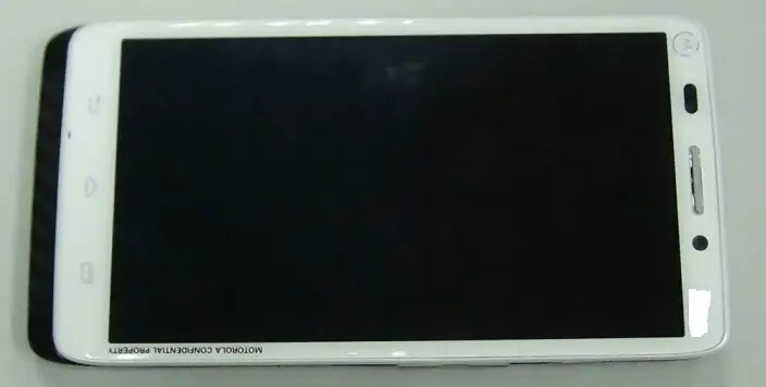
We’ve been imagining what the Motorola DROID Ultra could look like since it was originally leaked on Motorola’s site and subsequently passed through the FCC, and now we seem to have gotten an idea. A user over at XDA posted a supposed image of the Motorola DROID Ultra XT1080. Unfortunately we don’t get any information about the device, but its white-washed chassis matches up with Motorola’s desire to offer the device in a multitude of colors.
It’s not often we get to see Motorola’s devices in anything but carbon or jet black, so it’s rather interesting to see how a more bright device of theirs could look. It’s tough to tell how big that display is with nothing else in the photo to measure it up against, but it looks like this won’t be a small device to pocket. Take a good look at it now, and stay tuned for more information leading up to an eventual unveiling.


Ugh. This phone makes my penis soft.
Sounds like you have a problem that you may want to get checked out, bud.
Is it because she has a really large bezel and buttons on her bottom?
That is quite Freudian statement, even if you don’t mean it consciously.
So that’s what the micro sd slot is for.
WHYYYYY are OEMs not all 100% on board with on screen buttons yet?? This drives me insane.
Because some of them have realized that there is a *large* number of paying customers that don’t want on screen buttons.
Think to yourself, which OEMs are selling the largest number of phones, the ones that are offering a lot of onscreen buttons, or the ones that are keeping with off screen buttons…
Yea but do you really think people are out there looking specifically for phones with physical and capacitive buttons? I just don’t believe that’s the case. The S4 or HTC one would without a doubt sell just as many devices with on screen buttons but would both gain more selling points in saying you gain more screen real estate when watching videos or playing games and that the buttons adapt to what you’re doing. I’ve just never heard a great argument for why companies should use capacitive.
Believe what you want.
Personally, a phone with on screen buttons would have to be absolutely standout for me to consider it. None on the market today come close to even being considered.
YMMV.
Just out of curiosity – why don’t you like on screen buttons?
I like the on screen buttons, but for I have a sizable “screen burn” where they are and it’s noticeable when I’m playing full screen games/movies. Also not all programs have the buttons disappear which is really annoying.
You waste a large portion of the screen just to get three buttons at the bottom. It gets substantially worse when operating the device in landscape.
The onscreen buttons offer nothing of value (unless you feel having the buttons “always” be at the bottom left all that valuable) while wasting space, yet still leaving the same amount of un-used bezel as devices with capacitive/physical buttons put in that space.
Just look at the N4 and the GS4. The GS4 has a usable screen size of 5″ while the N4 has a usable screen size of about 4.4″, yet the GS4 is only .1″ taller.
I like capacitive buttons. Wasn’t a fan of the screen buttons on my old Galaxy Nexus.
I’m not so sure the fact of on screen buttons versus hardware buttons is the deciding factor for purchasing specific phones. it just so happens the most desirable phones (i.e. higher end) have mostly been hardware buttons.
I wouldn’t have bought my Galaxy S4 if it had on-screen buttons. I cannot stand them. Further one big deciding factor between HTC One and Galaxy S4 was that Galaxy S4 had a physical home button.
I wish I would have waited for Galaxy S4 active so I could have all the buttons as physical buttons. I hate when my finger suddenly slides over back/home/menu when I’m typing or playing games! It doesn’t happen with physical ones.
P.S. I paid £600 cash just to get the phone I wanted! I didn’t get it with a contract.
Lol that’s not true at all, the reason why those on screen button phones aren’t selling is because the only ones that exist at the moment are very limited, for instance the average consumer probably doesn’t even know the Nexus line exists due to Google not advertising it , The Xperia Z and all of those newer Sony devices are only available in Europe at the moment, and if they do make it over here they will cost around 750+ which not a lot of people are going to fork over. If the Galaxy S4 had software keys, it would sell just as much as it has sold with the capacitive buttons. the only people that actually care for this sort of stuff is the techies like you and me.
I personally prefer the software keys because it could minimize the chin bezel + they are very customizable to fit the theme you are going for, with the hardware keys theirs not much you can do although i do like the LED home button on the Lg Optimus G Pro, and if you don’t like them then you can just use pie and go full screen. Just a lot more options in my opinion.
I don’t like on-screen buttons.
Looks good.
there are capacitive buttons. Motorola hasn’t had those in a while. I’m not too sure this is real.