 The last year or two has seen a sea of change when it comes to the design of Android apps. Unless the developer has provided exceptional functionality, he can no longer expect success if the app doesn’t look good. In the Design Love series, I’ll share some of the best examples of the growth the platform has seen. So far, I wrote about Camera Zoom FX and Ovo Timer.
Flib is a converter app that, despite its drop-dead gorgeous look and a 4.7 rating on Google Play, continues to split my opinion. If I were to give an example of a great UI, but imperfect UX, this would be it.
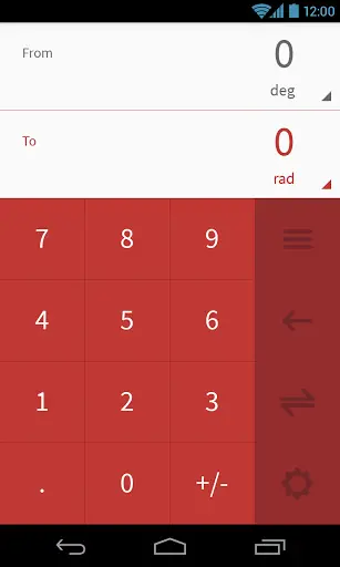 Before I talk about the negatives, I want to praise Ten Days One App, the team behind it. The Flat UI makes you instantly love the app. The app comes with various color schemes, choosing the default one at random but allowing you to set your own favorite (disclosure: mine is red). You are then offered a selection of categories or types of conversions to choose from. Once you have picked what you need, you are presented with a neat touchpad (screenshot on the left) to type in your numbers, and can see the conversion performed at the top.
Need to change the units? Just click on the number for whichever needs to be replaced, or the swap button if you need the vice versa. It also keeps track of which category of conversions you perform more, to push them to the top.
My real gripe with the app is that it tries too hard to impress the user. I found the various animations added all over to be a nice touch at first, but I soon found them to be getting in the way. The buttons-flipping-around-into-view animation was overdone, in my opinion, since it was shown with every state change. I got really, really bored of it after a couple of uses, and found the animations to be slowing me down when I just want to get some work done. A decent compromise might be to make them a touch faster, so that you notice them (and the state change) but it doesn’t take up too much time.
Another place where I feel form has been put over function is the screen where you choose what type or category of conversion you want to perform. Since there are more than 12 options provided, the app cannot fit them in one screen. However, instead of simply scrolling down with a flick, you have to press the down arrow on the right. It’s a small thing, but we’re just so used to scrolling with a drag that it seems weird to have skimped on it. Wait, there’s a reason? Oh, yes. To perform that flipping (literally) animation again.
I do know that I am being a bit picky while pointing out the negatives, but that is because this app is so close to perfection. I am certain most users would be more than happy with it, and I cannot state this enough: the developers have done a pretty good job, particularly on ensuring it works well on all form factors and screen orientations. Do give it a try by following this link, and letting us know your opinion.







I love the app. Just waiting on the dev to update the icon resolution on tablets…
Not a fan of flat interfaces. I remember back when the calculator used to have round buttons that were slightly shadowed, making them look more realistic. Now flat seems to be the new norm. It’s not doing well for WP and their Metro approach and I hope it doesn’t become the new norm in Android.
Hey Raveesh, buddy. Where have you been? I know you were off at the expo a few weeks ago, but then no weekend posts for a while.
I hope all is well. I know many of us look forward to your weekend insight spotlighting apps and products that we might not be aware of.
I wish Rob and crew would put you on full time. Your writing style is open and inviting. I really appreciate you presenting information so people who aren’t Android geeks like me can still understand and gain greater understanding and love for our OS.
Hey Robert, I was on a much needed vacation. As much as I would love to (and I honestly would) I can’t join full time since I’m working on some other stuff during the week. The weekend slot’s a great compromise: play around with apps (and now games with the Moga) Monday to Friday, then write about them on the weekend.
Can I ask what you do in your other job?
You’ll come to know soon enough, just want to keep things a little secretive for now :)
No worries. I’m excited to find out.
Terrible app, major case of design over practicality.
Google now does all of this