Rob has loyally covered iOS topics for several years at iSource.com, but with the HTC One in hand and a smile on his face, he is welcomed to Phandroid as a brand new Android enthusiast.
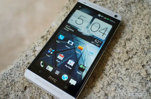
A couple of weeks ago I made the leap and bought my first Android phone after owning 5 different versions of the iPhone. I chose the HTC One for several different reasons, but the most obvious and easy to identify was how well it was built.
HTC One first impressions
Call me shallow, it’s ok, but first and foremost, the HTC One is a thing of beauty. This is one awesome looking phone. I’m sure by now you have read Chris’ HTC One review several times in addition to Kevin’s HTC One vs Samsung Galaxy S4 comparison post, but I personally can’t get over the quality that HTC put into the One. For me, a life long Apple customer, that ‘s saying a lot. Do I think that it is built better than the iPhone 5? Actually… yes, yes I do. Let me explain why.
With the iPhone 5, Apple went thinner and lighter than they have ever gone before. It’s a trend in the mobile handset industry that I think has too much emphasis thrust upon it. When I picked up an iPhone 5 for the first time I almost thought it was a fake display model, it was so light.
A strange thing happens when you design a device to be so lightweight — it tends to feel more fragile as a result. With the HTC One, that doesn’t happen. Weighing in at a whopping 30g heavier than the iPhone 5 it feels much sturdier as a result. Perhaps it’s simply because the weight is distributed over a larger surface area than the iPhone 5. Whatever the reason, I prefer the feel of the One.
HTC One durability
I have never been much into using a case for my phones. Sure, there are the occasions where I’m at the beach or on a boat and I might take extra precautions, but for the most part I support the “naked” approach for my mobile devices. Consequently, my iPhone 5 paid the price within the first week of its existence. The anodized coating that Apple covers the black version with chipped rather easily.
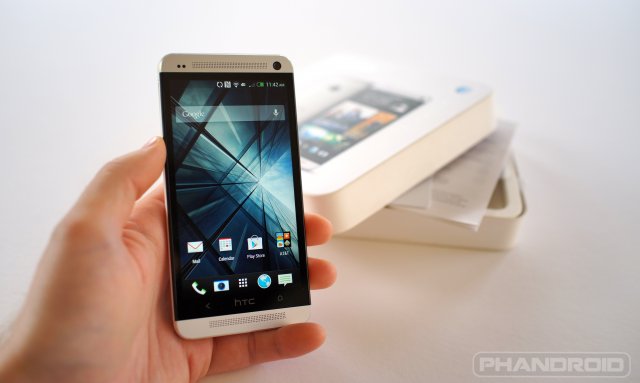
I got over it and moved on, but I knew it was there. So when I picked up the HTC One, I was concerned that the same thing might happen to the aluminum casing as well. To my surprise, after two weeks of using the One it doesn’t have a scratch on it — not even on the largely exposed curved back.
I was also a little concerned about the white plastic trim that completely surrounds the perimeter of the phone. My last three iPhones didn’t have any plastic on them, much less white plastic, so discoloring and durability were something I was worried about. HTC has proven that they can build a quality product that stands up to my daily routine. After two weeks, I have yet to see any discoloring of the plastic trim.
HTC One look and feel
The HTC One feels very great in the hand. I hate the way that sounds, but it’s true. The curved back rests in my hand very naturally. If there is one complaint I have, and it might be a result of my familiarity with using the smaller, thinner iPhone 5, is that it is NOT a one-handed device. I have average sized hands, and I can’t reach the top left corner of the screen with any accuracy on a regular basis. Even the back button at times seems to be too far to the left depending on how high the phone is resting in my hand. The volume rocker button is a little harder to locate than I’d like, but for the most part my thumb is always resting on it anyway.
Anything I don’t like?
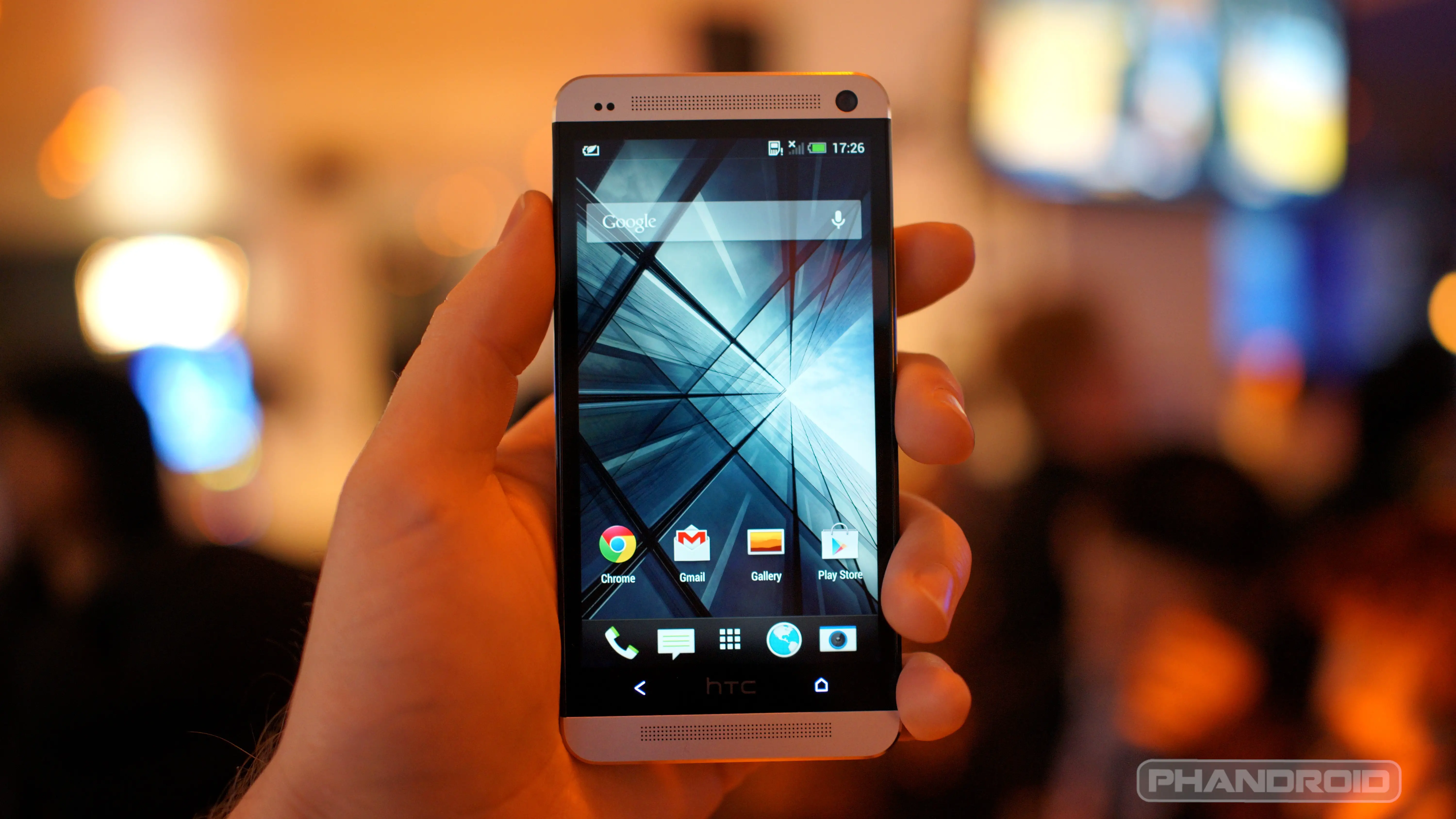
The last observation and comment I have is one of the only real “complaints” I have had with the HTC One so far, and probably Android in general — the soft buttons. I never really realized how much I relied on the physical home button on the iPhone. You press the home button and it takes you “home” no matter where you are in the OS. Even when I jailbroke my iPhone and relied more on gestures to navigate the OS, it was still fairly intuitive and easy to pick up.
Dedicated soft buttons for new users to Android seem straight forward enough. I especially appreciate having a “back” button, something iOS could definitely benefit from as well. However, my experience with the HTC One has been that of an inconsistent response from the soft buttons. Even with feedback turned on, which I’m still getting used to, I feel like I am always hitting the soft button more than once to get a response. Perhaps it’s a smaller target area than I’m used to, or the fact that I’m stretching my hand trying to maintain a one-handed experience when it isn’t reasonable to do so all the time.

Whatever the reasons, the fact that the buttons aren’t always lit and easy to discover in low light environments seems to just exacerbate my frustration further. Is this a common issue for other Android users, specifically those with a HTC One? Have you ever had problems using soft buttons? Would you prefer smartphones went back to using physical buttons for certain functions? I’d love to hear your thoughts on the subject.
[UPDATE]: I wanted to share with you my first “Android” moment–in the middle of my post no less. I had just ranted a little about the lack of consistent backlight for the soft buttons on my HTC One. Just for the hell of it, I Googled my issue, saw an app that addresses soft button backlight issues, downloaded it, and boom–no more problems. I guess this is probably the most celebrated benefit of Android over iOS–the ability to find answers to your questions, and resolve them on your own. More about that on a later post!




Rob really IS new to the Android scene – he’s confused physical, capacitive buttons for “soft”ware buttons ;)
Ok but soft or not, the “physical capacitive buttons” are a pain sometimes.
especially for those with the unresponsive buttons as reported elsewhere
Especially on the S3. I find myself accidentally hitting the back button all the time.
I just hope he tells us the name of the app he used…
Help a brotha’ out here, man!
Yes, I would also like to know what app the article author used to help control the backlighting of the buttons!
Soft Buttons Light
https://play.google.com/store/apps/details?id=com.meco.sbl&feature=search_result#?t=W251bGwsMSwyLDEsImNvbS5tZWNvLnNibCJd
I think this is it too.
Not true, try it. However, it seems after the phone goes to sleep, I have to re-launch the app again.
Yeah, worked for me at first, now will not. Thought I had it.
I think what he meant by soft, was soft “touch” not soft “ware”. Many refer to capacitive buttons as soft buttons, soft “ware” buttons as on screen, and physical as hard keys.
Thank you! That’s exactly what I meant.
Actually people only casually refer to ‘on screen’ buttons when discussing iOS development, such as the fact that most iOS apps have ‘on screen’ back buttons. IOS has zero OS action buttons that are ‘on screen’.
The one really does have crappy capacitive buttons though. The only complaint I have about the phone, really.
Can’t say anything about One, but I love capacitive buttons on my RAZR. And of course they always do what they are supposed to, and always located were I left them :)
My (only) three complaints, and I’m hoping they get addressed:
“soft” buttons requiring a precise touch (I have seen others with the issue and hope it gets addressed).
Precision sensor gets confused in bright light; my phone doesn’t realize it is against my ear during a call outside and allows my fat face to smash away at the screen, sending many random texts and playing games
Dialer letters (for T9) are too faint to read in bright light. Had to switch to a different dialer.
(I guess there are 4)-the omission of the “settings” button is a bit of a pain as so many applications expect that you have one. The One adds this button in at the bottom of the display screen, using up realestate.
Other than these issues, I love the thing!
I’ve heard other Android owners refer to capacitive buttons as “soft” buttons before. Is this not the case?
Not really, but don’t feel too bad about it.
“Soft” buttons are really supposed to be on-screen buttons as seen in Nexus/Motorola/Sony devices (and the Galaxy Camera, for some reason). They’re driven by software rather than capacitive hardware buttons.
The lines get blurred because the definition of the abbreviated form “soft” isn’t really agreed-on (as you can see from this thread).
“Soft” is short for “software”. ‘Capacitive’ is a type of touch tech. Seriously though…lemme write for this site. I promise to pound out something in a reasonable time frame, I can analyze a phone without talking about iOS, and holy crap, I know what tech terms mean!
That may be true, but for years I have heard the term capacitive soft buttons on numerous tech sites & blogs, mainly xda, but on news sites as well.
me too.
Rob, just wait until you root and ROM your phone. You’ll unlock so many possibilities for that device! You’ll need to start your own blog site to talk about all of the additional functionality and features you have access to.
I plan on it one day for sure
I would root by all means, but for me personally I would not put on a custom ROM on there. Losing the features on the camera which are amazing and the Beats sound enhancements and more importantly the noise cancelling and call quality which is second to none will be lost. HTC are actually being their shot together with updates also. There is already an Android 4.2.2 update on the way for the butterfly, the HTC One Mini will be running 4.2.2 when it is released next month so the flagship will be getting also very soon I think. I’ve already had one OTA update which improved the phone after only a month…
I’m surprised he didn’t say a word about the Camera features and quality.
And what about BoomSound?
It’ll all come in good time, I’m sure.
Bingo. First impression was what I was going for–as in picking up the phone for the first time.
baby hands bro
LOL, not quite
Welcome to family Rob! Now Root that bad boy and really have some fun!
Yeah those aren’t true soft buttons. True soft buttons are found on phones like the nexus line. Those buttons are ALWAYS there and always in the same orientation. Its unfortunate that HTC went with those but I have a feeling that their stupid sense software borks up true softkey implementation.
Every iteration of HTC Sense was a horrendous , slow, memory hog until Sense 5 on the HTC One. It’s slimmed right down, clean, modern looking and lightning fast. It is the first time in years that I haven’t used a third party launcher, apps or ROM on a handset. The only app that wasn’t so great was the keyboard, but still better than most attempts by OEM. SwiftKey beats everything though for me. The best Android phone ever made, probably the best smartphone ever made and definitely the best phone I ever owned by a long way
Welcome to the Dark Side, Rob ;)
Welcome.
To parrot the others, definitely root that bad-boy. however I would not upload a custom ROM for a while. I would stick with stock ROM; perhaps someone has debloated and optimized the stock ROM. My experience with custom ROMs are generally good, but I had to be willing to have spotty bluetooth or other key features (for me) that were not quite working properly.
Just my dos pesos….
Trickdroid is 100% stable.
I’m running CM10.1 at this point though. It’s about as debloated as you can get.
Wow another iPhone user’s take on an AOS device.
I have a minor preference for physical buttons over capacitive buttons (my thumb is the wrong shape and does not always trigger the capacitive button). Most of my dislike of the HTC One’s buttons comes from the missing menu/recent button and the search button. I definitely prefer the dedicated buttons over the soft buttons.
Tapping the home button twice brings up your recent apps.
Zactly. And holding it down launches Google Now
Really hope you see the light and hardness the power of Android for the greater good. Literally. I can’t ever see myself going back to iOS. It’s just so limited in every single way. I often still find myself stunned at some of the things I discover I can achieve on Android.
Baby steps for now. I really don’t know what I’m missing yet, so it might take some time.
It definitely will. As I said in my first comment, I still find things that I didn’t know I could do on my phone. For instance an application I purchased yesterday called Ninja SMS. I suggest you check it out. Great if you want a true multi-tasking experience.
On the one hand thing, I think that’s a key design difference between iOS and Android. Android isn’t trying to be a one handed experience, whereas Apple seems very attached and proud of that feature, as limiting as it is.
I traded my iPhone 5 for HTC ONE as well. I can’t describe how happy I am
Loving but HTC One too with you guys but I do notice that I too have to hit the home or back button a couple times, there is like that fine “spot” you have to hit to get it to work proper. Sometimes but very rare home won’t even work for me and I have to lock the phone then unlock it and it’ll respond. “Hopefully” HTC will patch this up.
I have the AT&T HTC One and the stock software seemed to have this issue. I put the 1.29.XXX developer edition ROM on and the issue seems to go away. Maybe that will be included in a future carrier update.
The One I tried in the T-Mobile store also had this problem.
I think the .12 build is where this problem was addressed.
Seriously this site is turning into iPhandroid, stop with making everything about the iPhone and Apple on here. Apple is a sinking ship right now and is basically irrelevant in the mobile tech industry. Their only user base these days are the tech dumb who are easily swayed by salesman and marketing and your typical MacHeads. Everybody is dumping their iPhones and moving to Android, we all know this.
I’m tired that everything has to be compared to the iPhone (a phone that’s two years behind in tech already) and/or an iOS users opinion on an Android device.
/End rant from a long time reader.
I agree with you. He could have written the article without even mentioning the iPhone.
that’s idiotic. the whole point of his articles is that he was an iphone user and columnist and is sharing his experiences with the change. He getting used to the new environment and only has one other point of comparison – iOS. It’s the same thing Kevin is doing but the opposite way. They will always be compared until one of them dies, so get used to it.
Then point is I don’t come to “Phandroid” to read about Apple/iOS news, “X” compar. to the iPhone, or articles of iOS users opinions on “X”. Like I said I’ve been a long time reader here and came here to get away from the Apple fan articles and trolls polluting the comment section like other websites. Its seems phandroid is becoming redundant because I’ve noticed more and more articles about iOS and iPhone (IMHO an irrelevant device/OS) are becoming more frequent.
Articles like this and the one about what iOS has over android have me facepalming. Personally as a “tech need” I don’t see the appeal of iOS and the iPhone, or why it has anything to do with Android and Google, its like comparing the Amish lifestyle to someone who lives like Tony Starks (ironman) in an effort to make the Amish lifestyle seem on par with Tony.
If you guys want to write articles about/comparison of iOS/ iPhone that’s perfectly fine but it belongs in on the sister site not here.
Personally I like to hear the experiences of iPhone user coming to Android. However, he could have done this review based on expecting a one-handed experience from htc one. Kind of silly since the only one-handed experience really only come from iPhone.
Not necessarily, many Android users who have upgraded from a phone out 2 years ago might be struggling with this too. I actually have some trouble occasionally trying to handle my Razr HD at times as the size is a little much at times. Unless you’ve been upgrading with every brand spanking new phone on the market every few months then the size issue is actually still a pretty new phenomenon, even for us non-iPhone users.
Not really a review, just a first impression.
not trying to start a flame war, but clearly you are. I hate Apple as much as the next guy, but to get so worked up over seeing just the word iPhone in an article written by a former sister site columnist that is coming over to the “good” side is silly. It brings in new readers who trust his opinion and may sway more people to take a chance and switch over. If you don’t get that then idk what to tell you.
Moreover, the article isn’t about what iOS has over android…did you even read it? i’m not even getting into this. Don’t comment on articles you didn’t read, dude.
Hey, if you “don’t come here to read about apple” as you said, don’t read it and don’t comment. You’re fanboying hard for Android and it’s making us look bad. You get mad at people for being iSheep, don’t be a gSheep.
Thanks for the support. Having an open mind and experiencing another OS only helps me better understand what is appealing to other users. Getting angry about it is silly.
no problem, dude. really surprised at some of the hating that I see going on in some of these comments. but I also have seen lots of supportive comments that you have replied to. THAT’s the android community that I know and love.
I wasn’t trying to start a flame war or troll the site, I’m just sick of seeing every flagship android phone having to be compared to the iPhone. Apple does not set the standard in mobile tech. Read my Amish remark above for reference.
If you don’t want to read anything with even a small hint of Apple in it then you can just choose not to read the article. Nothing says you have to read every article on phandroid.com by an y means. But give Rob a shot. He’s new to the community, he’s learning new things about Android (many things that other Apple to Android consumers might be going through themselves). So is this discussion relevant to Android? Absolutely!
Now if you’re such a big boy that you don’t need beginner stuff then go hang out on XDA Developers or something.
Ive been member of xda since 2008 and a recognized contributor.
Just sayin’…no need to hate on new users.
I thought you said you were done with your rant?
Still had my panties in a bunch apparently :-P
HA, it’s all good
My point is that he could have gave his impressions with mentioning the iPhone. At no point was it really necessary to mention the iPhone.
There are plenty of HTC One impressions on the net, I’ve read plenty of them. Hell, there have probably already been articles posted on this site about just that. So why even post this one if not to address a slightly different audience?
Just a thought– it’s in Phandroid’s interest to increase its readership. Throwing out the “iOS to Android” bait is a smart way to get some new visitors who may find the article valuable. It’s obviously not targeting existing hardcore Android fans.
I was just over at the iSource site and I read a post titled “The iOS 7 Crystal Ball Report”. The author of the blog post could have made it a comparison between iOS and Android or any other OS but he chose to focus squarely on iOS. In the entire 2000 word post he mentions Android, Windows and Blackberry in one sentence. He understands it’s an Apple blog and not anything else.
On a side note, I thought the comment section was funny. Two people commented: Kevin Krause responding to the post and the the author the post responding to Kevin. It looks like a pretty lonely place over there.
So basically, Phandroid should never post anything that even references iOS. iOS users should stick to reading reviews of Android devices like the HTC One on their iOS blogs. Fair enough. (Maybe the name “Phandroid” should make that obvious enough).
Like I said. There’s a larger potential audience out there for a site like this than just those who are already dedicated fans (and thus greater potential revenue). Whether you (or I) see it as good or bad that they try to make more money by occasionally doing something to get new readers is irrelevant.
Bingo
That is my comparison reference–it is absolutely relevant
I get it, I guess +Justin Berry is not excited about the feedback from an iOS user going to android and an android users going to iPhone.
As a support person who has to purchase and support these phones for our Sales Guys I can provide this feedback.
I prefer Android personally but for support iPhone is easier to deal with. It has a consistent user interface and menus, and is much more simplistic due to lack of customization. That provide a more reliable device even if it is less desirable than an Android device.
Android is pretty, can be customized but most devices have a different skin, and customized user interface and menus. Great for users, terrible for supporting those users :)
There are lots of iPhone ‘techies’ who still need an extra push simply because they’ve invested so much into the Apple ecosystem.
The 1.29 update fixes the soft button responsiveness. And Rob, are you just trying this out, or is this a long term change?
I am trying this out, and if I like it, I have no intention of changing. I sold my iPhone 5, so the HTC One is all I have right now.
If you think the HTC One is a two handed device you either have really small hands or do not fully understand Android. Stop setting your home screen up like an iphone for starters. If you use more widgets you can paste it one handed Also put your icons in the bottom right of the screen where you can easily reach them. If you still feel like you can’t get to everything you want install “pie control” from there market place and set up more short cuts and quick action button in that. Then you will have no excuse for not being able to use the device worth one hand.
Good points on how to optimize for one handed use. But usually the time I run into trouble with one handed use isn’t from the way my launcher, etc. is set up. It’s generally some app that has an element of its UI up there in the top left corner, for example. Not a fault of Android, not even necessarily of the app developer (as the app might be perfectly usable with one hand on say a 4.3″ screen). Just a natural consequence of having a screen that large.
good point
I’m sure I have initially set it up in a similar fashion to my iPhone–no harm in that, very reasonable considering my past experience. No I don’t have small hands, but whatever you want to say to put me down is fine. Fully understand Android? If understanding Android is leaving lots of blank space so that I don’t have to reach for it, that seems silly to me. I’m working through the experience, and adjusting as I need to. I am warming up to widgets, but not completely sold on them yet.
@renkman:disqus Some examples of a setup on a Galaxy Note 2 to allow for easier one handed use. The key is to just keep everything that you have to get to on a regular basis either in the Pie Controls or in the bottom right or your home screen. Use folders to (this text lines on the first image are all folders). Then everything you just need to glance at (eg. Widgets, weather, voicemail, etc.) in the upper left of the home screens. You will not have any trouble reaching what you need then, and you will fully enjoy having a large screen. I am not trying to make fun of people with small hands ;-) just trying to help you out dude.
That looks pretty cool. I get the gist of setting up the home screens for one handed usage. I even used some of the same practices on my iPhone, too. However there are apps when you need to reach farther, andw that’s where the biggest issue is for me. Thanks for taking the time to show me how you set up your phone, though. I’ll have to try some of your ideas out.
Nice article. I don’t know why everyone is complaining about the comparison to iPhone. It’s a positive review and Rob says that he LIKES the phone. As a former Iphone owner myself, I like seeing articles like these.
PS. There is an option to always have the softbuttons light (at least there is in 4.1.2), no need for additional apps.
Personally I like softbuttons, also my Note 2 has the physical home button, so it made my transition from iPhone easier.
Where is the option you speak of?
Settings then display they touch keylight duration
Not on the HTC One. No mention of key light duration in the display settings
Really? I guess it’s something Samsung added then. Must have to do with touchwiz. I have a Note 2, 4.1.2.
Yeah, I was hopeful there for a second–thanks anyway.
Rob – advice from a guy with small hands and is using a Note 2 (5.5 inch screen) with no problems.
The key is you don’t grasp the phone all the way around, like how you are in the second photo. that’s a consequence of being an iphone user.
Let your fingertips rest near the middle of the back cover. You can do pinky under (how you have it in first pic) for stability, but if you need to get to the top corner move your pinky to the back, then u can put it back under. its just a matter of understanding the balance of your phone on your fingertips.
This guy has it just right. It’s funny, because I naturally developed this method for one-handed use of my Note 2 as well, and I didn’t even realize I was doing it until you brought it up.
I do have bigger hands, though, so it is probably easier for me to adapt (and I would have no issues on the One — that phone feels like the “right size” for my hand size).
i craved that big beautiful screen so badly, I had to jump for it despite my little hands. so I just had to adapt. really glad i did too. definitely thinking more of a 4.8-5 incher next go round. that size I agree is just the “right size” in my hands. it just feels right. probably the s5 or the next One iteration.
definitely interesting to see other people adapting the same way as me!
Sure, in theory this works if not for the slippery texture of the aluminum backing. That’s kind of what I find myself doing as well. Thanks
ah, I see. that makes sense. See this is why I actually like the “naked” feel of my note, because it has a plastic back and sticks to your fingers well, making the technique a bit easier, despite feeling a bit “cheaper” than a metal casing.
To me the soft buttons became more muscle memory than anything. I was never one to talk down a product without actually using. So with every tech I’ve run in to I would use it for a solid 30 days (I’ve used everything from the palm to the blackberry z10). So with that, when I used the iphone I found myself reaching my thumb to the bottom left corner of the phone itself (the ‘back’ button on HTC phones). It made me feel dumb every time I did it but it was all muscle memory. Heck, I even do that between HTC and Samsung phones since the soft buttons are flopped.
Tl;dr: I can see where some people can be frustrated with soft buttons
HTC One is simply awesome. Let’s see how it holds up in 2 years.
Hooray another convert who finally left the Matrix :)
Physical buttons are the DEVIL!
It took me a while to get used to the soft buttons on my Droid Razr HD, but overall I’d say I like it just fine. Coming from the capacitive buttons of a couple of years ago I was a little worried but in the end I like the change. I especially like how the soft menu bar can move when tiling the phone in different angles.
Like others have noted I think the HTC One does have capacitive buttons, and while I’ve owned HTC phones, and phones with capacitive buttons, I don’t really know how it stacks up vs the soft menu keys on many modern post ICS phones. Overall though I don’t think I’d like to go back to them any time soon.
By the way Rob, I’m interested to hear your take on HTC Sense UI. I mean obviously you’re coming from iOS and not Android. But that makes your perspective unique since I already know what hard core Android geeks think of it.
i’m sorry, but kevin is blogging like it’s his *job* or something on your sister site! can i also work here & write 1 article every 2.5 weeks, not knowing the difference between ‘capacitive’ & ‘software’? i promise to involve an iphone in every other article for ye olde clicke baite.
He’s a full time writer, I’m not. Relax
Former iPhone user here. I’ve happily converted to the HTC One. If only Apple could see the light and switch up the design of the iPhone. Yes, there’s been tweaks, but to be honest, I simply got bored with the iPhone’s. I never realized how restrictive the ios eco system is until I started adopting Android. The switch was easy. Everything’s perfectly in sync (of course, now through Google and not iCloud). The operating system was a sinch to learn. And I’ve been having “fun” with my phone. I still have my iPad, iPod Touch and 2 MacBook Pros, so I’m still very much in the Apple club, but I have simply chosen to go with an Android device as my smart phone choice. Thank you HTC for your attention to detail and creating a superb hand held device.
Your experience parallels my own very closely. The One is a great device–starting to explore more and have “fun” too
Hey! I feel your pain with the capacitive buttons. I have been using a Windows Phone this semester (coming from a galaxy nexus) and I absolutely hate them. The true software buttons are much easier to use in my experience. And this is the one thing I dislike about the One’s design. If only they had listened to Google and done their damn buttons right….
Here’s hoping HTC makes another Nexus haha
Long time Android fanatic who went out and bought the iPhone 5 just to see what the hell it was all about. I really like the build quality, bought the white phone with 64gb of int memory. I really like the phone but IMO the iPhone is in desperate need for a good file management system. You are not allowed to do anything without the aid of ITunes. It is a money hungry system, Apple has everyone by the short hairs who can not jail break the phone. Most iPhone users have no idea how much Android makes adding your own downloads to your phone. If you want to ad anything to the iPhone you must buy it. No wonder Apple has a large bank account, it is crazy. iPhone needs a solid file system, it would make the phone so much better.
I see your point, but have never thought I “needed” a file management system before.
I didn’t think that I would buy a phone bigger than 4″ in the past
Really would be nice to know the app. I have tired a few I thought he might be talking about by they either cut them off totally, or just made them brighter. I found one app that you can make them brighter or dimmer, but it leaves them on all the time, even when the screen is off.
This was what I used, but it seems now that I need to relaunch the app to get it to work every time it goes to sleep.
https://play.google.com/store/apps/details?id=com.meco.sbl&feature=search_result#?t=W251bGwsMSwyLDEsImNvbS5tZWNvLnNibCJd
Have you tried any live wallpapers (Beautiful Live Weather is my favorite)? What widgets are you using (Android Pro Widgets have a lot of options)? Have you tried a home replacement like Nova Launcher yet? You don’t have to do any of these things, but they are unique to Android, and I would be curious how using them affects the utility and experience of your phone.
Haven’t fully committed to any of those suggestions, but am aware of them, and plan on giving them a try for sure–thanks!
Love my new HTC One, but hate the on screen buttons. Missing menu button and the home button is often unresponsive. That HTC label in the middle of the button row is also an annoyance.