With the Sony Xperia Z flagship still fresh off its unveiling at CES in January, we are hearing our first whispers of what could possibly be the company’s next flagship. According to the latest report, the Sony Xperia C670X could push a Snapdragon 600 processor at 1.8GHz with 2GB RAM and 32GB of internal storage.
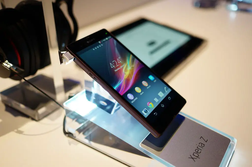
The Android 4.2 handset would be unique for a high-tier smartphone these days. Rumors say it won’t be another 5-inch+ smartphone (like the pictured Xperia Z), but rather one measuring closer to 4.8 inches with 1080p resolution. A 13 MP camera would handle the photo snapping work.
Whether rumor or fact, the specs seem to be about what we expect from this sort of hardware these days. But Sony typically offers great design and build quality, making us eager to get our first look at the phone. When that will, that’s any one’s guess.
[via TechCrunch]


Looks nice. Too bad I’ll never waste precious screen space on onscreen buttons.
I’m with you there, don’t get all the hate for sticking a couple of capacitive buttons on the bezel that would be there anyway, which means you can use all the screen all the time.
Because having a smooth all black surface looks cooler. Besides, when you’re doing something that requires a the whole screen, i.e. watching a video or playing a game, the on screen buttons go away. Either way, the PIE function is the best way to go. All the screen real estate you deserve, and no capacitive buttons ugly-ing up the bezel.
I see this a lot regarding the onscreen buttons. They only go away when you’re watching a movie. When you play games, they are there. The icons go away and are replaced with just lights, but the black strip remains. If it actually did work that way, I would be more about it, but going from my GNex to the Note 2, the extra real estate is appreciated.
I agree, I don’t think Google had gaming in mind when it implemented the onscreen buttons, because every time I accidentally push the home or back button while playing a game and subsequently get booted by the server I really start to re-consider Google’s current design philosophy and agree with the majority of manufacturer’s who have kept the hardware buttons or the Ubuntu/BB10 integration of swipe navigation features. The one thing tho’ I do like is using the bezel area for a forward mounted speaker grill instead of a rear mounted speaker grill so the bezel serves a functional purpose and the hardware buttons are actually giving way for something useful.
Google should add an auto hiding bar like in windows PC in the next android version I would love it even more
I have to say, I don’t give a dump about the look of 3 buttons on the bezel. I don’t think it’s ugly. What IS ugly is that crap taking up my screen space.
Another logical person
Wrong. The capacitive buttons on the Galaxy s3 disappear when not in use (or you can put the multi-setting duration to zero and they never light light up). And when I push my back button, guess what, it immediately goitres back. I don’t have to bring up the buttons and then tap them again. I think I’m gonna invent a new light switch where you have to push a button to activate it and then you can use the witch. I know it’s more inconvenient and more steps and might take up more wall space, but it’s new so its gotta be better right?
The only thing I wish Sammy would do is to make the home button the same type of disappearing capacitive button as the menu and back buttons.
Key Lime Pie will make the on screen buttons transparent. Plus when you watch video or run apps, you get full screen anyways.
Source?
if they’re transparent how can I see them to push them? What about that, huh? No I’m just kidding. I would have to see that to know how I felt about it. And it would have to be where I didn’t have to tap the screen to bring the buttons up in order to push them. To some people it’s not a big deal, I understand that. But my preference is to just have the button there all the time and it always is in the state of readiness to function.
my only question to you is, would you never do onscreen buttons just out of principle? Or do you actually have a required screen size. 4.6 inch screen is fine for some people. So a 4.8 inch screen (gs3) with onscreen buttons is probably close to 4.6 inches (Galaxy Nexus) in screen size. Or a 4.9 inch phone with screen buttons is probably a 4.7 incher most of the time
Either I have an ugly bar taking up screen space, or I have to tap to bring up buttons and then trap again to get the function. When I tap my back and menu buttons on my gs3 it works immediately. Why on earth would I want to change that. I also don’t want to hit buttons accidentally when playing a game. Onscreen burins make less sense and function more slowly than the disappearing capacitive buttons on the gs3.
I like capacitive buttons as well. And i thought i would hate on screen buttons too, until i actually used it. I can’t speak for everyone, but i do not notice any difference in performance from pressing the onscreen back n home buttons vs capacitive ones. I probably hit the buttons accidentally less so than i did before. When i hold it landscape, i hold the bezel, and before not oftent but occasionally the stem of my thumb would hang over n hit a capacitive button. But that’s a user specific situation. I cant argue with you if you dont like the way the bar looks, as far as taking up screen space that’s why i asked wether or not the actual size of your screen mattered or if it was just the principle of the fact that its taking up space. For example, a 4.7 inch screen with capacitive buttons vs 4.9 inch screen with onscreen buttons would have the same screen size when the bar is up. So if you are satisfied with your 4.7 inch screen, would you turn down a 4.9 inch screen with onscreen buttons and similar dimensions?
I appreciate you making good points and being civil while you have a discussion. as for your comments, I would say that when I pay more money for a bigger screen I want all of that real estate available 100 percent of the time. I am also a very heavy phone user. So the thought of having to always tap the screen to bring up the buttons, and then being able to use the buttons is a bit like nails on a chalkboard for me as far as the irritation factor (why add an extra step for no good reason).I can see if somebody was just a casual user, or if they didn’t mind that big bar, that it would be okay for them. In sorry, I just don’t see ‘improving’ something by adding steps and still getting the exact same functionality or improving screen size and then taking it away when you can have always activated capacitive buttons.
Yea but with on screen buttons you have the option to remove them and use gestures or a pie navi
Whoever told you that you couldn’t use gestures with capacitive buttons lied to you. Any decent launcher will give you tons of gesture control
As a recent shifter to on screen buttons, I can say I much prefer them and wouldn’t go back to capacitive/mechanical buttons.
Nexus or nothing
That’s exactly how I feel
Naaaaaaaah
that’s just plain sexy!
im not saying its ugly or anything, but its just a rectangle lol. Doesn’t look much different to me than a lot of other phones that are out.
Why aren’t any of these manufacturers using the 800?
the 800 is more of a tablet cpu i thought? besides the 600 will scream at 1.8!
ZTE is said to be using the 800….http://phandroid.com/2013/02/25/zte-grand-memo-news/
they lied they are using a weaker s600 or maybe even an s4 pro
Based on benchmark scores it looks to be an s4 pro, heck maybe it’s just an s4? :P
Yea even for a s4 pro its preety low, it could also be the memory holding it back since it only has like a gig of ram and a slower write/read, either way it doesn’t preform like a high end device like the HTC one, experia z or galaxy note 2.
Yea they pretty much lied, I won’t even bother reading any articles or watching any hands-on vids about any ZTE phones anymore. If it was just poorly optimized then maybe that’s understandable but I doubt it.
Sony is pulling an HTC and Moto. Too many phones too fast.
This device probably wont even arrive until fall, this is just a rumor not an unveiling.
I feel like at this point, all phones are fast, software is what counts and samsung is head and shoulders above the competition.
No, don’t do this Sony! I’ve already held off my upgrade for the Xperia ZL, don’t make me wait again!
I believe the Snapdragon 800 is worth waiting for. It will unlock capabilities we’re not even accustomed to these days!!!
Im sorry, you can down vote me or up vote me all you want, but Sony makes hands-down the sexiest smartphones!
Is Sony even TRYING to break into the US market? And what about The Xperia Z? smh
Sony can’t even get their now flagship out to people across the globe and they are already talking about their next flagship. They should work on getting the z and zl out to people and then maybe 6 months down the road or possibly longer release a new version.