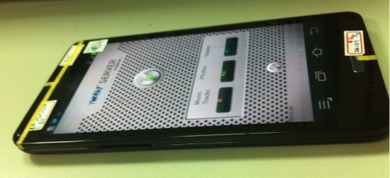
A new Samsung GT-I9300 prototype has leaked onto the internets, posing once again for the camera. And while at first glace it seems as if there’s nothing new here, those with a keen eye will notice the inclusion of a new, what appears to be, a customized virtual menu button for Samsung’s TouchWiz’d UI on top of Android 4.0 (below).
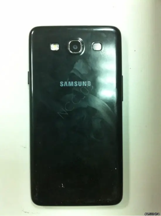
It’s not uncommon for manufacturers to actually add functionality with the skins the place on top of stock Android, and it looks like Samsung is addressing an issue that has bugged many when making the transition over to Android 4.0. You can see from these images, taken by a Chinese forum site called Mobile01, the prototype Galaxy S III still features the same, boring casing Samsung has used to disguise their next flagship whenever it leaves for testing.
I remember someone once saying that the inclusion of virtual buttons in ICS gives Google control of placement but it looks like it’s provided an easier method for OEM’s to shuffle around those buttons and mess with their users “just because.” You guys happy to see a bigger, drop-down like menu button? Here’s to hoping TouchWiz will allow for further customizing of the rest (crossing fingers).








The screen looks nice.
I was thinking the same thing! The full image (click on it twice) made my mouth go :O
Touchwiz: Looking as fugly now as it did in 2010
Meh
It better be a lot nicer than this.
there is a fake cheap plastic dummy case around it, no one knows what it will actually look like.
Def getting sick of these leaks. Everyone should know by now that Samsung has used dummy cases.
Joanie loves Chachi
TouchWiz looks downright terrible. Dear God. The screen looks like your run of the mill 720p display with some type of SAMOLED technology that IMO displaces colors a lot of the time. Little bit unrealistic… It’ll be nice to see how this phone turns out!
Ughh Samsung just leave stuff like its supposed to be. Does this screw up the action bar for devs?
It shouldn’t. There are compatibility libraries like ActionBarSherlock that will port ActionBar to Froyo+. Testing on my Evo I didn’t notice any difference.
No I meant on their moving of the menu. Will it still show up in the action bar or is this only for the legacy menu handling?
Ha, market icon and not google play or..
If you think about it, this pic has to be somewhat old. It’s still using the old android market, unless they decided not to update it..
Fake!
Best comment. xD
stupid
Thank heavens for Cyanogenmod
Or AOKP :D
big fan of AOKP now, they are really kicking some ass in the ROM worlds… its a great concept too!
lets just take the best parts of each AOSP rom and build a super, super stable, mega-uber ROM
Im gonna go ahead and say it, but i do think this could actually be the phone everybody is waiting for! Reason?
Samsung’s teaser a-la this link —-> http://phandroid.com/2012/04/21/samsung-teases-us-with-a-bit-of-samsung-galaxy-s-iii-goodness/
Now if you look at the second pic in this article, focus on the screen itself. It actually looks identical in shape (curved corners) as the teaser pic from the link above. So this case/border whatever they are using, is definitely just that, to distract from the actual shape of the phone. Take a look at the following pic that surfaced from last week of this same device. Much clearer look at the overall shape without the boxy border!
If this is it then im more than happy with the look of it. If im wrong, i wont be eating my underpants like Mr Chris Chavez. xD
looks a lot like the galaxy nexus in shape
I think your right, after looking @ a bunch of the pics closely I see exactly what your talking about…
Touchwiz…no thanks. Quite happy with the VZW Gnex here.
I dont like touchwiz because of all the funky colors in it, i like ICS’s blue theme throughout
Touchwiz really looks nice on this phone I might not actually go to AOKP
Wonder what the actual phone will look like?
Hopefully leaps and bounds better than this (although Samsung has me very nervous…)
i really dont understand whats the point of samsung adding the home button this yr if ics has an onscreen home button already?… that just throws me off really. or it wouldve been nice to just add the multitask and back buttons right next to the actual fiscal button, they shouldve made the back and multitask buttons touch capacitive at least.
I cant imagine S3 will look this generic
pretty fake why the hell will it have on screen buttons and physical home button plus it has the old market where is google play
It’s a prototype. Not uncommon to have inconsistencies like that.
It’s a prototype with a generic casing
So are we now starting to think the oblong button on the bottom is part of the crappy safety case?
Rumors had it that Samsung was going for the physical home button again in the GS3. Doesn’t make sense to have it and a virtual button though…
I dont mind having both. As I understand it, when some apps run, the virtual buttons go away to reveal more screen real estate. I’d love to have a physical home button to jam on if I want to back out quickly. Same is true if for whatever reason the onscreen button is unresponsive or is hanging. Its like a fail safe.
Its pretty simple. They’re not moving the “overflow button” which took the place of the menu button with ICS. In Android 4.0, if an application was not designed for use with the ActionBar, the system will display three dots where the on screen buttons are and that will function as a menu.
All Samsung have done is changed the look of that icon to look like the classic “menu” button, which I think looks pretty neat. I doubt it will be on screen all the time as some people seem to be suggesting. It’s only for applications that don’t use the overflow menu and use a menu button.
Exactly, that’s pretty obvious as the other photo shows a normal set of virtual buttons…
What’s really interesting here, is that the device leaked on the Vietnamese video didn’t have a physical button. Wich one is closer to the final product?
I remember reading a few weeks ago, when the device was said to be going into production, that it was decided that the device would have a home button though that the decision to add it wasn’t unanimous.
I’m not sure which I’d prefer tbh.. I did like the physical button on the SGS2, but that was more out of need of course.
We’ll find out, though, in just over a weeks time! :)
Hey : ) The last leak looked more convincing to me, as others have said it doesn’t make sense to have both a physical and virtual home button. I’d guess this is an old device being used to test the new build of Android.
Samsung really went all out ninja on this device. This case seems to be one big decoy. To me it appears the case is hiding some of the screen as well. The shuffling of the on-screen buttons doesn’t bother me but the physical home button has my mind a little boggled.
Calling all TouchWiz trolls…
Oh wait, you’re all here already…
Carry on.
This design leak is similar to the last one…and whether it has a home button or not this is steadily growing as a samsung phone im not going to like. They could have easily gone with the body of the Galaxy Nexus which is pretty darn nice, or gone the route of bezel less, as the rumors claim. I hope that the horrendous case they are using to keep it secret shows something different when its taken off. If this turns out to be similar to the GSII with no significant change to aesthetics, then im goin with a sprint nexus
Did you read any of the post on these leaks. It’s DUMMY case, not the actual casing. It isn’t going to look like that.
Is it just me or does that screen look bigger than 4.7in?
Take a look at this! Fits perfect :D
I dont mind having both a virtual and physical home button. As I understand it, when some apps run, the virtual buttons go away to reveal more screen real estate and to ensure you dont hit home by accident while playing a game and swiping all over the place. If that is indeed the case, I’d love to have a physical home button to jam on if I want to back out quickly. Same is true if for whatever reason the onscreen button is unresponsive or is hanging. Its like a fail safe.
I guess that raises the question of then why dont we just have all physical buttons, to which I reply…functionality, I guess. Apparently, the virtual buttons can be messed with, which is pretty cool.