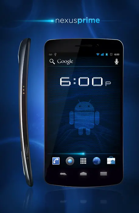
Someone on Tumblr randomly posted the above image and a couple of sites ran wild with it. It’s supposed to be the Nexus Prime’s front, simulated screen image and all. There are two things to consider. Firstly, the profile shot is upside down. The power button is supposed to be at the top and the hump is supposed to be at the bottom. Unless Samsung has chosen to go with some radical new design that’s ergonomically inefficient, we’re raising the BS flag.
Secondly, the right shot looks like it was painted in there – doesn’t look like part of the image at all. If you look at the edges of each shot, you’ll see that the side profile shot has smooth and consistent edges. The right shot simply does not. We don’t know what mystery device that’s supposed to be, but we’re going to go ahead and say no sale here. I must admit, though – that rendition of what we believe Ice Cream Sandwich to look like does look pretty. [via Android Activist, Thanks Cullen!]






However this does look beautiful don’t you agree??
Not claiming it to be real… I just mocked up what I wanted the Nexus Prime to be.
So I will see your BS flag and raise you a photoshop skill or 2…
http://nexusprimer.tumblr.com/
I understood. Looks snazzy, Eric.
Again, I’m glad this has come to light. Excellent render my friend.
Haha that’s correct for the side view. Although I believe you still have the bezel coming to too great of an edge. I expect this to be uber candy bar. Smooth out that bezel baby!
lol at least yhu honest
Nice ‘shop skills dude. This makes me super excited even though I know it’s just a mock up. I want my Prime!!
(Even if Verizon calls it the Galaxy Nexus I’m still going to call it the Prime. It’s so much cooler)
the problem now is that the power button is on the left side of the phone instead of the right.
If you just rotate the sideview image and place it on the right, it will fix the problems listed in the article. Nice mockup :)
I hope you are right! Looks amazing… (i you fix the sideview to the right and not upsite down)
good work, and the side view is properly placed, the bigger bump at the top seems holding a huge lens, maybe an optical zoom !
The whole design seems a breakthrough, since the limitation of the thikness has always been a problem for proper lens length.
let’s wait and see
you weren’t off by much! i wish you were dead on, your photo dropped my jaw ! :o
But the new revision seems a a bit too thing. isn’t there more bezel on the sides, and rounder corners?
Eric, I hope your mock up is exact. Except the whole power button being on the bottom left instead of top right. But that phone would be awesome.
My Photoshop mobile render designs are better. http://zandog.deviantart.com/ I can tell you that the concept device renders I get of Samsung phones never look anything like this. I’m going with you on this. It’s not real.
Because of the hype, reality doesn’t matter.
Apple seems to be really good at creating a reality distortion field around it’s fan boys/girls, but now there seem to be fan boys here who want to believe anything that they want to hear, regardless of contradictory evidence.
That said, I eagerly await the release of the real thing.
Considering this is my first mobile render. I like to think its decent. your stuff is on point tho. Make us a Nexus prime. I wanna see your take.
If this is your first mobile render, you did a kick ass job on it. Glad to see your setting the record straight on the device and it’s a good way to get yourself design exposure. I didn’t mean to belittle your device render. It’s very good work for the first go at it. Better than I did, thats for certain.
Wow, man, I really like your stuff! Can you do one on the RAZR HD/ DROID HD or whatever it’s being called? That’s the phone I truly care about. Not that the Nexus Prime is a bad phone, but I trust Moto more, especially with their top notch build quality. And they’re using Kevlar, so it’ll already be super durable.
One thing I’ve learned with Motorola is the like to put out a decoy device so the industry and consumers can speculate. The Droid Bionic is a prime example, which looked nothing like the final product. Until I can get a firm confirmation on the HD, I’m holding off on rendering it.
Ok, between this and the specs rumor crap – this is getting out of hand.
Son of a…
the shape looks something like the sprint or at&t galaxy S II, anyway it does look amazing
That’s what he said.
http://phandroid.com/2011/09/16/anonymous-4chan-user-posts-hands-on-time-with-the-samsung-nexus-prime/
I don’t care about the pics in the story, I want the specs!
I don’t like it all one color like that. I like the icons and stuff different colors. It’s just too blue, that’s how I know this isn’t for real.
I don’t think the original author intended this to be the actual device. I believe he mocked up what he thought it could look like based on the leaked info that has been out.
good call.
The screen is too curved and it’s upside down.
For a phone no one is quite sure of what it looks like, how are you all sure that the side profile is upside down?!? Wouldn’t it make sense to have that bump be where the camera modules and speakers are?
It looks quite like the Nexus S.
http://cellphoneforums.net/fr/attachments/samsung/44466d1295954145-google-nexus-s-se-colore-en-blanc-nexus-s-white.jpg
I wish Motorola were making the third Nexus, especially now that they’re part of Google. Besides, Samsung already had their turn last yea, it should have been a different manufacturer. I hope the 4th gen Nexus will be made by Motorola. If the Google+Moto partnership can create something tremendous like the original Droid, then I’m sure they can replicate that kind of success and partnership to create something extraordinary.
The purchase hasn’t even gone through yet…
I know, but it most likely will.
I think it should have been HTC. HTC did the “Nexus One”, Samsung got the “Nexus S”, & Motorola got the “Xoom”. It was either HTC or LGs turn this time. However, I would have preferred Motorola over Samsung.
Eric please tell me you are the designer of the Nexus Prime. It’s an awesome fake otherwise :'((
Wait….”that rendition of what *we* believe ICS to look like…”….are you phanboys behind this pic?…i hope so, be good to know you guys like to cause a lil fun’n’trouble along the way….
The source of the image (http://nexusprimer.tumblr.com/) has updated it and flipped the profile-render upside-down.
LOL you are so right! The battery case is the fattest part, and the small protrusion is the camera. classic silliness hehe
I don’t think it would look so wide, being a 720p display… that seems to be most people’s worry… still cool though hehe
Im really hoping It looks like this.
Looks awesome… However, I think that the phone will be a bit narrower granted 16 by 9 aspect ratio, also on the picture posted here: http://tinyurl.com/44y45vm it looks like there is more space between the bottom of the phone and the home button.
Im gonna go ahead and say that who ever wrote this is obviously a moron. OF COURSE its not the real deal its someones rendition of what they think it looks like.
Wow, Quentyn. You are an ass. Nowhere does Eric claim that this is the real deal, yet your article’s title alludes to him doing so. Artist envy much??
Mike, your right. I simply rendered out what I was hoping to see in the Nexus Prime or Galaxy Prime. Whatever you want to call it. And for the record, in no way did I ever “Boast Legitimacy”. I simply was not happy with the renders thus far, given light of the teaser video released a couple days ago.
But, It really doesn’t matter at this point. This sexy thing will be shown next week and I’m sure everyones guesses will be laughed at. Just like the IP4.
So guys (not mike) hate all you want. and until then let’s see your renders…
why are they ditching the search button?
good question. i use that A LOT. i hope they found a way to integrate that into the ics buttons that’ll appear on the bottom of the screen
I hadn’t realized this when I wrote that comment, but apparently they are integrating a search bar at the top of the screen. I guess that’s why hehe
As Eric has said, this is just his render. I like it, not so much for what the front would look like (looks really sharp!) but to get a sense of the proportions. I’m trying to wrap my head around what it’ll feel like. I wonder if anyone can tell if the aspect ratio of the screen and overall size seem to be close based on the presumed specs rumored. Just curious.
good job Eric!
Speaking of ergonomically incorrect, so long as the headphone jack is on top it will always be in the wrong place. It belongs on the bottom with regards to putting it in your pocket and taking it out. Any other location is wrong. Not opinion. Fact.
Am keeping my fingers crossed that it would really look something like this. ahihihi
Looks like it is inspired by Mattedblues
http://i53.tinypic.com/4ktp39.png