I’ve noticed as I continue to upgrade my devices, gaining more and more internal memory, I feel like I’ve begun to bury myself with what feels like hundreds of new apps I install almost every single day. Thankfully, Samsung San Jose Mobile Lab has released a launcher (homescreen) replacement in the Android Market and its creating some buzz. No, this isn’t TouchWiz for all devices but a homescreen app they’re calling Pure Breeze.
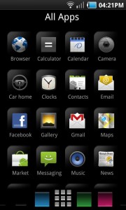
What separates Pure Breeze from the plethora of launcher replacements in the Android Market is the fact that this one is focused on one thing: organization. Gone is your traditional homescreen, instead replaced by a customizable app drawer that allows you to group apps by category into certain columns. Pressing the home button allows you to bring up the “Kite” which is essentially your typical homescreen customizable with widgets and shortcuts (but limited to one page). Make sense?
I know, this will definitely take some getting used to and I can tell you right now, Pure Breeze will not be for everyone. Those that are “iPhone-phobic” need not apply. But for those of you that need a little more simplicity, organization and like to try new things, I would give it a whirl when you have the chance. The app is new and I think there are a few areas of improvement (graphics acceleration) but overall I’d give Samsung Song Jose Mobile Lab an “A” for effort.
Once you try it out, make sure you come back here and tell me what you think of it. You can find both a free and paid version of Pure Breeze in the Android Market available now.







No home screen , no wall papers or live wall papers . Is samsung really thinking of improving user experience . Its more like load of horse **** . Good thing its just a launcher .
I don’t like it
Tried it out on my epic. And I agree it needs graphic acceleration. Hard to enjoy something that lags or is choppy. Neat idea, but ultimately not for me.
$1.99? Really? It is a little steep for an untested no-hype app. There should be a free trial version. If it is good, then the $1.99 will be a no-brainer
There’s a free “lite” version. Will update post with the link for that. =)
Definitely takes some getting use to. It was good, but not for me. A for effort as well
Okay so I tried the lite version and hate it. Lol. It’s not that simple. It’s confusing and the reason they made this is because touch Wiz is so freaking confusing well compared to sense.
most confusing this ever!
More confusing this ever than was that ever!
am i the only one who, when looking at the banner for pure breeze, sees a guy running through the field with a machine gun?
Now that you mention it, can’t unsee!
wow, same here
I DIDNT….until this post…lol!!
Ha ha ha, you’re right he does.
Omg you are right! Who in their right mind ties a kite to the end of a machinegun?! O_o
on-topic: I don’t get what this app does…..must be me
Wow dude. WOW.
I love organization, but hate the iphone look… I would suggest looking at elixir in the market…
I have the OG EVO and this is how I organize my stuff anyway, it just doesn’t have headings. don’t see why i need a new app for this?
Don’t like like in my EVO. Still like launcher pro the best
I love Launcher Pro. My home screen has AllApps organizer, airplane mode and the Launcher Pro Dock. all my other screens have calendars, facebook, news, etc…but my home screen is plain and simple
Man Samsung really likes messing with Apple. They should put this on the SGS2 and apple will really have a fit lol. Samsung please come up with something that is original! I feel like they tweak things and then just call them theirs. I liked when Samsung was the lowest of the low in android phones. And nobody liked them lol.
isnt our beloved cyanogen dev working for samsung? This might be some of his work.
No way he just started
Ugly ugly ugly. I doubt these are the same people who worked on Touchwiz. The San Jose mobile team is probably just an R&D team that doesn’t have much to do with Samsung’s main phones.
all launchers suck, i hate them all, tried em all, this one looks just as sucky..besides if you have 7 home screens which u can slide through just the same, why would u need a launcher, simply arrange your apps per home screen. i have games on one of my home screens, social widgets on another, news apps on another, and i just swipe between them, whats the difference ? anyone ?
I’m with you there David. My thoughts exactly.
I just spent about 10 minutes on it. I really hated it for the first few minutes and thought it was just a silly spin on homescreens. However, after a few more minutes it quickly dawned on me that it’s actually *very* well thought-out in terms of being an organizational homescreen. I actually saw myself switching to it altogether if it weren’t for one major problem: it’s slow and stuttery. I’ve got a N1, and the whole app is very stuttery. This is a dealbreaker, and no matter how much I like it, I can’t use it if it’s going to be acting all slow.
If they could make it as smooth and efficient as LaunchPro, I would probably switch to it completely.