Blink and you’d miss this one. Or maybe it should be ‘go about using Android Market as usual and you will probably still miss this one.’ And that’s a good thing. The Android Market has gotten a slight tweak to better its appearance on higher-res displays with the change of font for display text. Compare the old on the left to the new on the right.
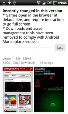
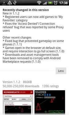
Again, nothing major, but it is looking a bit more crisp and clear, if a bit smaller. But as a big aesthetics nut I will take anything that has a final aim of making the OS I use look prettier.
[via EuroDroid]




From the pictures posted above, the old image on the left is easier to read.
I think this change was made for the larger screens, it won’t have a difference here since the text is smaller on the right for the larger screens with higher resolution support, the one on the left is for the smaller screens thus why the text is easier to read on the same size screenshot as the one on the right.
Continue your quest to be the best.. We love google
@duke69111 agreed.
Still stuck on 2.2.11 for some reason. Maybe I will get this update some day.
@duke69111 – you’re right
I prefer the new fonts for one reason. They’re smaller. Before the text took up a lot more vertical space and it made it take forever to scroll down to the Recent Changes. Now with the smaller text, it takes up much less space.
How am I supposed to get the latest market?
The website market.android.com has an SSL error when accessing it with the newest chrome browser. This problem has been here for the last two weeks, what are they waiting on to fix the problem?
@duke69111 – I think smaller is better, don’t frget that your phone is twice as scharp as a regular pc-monitor…
I just rooted when I saw this, I was under the impression that changed the text XD
Reads much better IMO
I have the new version now and it has a app sharing option (above reviews). Is this new? Seems like much bigger new than a font change.
you can get the same effect by changing the lcd density setting in the build.prop (or through some app in the market). I had it on 190 (default was 220 or something) on my milestone and it’s lovely. just do a google image search of “lcddensity” and you’ll find a good number of before/after pics.
Wouldn’t it be cool if we could make ACTUAL bulleted lists in our descriptions?