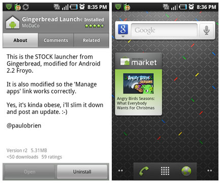
If it isn’t XDA cracking open and passing out the goods from a new Android release, you best believe Paul O’Brien of MoDaCo is. And that is exactly what we have here with his port of the Android 2.3 launcher/home screen for Android 2.2 devices. What’s better, it is available for Android 2.2 devices right in the Android Market. Now even if you can’t have the benefits of Gingerbread, you can sure as hell look like you do.
Follow the QR and/or link below to get it yourself.
[via AndroidApproved]




Does this work for non rooted phones?
Any advantages to this over something like LauncherPro or is it just a matter of preference really?
good work!! but not much different though. we want the new status bar..
typing from gingerbread keyboard on my Hero!
just installed.. am i doing something wrong not to get the new status bar?
The Gingerbread Launcher only has 5 screens by default. Any way to add 2 more screens for a total of 7?
Why doesn’t it have the effect when you hit the top or bottom of the app drawer?
Meh, pointless. Reminds me of what I hate about stock launchers…orange selectors and no options!
Brad: That’s something built into gingerbread not just the launcher.. its not just the app drawer that gets it, its the whole system..
I installed it and quickly uninstalled it. LauncherPro is a MUCH better option
Stock launcher, but it does seem to be smoother when scrolling between the home screens (compared to the stock Froyo launcher).
.
Won’t know for sure until I get the proper N1 build, but it’s looking promising :)
completely slowed down my dx.
slowed down my galaxy s…like having the gingerbread look though…wish it came with the gingerbread notification bar
Not finding it w/QR scan or searching the market…then again I’m running 2.1, maybe that’s my issue.
@Max, I’m also not seeing the new status bar, but I have Cyan 6.1 running, so it may be some sort of conflict with ADW launcher since the stock launcher is not even included with cyan roms anymore
Don’t think the new status bar is part of this build, at least it didn’t show up on my stock G2. It did run fine on my G2, and the drawer scrolling is super fast. Never been a fan of the 3D drawer so to see a generic, super easy to scroll drawer is nice. After playing around though, I deleted it and will wait for the official OTA. Until then, it’s Home++ and ADW Launcher.
I tried it. The status bar was still white. Initially the application drawer was empty as well but after 15 seconds or so it populated with all my apps. The opening animation was a little different as well as the 3d effect when scrolling through the apps. It doesn’t seem to be all there. Going back to Launcher Pro until Gingerbread is released.
Installs but doesn’t recognise any apps.
Looks nice and smooth but useless on my Hero :(
Not to draw away attention from this, but what is that wallpaper in the picture? I thought it was supposed to be the Nexus S but its not.
It would look awesome if it was a live wallpaper..
@Lou It’s a Wallpaper on the Nexus One…
max is an idiot
Hey guys, once you install it.. it adds a bunch of new wallpapers including the nexus one wallpaper in the pic. also, the market widget which is shown.. not bad for taking an early peek.
how do you get this to work?
In my opinion, the appearance 2.3 is a step back in terms of appearance. I don’t get how they can go from the nice transparent, floating dock to a boring gray box that looks like it was an afterthought. Also, the green icons can easily clash with certain wallpapers, while the stock icons on 2.2 go with just about anything. And the app drawer too, they go from a nice 3D effect to a boring list with a badly implemented shadow effect.
Now, this would be OK with me if 2.3 included a lot of performance upgrades, but that is not the case. This was primarily a UI and appearance update so I really do not understand where they are going with this.
I really believe that the appearance of 2.2 is vastly superior to 2.3. Unless they do something like HTC did with Sense, where there are different skins/themes, I am very disappointed in this update, which I was really looking forward to.
It doesn’t have the 3D drawer, i uninstalled it because of that. It was fun to toy around with but LP is much better