

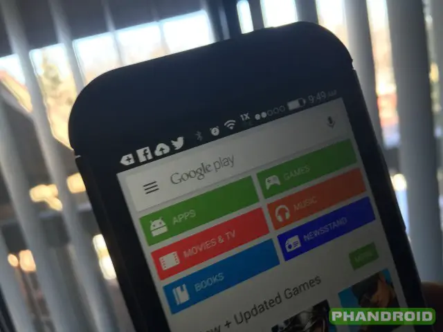
Quick, open up your Google Play Store! Seeing the old version with a search button in the upper right? Close the app (force close it if you need to) and open it again. You’ll likely see that a new search box is neatly squared at the top of the app. This is opposed to the old small search button that existed in the upper right of the status bar and could be hard to miss for some.
This new update should make it easier for folks to find the search box and begin looking for all the apps and games they crave. Inside the search box is a hamburger menu button that will bring up the standard Google Play menu for switching between different categories, sections and menus.
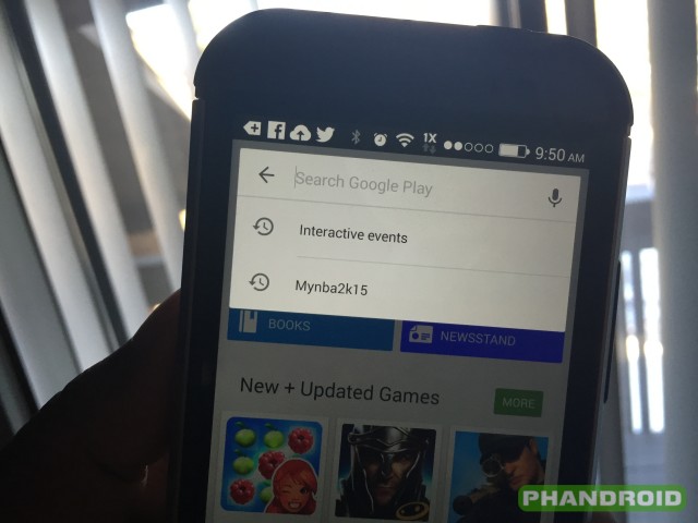
You’ll see the white box fade away as you dive deeper into Google Play’s goods, but a search button will persist at the upper right as you scroll through apps and descriptions. Press it and it’ll expand to bring the search box right back up. Intuitive, beautiful and easy — just how we like it.
This is a server side switch so there’s no updated APK to download. Let us know if you’re seeing it in the comments, and be sure to leave your thoughts on the new design while you’re at it!


got this early this morning….I like the new search box =)
You had me at hamburger O_o
Yup, had the magnifying glass symbol closed and opened it again and it has changed.
Loving the search box, even though I have a N5 it’s always nice to see a more unified look across all Google apps.
I’m confused. What’s different? I feel like I never gave the Search Box enough credit for it’s design. Nothing feels… different. Maybe I don’t have the different one? Or just gotten used to it already.
It used to say “Play Store” in regular font on the top header with a search icon aligned to the right. Tapping on the search icon will bring up your familiar search bar.
For a more visual comparison, you can launch the Play Store now and choose a category (let’s choose the green App button). That’ll give you an idea of what it used to be.
Get it done
I like it.