
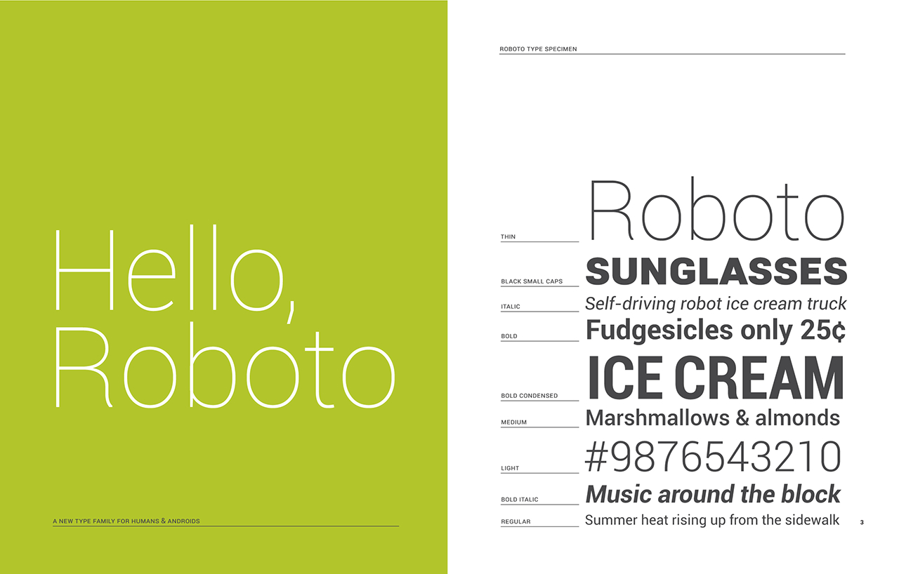
While not the kinda “graphy” that gets most people’s engines purring, there are few things in life we enjoy more than some good ‘ol typography. For Android L, Google decided to clean up the Roboto font we all love so much and saw introduced back in Android 4.0 Ice Cream Sandwich.
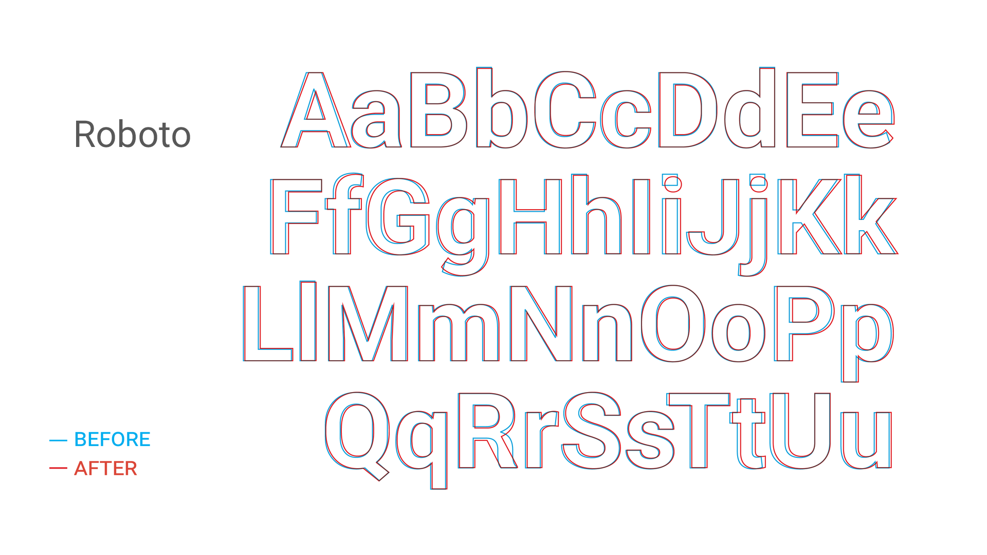
A few moments ago, Matias Duarte and friends took to the new Google Design Google+ page to show us the subtle difference coming to the typeface in Android L. While the differences aren’t anything too major (although Google says it’s been “extensively refined”), Google promises the font will look even better on the big screen (Android TV), the small screen (smartphones and tablets), and the really small screen (Android Wear smartwatches). You’ll notice a Roboto that’s a bit more round and wide, with the K R caps seeing the biggest changes.
Not shown in the comparison are the italics and numbers which also received some love, but if you’d like to check it out for yourself, you can download the all new Roboto font here. Enjoy.


domo arigato mr. roboto
So they changed the J,K and R? O_o
And the I
Dude. It’s been EXTENSIVELY refined.
True, but most of them are not that much differently visually unless they are on top of each other like in this article.
Roboto is the worst font I have seen in a along time. It’s on the web now, infesting Gmail and other sites with it’s blurry, hazy, wet-paper look while it flips between itself and other fonts while you move your mouse around and click stuff. why can’t we just use a nice normal readable font like Aerial?! actually Windows Phone font is worse.
I whipped out my 3D glasses to look at this alphabet hoping magic would happen
OMG, how did we ever live with that limpy R? This is mind-blowing!
Like back in the Oracle days, I was like – OK, you changed the angle at which letters are cut, does it really justify spending even $1 on that guy’s salary?
Noooo….I loved the R. The new R veers disturbingly close to Aerial category (my all time hated font).
Still love the font, however I wish they wouldn’t make it so large. I keep my fonts normally set to tiny.
How do you install the font on the S5? I unzipped it and went to display the fonts but it doesn’t show up.