It was back towards the beginning of April we saw the first of Google’s upcoming app redesigns by way of Gmail. Featuring a completely new UX, the update showed a more colorful future for one of Google’s most popular Android apps. Those rumors are now finding new legs to stand on after a new UI for Gmail on the web was leaked, once again, by the folks at Geek.
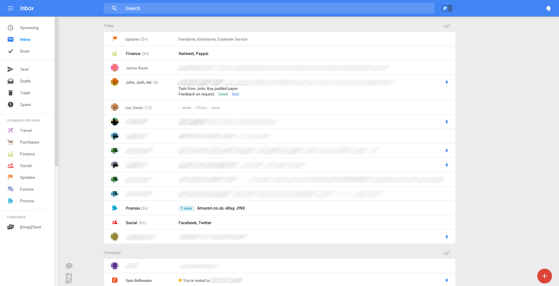
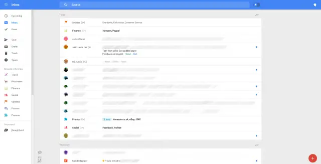
The leaked screenshots show Gmail as it appears on the desktop, albeit still in the testing phases. That being said, we should expect a few changes before it officially rolls out to users on the web, but you can see how closely it mirrors the previous Android leak. Big blue bar along the top, color icons on the right, it’ll take some getting used to… but we think we like it.
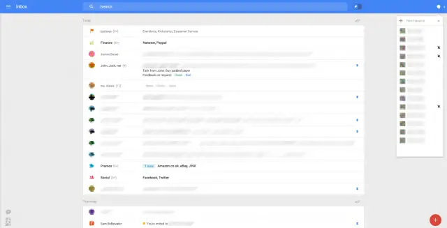
New features include the ability to pin important emails to the top of your inbox and small “creation bubbles” in the bottom right corner for quick access to unfinished drafts, and more. Hangouts will finally occupy its on section of your desktop, now located in a handy drop down on the upper right/side portion of your screen.
Overall it looks great but it’s still uncertain when we will finally see this rolling out to desktop browsers. Let’s hope Google isn’t trying to keep this hidden until Google I/O where we expect to learn more about updates to their Android apps and web-based services.






isn’t describing drafts as unfinished redundant? i think i like what i see too.
Its like a modified YouTube/G+.
Hope that I can still hide the Social, Promotion, Updates and Forums categories.
I’m liking it. Gmail has been in need of a UI overhaul for quite some time.
As long as they don’t do the usual Google trick of only bringing forward 40% of the functionality, then I’m in.
I can see where Google are going here – creating a consistent UI for their apps and services across devices and making the OS (even more) redundant. Now is probably not the time to buy Microsoft shares.
La Forge: Leak? I’m not detecting any leak.
Cochrane: Don’t you people from the 24th century ever pee?
La Forge: Oh… “leak…” I get it. That’s pretty funny!
“Leaks” these days are anything but, IMO. They’re more like planned experiments by companies to gauge the reaction from the internet public to either make changes based on the critiques received or to manufacture hype.
Either way, I’ve been waiting my whole life to use that quote from ST: First Contact, only one of the best Star Trek movies ever, in some way.
If I could like your comment 3 times, I’d do it. =D
You’re spot on, my friend!
You know what it looks like? Outlook.com.
Welcome change, if the leak is true, that is. Much better than the current UI.
WTF!? Outlook!? Hail no. I don’t see Outlook in this at all. Unless I haven’t logged into Outlook in a while.
Looks pretty simlarto me.
http://img.clubic.com/05334586-photo-outlook-com.jpg
http://phandroid.s3.amazonaws.com/wp-content/uploads/2014/05/New-Gmail-web-UI-1.png
Wait, just because they both have a blue bar means they are similar? Definitely not, they are completely different.
This is what I’m saying. They look noticeably different. For starters, the mail in Google isn’t conncted to the side bar like in Outlook.
Also, Outlook is using a noticeable larger font for their Headers. LoL!!
I guess this is why some people think every phone resembles the iPhone. I wonder if non-artists think that way or if artists do?
The similarities is the blue bar, and the white and gray backgrounds. So from far away, they can be confused. But the colors in Gmail is what distinguishes them.
I mean, if Gmail is going to be looking like that, I can’t wait for it to come out.