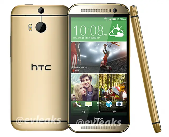
And here it is, folks. Our first officially unofficial look at The All New HTC One. The image was posted earlier today by @evleaks, giving us little reason to doubt its authenticity (he’s always spot on when it comes to leaked press images). Lining up with earlier reports, it appears HTC will launch the device in gold although the rumored grey and silver models weren’t pictured (yet).
You’ll notice HTC doing away with the sometimes flawed “gapless” design of the original HTC One, choosing instead a more unibody look that wraps all the way around the sides, and provides a lip around the front of the device. As some of you are sure to point out, it looks like the HTC bezel is all but official now, but we’d recommend holding off superficial judgements on the phone until we see what it can actually do.
We wont have to wait too much longer. HTC’s worst kept secret is scheduled to be unveiled during HTC’s March 25th event in New York and London. Let’s hope they still have some surprises left in store.







I am still calling fake, someone on another site pointed out how badly this is rendered. Look at the main camera hole, not even round. And the bezel ratio is exactly the same as the original One, I’m not buying it. I think HTC is leaking on purpose to wow us with the actual phone.
I like your optimism, I just hope you don’t walk away disappointed :/
Don’t know if bring sarcastic or just disappointed by comment.
*being*
Yeah I hope the same, worst case scenario I am perfectly happy with my One so it won’t be terrible to stick with this phone some more.
On second look, those camera holes do look highly suspicious.
They be hidin’ in yo’ phone, spyin’ on yo’ kids!
Camera hole should be the name for people who take pictures with their devices in completely inappropriate situations. See: Glasshole.
still more than a month to go until the official unveil so i hope you’re right! #photochopped
Man see leak in press . Man in press see leak.
Oh well HTC (HELP THIS COMPANY) need all the tricks in the Bag to come up on launch day … Cos this what I am looking at here is a total Failure …NO!NO!!! THEY NOOOO GET ME MONEY
For the sake of HTC’s viability…i really hope this is a head fake or diversion from the real deal we will see on the 25th. If this end up being the final product…i am worried for HTC cuz Sammy n LG will be doing the jig for such a colossal self inflicted demise.
I hope they explain the bezel. They just took more screen estate
HTC, you got some ‘splainin’ to do!
Lucy cry: *Waaaaaaaaaah*
Haha, you’re awesome, Chris!
This won’t be enough to separate me from my N5.. I was hopeful but the aesthetics just aren’t there for me.. Between this bezel and the devolution from the “gapless” face the only remaining point is BoomSound. As of now it’s a pass, but my last hope is that this is somehow the mini.
me no likey…. but then again….yeah I don’t likey….
This has to be a fake. I wouldn’t believe HTC to make as much as a poor design choice as to make the two speakers uneven in terms of size. I’m also hoping that the HTC logo in the front won’t be there.
Although evleaks has been a decent source, the announcement is still over a month away.
I’m sure they will get the sound portion right, to me this phone is a thing of beauty, just frustrating if that black bar with the logo is there to take up all that good quality space
so, i’m guessing Samsung might ship the most devices again this year, yeah?
Samsung and Apple is licking their Chops on this ONE …Another Failure Again
HTC should move that logo to the top left next to the speaker if they need it in the front so badly. But just remove that damn useless bezel HTC. Could’ve made the phone smaller and more ergonomic.
Call me Crazy I loved my One ,,was really hoping for some sort of design change , i mean a camera bump and a slight bump in processor , and that’s it …? I passed on the s4 after having the s3 for the same reason …… I really hope theres more to this years ONE then this , maybe this is the year i give LG a SHOT………..okay back to my cave…Humpaday’s almost over.
What did you expect, though? Technology isn’t growing substantially like it did from the S2 to the S3 time frame.
I wasn’t expecting the phone to be substantially better. I actually expected a small hardware increase.
The only reason I’d pick it up is because of Tmo Jump. Other than that, I may have just skipped it and look at phones 2 years after.
I’m in jump also so we’ll see as said above the minute it’s available on T MO it will be in my pocket……….
Um, the screen is bigger, we prob havent heard all of the specs. btw LG sucks.
I didn’t think the G2 was all that Bad ….but that’s always open for debate , i really hope we do get a bigger screen like 5.3 or 5.5 but i don’t think that’s gonna happen , that said all bithchin aside i’ll probably get it day one like i did with my One and then sell it on Craigslist when i get bored . by that time The Note 4 will be out and that’s my main phone ….
It hurts to see three rows on the bottom of the phone and not two like the previous leak from the “wild”. https://phandroid.com/2014/02/05/htc-m8-front-leak/ — It looks cluttered.
Not to mention, depending on how close in size the M8’s screen is to the M7’s, we could be actually talking about a REDUCTION of effective screen real estate. This can improve in time with app devs implementing immersive mode, but I won’t be holding my breath. I’ll sit tight until the M9 when my 2YR’s are up, hoping for a better design to replace my M7. That doesn’t help HTC.
It wont hurt that much when you realize the onscreen buttons disappear when not in use. :-)
You’re talking about something at HW level that HTC comes up with, not Kit Kat’s immersive mode? Either frankly worry me to some degree. I’m one of those weird people that still miss physical buttons on phones because I like a deterministic way of taking action when I intend to take it.
Accidental activation of the (overly) sensitive touch capacitive buttons on phones drive me nuts. If you’re suggesting HTC doing something special, how will a user make the three buttons reappear? Swipe up from the bottom? Shake the phone? Press the power button? Sounds like an extra step I could live without.
And even still, I’d tell that black void at the bottom of the phone to go away. I’d rather see HTC as part of the speaker grill if they insist on putting it on the front of the phone (which I get to help move the brand forward). PS: Still love my HTC One though, and I hear you — I’m willing to give a fair try to whatever they come up with.
Now that it’s been mentioned… is there a reason why they can’t put the camera in the middle of the phone on the front? I mean, they could technically split the speakers into 2 halves for left and right for phone calls so you could be comfortable either way; I doubt your first thought its “oh my god, is the phone speaker directly aligned with the middle of the phone against my head?”. Whereas, with the front camera, you get these weird off center videos.
I’m assuming the placement of the actual speakers are in the direct center. If they put the camera in the middle, then the bottom speaker would have to be moved to complement the top speaker.
How can you get “off center videos” when using the FFC, you yourself point the camera at yourself, maybe youre off center.
Naturally, hold the phone to straight on. Does it show your face in the middle? No. You have to adjust to to the side where the camera is, not to mention it looks weird if if you are looking at the screen during skype; like I’m staring like an idiot at the bottom corner of my phone. This effect wouldn’t be so pronounced if the FFC was centered.
I kinda like it. I’m just looking forward to seeing what the camera can produce to make my final call. I’m rooting for you HTC!
Rooting? =.3
it’s so round it reminds me of my Samsung INSTINCT
Is it just me? Or does this look like a IPhone 5/5S but rounder…the lines going across and around just totally makes me think of the iPhone @-@
Actually, phones don’t remind me of the iPhone anymore. I get what you’re getting at. If the phone had a bland, rectangular design, it reminded me of an iPhone.
Nowadays, phones all look like that. It doesn’t remind me of the iPhone anymore. I just see it as another phone.
Ummm I don’t actually think you know what I’m getting at. Galaxy S4, Z1 etc don’t look like an iPhone 5/5S
Looks awesome, though i wont ever get a phone in gold color, so tacky. Cant wait to get it, hope its an upgrade from the awesomeness of the original ONE.
Nice LED flash on the front for selfies! Hopefully no ultrapixel junk on this.
Hopefully the speakers are incredible. I wish they wouldn’t put the HTC band on the bottom though.
Ive always said it, HTC Needs a new CEO. What kind of crap is this?
Mmmmmm, Gollllllld.
HTC can remedy the situation by getting rid of the black logo bar hence shrinking the device and also toning down those rounded corners OR just put a bigger 5.2″ screen to occupy most of the space of the black logo bar. They can also adopt a compact Desire 8 design with a screen to face ratio of about 80%…with the top and bottom bezels made up of a shrunken boom sound space. I have a feeling that logo bar will be gone come lunch time…at least most of us HTC fans hope so.
If this is the new 1 then I will either stay with the old one(htc one) or I will see if the galaxy s5 finally goes aluminum. Why would HTC put a useless black bar at the bottom.? No edge to edge screen? Hopefully all of these images are fake…