
An all new version of Twitter is hitting the Google Play Store for a handful of select beta testers. It was a few weeks back when Twitter — like Snapchat and Facebook — began using the Play Store’s new beta app system. The catch? All you had to do was sign up for their Google group (no longer open), and you’d be on the bleeding edge of everything Twitter (at the cost of the stable releases).

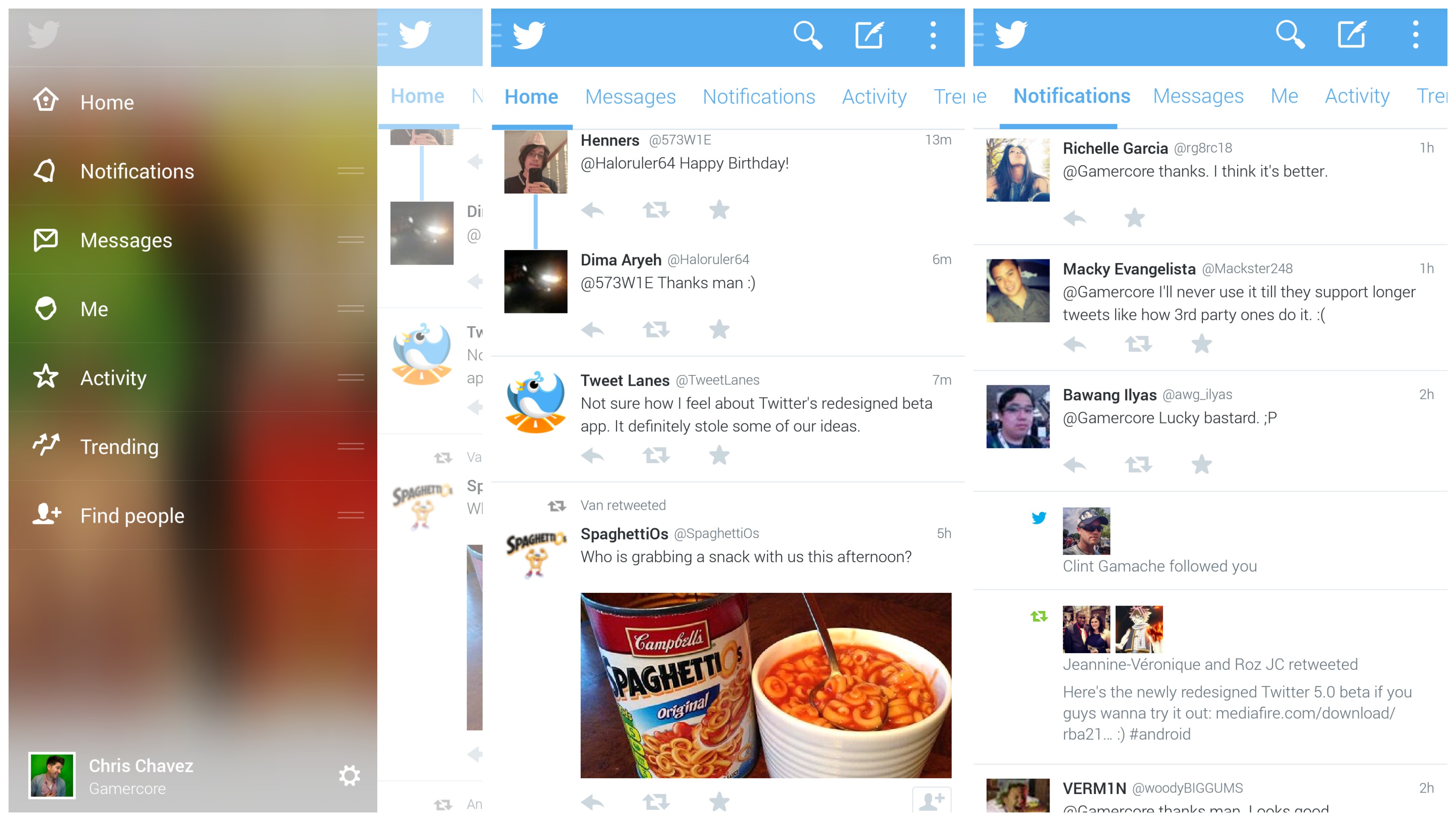
Today, Twitter version 5.0 hit beta testers introducing a completely revamped, more Holo-looking UI. Gone are the tabbed icons from the previous version, replaced by actual words and a few extra tabs. The biggest change comes with the addition of the side-bar menu, accessible by pressing the Twitter bird icon in the top left corner of the screen (it’s not slide-able). It’s there you can actually rearrange the order of your tabs, sliding them around like songs in your Play Music queue.
We were able to give the app the hands-on treatment in a video, where we quickly compare it the current (older) version. For those willing to give the app a whirl, you can download it via the link just after the video.






It looks really nice, I just wish Facebook implemented Google’s design guidelines.
Why isn’t there a shortcut to lists? It’s one of the most underrated features of Twitter IMO.
Didn’t even notice that. I just started organizing everything into lists and it’s changed the way I use Twitter. This isn’t good :/
Very pleased with it so far.
It’s more themed towards iOS 7. Not happy!
Well it is just Beta it could change.
It’s funny how Jobbie and Apple made fun of the Aero interface in Windows Vista a few years ago, yet it’s now an integral part of the new iOS7 lol!
Loving it, thanks for the link.
Now it’s time for facebook! :)
(to go holo)
It feels like they over complicated the tabs. Not a fan of the activity tab. I dont really have any interest in people’s favorites or RTs. Find People doesn’t need its own tab either.The slide tab on the left is redundant as well. While it looks nice it could serve other purposes.
Oh hey, I can see myself :D
Wow 5.0 man whoopee been waiting my iphone is on version 5.133