[Update]: It looks like this is another fake, folks. (Not that we expected anything more.) The icon used is the same one that Google+ user Shen Ye created on his own. Alongside that, reader Alankrut Patel pointed out how some elements of this image prove this is likely just a mock-up thrown together by someone who was simply bored. In other words, there’s nothing to see here (but keep discussing what type of design you’d like to see for Google Babble, anyway).
Last week’s Google Babble leak might not have been that believable — after all, a cheesy poll screen and some bad grammar didn’t do well to convince us — but we’re holding out hope that we’re inching close to final form for a version 1.0 release. An anonymous tipster sent us another supposed shot of Google Babble today, this one being much cleaner and “Google-like” than what we saw last week.
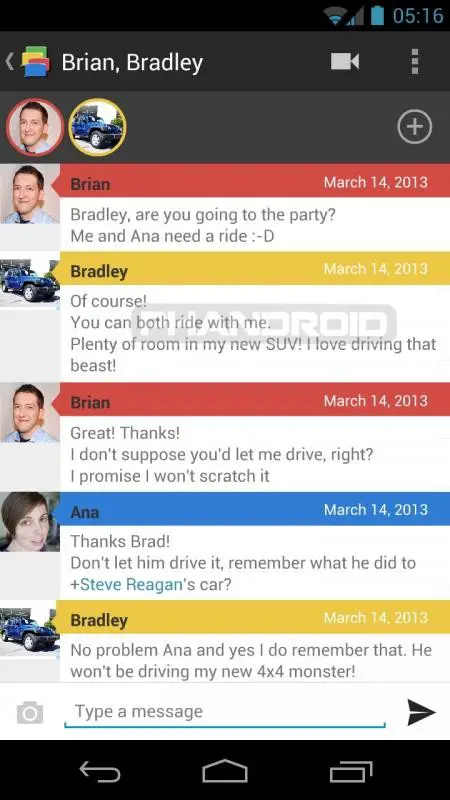
This particular screenshot shows a simplified Holo-styled user interface that incorporates elements from a couple of different Google services. For starters, the member list near the top uses pictures that are surrounded by different-colored circles ala Google+. The colors on those circles are all used to identify a new string of messages from each individual in the chat.
The rest is straight forward, classic Holo — the “back” arrow on the app’s icon in the upper-left corner, the overflow menu and video chat icons on the upper-right, and the standard list and text input elements below all of that seem quite believable and realistic.
Its simple design would fit with Google’s style, but it’s also simple to a fault. With other elements — such as picture messages or other views within the app — it might be easier to call this out as a fake as those are tough to get down, but whoever made this didn’t give us much to scrutinize and didn’t get imaginative enough to the point where they might have messed up.
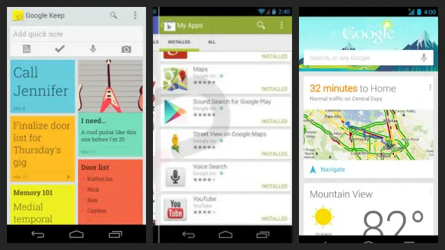
It also doesn’t have that new, distinct style we’ve seen in a couple of newer Android applications. Google Keep launched with an evolved Holo style that was akin to Google Now’s card-style layout, and we’re told to expect the same thing from a major upcoming Play Store upgrade sometime soon. That particular style might not be required for all of Google’s new or updated applications going forward, but it’s something you have to think about.
What do you think? Is this just another fake or will a group chat inside Google Babble end up looking something like what you see above? Hit the comments section below to give your input, and don’t forget to throw in suggestions about what you’d improve while you’re at it.
[polldaddy poll=6989572]
[thanks anon!]




“I’ll babble you tonight”
Ahaha your icon makes that comment a million times better
Reddit sucks
Looks real!
This is really just Google+ Messenger with a different icon in the corner.
That’s good, Google+ Messenger works really well. They just needed to re-brand it so all other Google services can all use the same chat protocol.
I hope it’s fake. Because compared to newer #HOLOYOLO apps, it’s damn ugly.
Please please please let not this be the final icon!
Ana is out further than the rest. fake. everything lines up except her
Her name looks fine in that respect. But aren’t the names and dates out of line with each other. Intentionaly perhaps as it seems to be the same across the board. But that would bug the hell out of me if it was released like that.
Not referring to the name, referring to the grey portion below the pictures. all are aligned, except the one below her picture
Ah right, yes. I see what you mean! That is pretty dodgy..
Poor Brian, he just wanted to drive the SUV
oh god, I was scrolling down to say this exact thing. ha ha. nice!
No, this is fake. Look at my G+ post explaining it. https://plus.google.com/103185718916653927607/posts/7zY5BXnZqJN
Nice catch!
I do see where your going with that but it could be possible that because that is the most recent post on the image, maybe its a little thing that shows it as the most recent or possibly, new since the last time they were in that chat. The screenshot could also have been taken mid animation.. only time will tell… i kinda like that layout and hope it is real, if not… im sure googles got a even better one up there sleve
Or maybe a secondary participant gets a smaller arrow?
Oh my…
I like it but it is still missing features that I really wanted to see in the new unified messaging platform. In particular, I really want to see location and contact sharing involved and ideally general file sharing (although this is less likely).
I think it is fake. Look at the bottom response by Bradley. The yellow rectangle that contains his name and the date extends slightly into his profile picture. It is the only response on the screenshot that shows this inconsistency and it tells me that it was overlooked mistake by the forger. I also think it’s pretty silly for the timestamps to only include a date and not the actual time that messages are sent and doubt that Google would overlook that in the final product.
You do know that Google+ Messenger also only shows the date and not the time right?
(at least for messages older than a couple of days)
I didn’t. I can’t really stand Google+ Messenger. Talk ftw.
Whatsapp for me, but used it for like 5 conversations when it was still new… :P
this would be awesome with ingress.
It’s a fake, made in forocoches (a spanish community).
http://img.imgur.com/zZiDOlv.png
fake pics:
http://img.imgur.com/IyTACFl.jpg
http://img.imgur.com/D6quGJ0.jpg
Photoshop:
http://img.imgur.com/IgnDhHA.png
http://img.imgur.com/6tLIrk9.gif
dude, those images you are using to point out that this is a fake are from the old forged leak. This is a new leak.
i haven’t got account in forocoches, but I think the new images come from that forum ;) care
Source: (it’s a private post, need account).
http//www.forocoches.com/foro/showthread.php?t=3186384
Its a fake, Shen Ye (https://plus.google.com/116988351660148062102/posts) exposed it as he was the designer of the icon in the leak.
That is about a different ‘leak’
The first time this icon was revealed was in a Google distributed video or picture, so the icon was originally designed by someone at Google. Shen Ye, just shows how his the other leak was a fake.
But this is most like also a fake, nonetheless
This is some BS, Ana is always such a kill joy … WTF
Where is the poll?
yea i dont see one either
The leaked image on Skloink.com looks more legit. http://www.skloink.com/apps/foto-toont-google-chatdienst-babble/ It follows the Google design patterns
I hope so, that one looks much better.
Looks pretty nice, just think the hangout button on the bottom left is in a wrong place.
That looks great!
I am not convinced with the + sign. thats not how google do + signs
actually i think that is how they do there “add” sign.
Its not a +1 sign
No, Absolutely fake. Its using the icon that has been proven to be an internal app for testing notifications on chrome OS.
IT’S TOO COLORFUL! IT’S NOTHING MORE BUT AN EYE-SORE!