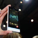
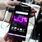
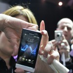
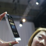
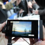
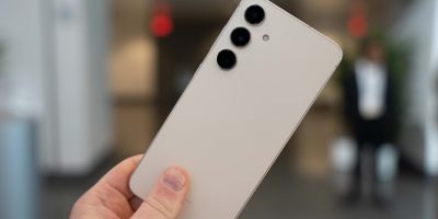
Sony announced their NXT (no, not WWE style) series of devices here at Mobile World Congress and, as you’d expect, we were front row and center to witness it all. New entrants include the Sony Xperia U and the Sony Xperia P. These beautiful devices are not only visually pleasing to the eye, but also has some of the best technology you’ll find in a smartphone. From its Bravie Engine display to its Exmor camera sensors, alongside some pretty nice internal specs, this device should appease many-a smartphone buyer.
There are some differences between the two, though. The Xperia P is a middle of the pack device but still deserves a high-end tag. It comes with a 1GHz dual-core processor, a 3.5 inch display, an 8 megapixel camera that is capable of shooting 1080p HD video, a VGA front camera, 16GB of internal storage, a 1305mAh battery, Android 2.3 and more
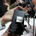
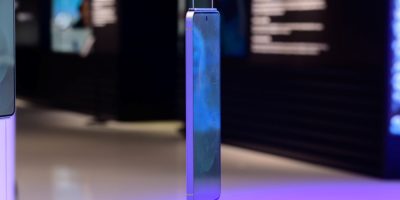
The Xperia U brings us a 1GHz package with 512MB of RAM, an 8 megapixel 720p HD camera and Android 2.3. It also boasts a front-facing camera, an HDMI port and an illuminated strip which rests beneath the device. The strip will change colors depending on what picture you’re looking at. For instance, if I’m looking at a photo of a red flower, the strip will illuminate red.
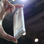
It’s a really cool feature and will please the fashion-focused, but it’s a novelty feature which doesn’t add much the the package. Below that strip is a detachable plate which you can use to change the color of the bottom of the device. Again, cool, but not particularly useful.
Sony’s timescape interface on both of these devices is a bit much, though they deem it necessary in order for their users to get full use out of the Sony Entertainment Network services such as PlayStation Suite, Video Unlimited and Music Unlimited. Despite a heavy UI and tons of bloatware, the device operated smoothly (though we doubt it would on anything less than a dual-core processor).
All in all, we were underwhelmed by Sony’s offering. We imagined they’d come to town with as much heat as they did at CES in Las Vegas but these two devices didn’t do the trick for me.
While they’re cool for who they’re aimed at, we expected Sony to do a bit more than just a slight bump in specs and a couple of novelty features here and there. We recognize that Sony’s focusing more on the content and entertainment side now, though, and those services should prove to be great. Check out our hands-on video above.









All this attention about tech specs quality should have been followed by an attention to the OS side. It’s unbelievable that, in March 2012, a 500€ device still comes with Gingerbread.
This isn’t going to appease shit. These specs are insulting.
You’d need to add ICS out of the box and removable battery to get me interested in this. I do like the 3.5″ screen though. IMHO screens are getting too big. Anything more than 4″‘s makes single thumb use difficult. The Nexus S is my favourite Android device to date from a physical form factor perspective.
Wow, only 12 months behind on the software. Good effort Sony
I’d rather have them replace regular tiny LED signals with that detachable transparent bar.
If timing fits in with what Sony is communicating, these phones will get ICS within 1-2 months of going on sale. As for specs, has anyone noticed that HTC is releasing a single core phone in 2012? Seriously? Granted, it’s coming with ICS whenever it makes it to market, but still. Does that justify the really low end specs?