Google is on fire lately! With the launch of the uber exclusive social network, Google+, we were introduced to something I wasn’t used to seeing from Google: polished UI.
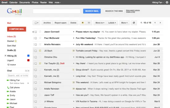
Well, it looks like Google is running with the UI from Google+ and incorporating it into Gmail as well. The newer, more minimalistic, clean look wont officially be rolling out for a little while longer but you can get a sneak peak preview with Google making it available as a theme inside of Gmail’s settings. Google had this to say on their blog:
This is part of a Google-wide effort to bring you an experience that’s more focused, elastic, and effortless across all of our products.
Not only will Gmail be receiving a facelift but Google said we should see it in Google Calendar as well so look forward to that in the coming days. I honestly couldn’t stand the old cluttered look and as superficial as it sounds, hated opening my Gmail simply because of how painful it was to look at. Of course, all that has changed and I can now leave my Gmail tab open and get to tackling those 402 unread messages.
[Via GmailBlog]







Loving the new Google UIs. My Calendar already switched over, as has the Google search results page
+1
I’m waiting for the search UI to change on my new laptop. I don’t see why people don’t like it it looks great
my gmail hasn’t changed yet, guess I have to wait for it
Go into your Gmail settings. It’s available as a theme. You have to look for it under “Themes” towards the bottom. It’s there. Trust me. =)
To active it go to gMail settings > Themes > and look for “Preveiw” it was towards the bottom for me.
My calendar and search updated but not my gmail. Also googles firing on all ui pistols so we may see ice cream sandwhich prveiew soon.
can I get an invite
Yeah not a fan of the new Gmail UI…
To expand on what Mitchell said, go to gMail settings > Themes > and look for “Preveiw” and Preview (Dense)
I went with Dense as Preview just took up to much space.
Enjoy!!
1) The “Preview Dense” is better but I’m not sure if I like the COMPLETE lack of any kind of contrast on the page.
2) My Calendar sidebar in GMail really stands out like a sore thumb now because it has a scrollbar that doesn’t match the look of the page.
3) Google Reader needs an updated theme, I spend way more time there than in GMail. Reader is where I spend 75% of my online time.
calendar is too big, wish they would compress it so I can see the full day without having to scroll! Never had this problem before.
Not really a fan either. They will need to update the themes for this UI and it might improve.
There will be themes for this new outlay. You just dont like the colors, but thats missing the point. The UI, itself, is much cleaner and neater. You’ll be able to tailor the look of it though.
Actually, I don’t like how chunky the spacing is between everything either, the (dense) options helps a little bit, but some of my labels are now below the screen fold, which is annoying if you have a lot and use them frequently. Not to mention the huge red compose button and blue search button…I find them distracting,
Definitely a big improvement. Really liking it.
There is a ton of wasted space in these compared to the classic view. Even the dense version. And why so low contrast? Low contrast looks great if you’re not trying to read it but is horrible to use.
Always enjoyed Gmail since my college days, compare to yahoo , gmail was implemented with a simple and sophisticated but more secured approach , may be its my personal view only but nevertheless enjoyed every bit of this great mail application.
“This is part of a Google-wide effort to bring you an experience that’s more focused, elastic, and effortless across all of our products”
I love you Google, but this is just a UI overlay that delivers nothing new what so ever.
Let’s hope they do this because the UI of ICS is ready and are now “porting it over” to other google services :)
Some corporation would rather file frivolous lawsuit than to innovate and out compete their rivals. Google , on the other hand, continue to experiment and innovate until they get a good handle of their competitors. Google+ experiment should be a lesson for MS and Apple. Stop frivolous lawsuit and innovate in order to compete
I like “preview Denise” better that just “preview” as the line spacing is just too big in “preview”. I do quite like it though.
Anyone know if docs is going to get a revamp? I have nearly all my work in there and its just ugly and clunky to navigate around.
Ill keep my Android Theme
Also, if you really have so many unread emails, I’d suggest “upgrading” to use priority inbox – its a big help in terms of filtering out the low priority items.