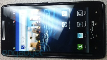
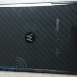
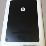
Two of the devices Motorola is expected to unveil for Verizon at an October 18th press event have posed for the camera ahead of their official debut. The Motorola Spyder (which should launch as the Droid RAZR, though there is still a chance the Droid HD name will stick) and the Motorola XOOM 2 are seen in their near-final version, complete with Verizon branding. The Spyder is looking pretty svelte with a glossy black finish and textured battery door, while the 8.2-inch XOOM 2 appears with a two-tone white/black finish. The Spyder/RAZR pictured here is said to be clocked at 1.5GHz, though the release version should stick with a 1.2GHz dual-core CPU. Both devices share a similar design language, with more angular corners and sharp lines. So do either of these get your mouth watering for next week’s announcements?
[via Engadget]




Moto Blur?
Nothing To See Here Folks
Its not motoblur anymore.. The new layover is actually quite good hater!!
It’s true, I like it better than Sense. Sense looks too child like for me. Once you download a secondhand launcher with an icon pack the new Blur is really good.
I’m trying to understand this, so if you don’t use most of the new MotoBlur that equates to the new MotoBlur being quite good?
I would be happy to hear that their skin is getting better, cause I’m a sucker for a good UI.
Android on its own is not unattractive. All the extra overlays tend to just slow things down or change functionality rather than add new functionality. Almost anything you can find in a manufacturer skin can be downloaded from the market.
So in that sense, motoblur being largely stripped away (as it has been on newer phones) is a very good thing.
Oh gotcha.
The new Moto UI is very nice. The memory of the bionic helps too.
The only thing that’s bad about it is the icons, which you can’t replace without a secondhand launcher. The launcher itself is good and the home screens and animations are good, it’s just that the icons still suck.
Touchwiz>>>> Sense>>> “Motorola Layout That Was Once Considered Moto Blur”
touchwiz is utter shit. gtfo.
I like Sense. I don’t see why people have issues with it.
They do not want to understand that.
Why buy this with MotoBlur and Gingerbread when I can have the Prime with AOSP and ICS?
To have reception? I don’t do Samsung or LG because of that reason (losing faith in HTC as well with this thunderbolt, but for other reasons) Motorola has the best build quality, best reception, and best call quality. The Samsung note does look appealing (5.3″ screen) and that might just make me deal with no signal if the other specs are decent and its on Verizon
Reception? I Haven’t Had Any Issues With Reception With My Nexus S, My Sensation On The Other Hand….
The Sensation is a HTC phone? I haven’t heard much about the nexus s but other galaxy s phones had the same signal problems that have always plagued Samsung phones.
Really ?.. never had a problem with reception on my Sensation.
Agreed. Radio and build are top-notch for Motorolas. Can’t say that Samsung doesn’t have certain advantages, but Moto builds strong devices that have the best reception. I don’t mind a little heft to the phone if it feels solid and does not creak and flex like a cheap mass-produced toy. In fact I like it that way. The phone should feel solid. The SGSII is better than the SGS, but Samsung has a ways to go with the build and design quality.
I do agree Moto, iphone and some htc devices have good build quality.
You took the words out of my mouth :)
Don’t judge HTC by the Thunderbolt. It was a disaster from what Ive seen, but my Evo and Evo 3D are both killer gadgets.
Moto has the best radios and sound quality :)
what’s with the wavy speaker grille?
I think it was photoshopped to blur out a device number? to protect the identity of the leaker…perhaps?
The “angular corners and sharp lines” makes it look like it was made by a 4th grader.
better than being sued by apple for copying the rounded corner design?
Phones have had rounded corners since the late 90’s, Apple can go suck it.
Does anybody know if the Xoom 2 has dual core at what speeds or is it quad core??
Motorola just doesn’t get it… As a die hard Moto fan it will be hard for me to choose the Razr/Spyder over the pure vanilla Samsung Prime being released in a few weeks.
Just seems odd that they would use the name RAZR when it is going to be an LTE device. There is no way that the phone is going to be anything close to thin, so using the name RAZR just doesn’t seem right to me.
Wow that is an ugly phone.
You are crying over here too lol. What a turd.
Sorry moto fanboy its called an opinion and to me its ugly:)
Non-flip? Hmmmm. not everything needs to be a candy bar!
Was Motorola trying to make it look ugly? It looks like a “wtf.”
better looking than the bionic
OK… With the rear-view of the phone now, I am a bit concerned. It looks like it confirms the non-removable battery. Anyone else see a battery door here? That is not to say they won’t have an accessory piggy-back battery that tucks in neatly into the space created by the slight lip of the camera sensor though. I definitely see that as possible, even likely.
As for the camera sensor, from the outside, it looks to be the same stupid, horrible, crappy, grainy, crappy, stupid, grainy and horrible 8MP shooter they have been using since the X. Please don’t be. We need a Moto with a nice camera.
As for the design, I actually like it. I like the industrial design of the Motorola Droids and this is better than the Bionic or D3 in terms of design (no cheap plastic Samsung-esque battery door). It is like the difference between driving a muscle car and a compact import. Sure the import gets better fuel economy and may handle a little better, but the raw nature of the muscle car is part of the appeal of the muscle car. Just more fun.
Those four capacitive buttons across the bottom are about to be so out of date. Gingerbread too. Another MotoFail
Shut up
I like my capacitive buttons, and it’s most likely going to be up-gradable to ICS
Is that the Sprint Logo on that Xoom 2 home-screen? It looks JUST like it!!!
It gets old with people saying it looks ugly I mean I know to each there own and all but there is only so much you can do to for the look of a phone I think the design is different and is not the normal curved edge phone you see on EVERY OTHER phone out there granted I wont be getting this phone but it looks to be quite nice spec wise
I didn’t care about this phone until the rumors of the verizon prime being dumbed down with a slower processor and inferior camera hardware came about.
Don’t believe what BGR has put out there.
Ooh i likey
Global? If not, I pass.