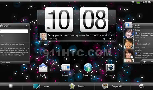
We simply can’t escape the amount of information coming from a set of HTC system leaks today. We are now learning more information about the HTC Puccini, one of the upcoming Honeycomb slates HTC plans to launch after their first tablet, the Flyer. From information pulled from build file, the Puccini will get a 800×1280 display most likely sized at 10.1-inches, an MSM8660 dual-core chip, and AT&T LTE support.
That last part might clue us off to when we could see this next-gen tablet from HTC. AT&T is rumored to be firing up their LTE network by midsummer, so a device compatible with the new network wouldn’t be expected until late summer or early fall at the earliest. That should leave plenty of time for HTC to polish up their new Honeycomb Sense UI for release.
[via 911sniper]


I just don’t see myself ever buying an HTC tablet. I love my Evo but, that’s just a huge phone UI. I just wish HTC did something else for their tablets. Love the Zoom by the way.
” how to completely ruin a cool UI” by HTC sense?If only skins were an option….stock FTW!
I also don’t see any on-screen navigation. Are we sure this is honeycomb?
amen brother!
Why, why somebody would need such ginormous clocks? And two of them one one screen?
Oh, wait it’s 3 of them. 3 fucking clocks, so you can be abso-posi-lutely sure about time.
No… There are only two clocks on that screenshot.
oh no there is definitely 3
Nope. Refresh time ≠ clock. clock.
SHUT UP
Why don’t you piss off you hypocritical child?
nukkayarrell approves dis message, boyeeeee
Sorry but there are in fact 3. The one in the top right(default Android), the giant HTC sense clock in the middle, and the third is at the bottom of the “Stream” widget on the far left side. Although, upon further consideration, I wouldn’t exactly consider that last one a “clock” since I would imagine it shows the time last updated, not the actual time. Unless of course you’ve got it set to update every minute… Kind of iffy on that one…
I think Wenjaman and Squiddy20 are right…there are 2. The third under the friend stream is the time the widget was last refreshed…not a clock.
On another note, this does not look like Honeycomb at all. :/
it’s a mockup. Why can’t people spell their own names correctly, Jason?
Does not look like honeycomb. Now that is true fragmentation when OEM’s trash the OS to the point that it is no longer recognizable. .
Well HTC was the first company to fragment Android with the European HTC Hero, at least back then it was an actual upgrade to Android 1.5 but now they are going backwards.
http://www.youtube.com/watch?v=FKTDSfbcbBU
[rant] Ummm, what? That’s not fragmentation. That’s skinning, something many people do to their Androids. If you don’t like Sense, that’s your opinion and you’re welcome to it. Go pick up one of the many stock Honeycomb tablets and enjoy it. I, for one, am a fan of Sense and don’t like my device looking like every other one out there (ala the iPhone). Stock is great for those who like it. Sense is great for people that like a polished custom UI (i.e. not Motobarf or iTouchWiz (see what I did there?)). Every new version of Sense polishes it more and adds new features. Certainly, it isn’t without bugs. But Sense has been around for many, many years in the form of TouchFLO, TouchFLO 3D, and so on. HTC has more experience with smartphone UIs than ANY manufacturer out there to my knowledge, so I tend to trust them on their UI decisions. What I don’t like I’ll root and fix. [/rant]
Why wouldn’t HTC just make it so that you could switch between Stock and Sense whenever you want like LauncherPro? Then the 99.5% of people who don’t root can be happy. Yes only .5% people root their devices, it just seems like more because we are more vocal then the other 99.5%.
sorry HTC …I love your phones but I won’t buy a Honeycomb tablet without the Honeycomb look…..ASUS EEE or Xoom for me then.
you can disable it you know.
I like Sense on my phone but I am having a hard time accepting it for a tablet. As Kingtheproducer says, I wish they did something a tad different for tablets. At least I know I can remove the widgets. In any case, time will tell. :)
wifi please. I am not going to switch carriers over this.
Guys, that’s not Honeycomb. It doesn’t have their navbar and it has an Android 2.x notifications bar on the top. I think this screenshot is fake.
AT&T ? A wet dreams worst nightmare is anything related to AT&T, They will soon figure out how to charge you for your thoughts of text messages and every use of the . (period). Worst customer service and just plain rude! If you are happy with AT&T you really have very low expectations of what you pay for.! ifoam lovers deserve AT&T and the hidden charges of data overage on Verizon. Good luck with the duopolply! I have moved to Sprint but would move to Cricket if they did away with true unlimited! Until you minions fight back and complain they will keep raising your “unlimited” rate … capped at 2-5G then throttle you back …. what a crock!@40fd566f2fe005e556a59fe084ab9c86:disqus
I love this. I think its a big step for tablets. I wasn’t quite on board with the other UI’s but this one looks really attractive and simple. and simple.