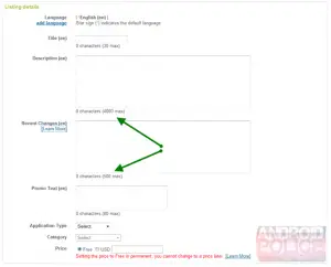
I knew I wasn’t crazy. Ever since I got the new Android market on my device, app descriptions seemed a lot longer. A lot more winded. The initial change a while back added about 100 more characters and a “Recent Changes” feature in the developer backend, but somehow folks have been going above and beyond those. It turns out the Android developer console was silently updated again, according to Android Police.
Developers are now able to write descriptions as long as 4,000 characters opposed to just 325 before, and they’re awarded 500 characters for the “Recent Changes” section. It’s a welcome change for developers and users alike: developers can better explain their features, and users can get the skinny on an app (at the developers’ discretion, of course) without having to download it and peek into the change log. I’m all for it!


@QK Dude…sleep seriously LOL. I agree with post i made in other topic….4000 followed by 4000….just saying. kinda makes the reader go huh?
OMG. Thanks for pointing that out, haha.
I love that the app descriptions are longer now. I noticed it the first time with the new market. Very helpful in my opinion
4000 characters ay? So it will take longer for me to read the description then the amount of time I have to get a refund? jk. But seriously I love the new Market and think they took a lot into consideration when they rebuilt it.
I received the update for the market today. I like it.
Still got the old market :(
Can you download the new market; I have a G2 and still old market!!??
I like how they have the shortcut buttons for Apps and Games. I just wish the T-mobile shortcut would be “My Apps” instead
@laurie yea I was wondering the same thing here wit my g2 I went to settings applications then all clear data on that now I have the new market check it out
@laurie You can get it here: http://www.mediafire.com/?k4d5w3te3spyqk6 . And yeah of course descriptions are longer. Developers have been asking for this. Still They should allow at least 5 lines of text instead of the 3 they allow now. It’s just too little.
Am I really the only person who hates the look of the new market. 4000 chars thing is great, but the carousel is so ugly. It takes up half the screen, is a horrid stomach curdling green and what’s so wrong with tabs?
And 15mins is way to short for trials … one hour at least … surely?
Yuo can also add more that two screen shots as well
Other than that I love google and think the market is coming on great! it’s just an ugly new UI!
@jer – It may be a good thing that you have the old market. I keep uninstalling the Android Market update so that I can use AppBrain’s App-To-Phone feature (where I can browse their website on my desktop and with one click, send any app to my phone and have it installed). The new Android Market seems to have broken this ability permanently. I’ll survive without longer descriptions.
One kind of annoying thing I’ve been seeing lately is that the “Recent Changes” text is showing up twice in the description. At first I thought it was developers being idiots and just pasting the same thing from the Recent Changes section into the bottom of the Description section, but apparently it’s a bug in the Market. The reason I say this is that it only seems to show up like that when I have an app that needs updating. After updating, when I look at the description, it seems fine (no repeated info).
I got the upgraded market today and one thing that I’ve noticed is that it lags off and on. Especially when using that pointless carosel that they added.
Dude…not for nothing, but if you need 4000 characters to describe your app…Its probably overcompensating for it sucking.
I still haven’t received the new market yet! This is crazy! And I also haven’t received the Evo update either.
Android Market 2.2.6
http://db.tt/ObPvxKb
@Andytrop79 Wow,I thought it was just me! I’m NOT a fan of the new market. OK, why put a tiny skinny uninstall button right under the open/update button?????? Is there no where else to locate that?
I liked the tabs, the colors don’t bother me but the top half takes up too much space. U have to click a bunch of “more” buttons to view > 3 reviews or more info. Also concerned that my AppBrain may not work now, will check that out.
thanks for the tip. I updated the description of my apps…now if only i could respond to reviews…
Wow…no more trying to figure out how to reword a sentence to save 2 letters.
I love the new market for its app description pages but I hate the colors and the carousel on the top of non-app description pages.
I dislike the new market. When I first received it, it Force Closed about three times before opening and then I thought that my Cliq had officially died (because, gasp, we never receive an updated anything and it looked weird). When I figured out the new…look?… was intentional, I was mortified. It confuses me, is way too cluttered, and now my mobile is on the fritz.
did they ever fix it for cm 6.1?