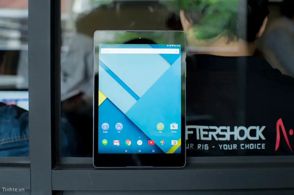
Renders are enough to give us a decent idea of how a new device looks at its best, but there’s nothing like getting a look at the thing in the flesh. The Nexus 9 won’t be available until November 3rd, but some lucky souls in Vietnam have already gotten a chance to finagle the thing and were gracious enough to deliver all the photos and video we can handle.
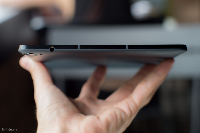
The device doesn’t really look more or less cool than what we’ve seen in the official press renders, though we were taken aback by the fact that it definitely is as thin as advertised. And it does look absolutely stunning. We obviously can’t comment on how it feels in the hand just yet, but early impressions suggest you won’t have any issues palming the 8.9-inch tablet.
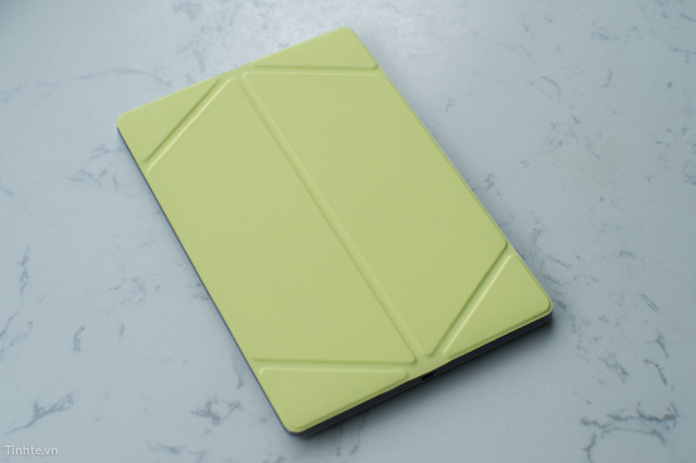
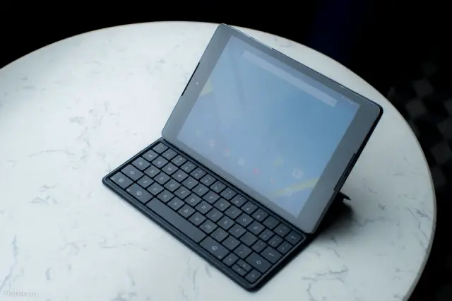
The Nexus 9’s 4:3 aspect ratio might have been off-putting on paper, but it looks like a really comfortable, natural device that should hopefully bring 4:3 back in style for the tablet scene. One last thing — that keyboard case looks freaking awesome. The case is a very snug fit when not in use, and it looks to fold out into a laptop-like state with ease. Needless to say this is most certainly one of the best looking tablets out there, and we imagine there won’t be a much better way to spend $400 this year if you’re in the market for one. Be sure to head to the source links for a lot more.






It may be time to say goodbye to my beloved LG G Pad 8.3 GPE. It’s been fun but this thing looks amazing
I’ll pay postage for your G Pad!
I am in the same boat with u, just that my pad isn’t GPe.
I’ve had four tablets in the past,most recent being the LG G-PAD 8.3
It was by far my favorite,compared to the XYBOARD 10.1/G-NOTE 8/G-TAB 3 8.0
I just didn’t use any of ’em much at all,but,if I still owned any of ’em,I couldn’t see going for the N9.
Just my preference & not a slam on anyone who may opt for this tablet.
Hope you enjoy the N9.
Perhaps if HTC put out a tablet w/a 16:9 ratio & SENSE,I’d go for it,seems perfectly fitting for a tablet.
Very sexy! Want it!
This might be a nice choice for those who want BOOMSOUND &/or 4:3 Ratio aspect.
Otherwise, there’s a lot of other tablets available at a better price.
I myself don’t see the pressing need for a NEXUS tablet vs a NEXUS phone for the latest updates.
Both look like an appealing buy to me… Which is a first for an android tab altogether and for a Nexus device which I haven’t wanted in a long time
If you have a “big one”. LOL
I don’t know about this – looks like too much bezel – but that is my opinion.
yeah…seems like the galaxy tab s is the better option.
Everyone should go to a store and see a Tab S’ screen. This will effectively kill any thought of going with something else. I’m waiting when they make Note 10.1 S
I’m waiting for a note 12.2 s
I have a Galaxy tab from work…too much lag for me. I’d rather substitute loss of screen for performance.
Tab has never been as prime product as Note series.
The Tab S has the same proc as the Note tab 10 or non Lte Note 3.
Not to be confused with Tab 4 or Tab pro. which are 2 and one notch below.
how does 4:3 affect videos? Do they get scrunched?
No, you’ll have unused space (black bars) top & bottom. Kinda surprised GOOG went w/ a 4:3 ratio, actually. They’ve always preferred 16:10 in the past.
Have 2 tablets, one for web browsing and one for video ;)
Or you can always chromcast it~
That’s one (not so convenient) way to do it. I prefer to have 1 tablet that handles everything. Chromecasting is great, as long as you’re at home.
4:3 aspect ratio is definitely a nice selling point for me… It’s like the perfect size
Yeah, that’s the only piece of good news….after both the micro sd card expansion and the price of the LTE version disappointed my impulse buying drive, I may just get it because of it’s 4:3 ratio.
4:3 is definitely much better for a productivity tablet. Everything gets so small in 16:9 ratio….unless you are watching a wide screen movie (which is just about every movie today).
This is why professional monitors are all 16:10?
No, it’s because manufacturers forced it down our throats. I still use multiple 4:3 monitors because they use less desk space and aren’t awkward.
They did not force it, 16:10 ratio exists because of professional demand. 16:9 is entertainment oriented and 4:3 was introduced in 1953 when a standard for broadcasting was established.
The 1950s are long gone I am afraid. But now the alternative to the iPad is also gone. Everyone wants to force 4:3 on us why would I want to go back? What’s the next step back? Monochrome tablets?
And at 299$ the iPad mini Retina is much more tempting than a Nexus 9 for 399$.
I haven’t worked for one boss that bought a 16:9 monitor because they wanted their employees to be entertained. That’s ridiculous. Those took off because widescreen TVs were more affordable and they were the “cool” thing. Only a few times have widescreen been useful at any of my jobs, and the thing is, if you’re going to add width, now it’s awkward by height, so you could have just gotten a bigger monitor to fit more height on screen, and most interfaces people use have to scroll vertically far more often than horizontally, even on standard screen. Most things I look at in my personal life and profession are longer than wider, with tons of blank space on each side, much more with widescreen. Like it or not, they’re not as professionally practical as standard, and 50+ years can’t be all that wrong. Just because it’s been around for awhile doesn’t mean it’s worse. We still eat fruits and vegetables; the more natural diet is more doctor-recommended than all these new-fangled unpronounceable food ingredients; we still use spoons and chairs and milk jugs. Something isn’t better unless it’s better, and most of the time, standard screen monitors are better for me than widescreen.
I am currently working for a large corporation that purchases 16:10 monitors so we can fit all of our programs on it at once. Yes we do have 20″ 4:3 1600*1200 and 24″ 1920*1200 16:10 when you put them side by side they are both the same height (like a 9″ 4:3 tablet next to a 10.5″ 16:10 one). and we can magically fit more stuff on the larger screen.
The tablet has the added bonus that you can put it easily in portrait mode to navigate the web because all web pages are formatted to be displayed that way. The longer screen allows you to scroll less to see more content.
I hope you understand this time, don’t hesitate if you have questions
ugh no!
google failed hard this year!!
that is WAAAAAY too much bezel. no reason for that amount of bezel on a tablet. the screen could have been almost an inch bigger without changing the size of the device!! lazy design! that camera in the corner plus the placement of the headphone jack is a tell tale sign of a blown up phone concept. this is ugly!
I personally thought this tablet looks really nice. The bezel complaint… look at nexus 7.. i think its bezel is worse than this tablet imo.
this isn’t a nexus 7 now is it? this is a nexus 9 and the year is 2014!
and 4:3 really!? this is 2014! not only does it have ridiculous bezel but you’ll basically be watching videos with almost as much black around the edges as there is picture thanks to the cropping. google has some explaining to do. this strategy of just dropping stuff is gon cause them some nightmares. mark my words. completely out of touch with who buys their stuff. they could have kicked apple in the gut this year with the hardware instead they’ve pretty much conceded the tablet space to whatever apple is about to announce!
A lot of companies do this, Apple included. And you have to wonder about it because there’s got to be at least one person at the company who shares your feelings and yet they do this anyway. I’m willing to bet it has something to do with market control or whatnot. Apple, HTC, Motorla, etc likely know exactly what their customers want, there’s just something we’re not being told as to why that can’t create our perfect device.
4:3 is one of the main reason I have not bought an iPad already. And now one more reason for me to buy from a Korean vendor.
The bezel is so you can hold the tablet and not cover the screen with your hands. Matias Duarte explained this years ago for the original Nexus 7.
4×3 works better for landscape apps. Movies, not so much.
1. how does bezel prevent you from covering a 9″ screen with your hands genius? that is one retarded excuse only a sheep would buy into…the small bezel on a phone is quite adequate! this is simply the result of scaling up a phone design! period. if I wanted something that looks like it was made “years ago” i’d go on ebay! this is 2014 and that design is atrocious!
2. 4:3 has nothing to do with how an app works. android apps are specifically made to look uniform across any range of screens…the only benefits would come from adjusting the pixel ratio itself which they didn’t do.
Azmon, tone it down about 10 notches.
The bezel gives you a place to put your thumbs, for example when holding the screen with one hand, without actually touching content. You may not like it or agree with it, but it does serve that purpose.
4:3 allows for more vertical real estate when in landscape mode — which equates to more space for scrolling content, i.e. text, list views, cards, etc..
you’re wrong!
4:3 gives the illusion of having more vertical real estate because of the relatively smaller horizontal screen real estate…how much can fit on the screen is governed by the PIXEL ratio not the SCREEN ratio. there’s no benefit to 4:3 screens which is why screens aren’t made in that ratio anymore!
you’re acting like I’m saying no bezel…THAT MUCH BEZEL serves no purpose…did people’s thumbs get smaller since the nexus 7? no! yet the bezel got smaller! why? because THAT MUCH BEZEL is unnecessary! wonder if you’re gonna scream “where am I gonna put my thumb?!” next year when the bezel gets smaller once again! isheep aren’t the only sheep!
For your argument to be true, you’re assuming that by making the tablet narrower (i.e. 16×10) that they would also *add* more pixels as well.
The N9 (at 4×3) is 2048×1536.
You’re argument basically assumes that at 16×10 the pixels magically become 2457×1536 (or better). It doesn’t generally work that way. Manufacturers don’t suddenly choose a more expensive (pixel-dense) screen. What you would more likely end up with is a 2048×1280 screen.
its not an argument. it’s a fact:
http://www.tru-vumonitors.com/articlesreference/43vs169aspectratio.html
same vertical information with more horizontal information because of the PHYSICAL difference of the screen size! 4:3 is the ratio of the height to width of the PHYSICAL screen…if the PHYSICAL screen were at a 16:10 ratio, which is closest to the golden ratio of phi, pixel ratio being the same, both screens will show the same amount of vertical information in landscape while the 16:10 will show more horizontal information…
considering that the vast majority of media is not made in 4:3, which means they made a huge sacrifice in an area where tablets are supposed to shine, it is very clear to see that it was a cost compromise plain and simple.
You and that article are talking about *media* — i.e. content with *fixed* dimensions. There’s no argument there.
You’re missing the point. Re-read what I wrote.
I’m talking about APPS. Things that have “scrolling content”. Things that have more vertical content than the screen space available. i.e. Google Now, Facebook, anything that “scrolls”…
OMG
apps are limited to the amount of pixels there are. if there are 1536 vertical pixels in landscape on a 4:3 screen and 1536 vertical pixels on a 16:10 screen and an app has only those 1536 pixels to draw its ui please explain how the 4:3 screen will magically create new pixels for the app to draw a larger vertical interface.
you must have never used a rom that allowed you to switch between tablet/phablet/phone interfaces…
I’m saying that you will have more pixels in the horizontal dimension (portrait-mode) in a 4×3 screen vs a 16×10 screen — because cost-wise manufacturers will opt for screens with the same pixel density — hence a 16×10 screen is just a 4×3 screen chopped narrower.
Dude, good luck. We’re talking past each other, and I’m not buying an N9 either.
The next bump up in Resolution would be 2560×1600 for 16:10 and there are plenty of flagship devices with that resoltuion heck even my Kindle from last year has that resolution. I was thinking I may upgrade to this but at this point its a no go for me. Price is 1 factor the other is the 4:3 aspect ratio and lower res screen and I am betting hte screen looks worse then the one on my Kindle Fire HDX 8.9″ as well.
Not when the keyboard is up.
16:9 works best in portrait when you have to use an on screen keyboard.
Does it do wireless charging?
Nope, dont’ see it on the nexus 9 official spec website either.
Minus point for me.
Really enjoyed the convenience of wireless charging with N5 and N7.
That is one awesome looking tablet! I love that it has front facing speakers.
Not a fan of the square design. I don’t ever want/need to use a tablet in portrait. Still think the N10 has the nicest industrial design. All I use it for is watching movies when I travel.
google should have googled the golden mean ratio.
squarish tablets are ugly!
pretty sure apple is gonna crap all over this in a few hours and that makes me sad.
Hmm, this might make a good school computer.
by the initial looks, i feel ipad air is better.. i thought 10 inch was the perfect size but now google came up with 8.9 which is right in middle of 7 & 10, kind of killing both. apple is gonna release air 2 in sometime which will be better than air.. so u know nexus 9 might be mind blowing for some but not for 4 me & before jumping the gun please note ipad air is the only apple device i have, other than that I am all android..
Cool story, bro.
lol…
Amazing device. Not surprised that HTC has delivered yet again. If I didnt already have a Surface Pro 3 for my Tablet needs I would definitely purchase this. As of now my next HTC purchase will be the HTC ONE M9 sometime this March or April.
how do you like the surface pro 3? i was thinking of purchasing one to supplement my laptop but was thinking i would wait until the update model (surface pro 4?) was released.
Its great. I bought it mainly as a drawing tablet , but he fact that it runs a full version of windows is awesome. Great weight and the pen is awesome.
I really want that yellow folding back case ( since it only covers the back) looks really interesting. Is it by google or 3rd party?
I really hate the fact that it has a 4:3 aspect ratio… why go with that? looks like an ipad
4:3 is pretty great for tablets IMO. It’s nice and roomy on webpages and I don’t feel the need to turn my tablet in landscape all the time. I typically like to read webpages as if I’m holding a fat and wide book.
Bezel is 1. for thumb space and 2. for the boomsound speakers
with this size of 9 inch what Google would like to compete with, the nouvel ipad air 2 or the ipad mini 3, or both of theme ?