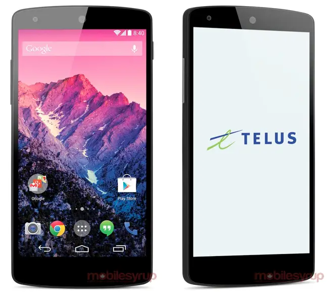
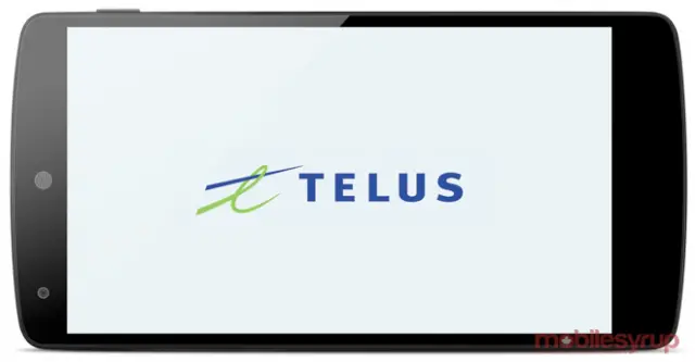
It looks like you might soon be able to pick up the Nexus 5 from your local carrier, if this latest leak is any indication. The folks at MobileSyrup nabbed some alleged renders of the Nexus 5 pictured for Telus in Canada. This marks the first time we’ve seen what could be official renders of the Nexus 5, normally pictured in swanky hotel rooms and bars.
What’s interesting is the obvious fact that we might see the Nexus 5 offered at carriers, something we didn’t see from the Nexus 4 (except on T-Mobile, but without branding and not much of a discount). But Canada does things a little different, and you can find the Nexus 4 still being offered on Telus for $30 with a 2-year agreement.
You’ll also notice we now have a clearer look at Android 4.4 KitKat and the new “Google Experience Launcher” that is rumored to also be making its way to the Google Play Store. That (terrible) origami-styled phone icon is present, as well as Hangouts seemingly replacing the normal messaging app. Don’t even get me started on that Touch Wizzy looking camera icon.
Oh, and don’t freak out about the center circular earpiece at the top. It seems Telus might have added a little extra sheen to the phone. From previous leaks, it’s clear that this will be a cutout in the glass, not covered by it.
If you want to grab the wallpaper shown in the leak, you can find it on ex-Android team member Romain Guy’s Flickr page here.






Dat Earpiece…hole thing…. :/
I thought it’d be weird, but I kinda like it. It’s different than the typical slit that really only houses a circular speaker anyway :P
I think it’d kind of cool. the regular ones dust up and look horrible.
It may or may not be coming to American carriers, it being on Telus not necessarily an indication.
Although you probably aren’t aware, the Nexus 4 was available on pretty much every main Canadian Carrier (Bell, Telus, Fido, Koodo, Virgin, Videotron) except for Rogers and a couple of other small ones.
Even if it isn’t it will work on any network see bands and radios used
Poor background photo choice. It took me a while to pick out the phone icon due to the color being close enough to those in the background. I rather like the icons though.
The artist behind the image, fake or not, apparently does their homework. In standard Nexus device fashion, the wallpaper image is from Romain Guy’s own personal stash of gorgeous photographs. You can download it here: http://www.flickr.com/photos/romainguy/5911366388/
Did their homework? How? To make sure the icon faded into the background?
I didn’t even see the phone icon until i read your comment haha!!
I had to keep scrolling between the origami phone icon comment and the device “photos” because I wasn’t seeing it anywhere. Then I realized that wasn’t an empty spot at the end of the icons. But yeah, it took a bit to register.
why waste screen real estate with onscreen buttons when you are going to keep the giant chin bezel?
theres pros and cons to ON screen buttons – but yea, I agree with u
“Don’t even get me started on that Touch Wizzy looking camera icon.”
Yep, and the TouchWizzy bubbles on the home screen. The straight line is much better IMO.
I guess round is the new straight.
This seems a bit odd. In all of the other Nexus press shots the clock is set to match the android version the device launches with. This photo says 8:40 where it should say 4:40. Galaxy Nexus had 4:00, Nexus 4 had 4:20 and nexus 7(2013) had 4:30.
Not a press release from google. This is from Telus. That might have something to do with it. Or…
8 + 4 = 12
1 + 2 = 3..
Something something confirmed.
Except this image isn’t from Google. It’s from Telus.
This just in, zero new actual reports about the Nexus 5, just the same recycled garbage from 25 other articles. #PhandroidFail
iPhonishhh Much? :)
Why? Because it’s a phone?
I think ios 7 has taken a lot from android aesthetically. And do you really expect google to redesign their entire os just because ios now looks more like android? 4.4 looks pretty much like it did since 4.0 expect a few small Changes here and there
iOS has taken cues from Android & WP but I think its incorrect to say that it looks like Android, more like its methed out ugly cousin. :D
Sure, if you ignore history and disregard Android 4.0 and up. Revisionist history much?
So the jelly bean lock screen is iphonish too.
i like it! its different..
Not at all a deal breaker but I miss the blue indicators in the notification bar. White is so blah. The battery is the real deal breaker for this phone.
whats this about the “Google Experience” launcher coming to the play store?
It’s the expectation that’s been set to give everyone a stock experience, if desired, which I sure did when I had a non-nexus phone.
Any substance to this rumor?
I guess you can have *that* particular launcher if you really want the Google one, but there is a launcher that gives you like nothing, just like the Stock launcher. I think it’s called Trebuchet Launcher. I don’t remember how it’s spelled.
I’m sorry, but I NEED my gestures. LoL!!
I can’t wait for integrated messaging! Maybe we’ll finally have colored emoji so I know wth I’m sending my iOS friends.
if its going to be like the current hangouts i can wait
I’m not digging the transparency. That won’t look so good with certain backgrounds. But it wouldn’t matter since I root anyways.
I tried a transparent NavBar and it was So bad. LoL!! My wallpaper was not doing it justice.
I’m hoping there’s some way to get the stock messaging app. If there is, then I’d keep Sense on my phone. Ooo!! API’s should make it to where the Launcher dictates the “Slide” security option. This way people wouldn’t have to root to change their lockscreen.
Unless those lockscreen apps have gotten better.
I like how Android is getting all the features people usually root to get. That’s pretty cool. Soon we’ll practically have Xposed Installed as a Stock app. LoL!!
i think i like about 50% transparency.
I tried using transparency on my Nexus 7. It wasn’t working out for me. I think I have a slight transparency. But it doesn’t really count since you can’t even tell. LoL!!
I don’t think you’re being completely transparent with us about your alleged preference to transparency.
haha actually you’re right. I dont exactly remember what the transparency settings used to be when i had carbon rom it coulda been anywhere between 30%-70%
I LOVE the transparency. I have a G2 right now, which I would normally put nova launcher on due toto LGs ugly skin, but I’m using LGs launcher because the transparency is so freaking nice. But, LGs launcher note allows for the changing of icons on the home page, so it still looks good.
I think LGs UI fits pretty well with the current colour scheme of Google’s apps and who knows they might make some tweaks to make it looks nicer.
Where the hell do you see an icon for a “Google Experience Launcher”…I see camera, Chrome, app drawer, Hangouts and phone……so what the hell are you talking about??? HELL!!!
What are you talking about? *confused*
Or is this a joke too? I have seemed to be ruining jokes lately.
In the text it says that we have a clearer view of GEL, but it’s not in any of the photos, so I’m just as confused…
Okay. So now I’m even more confused. What exactly are you expecting to see when Chris said that? Are you saying we can’t see a clear view since we can’t see how the app drawer looks and stuff?
The launcher is the first thing that shows when the phone boots. You wouldn’t see an icon for the stock launcher. There never has been one in the app drawer.
That’s what I’m referring to. That’s what I thought Chris meant. How you can “clearly” see the homescreen. Like how it actually looks.
You’re correct that launcher is GUI, but then there is GEL which is what Google is going to make available from the Play store. The closest we’ve seen of the icone is from that French N5 video. Here’s a screen capture and the cropped icon(between gallery and gmail), which isn’t the most clear.
I’m just as confused as you are, I do recall some comments that mentioned that google was making their own launcher for all android smartphones, but yeah…
I think It looks pretty great, we won’t know for certain until it’s released, but to me it looks like a compelling upgrade, and I’m certainly excited for Android 4.4.
Ughhhhh the suspense on this is killing me. I’d love for this to come out on Verizon, but if all of the rumors are correct, then it doesn’t look like it will be, which means October 28th will unveil what my last day of Verizon service will be!
Keep stomping out user rights, giveaway/sell user data, AND refuse to pick up so many of the best phones that come out in a year (or wait half a year later to release it ala HTC One) and you expect me to keep paying for the most expensive carrier service in the country?
NOPE.
Don’t really care what your post says, sorry, but upvote for the pic of Link in shades.
Dam this thing is sexy
such a smexy phone indeed.
I like the blur and transparency. I will miss the blue in the status bar. Still dig this though :)
Please 3000mah battery
Give up. There is NO evidence even hinting at a 3000mah battery.
Atleast there is a rumor floating around about the higher memory version with 3000mah:) better than nothing
man I just want to change that wallpaper and theme those icons.
Least like Google is trying to uniform Android UI by matching it with TW since its the most popular Android skin right now thanks to Samsung