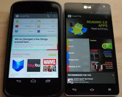
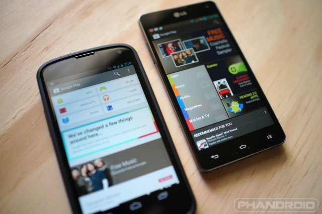
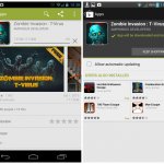
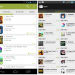
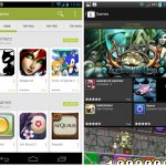
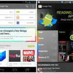
By now many of you have grabbed the APK for the new Google Play Store and given it a whirl for yourself. If you haven’t gotten it yet for one reason or another, though, then look no further for a comparison of the old version of the Play Store compared to this brand new redesign. Chris Chavez dove deep into the juicy bits on camera, giving you a side-by-side look at everything there is to see.
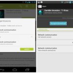
Aside from a tweaked color scheme, a new card-style layout and new interest-based categories, there’s also a tweaked purchasing flow and other minor tweaks. We won’t spoil all the fun, though, so give it a download for yourself or check out that video above if you haven’t got the time (or another good reason why you can’t install the APK).











It’s gotten much uglier if you ask me. Looks circa 2009 if you ask me.
Good thing no one asked you.
I agree, seems like a step backwards in desgin terms.
When I read they were updating the play store, instantly, the first thing on my mind was what are sheldermans thoughts on this!? I’m glad you posted your opinion. Thank you. Thank you THANK YOU
It is the comments section after all.
I agree as well, but this does match holo so its the future. All great things look ugly at first but after seeing it for a while you will end up liking it. Plus its meant to bring in dev, that’s why it copied ios a bit.
I agree. The layout looks good, but that color scheme is terrible. Welcome back Froyo Android Market.
Completely agree this play store sucks. Why are they going back to the UGLY version? Its not an upgrade its like a roll back to 2.3. AND white background with a green title bar, yuck. Sometime you can really tell Android is built by a bunch of nerds with no design experience.
Green is only for the app section. Each section is themed with a different color. Pay attention.
Tried it on my HTC One X here in Canada…I suspect there is a reason they are rolling out in phases as although it installed and works, the first screen of the playstore on my side ONLY shows the categories, but does not show the “What’s changed” message nor does it show ANY app recommendations. It’s pretty much a blank page with just the categories.
I suspect nothing will show up here until Google has properly rolled out the Canadian Play Store update.
Hopefully it’s just a server side / local issue and not client side issue…
It’s quite nice
And boom goes the dynamite
needs new colors ASAP. otherwise i like it
Uglyyyyyyy!
Ugh I’m not pleased. The Play Store is so ugly now.
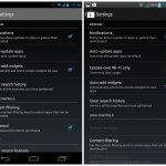
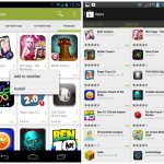
wait a minute, i see auto add widget on both versions….am i missing something?
I’ve also got the option. From the description underneath it, it sounds more like a shortcut. Wonder if this is different.
Edit: In the screenshot provided in the post, they seem to be the same thing.
Thanks, this was helpful to see.
so much wasted space on the new one. are you expecting me to scroll all through that? 2 apps per line on the old one was much better. and smaller icon on product page was better as well.
it looks like they aligned the design of the app to Google Play’s desktop version. it’s not like we have 13 inch smartphones to accommodate all the white space.
LOL…New quote of the day made by Chris Chavez, “…this application will steal your identity…what?”…hahahaha
my buddy’s half-sister makes $87/hr on the internet. She has been fired from work for 9 months but last month her paycheck was $13169 just working on the internet for a few hours. Read more on Jive8.com
Shut up. No one likes you.
my only problem is that when scrolling down.. its kinda lagy cause it has to load alot of images and only loads them when there in view
DON’T CLICK THIS OH GOD NO PLEASE DONT AHHHHHHHHH http://amzn.to/mCihYw
For what it’s worth, “auto-add widgets” was an option in the last play store. It just means app shortcut. Don’t piss yourself with excitement.
Needs a new color scheme…
I like it a lot. I like how the app permissions are now a popup instead of just another screen. It makes them stand out more. Also, I just like the overall aesthetics. Coupled with Google Now, I think this is indicative of where Google is moving with KLP.
Not bad. I never liked the “magazine style” Play Store since they introduced it. The only thing that bothers me in this new version is the one-app-per-line view. That’s going to cause a lot more scrolling.
Don’t like it. Old version much better. Old version was much sexier, sleek, and modern. New version is very ios.
So I just downloaded the APK but fortunately I e-mailed myself a copy of the current Play store using APK share, and I browsed around the new Google Play for over 30 minutes to see if I started to get used to it… I didn’t and I’m not. I hate it. With a passion. The App Market from mid-2010 when I first got Android was at least 5x better than the current version. Why did Google insist on ruining the Play app? As much as I’ve hated browsing the desktop web version for apps I will probably do so more now until Google releases a new version. It’s ugly as hell, it’s a lot harder to stumble across apps I might like, and basically I hate everything about it. And this is coming from someone who loves both Google and Android and would never want to own another mobile OS. Ugh. Once Google does on over-the-air update I hope I can reinstall the former Play store without it continually trying to update itself or I will be extremely irate. I will not have or use this unless I absolutely have to.
What does Chavez know about 2 Pac Me Against The World? Lol @ Chris trying to get some cool points with the hip hop people.
Man Chris hands were on speed, the ladies must like all that quickness lol
Has anyone noticed with the new market when you update an app it pulls the full app amount. It used to only download the bits of code that were new. It’s back to the old ways of redownloading the entire app. I really liked that it only downloaded the code it needed too.
am i tripping? Maybe they will update this soon?
In the video, the narrator said Auto-add Widget was a new feature, yet Auto-add Widget was listed in the options of the old settings. So, Auto-add Widget is not new. Wtf. Headline: New Play Store has touchscreen capability! Pathetically sloppy, lazy editing.
Mason. true that Angela`s stori is astonishing, on wednesday
I got themselves a Porsche 911 when I got my check for $5876 this last four
weeks and a little over $10,000 this past-month. it’s by-far my favourite job
Ive ever done. I began this 6 months ago and pretty much immediately made
myself more than $75 per-hr. , kep2.comCHECK IT OUT