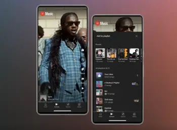
YouTube hints at redesign to your Library
The good folks over at 9to5Google have spotted a new change. YouTube for Android is undergoing an intriguing transformation, diverging from the standard Google app interface to carve out its unique identity. In this experimental redesign, the well-known Library tab is making way for a fresh “You” tab, signifying a substantial shift in both form and function.
Unveiling the “You” Tab
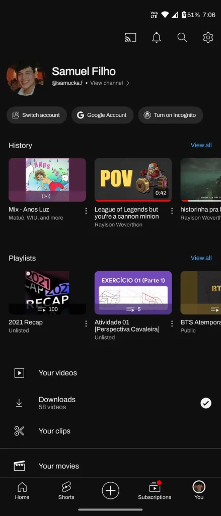
One of the most obvious changes is the repositioning of your profile picture. Traditionally found in the upper-right corner, it now finds a new home within the bottom bar. This revamped profile icon serves as the entry point to the innovative “You” tab. This unites the functionalities previously distributed across the account menu and Library.
This design evolution signifies a departure from the uniform placement of the account picture. Previously considered to be a hallmark of Google’s app ecosystem. Notably, this change seems to draw inspiration from popular social media platforms like Instagram. Offering a glimpse into YouTube’s evolving strategy, especially about features such as Shorts.
Seamless Accessibility
Upon entering the “You” tab, users are immediately greeted by their channel information displayed prominently. This streamlined design introduces intuitive buttons for swift actions. The cog makes an appearance on this page, simplifying the navigation experience. So going through quick settings you may need to access will be a breeze.
The organization of content has also received a significant makeover. The redesign introduces distinct carousels for “History” and “Playlists.” This departure from the continuous list format that once defined the Library section aligns with YouTube’s evolving nature. As the platform continues to grow. Playlists may have a diminished role in the app. However, they will remain useful for services like YouTube Music or TV.

- Source: 9to5Google
Exploring the “You” Tab
As you can see from the screenshot above, the usual array of tabs is present. A dedicated home button remains, as well as access to your subscription feed and shorts. It’s important to note that, reports of the “You” tab replacing the YouTube Library are still limited. So this change hasn’t seen a global rollout just yet.
A Distinct Identity
By embracing this redesign, YouTube distorts itself from the conventions of other first-party Google apps. With a distinctive design language encompassing unique fonts and custom icons, YouTube’s identity remains unmistakable.
While the redesign is currently in its experimental phase, it serves as a testament to YouTube’s unwavering dedication to innovation. As YouTube continues to evolve and refine its interface, users can anticipate a dynamic and engaging platform that caters to their diverse needs and preferences.