

Reddit User, NightDriveAvenger, spotted in their Youtube Music feed an interesting visual update to the Youtube Music App. After a long wait, we finally have what looks like a grid system for seeing albums and an alternative list view.
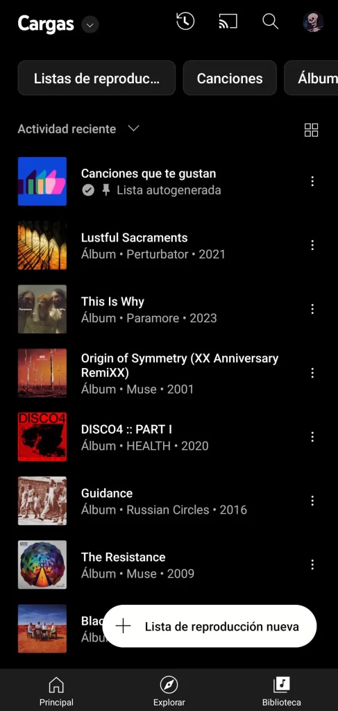
Source: u/nightdriveavenger
The new design for Youtube Music is primarily focused on the album cover art. Its images are square in shape and are substantially larger than what we’re used to. This should make things easier to access at a glance. As you would expect, like on any other music platform or service the grids display not just the art, but the artist and title. You are restricted in the grid view to only 4 playlists, being in rows of two. While in a list view, as would probably expect, you can change these views at the push of a button.
It’s always great to see the artwork that comes with your favorite artists and playlists. But, you can see how that might be a little restricting for smaller screens. So, you may find that you have better experiences on tablets or if you’re lucky enough to have picked up some of the foldables that are now on the market. Be sure to tell us what you think if you’ve got it on both your phones and tablets!
As for when we can expect it to come to devices, we have no formal word on when this will be rolled out. Android Central and 9to5Google report that it has rolled out to some of their staff’s devices but not all. So if you are on any of the beta programs, keep an eye out for an early rollout.


Comments