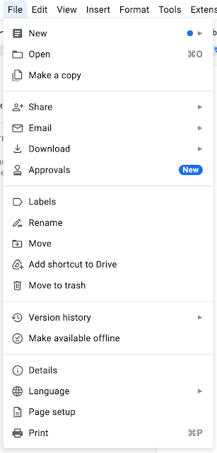
With redesigned menus on the web, Google Docs is making it more easier to browse its many features, allowing you to find frequently used activities much faster.
The addition of big symbols next to each action in the menus is the most visible improvement. This is supposed to help you notice certain behaviors faster, according to Google in a blog post.
Some actions have also been relocated. The reorganization is meant to make it easier to find the functions you use frequently.
What’s new?
The option to create or open a document, for example, take precedence in the File menu. The share action was formerly located at the top of the menu. The area for sharing and downloading a document comes next.
Although a few functions have been restructured, the most recent version makes no modifications to current features.

Image Source : Google
Google Docs’ menus have also been reduced to make it easier to navigate the service.
Apps Script-related capabilities have also been relocated to a new menu called “Extensions” from the Add-ons menu. This allows you to manage the add-ons in the Apps Script IDE.
It’ll be available on all Google Workspace tiers, as well as old G Suite Basic and Business subscriptions and personal Google accounts, starting at the end of May. The redesign will be enabled by default, with no way to turn it off.
The latest modification compliments Google Docs’ new features, which include document summaries and a pageless style, which make perusing long papers a pleasure.
Let us know what you think of the changes if you’re a Google Docs daily driver!


Comments