Promptly after the introduction of Android 12 and Material You, Google made the first Android 12 beta available to download. Since then, everyone’s been diving in to see what new features have arrived that weren’t announced. However, Pixel owners have also been noticing that there a more than a few features which were shown off, but aren’t currently present in Beta 1.
Since the I/O 2021 keynote, Google has confirmed some features won’t be arriving until Beta 2. Here’s what you can expect to see when the next Android 12 beta is released.
Thinner Volume Bar
Fire up Android 12 on your Pixel and just click one of the volume buttons and you’ll see something very un-Android-like. The volume panel has been adjusted, providing easier access to things like the ability to switch between sound modes with a tap along with sliding up or down to change the volume. But in the first Android 12 beta, the volume bar is quite a bit larger than you might expect to see.
The #Android12 beta's volume panel is still separated, but Google is testing a version where the ringer toggle is part of the slider. pic.twitter.com/1nLsovvZ3F
— Mishaal Rahman (@MishaalRahman) May 18, 2021
Mishaal Rahman of XDA Developers got his hands on a newer build of Android 12, where Google will be slimming things down again. Simply browsing the different menus and settings within Android 12 makes it obvious that Google is trying to make the software easier to use with one hand. And this larger volume panel is part of that plan. But if you have a display with a smaller device like the Pixel 4a, then it just takes up too much of the screen and is just not very aesthetically pleasing. Thankfully, this should change in Beta 2.
Clipboard notifications
While Android 12’s design overhaul is enormous, Google is also making great strides to improve privacy control. The latest effort is in an attempt to notify you of when an app is copying data from your keyboard, known as a “toast message”.
Whenever an app attempts to use the copied data from your keyboard app, a message appears showing you two key pieces of information. The first is where the information is being copied from, while the second piece shows the app that is requesting it. This is similar to what iPhone users see after updating to iOS 14, as Apple has implemented similar privacy features to let you know what apps are trying to access the clipboard. Although this was shown off during Google I/O, it won’t be arriving until the 2nd beta.
Android 12’s new privacy features

One of the cooler privacy features coming to Android 12 is the ability to quickly revoke microphone and camera access for an app. Whenever you download and launch an app for the first time, the app could request access to one or both of these. However, the process for trying to disable access can be a bit of a pain, and you might not want the access to be permanently removed.
With Android 12, Google is adding two new toggles that appear in the Quick Settings panel. One for microphone access and the other for camera access. So if an app is taking advantage of those permissions, you can just toggle them off with ease. Google also states that the toggles in the Quick Settings panel will reveal which app is currently making use of the Camera or Microphone access. This will be a great help if you need to revoke access on the fly, letting you deal with the app later on if you think it’s being malicious.
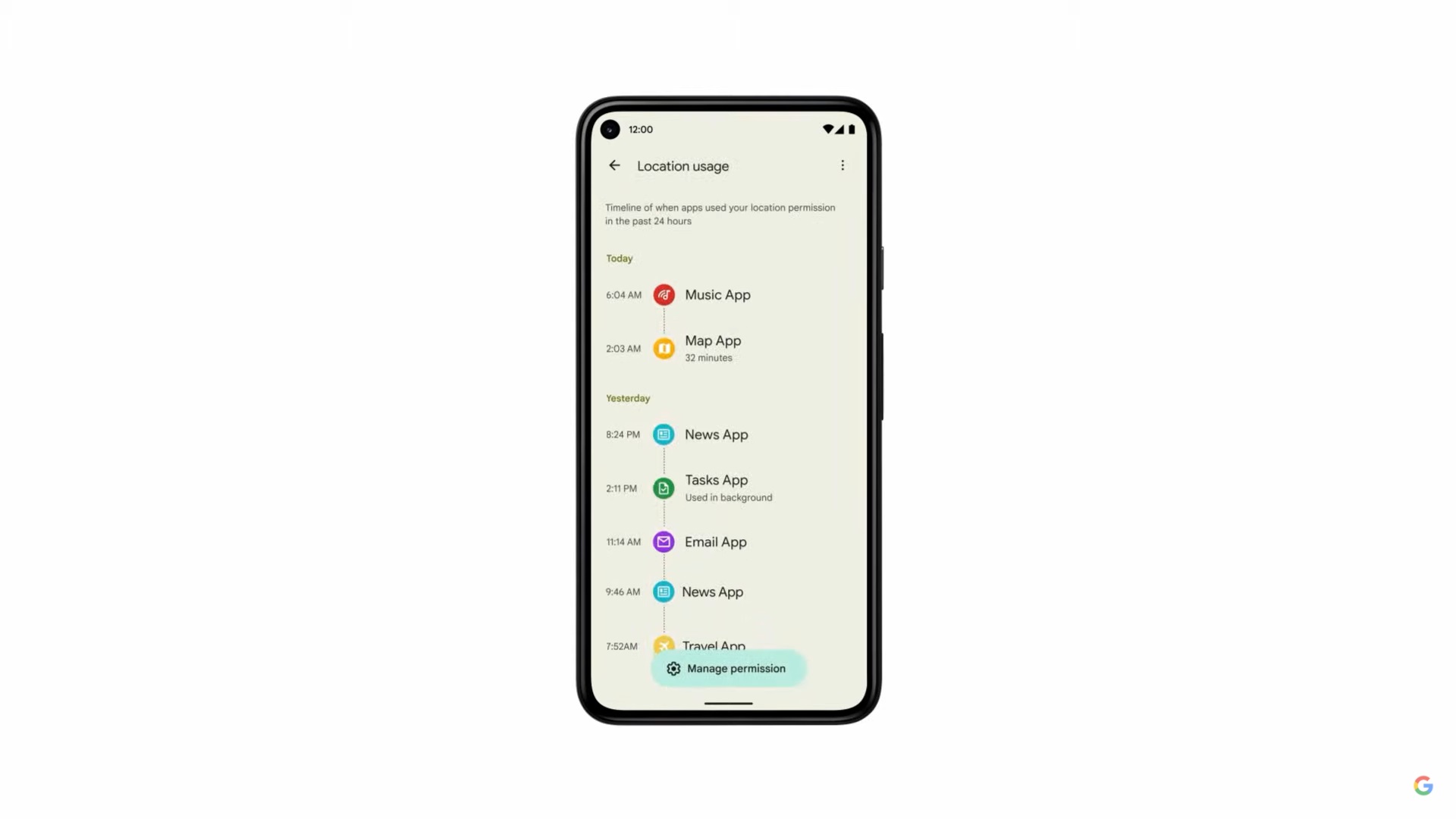
We’re also awaiting the arrival of the new Privacy Dashboard which provides a slew of information about your what your apps are doing. The Dashboard shows exactly when and for how long permissions were being used, along with which app was using those permissions. The layout is practically a copy of what you see with Digital Wellbeing, and that’s a good thing. Google bringing a new feature without plenty of information, without trying to re-invent the wheel.
What’s still missing?
There are still a few things missing, some of which are at the crux of what Android 12 has to offer. For one, it’s been discovered that there’s a hidden Game Mode found in the Do Not Disturb settings. However, we aren’t sure whether this will make it to the final build, as Google didn’t mention this at all during I/O.
Perhaps, more importantly, is the new theme changer that was shown off in great detail during the Keynote. This new Dynamic Theming is codenamed ‘Monet’, but it is not available in the first beta. Whenever it arrives, the theming engine will extract colors from the wallpaper that you are currently using, and then applies those colors to different aspects of your interface. This means that the tint on the lock screen clock, quick settings toggles, and much more will all match, offering a fluid interface. Those who want to select their own colors will be able to as Google confirmed as much to The Verge.
The final option, going along with the new dynamic theming, are the new widgets. Google is FINALLY paying attention to its boring and stagnant widgets, bringing new options to stock Android. While the new conversation widget is available, those snazzy new clock and weather widgets are not. Instead, you’ll have to rely on the Play Store and KWGT if you want to get them today.


Comments