When it comes to the infotainment units in our cars, the user experience is very important. This is because while we are driving, we need to be able to clearly see what we are pressing so that we don’t have to look away from the road and fiddle around on the touchscreen while driving, which is obviously rather dangerous.
To that end, the folks at CarDroid have since released a new video showing off the new UI for their upcoming CarDroid USB dongle. From what we can tell based on the UI, it will feature large fonts and clear, big buttons so that users should not have trouble using it in their vehicle.
It also walks users through the setup and pairing process which looks rather simple and straightforward, so assuming that this is the case for the final version, all you need to do is plug CarDroid into your car, pair your phone, and you should be all good to go. Users will also be able setup things like apps to launch whenever CarDroid starts up, which should save you some time during your commutes as all your favorite apps are ready to go when you start the car.
https://www.youtube.com/watch?v=BSmQyWxp_jE
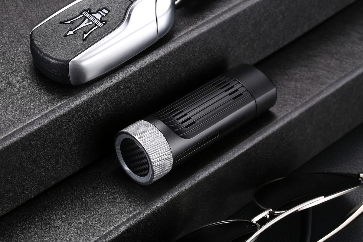
For those who are unfamiliar, CarDroid is a USB dongle that connects via the USB port in an Android Auto’s head unit. It is designed to be an alternative to Android Auto where it will actually give your car full Android capabilities, so if you always felt that maybe Android Auto was a bit limited, this should help unlock additional features and functionality.
It comes with an octa-core processor, up to 4GB of RAM, 64GB of expandable storage, and also supports wireless connectivity like Bluetooth and WiFi. It will also comes with Android 9.0 preinstalled, which we get is a bit dated, but should be more than enough for your daily commutes.
CarDroid has been successfully funded on Indiegogo and its developers welcome users to post questions that they might have about the device on its official forums, like vehicle compatibility and so on.





Comments