

Snapchat is receiving a long overdue UI overhaul and although it’s rolling out first on iOS it has a slight, dare we say, Material Design feel to it. Persistent navigation buttons now follow you through the chat and Stories screens and smooth UI animations can be found in more places throughout the app (we love the new transition animation when opening Discover Stories).
Speaking of which, it’s the Stories and Discover pages that are receiving the most love. With more than 100 million active users, Snapchat wants to cash-in on all those eyes by making the service more friendly for advertisers and brands. Discover and Live Stories are now grouped together, highlighted by a rotating carousel that appears at the top of the Stories page. Instead of just the brand name, users now get a quick look at the headline and thumbnail of the most recent post — content is no longer hidden behind a circular icon.
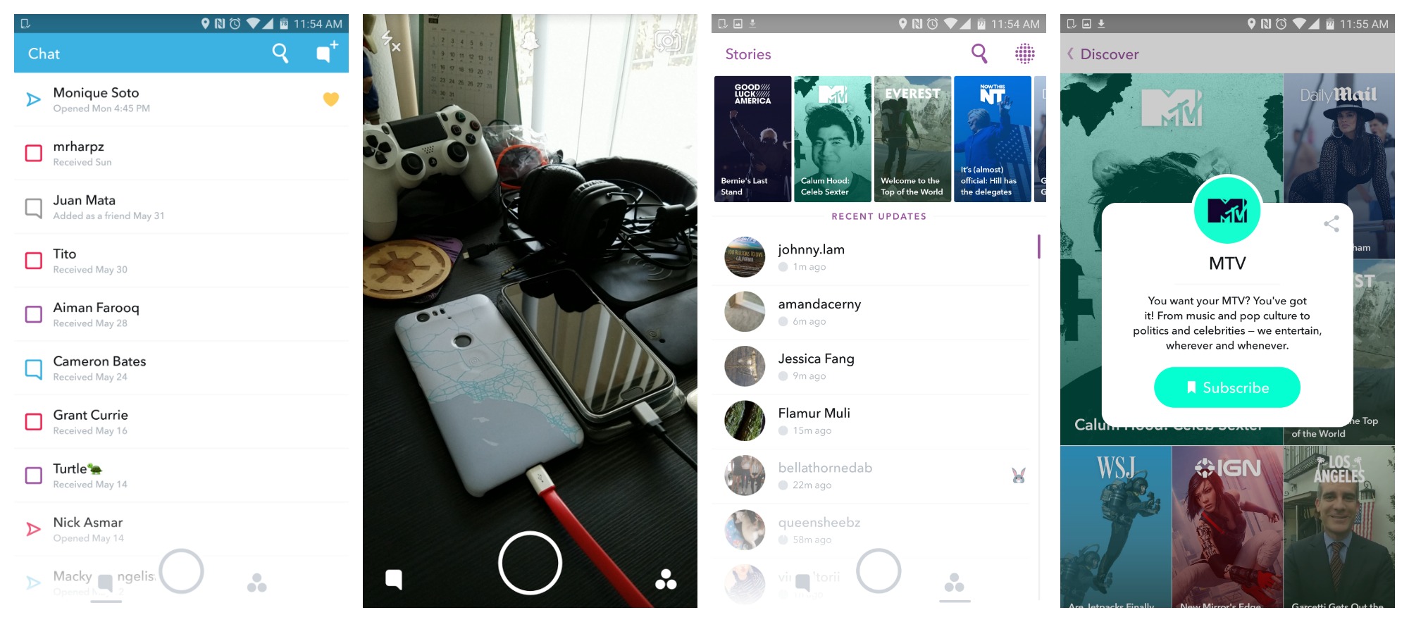
Just beneath the Live/Discover carousel are recent updates from your friends, then a section for viewing Live Stories-only, and finally All Stories from your friends. It’s a little reorganization, one that doesn’t really bother us and we found the UI overall more pleasing and easier to navigate.
The actual Discover page now features a magazine style UI and like the rotating carousel on the Stories page, combines both Live and Discover Stories from publishers. You can view Discover Stories the same as usual, but long pressing on the thumbnail will give you the option to subscribe to that specific outlet. A Subscriptions section will then be wedged in between Recent Updates and Live showing you recent updates from the outlets you care about most.
Really, the redesign is more geared toward publishers who Snapchat is hoping to entice with its massive user base. The side effect is that it makes the app cleaner and nicer looking as a result, which is a big step in the right direction for an app who’s UI has commonly been described as a big cluster f*ck. Download the app now if you haven’t already to check it out.
Download on Google Play: Snapchat
[Image credit: AdWeek]


Comments