Android M is here, and although Google made a point of indicating its primary purpose is to polish the sweeping changes introduced in Android Lollipop, this new version still has a long list of huge improvements and entirely new features. Here is a complete list of all the changes in Android M, highlighting the 18 most important. Let’s go!
1. Google Now on Tap
In previous versions of Android, Google Now lived in its own container, accessed by swiping up from the home button. Occasionally, when Google deems it important enough, you’ll find Google Now Cards in your notifications. Google Now on Tap takes the feature several steps further by become an all knowing, always ready concierge: hold down the home button from any screen in any app and Google Now on Tap will use the context of the situation to fetch what information it believes you seek.
For more, read our article on How to use Google Now on Tap.
2. Android Pay
Android Pay is a new service that builds upon the promises of Google Wallet and adds more features. It can store all of your physical credit cards and loyalty cards so you can simply scan your phone via NFC to pay in stores. Android Pay can also be used to purchase items online. If a website supports Android Pay you won’t have to enter any credit card or shipping information. It will all be saved and ready to go.
When paying for things in the physical world you need some extra security. Android Pay checks if your phone has been unlocked in the last five minutes when you touch it to a terminal. If your phone hasn’t been unlocked recently it will ask for some sort of password, or if your phone has a fingerprint scanner you can use that. More on fingerprints later.
For more, read our article on How to use Android Pay.
3. Auto backup for apps
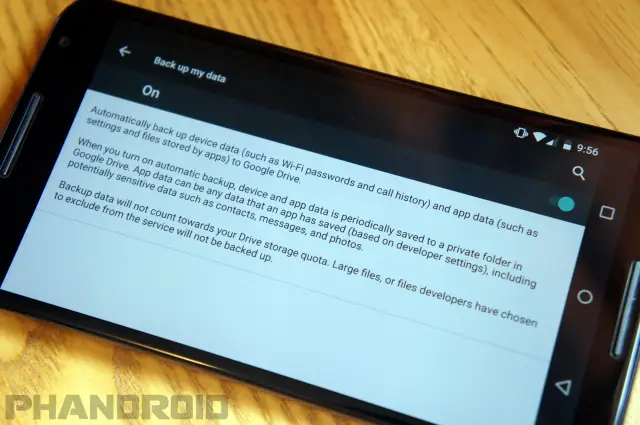
One feature that Google didn’t talk about might be one of our favorites. Android has always had back-up and restore functionality, but it wasn’t a complete solution. You’d still have to go into each app and sign in and set it up again. There are plenty of 3rd-party apps that fix this problem, but now stock Android will be able to do it.
In the Backup & reset settings there is a new description that explains how app data and settings will now be backed up to Google Drive. That means when you set up a new phone and restore your apps it will also restore how you had those apps set up. For example, if you had notifications disabled in the Twitter app on your old phone it will remember that on your new phone. This should make switching phones a breeze.
4. Vertical app drawer with search bar
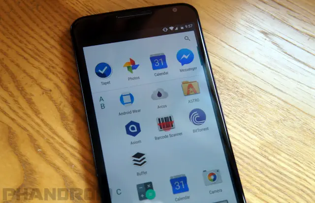
One of the biggest visual changes can be found in the default Google Now Launcher. The app drawer is now a vertical-scrolling list with four recent apps and a search bar on top. In Lollipop the app drawer consisted of horizontal-scrolling pages. We’re not sure how we feel about this change. The icons in the new drawer are very large, so you can’t see many apps at a time. It seems to require more scrolling than the previous design.
5. Easy word selection and toolbar
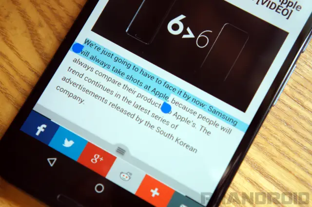
This might not be a big deal to some people, but selecting text in Android M is a lot easier. When dragging your finger the selection now grows by word and subtracts by letter. A new floating tool bar appears right above the selected text with options for cut, copy, and paste. We love this subtle improvement.
6. Simplified volume controls
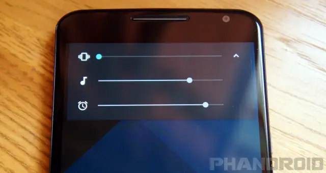
The volume controls in Android Lollipop were one of the most controversial new features. New modes made it hard to figure out which notifications would get through, and the removal of Silent Mode was a serious mistake. Thankfully, Google has realized the error of their ways and fixed the volume controls in Android M.
When you press the volume buttons you’ll see the familiar volume slider, but now it’s possible to go lower than vibrate. Taking the volume past vibrate now puts the phone into silent mode where only alarms can make noise. There’s also a little down arrow icon on the right side that allows you to adjust the media and alarm volumes. We’re very glad Google has backtracked on their crazy Lollipop volume controls. This makes much more sense.
Read more about the new volume controls in Android M.
7. ‘Do Not Disturb’ gets overhauled
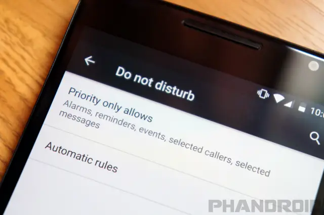
In Android Lollipop there was Priority Mode and Do Not Disturb mode. It was confusing why these two things were separate when they had many of the same features. Google has done away with Priority Mode in Android M and focused solely on Do Not Disturb.
In the Quick Settings pull-down you’ll notice a toggle for the new Do Not Disturb mode. When you tap the toggle you’ll have options for “Total silence, Alarms only,” and “Priority only.” The first two are self-explanatory, but “Priority only” requires some set-up. You can allow only certain apps and people to break through priority mode, and a new setting called “Repeat callers” will allow someone who has called twice in 15 minutes to break through.
“Automatic rules” allow you to choose certain times for Do Not Disturb mode to be automatically enabled. For example, you could have it turn on every night when you go to bed, on the weekends, or during certain calendar events. It’s very handy.
8. Customize the toggles in the Quick Settings
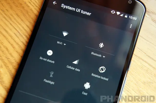
Most non-Nexus devices allow you to customize the toggles found in the Quick Settings. In Android M we can see that Google is tinkering with that very same idea. In the Developer options you can enable “System UI tuner.” This allows you to drag and drop different toggles into the Quick Settings area. It’s very buggy right now, and only includes a few toggles, but in the future it could be great.
For more on customizing the Quick Settings, watch our video here.
9. ‘Doze’ saves battery life
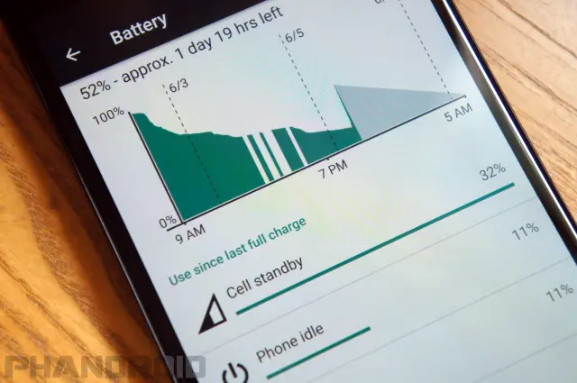
Every feel like battery life on your Android device isn’t as good as it should be? That’s a problem many Android fans complain about, and Google is always trying to fix it. Their latest attempt is called “Doze.” In Android M apps will be put into a deep sleep when the phone isn’t in use. Doze activates when your phone is unplugged, stationary, and the screen is off. It will periodically wake up to sync data, but most things will be asleep. No more battery drain while your phone is on your desk all day.
For more about Doze, read our full article.
10. App Links removes the default app picker
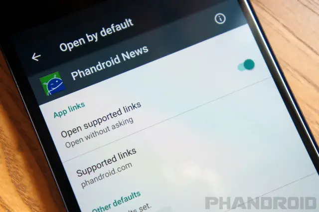
Anyone that has used Android knows how often you’re asked about the app you’d like to use to perform a task. It’s nice that we have that power, but it’s also a little annoying. App links let you choose if you want an app to always open a certain type of link. For example, you can make Twitter links always open in the Twitter app without asking you every time. It just works.
11. Granular App Permissions
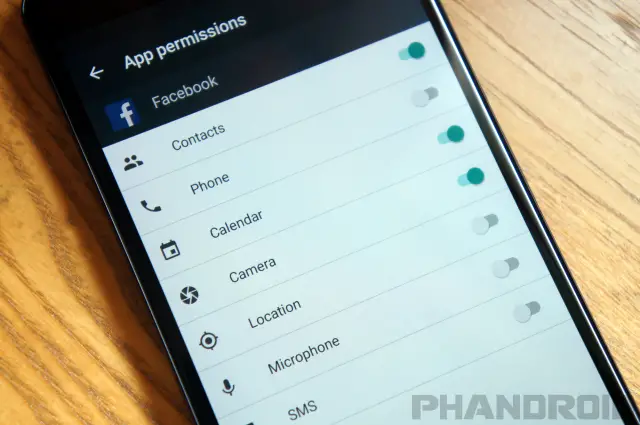
Why does the Twitter app need to know my location? Why does Facebook need to access my microphone? If these are questions you’ve asked you will love Android M. Instead of seeing a long list of permissions when you install an app you will be alerted when an app requests permission to do something. If Whatsapp wants to use your camera it will ask for your permission first.
That’s only half of the new features. It’s also possible to choose which permission you’d like to deny. The new App Info page in the Settings has a section for permissions. You can simply unselect which things you don’t want an app to have permission to do.
For more, read our full article on Android M App Permissions
12. Unified app info view
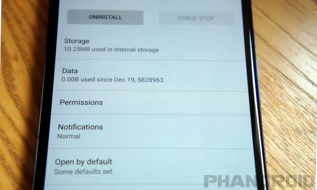
The App info pages in the Settings menu have been overhauled in Android M. You can now see information about storage, data, permissions, notifications, defaults, and battery on one page.
If you’d rather see app info in bulk you can go to Settings > Apps and tap the three-dot menu to select Advanced. From here you can see default apps, app links, permissions, and more from all the apps installed on your phone. It’s a great way to manage apps.
13. Direct Share makes sharing to people easy
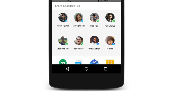
It’s always been easy to share things on Android, but Android M will make it even easier. With Direct Share developers will be able to allow users to share deeper inside their apps. Currently, to share a photo with someone on Hangouts you would select the share icon, choose hangouts, wait for it to open, and then select the recipient. Direct Share will allow you to select the share icon and share directly to a Hangout contact.
14. Fingerprint Reader support
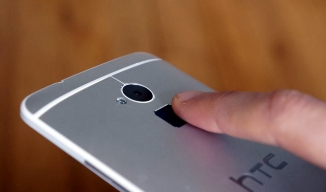
Android will finally have an API for fingerprint readers. This will allow manufacturers to build fingerprint scanners into Android devices without hacking on their own solutions (except Google, who hacked a fingerprint scanner onto a Nexus 5). The fingerprint API will allow you to use a fingerprint reader to unlock your device, buy things in the Play Store, and verify your identity for Android Pay. The future is now.
15. Disable “Heads Up” Notifications
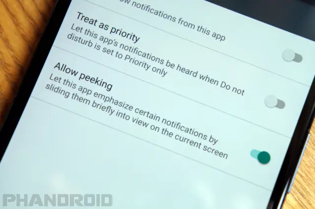
A lot of people were not fans of the new “Heads Up” notifications in Android Lollipop. They pop up in front of whatever you’re doing and can be very distracting. Google hasn’t gotten rid of the Heads Up notifications, but in Android M you can disable them on an app-by-app basis. Go to the App Info page for any app and select “Notifications.” Toggle off “Allow peeking” and the app won’t pop up notifications anymore.
16. Lock screen font and voice shortcut
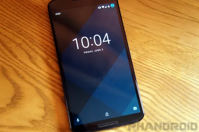
The lock screen has some subtle changes in Android M. The font for the clock is slightly different, but the bigger change is a new shortcut for voice search. In Android Lollipop there was a shortcut to the dialer in the bottom left corner, but now it’s a microphone icon that jumps right into a voice search.
17. Dark Theme
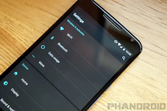
If Android M is any indication it looks like Google is considering adding themes to Android. Hidden deep in the Developer options in Android M is the option to change the theme from Light, Dark, or Automatic. Currently, it only adjusts how the Settings look, but we could see this controlling the entire OS in the future. See the dark theme in action here.
18. USB Type-C Charging
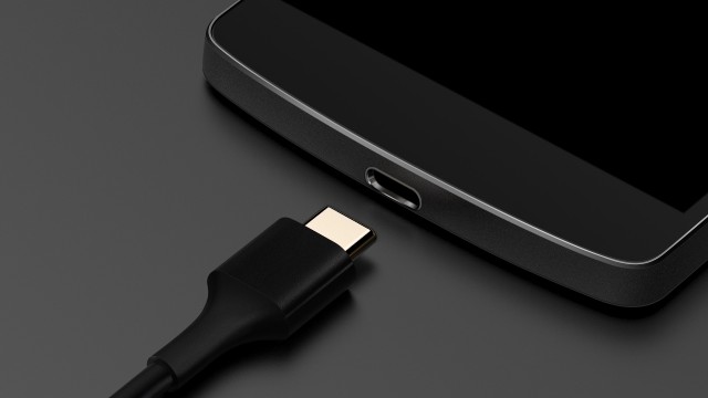
The hot new standard for USB connectors in computers and mobile devices is USB Type-C, and Android M will finally bring support. USB Type-C connectors are reversible, which means you’ll no longer struggle with finding the correct orientation of a charging cable. USB Type-C can also transfer data and power in both directions, and Google promises improved charging times.
Everything Else
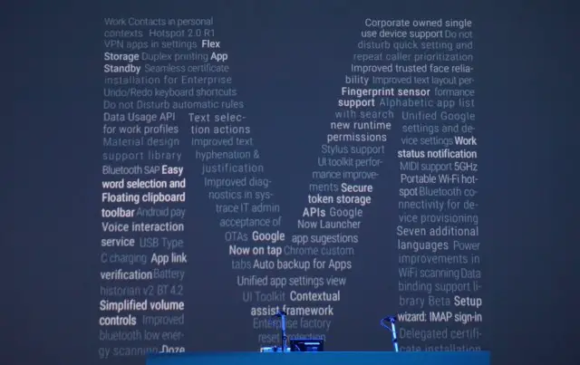
Android M has a lot of other little changes and improvements. In total there are over 50 new things in Android M. The features mentioned above are the ones you’ll notices the most, but we’ve listed everything else below.
- Power improvements in WiFi scanning
- Chrome custom tabs
- Work contacts in personal contexts
- Hotspot 2.0 R1
- VPN apps in settings
- Flex storage
- Duplex printing
- Seamless certificate installation for enterprise
- Undo/redo keyboard shortcuts
- Data usage API for work profiles
- Material Design support library
- Bluetooth SAP
- Voice interaction service
- Battery historian v2BT 4.2
- Improved bluetooth low energy scanning
- Beta setup wizard
- Improved diagnostics
- IT admin acceptance of OTAs
- UI toolkit
- Contextual assist framework
- Enterprise factory reset protection
- Corporate owned single use device support
- Improved trusted face reliability
- Improved text layout
- Unified Google new runtime settings and permissions
- Work status notification
- MIDI support 5GHz
- Portable Wi-Fi hot-spot Bluetooth connectivity for device provisioning
- Seven additional languages
- Data binding support library
- IMAP sign-in
- Delegated certificate installation
- Flashlight/Torch API
- Simplified Share Menu
- Developer Custom Landing Page
For more news and information about Android M, click the delicious M-themed desserts below! What do you think Android M will be called at launch?







Is it possible to use Google tap without all the options that Google now offers? Google tap sounds awesome but Google now is useless for me.
finally the END ALL BE ALL android version. why didnt they think of all this sooner? surely there will be no reason for any newer versions as this fixes it all LOL
*Google drops mic*
Will there ever be a version of android that comes issue/bug free? Sorry,just thinking out loud…my bad!
I don’t have a device with lollipop, but I understand it’s not possible to set DND mode for different times on week nights and weekends. If so, is this rectified in Android M? On my 2013 Moto X, if I turn it on for weeknights and want to be able to receive calls Fri/Sat night if I go out, I have to remember to manually turn it off, and then back on again afterwards. First world problem to be sure, but extremely aggravating.
Bring it!!!
Hope Android M will fix batterie life problem
And offer spell check in your case
Lol you so funny ?
Oh, you are French? You ‘ave a batterie in your telofon, no?
after having big oroblems updating my N9 to 5.1.1i’m going to ask a friend to flash ANDROID M to it.
“App links let you choose if you want an app to always open a certain type of link.”
Given that the existing dialog for this has had the Always option for years, I’m not sure how this is actually new.
It was obvious in the keynote how much Google hated the old way and how much they consider this an important change.
But I honestly don’t understand the part where an actual change has occurred.
Lollipop is a flipping fiasco. This almost has to be better.
App links doesn’t look like much of an improvement; the pre-JellyBean functionality was perfect, you tap the app for “this time” or check the box for “always” (like Windows), it only needed a way to delete specific defaults in app info; I don’t know why Google hasn’t made this more useful and intuitive.
that didn’t always work for me, personally. It would ask me when i clicked a certain link, however it only worked whenever i reclicked that exact same link. If i clicked another youtube link for example, it would prompt me again, even if “always” was checked.
That depends on whether you’re clicking something for the same site but a different area, so if an app has multiple features or sections, each one of those can give you a prompt. I haven’t seen that often though, and on older versions of Android it seemed to happen less.
Is this a new build of the M preview or is it still MPZ44Q where Google on Tap doesn’t work?
Still MPZ44Q = No Tap
Can someone tell me why google doesn’t redesign “quick settings” to be more multifunctional? Most roms have a quick toggles thing that can always be there when you pulldown the notification panel. Samsung touchwiz has it too, and plenty of others, and they let you customize what toggles you have. Google on the other hand makes toggles its own separate panel, so you either need quick pulldown which runs the risk of always or never getting toggles depending on which hand you use your phone with most, or pulling the notification panel down then tapping an icon just to get to quick settings which would have been almost as fast as having settings on the homescreen and then just tapping it and then making changes from there.
What about app standby?
An overall polish release along with Dark Theme, USB-C, Fingerprint Security, etc. just sounds awesome… USB-C will be great, mini-USB has always been a terrible flimsy port design. That white vertical app drawer looks hideous but we have Nova :)
Yes the USB-C on my nVidia Shield Box is awesome. So easy to use and has a really snug fit. Nothing flemsy at all, in fact I had to double check to make sure it was a USB-C connector and port as it feels so sturdy and solid connection.
I miss notification badge on app icons and family sharing apps/music as in iOS.