Because not everyone can get their hands on flexible OLED displays, Chinese smartphone makers like Oppo are forced to get creative when it comes to their smartphone designs. The latest trend they seem to be focusing on are bezels. Before you get ahead of yourself, we’re not talking about bezels on the the top and bottom — we’re talking about side bezels.
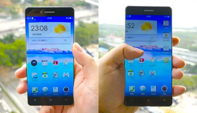
Oppo is gearing up to announce a new smartphone and to prepare for its launch, it appears they’ve been seeding their own leaks to hype it up a bit. The phone — which still remains nameless — was “leaked” to Chinese tech outlets, and shows a phone running Oppo’s Color OS (which, we should add, is in desperate need of an overhaul) with stupid small bezels along the sides. According to an Oppo patent, the manufacturer is further adding to the illusion of a completely edge-to-edge display by using light refraction, similar to something we saw on the Sharp AQUOS Crystal and the Moto 360’s displays.
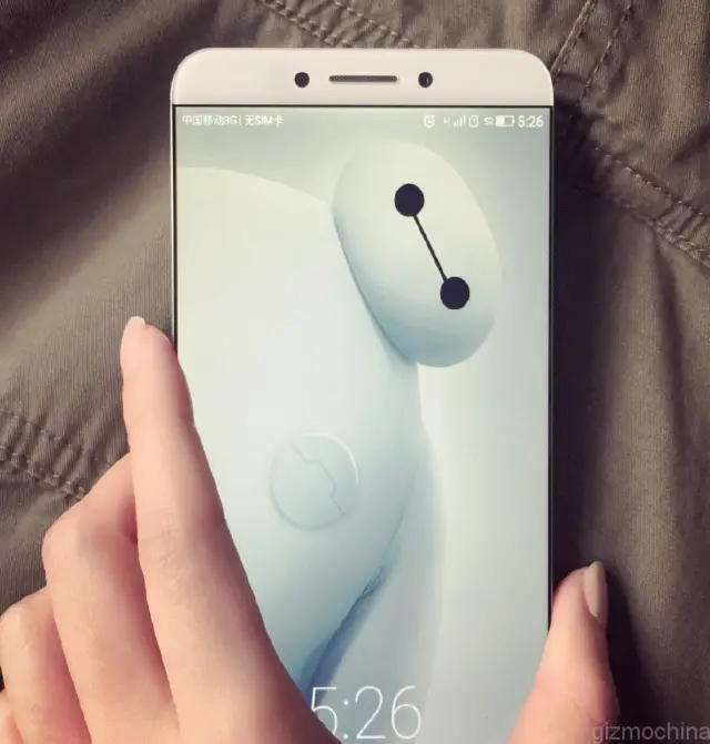
It’s not the first time we’ve seen a device with stupid small side bezels. There was also the Meizu MX4 or last year’s Sharp AQUOS Crystal which manged to also eliminate the top bezel for a phone that looked more upside down than anything. Last week, Gizmochina also uncovered the LeTV X900, another Chinese smartphone with virtually non-existent side bezels and uses a USB Type-C connector.
We’ll have to admit, side bezels have never been a pain-point for us when it comes to smartphone design. Super thick bottom bezels (with black logo bars), really slick phones that slip out of your hand, or rear facing speakers — now those are a few things that really grind our gears. While having a phone with super small side bezels wont actually make it easier to hold or add any functionality in any way (kind of like the curved display on the Samsung Galaxy S6 Edge), it sure does look pretty.







Sweet! Just wish they’d lose the top and bottom bezels, aka physical buttons. Replace that waste of space with some front face stereo audio, please. Maybe one day when I design a phone…..
They did, but mobile audio isn’t at it’s prime and the components are still quite large, so it’ll have a black bar on the bottom. No one seems to like it. ._.
Ironically, the video looks like this on a mobile browser. :D
It looks nice but tiny bezels kind of suck as your constantly hitting the screen by accident by just holding the phone so it’s not as great as it sounds…. Or looks I guess.
Technology prevents it from happening. People said the same thing about the Note 4. It’s been proven that it doesn’t register palm touch. It is not natural to grip a phone closed fist. Trust me they consider this.
I have the Note 4 and the bezels are not as small as this device pictured above. If I put my palm on the edge of my screen of my Note 4 it does indeed register.
I ran into similar issues with my old HTC device due to the raised glass. Threw a case on it and I was fine
I am guessing that you are referring to the Note Edge, right?
I got to have it
And it’s all ruined by capacitive buttons, oh well.
The OnePlus One allows you to have either capacitive buttons or on-screen buttons. I’m assuming the same functionality will carry over to this.
I think Koz means they’d rather have less bottom bezel and software buttons, rather than the thicker bottom bezel required to accommodate the capacitive set.
“stupid” as in cool or “stupid” as in dumb?
Stuphid? Kind of like fat, but phat.
Oh, so you mean “stoopid”
Phat like phatman
This does not looking appealing to me. I just like some bezel around the screen.
It’s just a placebo, I know, but the screen looks more nice and better with the bezel.
It’s the optical illusion where colors look more vibrant with a black outline even though they’re the same hue and saturation.
This? No, I don’t like it. Hooray for the people that despise the infamous black bar. Your phone has arrived. LoL!!
There’s one reason why I love seeing OEM’s trying to eliminate as much bezel as possible, regardless of where they are attempting to do it on the physical phone. If they can manage to increase screen viewing size without compromising overall size of a device, I’m all for it.
I think LG did something awesome with the G3 that always seems to be overlooked. That phone has a 5.5 inch screen, but the physical size of the phone is quite comfortable to hold. By comparison, there are many phones with 5.5 inch screens current and in the past, that are physically bigger than the G3 and less comfortable to hold. What’s intriguing is why there hasn’t been an OEM to attempt not having a bottom bezel at all (or very little bottom bezel), due to Android’s on-screen navigation buttons, that can be hidden away with software add-ons, but still make for full viewing experience on videos.
The other technology that I’d love to see an OEM make an attempt at is the one where the speakers are integrated into the glass, which would eliminate the need for physical speaker add ons for the front. Nonetheless, I like that all the OEM’s are pushing the boundaries. It provides us consumers with more and more options.
Looks nice but isn’t practical. Good luck holding a phone with no bezels while the screen is on.
Nice..but probably a lot less protection if you drop your phone!
Side bezel is not a big issue these days, in fact you need somewhere to hold the phone without touching the screen!
The big win comes from reducing the bottom bezel. Why? Because for one handed use the further away the screen is from the bottom of the phone, the further you need to stretch your hand. I would happily take a larger top bezel as long as it means a very small bottom one.
“stupid small”
Really? This was used in an article, and used TWICE?! are you writing an article or a rap lyric?
the screens do look great though. stupid great