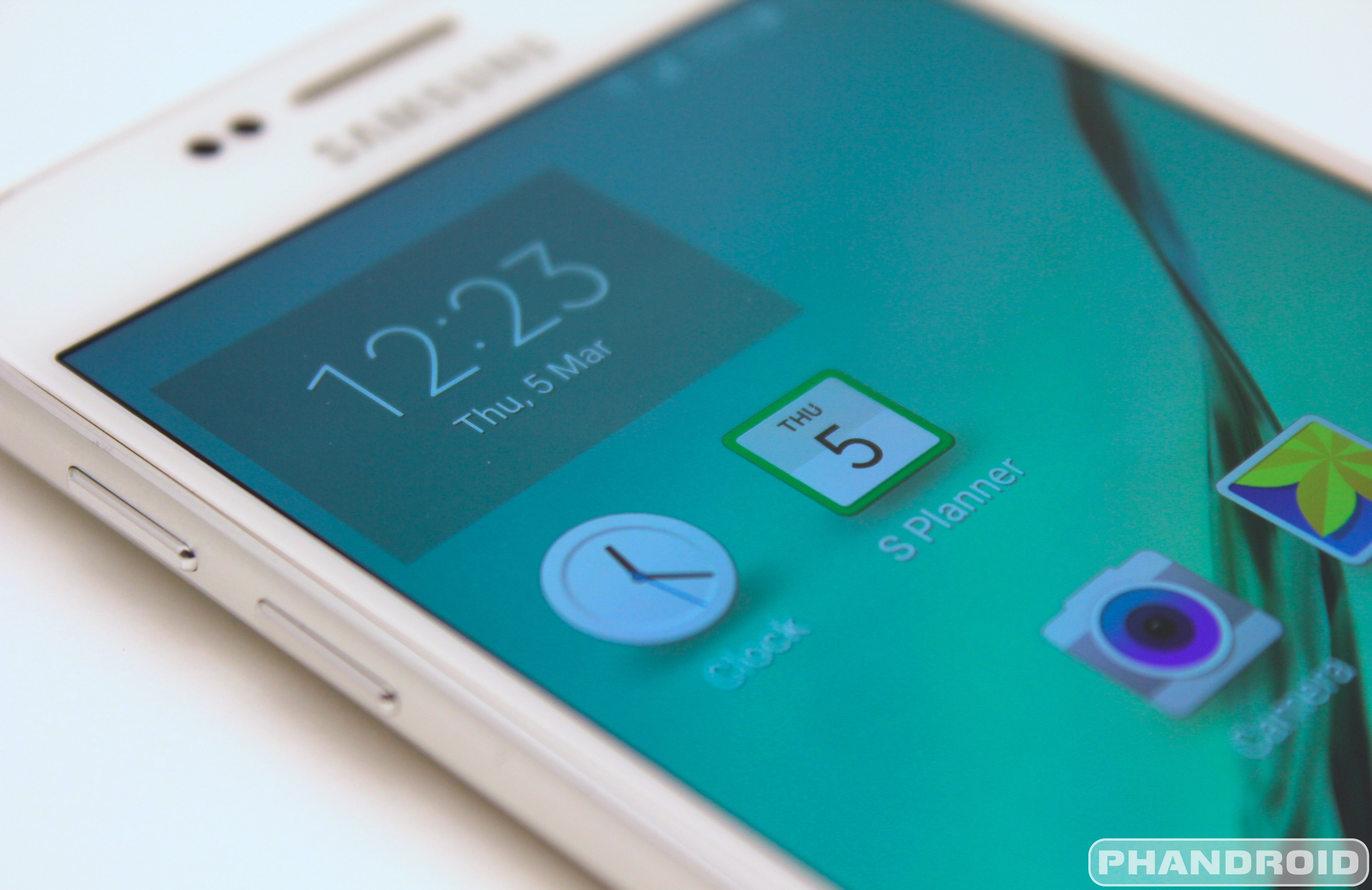
Mobile World Congress has come and gone, but that doesn’t mean we still don’t have some interesting tidbits from the show to give you. It’s not the most groundbreaking new “feature” mind you, but we think it was one many might have missed during their short time with the Samsung Galaxy S6 and Galaxy S6 Edge.
We all know Samsung made some interesting changes to TouchWiz for the Galaxy S6, optimizing performance and introducing a more user friendly UI that uses less icons and more text. While I’m still bitter the Galaxy S5 didn’t receive the treatment in its update to Android 5.0 Lollipop, another interesting, albeit, smaller changes being introduced in TouchWiz are new system icons for the calendar (S Planner) and clock applications.
Unlike previous versions of TouchWiz, these icons now appropriately reflect the actual time and date, right there on the home screen. Sure we’ve seen something similar in iOS, but it’s the little changes to Android like this that get us excited about new OEM skins like TouchWiz. FYI, the clock app icon only updates upon every screen unlock, so you won’t see it changing before your eyes.
While I’m still bitter the Galaxy S5 didn’t receive the treatment in its update to Android 5.0 Lollipop, it’s a neat little touch and yet another reason I can’t wait to get my hands on these new Sammy devices come April 10th.


So, was date and time inaccurately reflected before? O.o
Date was always “31” while time was “10:10” and 25 seconds.
Any significance to that Date/time?
Date was always 31.
3*1 = 3.
Time was 10:10 and 25 seconds.
Take the 25 and divide it by the first 10.
2.5.
Take the other 10, and divide it by 2.5.
4.
Only one common digit between the HH and MM other than 0.
1.
4 + 1 = 5.
Take the 25 seconds.
Add 5.
30.
3-0.
3.
Half-Life 3……. well you know the rest.
… Triangles also have 3 sides o.O
Three shall be the number of the counting.
Your upvotes are illegal, sir.
Don’t you think Valve knows?
They’re 3 steps ah-wait…
Not sure but the hands are on 10, 2 & 4 the same numbers that were on the old Dr. Pepper bottles but that’s probably a coincidence.
Doh! I get it. This move takes the place of 1×1 widgets – despite you saying icons, I was stuck on widgets. :p
Thanks Chris! :)
lolz
So it’s like a widget…Apple still tops the looks with that whole ‘jumping into’ the app UI. All that comes to mind for me with any of this is that it’s just a little bit more battery being drained.
Bitter much?
C’mon… he only mentioned it TWICE!!! :O
Most definitely.
I like small features like this.
Maybe I’m misunderstanding, but the calendar icon always show the correct date? No?
“Sure, iPhones have done it for a while and my stupid S5 doesn’t do it, but yay Samsung!”
The fanboy is strong in this one.
Oh, you mean like Apple’s been doing for several years now?
So has Android.
They’re called “widgets”.
If it doesn’t always update the correct time, why bother? Why not just use a small widget and use it also as an app icon, to link with the app itself?
Problem solved, non?
stop the insanity:
https://www.change.org/p/samsung-we-loved-your-phones-for-the-flexibility-please-add-micro-sd-cards-removable-batteries-and-waterproof-back-to-the-galaxy-series
Tell me this is a joke, right?
People usually start a petition in view of doing something good or meaningful. This is a complete joke. I couldn’t even describe that as ‘1st world problems’.
Seriously some people here are deluded that they have to start a petition for such a trivial issue.
Easy solution – get another device which has SD card and stop spamming every damn article with your non-sense.
Note: I am saying this as a fan of SDcard.
Enough of your non-sense.
No joke… they removed those features.
Fight the power!
https://www.change.org/p/samsung-we-loved-your-phones-for-the-flexibility-please-add-micro-sd-cards-removable-batteries-and-waterproof-back-to-the-galaxy-series
fight the power? who said those features are mandatory? dont like it, o well. you people are the reason i hate humans
suck a butt u
Really.. REALLY?! if you can’t deal with change, just go to another company, ik pretty sure there is a phone that has premium materials, SD card, water resistantance, and a removable back. Because those obviously are the only important features needed in a phone, who cares about the other stuff, who cares, because that’s all people want, that’s what every consumer cares about…. We don’t even need a screen, just let us add storage, and throw or phones in some water and take The battery out.
suck a butt
That’ll happen the day you decide to grow up, which looks like never In this case.
stop the iNsanity!
https://www.change.org/p/samsung-we-loved-your-phones-for-the-flexibility-please-add-micro-sd-cards-removable-batteries-and-waterproof-back-to-the-galaxy-series
ain’t no joke fool, the joke is in your hand
Lol good luck with that petition. Everyone asked for improved materials for a long time. Sealed backs are here to stay. The increased default storage to 32GB is a reasonable compromise.
More from apples lil brother…smh
Chronus.
Yes, I use that too. Nice, clean and powerful.
Touchwiz has definitely improved in the GS6. The new clock Widget looks so much cleaner. It would be nice to see Google add this moving icon feature into Android for their stock apps.