
It’s always nice when an app gets upgraded with Material Design. It’s like unwrapping a gift on Christmas morning. Except it’s not Christmas. And this gift isn’t physically tangible. And, well, you get it.
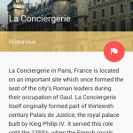
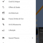
This time, Google’s Field Trip app gets some Material Design love. It still performs the same actions you know and love about it — that is, it’ll let you know when something cool or interesting is in your vicinity with a handy Google Now-like card — but it’ll be more beautiful than it already was.
The changes aren’t just visual, though. There are also tweaks to the navigation structure inside the app that make it easier to find cool new stuff, and Google says they’ve added more content from over 100 different publishers. Sounds like it’s worth the download, so be sure to head to Google Play and grab it as soon as you can.









Why does whatever device you’re using have a Lollipop notification bar with KitKat navigation buttons? Are you using some kinda half-baked ROM or something?
Aren’t most of its features baked into Google Now anyway?
This looks pretty cool, I don’t use Google Now (it never seems to come up with any useful suggestions for me).