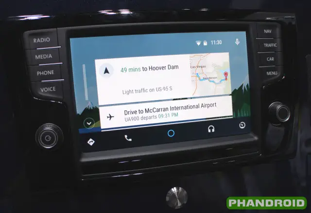
In July Google officially announced Android Auto at Google I/O. Fast forward to this year at CES and we’re finally starting to see what car manufacturers have been doing with it. First up is Volkswagon and Audi. In case you didn’t know, Audi is actually a subsidiary of Volkswagon. They have a lot in common, including their Android Auto offerings.
The Volkswagen system is very familiar looking. It has large buttons and knobs along the left and right side of the touchscreen display. In the demo we were given an iPhone and Nexus 5 were connected. You can choose which interface (Car Play or Android Auto) to launch from the menu. From there it’s your typical Android Auto experience.
The Audi system is much different. It has a big touchpad with buttons all along its edges, and a giant knob for scrolling through menus. The touchpad is very important because the display is not a touchscreen. Like the VW system, you have to launch Android Auto from the menu (skip to 3:00).
What do you think of these in-car systems? We’ll have to side with Volkswagen if we’re choosing a winner. The touchpad from Audi seems like a big distraction for drivers. They even advertise that it has handwriting detection! Kids, don’t write and drive.


Thank God Volkswagen doesn’t outsource their ui design to the Kenwood designers
Seriously, was so looking forward to seeing this, but this is a minute and a half of pain. Nearly unintelligible audio, with very poor video quality on top of that! C’mon, guys, this should’ve been SO much better.
The touchpad isn’t new; it’s part of Audi’s MMI interface. It’s regarded as one of the best infotainment interfaces in the industry, I believe.
I’m glad to see that they’re not trying to reinvent MMI; rather, they’re modifying the UI of the MMI platform.
The Audi UI is a horrific complex mess! It looks incredibly distracting and takes way too much interaction to accomplish a task. Who is going to do handwriting while driving? Scary.
that ugly complicated ui will cause many crashes
Joe, yes touch screens are great, but if youve been in an audi or a BMW within the last few years, they dont put the screens down on the console, they put them up at the top of the dash….ie…out of arm reach. This means that the touch panel allows you to interact with the screen, not fingerprint it up. The control knob, like BMW idrive was at first scorned, but quite frankly I have no problem with it at all. infact, I like the solution and have no problem with the Audi design.
As has already been mentioned, the Audi version (with touchpad) is simply an evolution of the MMI interface that they’ve already instituted in their vehicles. I have a current Audi, and while I skipped the handwriting detection (comes with the navigation package, and I use my phone for navigation, so I didn’t want that), the rest of MMI is clean and easy to use, so I’d imagine this is more of the same.
Either way, I just want that WebOS watch.