 Solid Explorer has always been, well, solid. In fact, it’s always been more than solid, and its developer has always tried to stay true to Android’s design standards and practices. That’s no less true today, as the first alpha release for version 2.0 has been released for those opted into Solid Explorer’s Google Play beta program.
The first thing you’ll notice is literally unmissable: Material Design. Material Design, everywhere. It’s in every corner of the app, with the developer making good use of white space, a good crop of lush animations and one of the most beautiful sliding drawers we’ve seen.
File management apps aren’t always expected to be the best designed — in fact, I sometimes wonder if most developers actually make it a point to make their apps super ugly — but Solid Explorer has once again proven that design is just as important for a file explorer as any other app out there.
Want in on the beta? Join their Google+ community here, then head here to opt into the Alpha program. The alpha update may take a while to show up on your device if you already have Solid Explorer installed so be patient and wait for its arrival. Oh, and if you want the full experience you’ll need to drop $.99 for the Unlocker (that’s 50% off its normal cost for a limited time), which can be had right here.

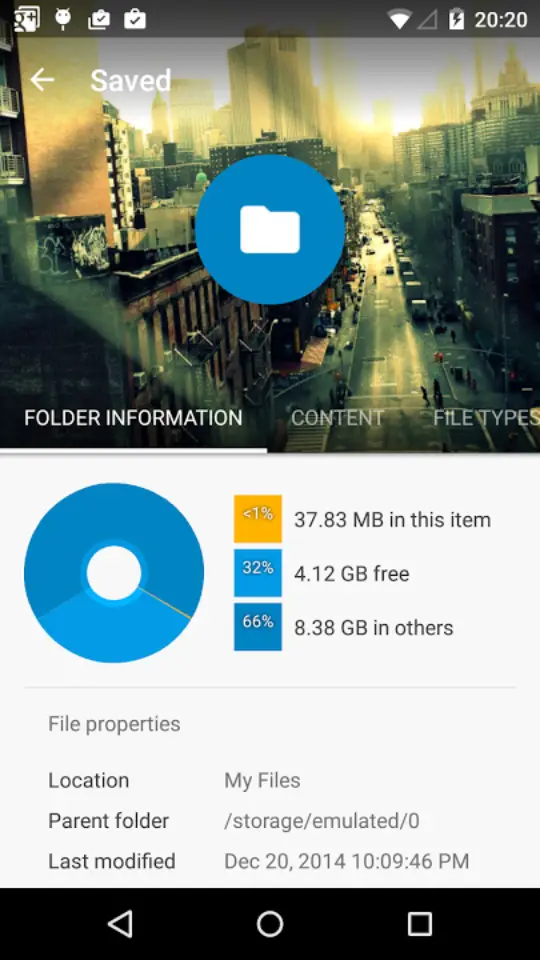




The screenshots are pretty, but I don’t think I’ll be switching from ES.
Can you give a particular reason why you prefer ES? I’ve use ES for awhile, but it just looks so dated. I’m running Lollipop on all my devices now, and my OCD is kicking in.
It’s not so much a matter of preferring it over Solid Explorer, because I haven’t tried Solid Explorer. I just don’t feel the need to try yet another file manager, even though it does look very nice. Functionally, whenever I think of something I might like my file manager to do, I find that ES already does it. Not to mention some things I would never have imagined: Lately I’ve noticed when I am uninstalling an app, and the app uninstall leaves
some junk behind, ES pops up a dialog saying “I cleaned that out for
you.” Oh, and it’s free.
Edit: I also have a small personal problem with the name. As someone who works for a CAD software company I expect an app named Solid Explorer to be a 3D model viewer, not a file manager.
I use ES as well as it works great. But I think I’ll give this a whirl. Maybe try it for a few days after the update comes out and if I like, maybe I’ll switch. Certainly can’t hurt since the trial’s free.
What can I say, I like to try out new stuff.
I love ES, but I wish they could make it look nicer. ES is a swiss army knife for any Android device, and it’s free (including root explorer functionality). I’ll gladly throw a few bucks at the ES dev if he promises to spend it to improve visuals.
Very Nice Looking,,, I will give it a shot… Thanks
Bookmarking for after Christmas when I can cash in on all these Google Play gift cards :D