
Android Wear has already improved a lot since it was first announced. There is still a lot of room for improvement. Now that the hype and excitement has worn off I can look at my smartwatch more critically. I like Android Wear a lot, but it’s far from perfect. There are several things that really annoy me when I’m using my Android Wear device. Here are 7 things I hate the most about Android Wear.
1. Card/Notification Management
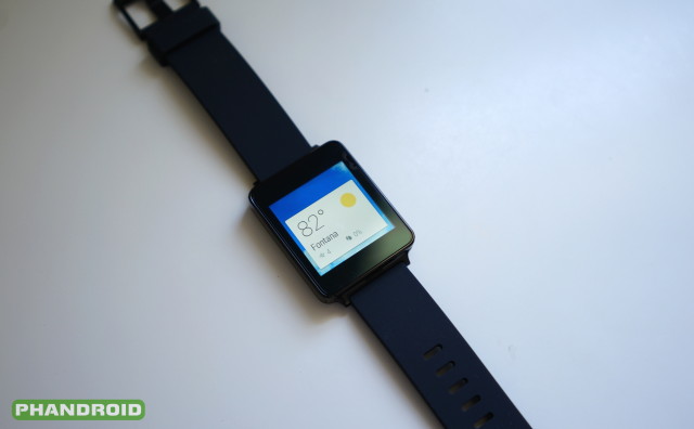
The biggest thing I hate about Android Wear is card management. Cards can be notifications from your phone, Google Now cards, or prompts from Wear apps. No matter where the card comes from interacting with them is the same. Swipe from the left to remove it, or swipe from the right to get more options. It’s a rudimentary system that desperately needs more.
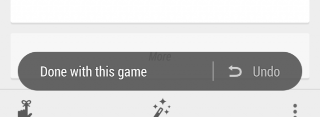
Can’t Undo – If you accidentally remove a card there is nothing you can do. It’s gone forever. Sayonara. That’s a major problem. Swiping away cards in the Google Now phone app has had a solution for this problem for a while. A simple toast notification pops up and asks if you want to “undo” removing a card. Android Wear needs something similar.
Viewing Old Cards – Seeing old cards/notifications would also be nice. For example, when using your phone you can open Hangouts to reference an old text message. I should be able to do the same on my watch. It would be nice if there was a sort of “notification center” that showed a history of dismissed notifications.
Card Order – As it is now, the stream of cards is pretty much decided by Google. Most of the time it’s not an issue, but there are certain occasions where I want the control. I wish I could pin certain cards to the top of the stream, or send other cards to the bottom. There are also times where I would like to remove a card from my watch, but keep the notification on my phone.
Cards and notifications management needs to get a lot better.
2. Card “Peek” Size is Inconsistent
One little thing that annoys me is the inconsistent size of cards in their “peek” state. This is what you see when a card is sticking up over the top of your watch face. On some watch faces the card is small and discreet, but on others it takes up half of the display. The latest Android Wear update made the situation even worse, as you can see in my Google+ post above.
I would love to be able to choose what size is used. Right now it’s determined by the watch face you use, but I think it should be a universal setting in the Android Wear companion app. The best solution right now is to choose “None” in the “Card preview” settings.
3. Launching Apps
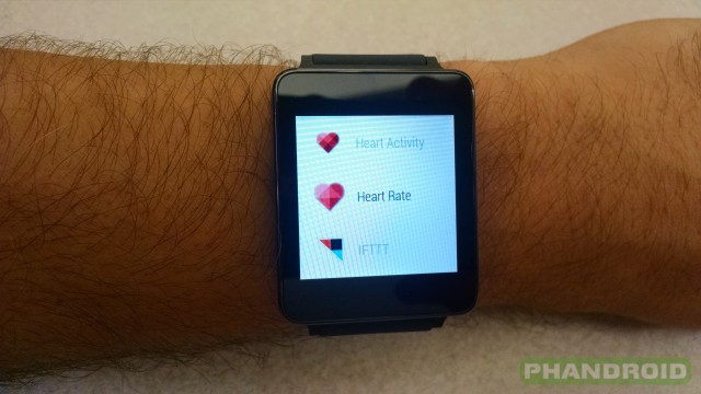
This one is tricky. I can recognize that launching apps without your voice is a pain, but I don’t think the current 3rd-party “launchers” are the answer. A launcher just doesn’t feel right on a watch. But still, the process for launching apps needs to be better. It can even be difficult to use your voice if the app you’re trying to open has a strange name (such as IFTTT). What’s the answer to the problem? I’m not sure. I’d like to see more functionality from the hardware button the Moto 360. Maybe a double-click goes straight to the app list?
4. Built-in speaker
Speaking of talking to your watch, one thing I really miss is the ability to hear answers aloud. When you perform a voice search with Google Now on a phone you usually get a nice spoken reply. Android Wear devices don’t do this. Granted, this is not so much a problem of the software as it is the hardware, but we haven’t seen any manufacturers add speakers. I’m wondering if that is due to a limitation set by Google or a product of trying to make tiny devices. It would be nice to have the option to hear responses.
5. Can’t Choose Default Messaging Apps
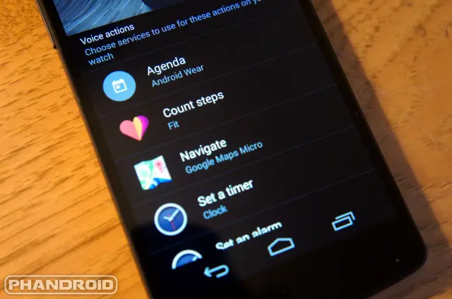
The Android Wear companion app allows users to choose default apps for navigation, playing music, setting a timer, taking notes, and much more. One thing that is missing is the ability to choose a default app for sending messages. If you want to send a text message you are stuck with using Hangouts, and if you want to send an email you have even fewer options.
Android allows users to choose a default SMS app, and it uses that app when you use Google Now to send a text with your voice. Why can’t Android Wear do the same thing?
6. Muting Google Maps Navigation mutes it forever
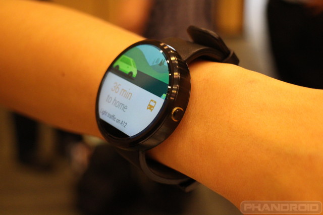
One of the coolest features of an Android Wear device is getting Google Maps navigation instructions right on your wrist. The device will vibrate your list every time a new direction comes up, and you can still hear instructions from your phone if you wish. It’s really cool. However, a few weeks ago I found a really annoying bug.
I was using the awesome Google Navigation instructions on my watch when I decided to pull over to stop for food at McDonald’s. As I’m walking into the building my phone continues to shout at me to make a left turn. I tap the “mute” button from my watch expecting it to silence the navigation until I’m ready to drive again. Little did I know that I was actually adding it to the list of apps that can’t send notifications to the watch. This was very confusing to me when Navigation suddenly stopped appearing on my watch.
7. Content Gets Cut Off on Round Display
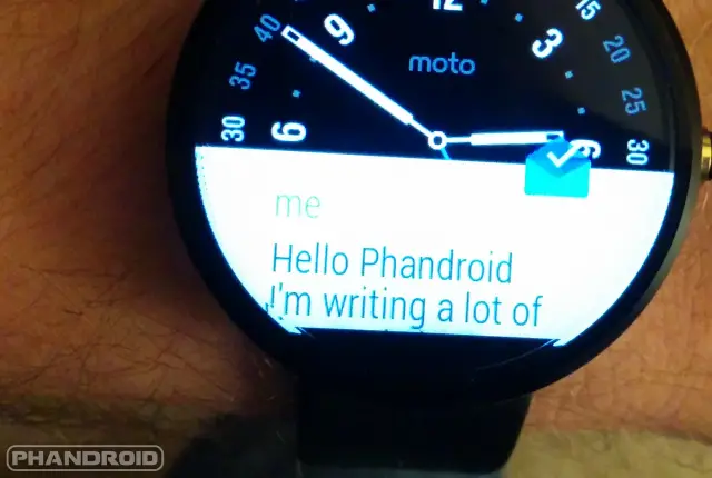
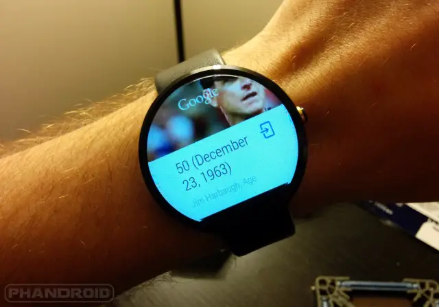
When Google announced Android Wear they were very proud that it could work on both square and round displays. It does indeed work on both shapes, but the experience is not the same. I assumed that Android Wear would show content slightly differently to accommodate for less screen real estate on round displays. I was wrong. Some content gets cut off by the round shape of the Moto 360 display. If Google wants OEMs to continue making round displays they need to make the software adjust accordingly.
***
Overall the pros outweigh the cons when it comes to Android Wear. I’m very happy with my experience, but it would be even better if these things were fixed. What things do you hate about Android Wear? Do you agree with the list I’ve made? Let me know below if these things annoy you too, and share your other complaints about Android Wear as well. Google, are you listening?





In regard to Hangouts on the watch (and I guess Android Wear in general), can you use it to send/receive Google Voice messages, missed calls, etc?
8. Having to babysit another device. Not only keep it safe, protect it from damage, but you have to feed the thing daily. Just 1 more device one has to babysit. And, arguably, a device that just mimics the other device you already have in your pocket.
True, but I might buy one just for the Maps app, and take it on long trips. Would be nice not having to dock the phone and keep it turned on for turn-by-turn nav.
True, but make sure it turns your screen back to normal, and or back on with each new direction. Burns up battery other wise. I know from Experience Galaxy gear.
But that’s the Fun with Electronic Toy’s.
“Fun with Electronic Toy’s.” has a ceiling effect on ROI.
Speakers are going to make it bigger and probably harder and more expensive to make waterproof. Maybe beeps like some watches can be used.
not accurate. all samsung gear watches except the androidwear one have a perfectly functioning speaker. all are just as water resistant and are the same approx size..
Good to know. Thanks
Note that the speaker on Samsung’s watches is in the wristband itselft and not on the watch.
yeahh thats a no go for me then…and i still dont see the need for a speaker on my watch…i dont wanna look that stupid speaking to my watch and it responding
Not true. Only on the Galaxy gear 1. The Samsung gear 2/neo have user replaceable bands.
Thanks. So again speakers can make the phone bulkier.
One new addition I’d love to see: NFC for Google Wallet!
How exactly would you scan your watch? It’d be pretty awkward.
walt disney world uses NFC bracelets (magic bands) as tickets and a payment system(linked to your credit card)…not awkward at all.
You scan from the inside of your wrists? In which case you have to have the nfc in the strap. Which would make replaceable straps expensive. If you scan from the face, it’s a little awkward twist of the hand. But doable. It’s the same problem with a qr code, if the scanner is in a fixed location.
agreed! i hate to bring it up, but apple is including that feature in their watch. im surprised google didnt push that from the start!
#3. My galaxy gear, got a app called all apps Launcher. It cuts out all the bull, swipe kick stomp flip. Just tap on the app, bingo. I know Android Wear is starting out but it can be done. Put the app Launcher icon on the face of the watch. No more swipe kick stomp flip.
Kick stomp flip? Did you forget to take your Adderall today or what?
Lol
As to 7. Content Gets Cut Off on Round Display
Given the fact a square can show more info than a circle, since you can go edge to edge in all 4 corners, it truly surprises me that so many are circle. And, so, I am glad to see others voicing this irritation.
Yes, squares show more info than circles.
The point about content getting cut off on round displays, however, is only relevant to the Motorola 360. Since the Motorola 360 is virtually a bezel-less device, there needed to be some space to fit some of the electronics of the display, hence the black space at the bottom (functioning as the bezel). The LG round watches don’t have this problem because those displays don’t get to the edge of the device.
The cut off has nothing to do with the bezel – it’s on both the 360 and the LG G Watch R. I’ve seen pictures showing the exact same problem as on the 360. Just an issue with squares being used in circles.
Yep… in a circle you can only use a square of info, so the square is smaller. On a square watch you can use a square of info and thus.. edge to edge and corner to corner.
OEM’S concern. Scroll baby scroll.
this one is so overstated…just bc i cant see the botton left of a letter and the bottom right of a letter doesnt mean i dont know what the message says…this is so nitpicky…if its a problem for you your a simpleton
I really am liking my moto360. But I guess I knew I was getting a device to work with my other one, not replace it. And it does that well.
this guy gets it
If you feel this recording is in error, please rotate your arm in full circle to hang up, or a quick jabb to redial. Bio jesters sheeesh!
Agree with most points made in this piece.. I’m disappointed that the cards (although they work) don’t look like they’re made for round screens at all.. with Google’s design philosophy going full steam in recent times its a darn shame they didn’t implement it better..
Also the screens need to be higher res as there’s limited real estate.. there’s no substitute for a real face watch however with super high res ppi it gives the opportunity to developers and designers alike to express their visions more robustly without so much hindrance of hardware limitations.
Another point that’s been bugging me is the battery.. I really hope we start seeing these babies last longer than they currently do..
the battery life is outstanding! I get about 16+ hours with moderate to heavy use. the battery issue was an early programming issue that has since been fully corrected
I don’t need to charge my MTM special ops watch each night nor do I need to wind my omega on a daily basis..
I’m not going to demand month long battery life but it should be at least a few days with future iterations aiming for a week! That’s where the next evolutionary steps need to head – battery life!
I’d love Smartwatches to be able to monitor heart rate whilst resting / sleeping as well as having alarms which vibrate on your wrist.. These could be powerful and useful features which aren’t really feasible due to short battery life :(
I don’t know of many smartphones that I can use normally for two or more days without recharging. if the phones need to be refueled, i cant expect a device 1/4 of the size with similar capabilities to do the same. I guess it’s just a matter of lowering expectations or waiting the tech out a few years before reality catches up to desires!
Agreed! But these ain’t phones! Lol! That’s why its going to get infuriating when Apple starts boasting about something magical next spring! Arghhh!
I really want Android Wear to succeed which is why I’m secretly praying Google has some of their brightest and best trying to figure out battery life solutions!
dude…stop it…its not comparable to a reg watch that does nothing but move tiny mechanical parts…its a fkn lcd screen being powered on your wrist thats alwasy connected to your phone…battery life is a NON issue since the update on my 360
Well now I’m not so certain I still want a smart watch. Thx Joe
Give it another generation or three. Both the hardware and software are bound to improve. Android 1.0 and first gen phones were pretty weak, too. I figure most of the current generation of “smart” watches will be on sale for $49.99 after Christmas, when manufacturers and retailers discover the still have 80% of the pre-holiday inventory available..
I’ve always thought the round design was dumb. It’s obviously just for aesthetics. I’m pretty sure I’ve never seen any other media in a circle. IE, I’ve never seen a magazine or book in a circle. It just doesn’t make any freakin sense.
its a watch…watches are round…tvs arent round…but then again your not supposed to wear a tv on your wrist
I think that bottom black bezel is just on the 360, the G Watch R is round and doesn’t have it, right?
You are correct.
Bottom bezel doesn’t bother me one bit. I don’t know what the uproar about it is all about.
The diver’s bezel on the GR seems far more ridiculous than the “flat tire” on the 360.
I agree, the screen looks tiny surrounded by what looks like wasted space.
yes they hid it by making a bulkier watch and smaller screen…its not some advancement that moto couldnt do which i love how people think
I see the K’Nex on that table :) Glad to see other people have my favorite toy too!
This couldn’t be written earlier today?! It’s too late for me, all the postings about Wear and I went for a black metal 360 today. Woe is me.
All of these complaints are really minor when taken in the context of the whole experience. And remember: Wear 2.0 is coming out soon, and most assume it’ll get it’s full polish then.
Tell me when these smartwatches actually become useful. Oh, and with battery life measured in days, not hours.
Because you don’t charge your phone every evening? You’re already in the habit of charging devices when you go to bed, it fits nicely into that habit.
How exactly is a battery small enough to fit in one of these devices supposed to power a full color screen, a cpu/gpu, and all the various sensors and last more than 24 hours?
I dunno… that’s not my engineering problem to solve. I buy things that are fit for purpose, not for the novelty. A watch needs to be able to tell time accurately. There’s nothing worse than a watch that can’t tell time at all (because of a dead battery or otherwise). Don’t need another device that I have to babysit!
#1: You have to wear something annoying on your wrist. NEVER AGAIN. ;}
Battery life?
I have yet to worry about it. Mostly because I just don’t find wear all that useful at home. I put my watch on the charger after work and it’s usually got 40% left, with ambient screen turned on.
I wear it from around 8 in the morning to around 2 in the morning. And it’s got about 30% left every day. Now that doesn’t include playing music on it directly. I don’t know how much that would consume. But I presume you’d do that for a jog or something. In which case you should be able to drop it in the charger while you are taking a shower. A 20 minute charge should be sufficient for the rest of the day.
#5 – Isn’t completely true. I use EvolveSMS as my default texting app and I can reply and interact with my texts through Android Wear – I don’t use Hangouts.
That last one only applies to the 360, no?
And the LG round.
I thought that the LG G Watch R was a 360 degree screen w/o the cutout?
They don’t just mean the cutout, look at the letter “I”, it’s cut off by the round edge. Same would happen on any round display, & happens quite often.
Ah, I get it now! I was just missing the obvious! Thank you!
good list i got to agree with most if not all…great thing about this list is they seem to be easy fixes from the guys over at mountainview and i wouldnt doubt we see them in the not to distant future…android wear works pretty damn well for what i want out of a smart watch…i love never missing and important phone call if my phones on mute bc my watch is vibrating…another i would add to this list is the vibrate itsself…seems to have a mind of its own depending on the app…i feel the fb vibrate is way to long and prob drains battery a bit faster bc of it…i wish i could control the vibrate length to make it a very simple n short buzz…also when u get a phonecall its consistent and its not very discrete in front of the boxx lol…prob all i would add to this list…that and i want the api released for watch faces already
Great list, I agree with all of them, and also love my Moto 360.
people are writing battery life and it makes me laugh…i havent had any issue with bat life unless i slept out of my house and hadnt had a chance to throw it on the base for 10 minutes before i did…blasts through my work day and is full charged by the time i change to go out afterwards and lasts through the night…please people relax with the argument get a pebble if you want that type of life
i went look at the moto 360 yesterday, i personally think its ugly….. and i cant believe im saying this but after seeing the gear s. i really lik the look of it, im just not about to buy a samsung phone just to own there watch
You buy it for what it is.
I wanted a watch that I could change the face on, see the temperature, do a quick search, and see notifications. I expect nothing more from it.
Everyone has their own opinion on what the worth of that is. And that’s all it is, YOUR OPINION. IMO, it was worth it for the price, so I bought it. And I still love it. Will everyone feel that way? No.
On another topic, since you guys seem to love doing Moto360 articles and how-tos and such, I would love to see a guide on care of the leather bands. The black band is the glossier leather, but the gray is suede-like. And it really starts to look like crap over time. If you would show people a guide on taking care of and revitalizing the gray band in particular, that would be awesome!
I think the list is spot on. I just received my LG G watch which I bought refurbished. As much as I like it, I think the 2nd generation Wear devices and software will be much better than the 1st generation devices currently available. I don’t recommend spending a lot of money on ANY of the 1st generation stuff. You will likely want to replace it very soon….
Hopefully the 1st gen devices will be updated with the 2nd gen software…if the hardware will be capable of running it.
Of course they well be updated. That update is coming very soon. Google said by the end of this year.
please please please moto please add a function to only wake when i double tap. Because when i do a 3 hr long run my battery dies. Thank you.
Aside from the messaging app complaint, I have NONE of these complaints As for content “cut off” on the round watch face, all you have to do is tap it, then you can scroll it up to read the rest. You can also swipe to the left, after tapping it, to see the full stream of scrollable text. And I most definitely don’t need/want a speaker.
Also from what I’m reading, the reason that the notification is smaller on some faces and not others is because there is no customized watch face SDK yet. It shows up bigger on all custom faces and smaller on the built-in faces.
Well, even within the built in faces, notifications are different sizes on the Moto 360. When you choose an individual watch face, it lists the size of notification as a “feature” of that specific watch face. It’s how Moto “designed” that particular watch face to look.
I’m surprised that there’s one missing in this list. how about cards that never stay dismissed? when i got my G Watch it would, twice a day show me the current step count. swipe away the card to get my weather back (i prefer weather on all the time when i’m not getting notified of anything else) the step could would always come back within seconds, sometimes minutes. it refused to stay away. some other types of cards come right back as well, enough that i had to kill certain functions in Google Now to work around the issue. Google, when i swipe a card away, i don’t want it back in my face in a few seconds!
Are you sure you couldn’t dismiss it when it showed a notification an it’s own and not when you asked it for your steps? I have never had a problem dismissing it when a notification pops up on its own. But I think when I asked for it, it displays the steps again when I swipe up.
That muting notification on an app stops showing notifications completely for that app drove me crazy.
One of the primary reason for me getting the watch was to set a timer so I could quickly glance at the watch to see how much time was left. When I got it, it worked perfectly. And then it simply stopped showing me the timer notification while actually buzzing when the timer elapsed. I rebooted, then reset the watch. Nothing. It took another half hour until I stumbled on the muted apps list in the settings of the accompanying Android Wear app. That’s when I remembered that I had inadvertently muted the app on the phone.
Very poor discoverability for a first time user!!
You can use Torque v. 1.5 to launch app by twisting your wrist: https://play.google.com/store/apps/details?id=com.microsoft.bing.torque
#2 is solved by using the android wear app on your phone and selecting [card preview> none] This hides cards until you want to view them. Basically your wrist vibrates and when you wake up your watch, nothing is on the screen until you swipe up. Great improvement added in the last update. #6 has a spelling error in the second sentence. Wrist, not list. #7, just tap the message and swipe up to read the whole email. Buying a round watch would have to come with some limitations. I think those limitations are solved by expanding apps by tapping on them. Its like you bought a round phone and wish it was square….Oh wait, you did buy a round watch and complain because it’s not square.
How about a built-in shower mode? I hate taking it off before I get in the shower and when I’m actually wearing it, it FREAKS out when it gets showered on. I would say a simple moisture sensor would solve it, or, if the screen begins to freak out, let the software figure out that it’s under water and turn off the screen.
Mine sends texts via EvolveSMS just fine. It is the default app on my phone. Also the biggest thing you didn’t mention… Editing mistaken words.
Keep up putting the pressure on Google. By the time I get an Android watch a year or two from now, I want these problems fixed :)
Thank you for sharing the Android Wear experience. I’ve been trying to understand the utility from the hype, and you made a better case of explaining it through its flaws than 5 months of it being explained through its features.
“If you want to send a text message you are stuck with using Hangouts, and if you want to send an email you have even fewer options.”
Fewer than one?