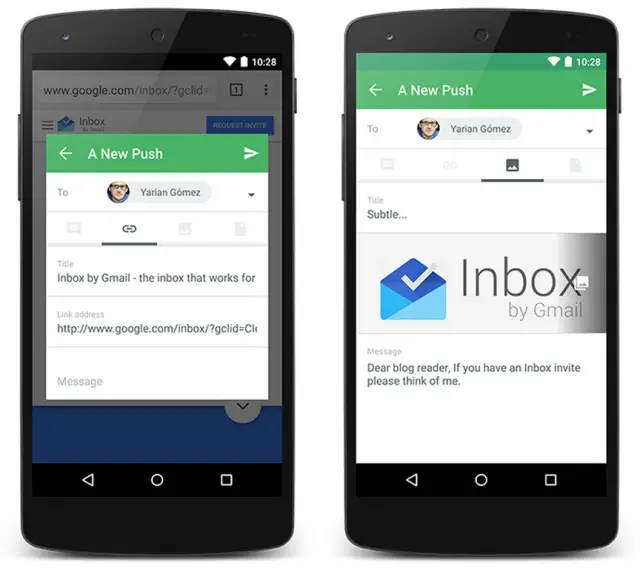
Pushbullet, whose developers are seemingly the fastest on the face of the planet, has gotten another big upgrade today. The biggest highlight by far is the makeover it’s gotten — this thing is full-on Material Design, baby. The company has embraced Material Design down to the “T” as they’ve always looked to follow the latest design standards set by Google. Key visual upgrades include better use of white space, a card-like interface with floating action buttons, the new sliding hamburger drawer and lush animations.
Here are some of the other changes included in today’s upgrade:
- Improved navigation
- Convenient push search options
- Streamlined settings screen
- Better new push form
- More robust and reliable notification pushing
That sounds like it’s worthy of a few megabytes on your Android phone or tablet. Pushbullet notes that there are a couple of UI things that need cleaning up, though they’re already planning on a smaller house cleaning patch that should address most of the issues in one fell swoop. The issues aren’t big — just a couple of quirky kinks that need working out. Be sure to find the latest version of Pushbullet over at Google Play.
[via Pushbullet]






LOL @ ‘healthy load’
ha
The 15.0.1 update appears to be out too. It says “few bug fixes” so I’m going to assume that’s the patch mentioned at the end of the article.
I think so. Either way, I’m loving the new update.
App of the year!