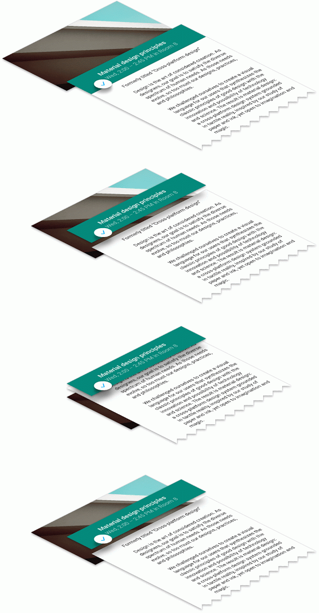
Material Design is the biggest design language shift we’ve had since the jump from Gingerbread to Ice Cream Sandwich, so it’s understandable if some developers have a tough time making sure they’ve hit all their marks when updating their applications. As such, Google has released a handy checklist guide to make sure you’re setting up your elements, layers and goodies the way they should.
Of course, guidelines are only guidelines and you don’t necessarily have to follow them to the letter, but users will appreciate familiar behavior when jumping from app to app so developers should definitely try and make sure they’re getting as close to Google’s suggestions as possible.
The document goes over animations, shadows, context-sensitive elements and buttons, and more. This will be what all of Google’s material design apps go by going forward so you can be sure this is the way to go if you want to keep up. Be sure to give the guide a full look over at Google’s blog post on the subject and get started on implementing those changes as soon as humanly possible!


Comments