It’s been a roller coaster of events for Motorola these past few years. As sales of their once widely successful Droid line began to dwindle, Motorola seemingly found new life in Google after the internet search giant officially bought them for $12.5 billion back in February of 2012. A sort of rebirth for the company, soon after they were rebranded “a Google company” and launched another flagship under new management — the Moto X.
Built with an entirely different vision than previous efforts (a more Google-y one), the Moto X avoided getting caught up in the smartphone arms race of offering bigger, badder hardware specs and heavy custom UIs. Instead Motorola took the road less traveled, keeping things relatively simple by offering an almost completely stock Android interface. From there, they looked to improved upon the user experience by adding their own specialty apps that complimented the core OS, not tried to hide it.
Ultimately, the Moto X wasn’t the breakout hit Motorola (or Google) thought it would be and in January of this year, Google sold Motorola to Lenovo for $2.9 billion. Back at square one, Motorola is giving it another try for 2014 with an all new model, the Moto X (2nd Gen). The new Moto X looks to address many criticisms of last year’s model by offering true flagship specs, while building upon the Motorola apps and services that set the original apart from its competitors.
There’s no question Motorola has a lot riding on their latest flagship and with a new recipe for success, will the new Moto X be enough to capture the hearts (and wallets) of consumers looking for a next-gen smartphone? Or will phone fold under the pressure from heavy weights like the Apple iPhone 6 and Samsung Galaxy S5? Find out in our full review of the Motorola Moto X (2nd Gen).
Design / Build quality
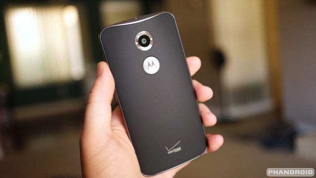
Last year’s Moto X had a very Google/Nexus vibe to it. Motorola went with a nearly all plastic housing, something that could be easily assembled at their Fort Worth Texas plant. Although Motorola now plans to shut down that facility by the end of the year, it seems they wanted to go out with a bang, improving the build quality of the older sibling in just about every way.
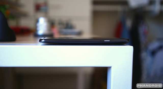
If you had to describe the new Moto X with a song, Daft Punk’s single “Harder, “Better, Faster, Stronger” is the first to come to mind. The phone ditches last year’s all-plastic design in favor of something with a little more metal. Similar to the iPhone or the new Samsung Galaxy Alpha, the new Moto X now offers just a taste of metal with an aluminum frame that wraps around the sides of the device.
The frame isn’t just pretty, it also acts as an extension of the internal antenna to help boost signal quality. Along the sides, the frame starts off thicker in the middle, the shrinks to almost nothing towards the corners. It reminds us a lot of the sides of the HTC One M8, which in all honesty, were a little difficult to grip given the small surface area. The new Moto X makes the same mistake, and because the sides feel like Teflon, the phone repeatedly slipped from our hands and onto our face while laying down with the phone in our bed.
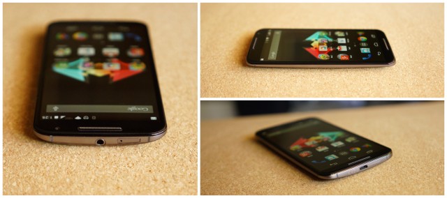
On the front of the device, you’ll find the smooth Gorilla Glass 3 is beveled around the edges, creating the most satisfying experience when sliding your finger from the sides of the device (grabbing sidebar menus and such). It’s not the first time we’ve seen this on a smartphone (iPhone 6 has a similar glass front), but the new Moto X is the first Android device in a long while to go with this design. Buried underneath each corner of the glass are low-powered IR sensors Motorola uses to detect movement. They’re virtually invisible with the black housing, but somewhat of an eyesore on the white model.
Keeping the design language of the Moto E (and now the new Moto G), the new Moto X now also features a front facing speaker. Unfortunately, unlike the new Moto G, it’s only the bottom speaker capable of outputting loud sound for media, with the top acting as little more than a simple earpiece when making calls. Quality on the front facing speaker was nice and loud, but not as tinny or ear-piercing as we’ve heard on other devices. It seems Motorola tuned it to have fuller sound, but it’s nothing near the quality you’ll find on the HTC One M8. Interestingly enough, the aluminum speaker grills actually protrude a bit from the front of the device, keeping the new Moto X’s glass slightly raised when laying the device face down on a perfectly flat surface.
It’s the back of the device where the new Moto X shows off all of its personality. You’ll find a huge camera hole on the back, made even larger with a clear ring to position the dual LED flash around the lens. We loved the way the entire camera/LED unit is incredibly smooth, making for easy wiping of fingerprints that sometimes accumulate on the lens.
In somewhat of a new tradition, Motorola kept last year’s dimple but this time cut out a hole especially for it, slapping an aluminum “M” logo inside. While it looks great to have such a prominent display of the company’s branding, it also acts as a reference point when holding the device, allowing your index finger to quickly find and rest inside. All these small details make for a smartphone that feels absolutely wonderful in the hand and looks even better.
Making a return for the new Moto X is Motomaker, Motorola’s online tool that allows anyone to customize a Moto X to their liking using a variety of back cover options and trim colors. Prospective buyers are given a choice of either a black front /gun metal frame, or white / silver frame combos, and more back cover colors than you can shake a stick at.
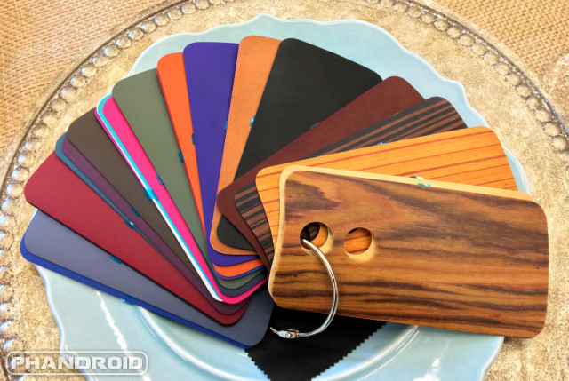
Pretty much all the colors of the rainbow are covered if you’re looking for traditional plastic (black is the only color to offer a soft touch finish). But for those willing to pay a little higher premium, you can upgrade the material to wood or one of Motorola’s all new leather options for an extra $25.
Leather comes in black, natural, cognac, or navy blue colors, while woods are available in walnut, bamboo, ebony, or teak finishes. If you want to build a phone that truly stands out from the crowd, these are definitely the way to go.
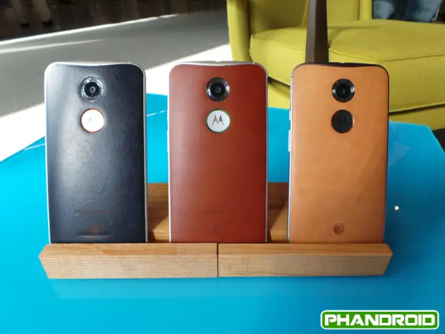
In a day and age where smartphone manufacturers typically hold onto new color combinations for carrier exclusives, gradually releasing new colors of their popular handsets months after launch, it’s refreshing to have so many options available right off the bat. Not only that, Motorola is the only manufacturer to offer such unique and premium materials in their smartphones, and with this level of style and personalization.
Up until now, it’s something we’ve only seen with sneakers (NIKEiD) and nobody — not even Apple — can touch that. Motorola has definitely carved a niche for themselves, but whether or not the soccer moms and Joe Schmoes will take notice (or even care) remains to be seen.
Hardware
There’s no question the hardware specs in last year’s Moto X left many feeling like something was missing. And there was. Although you can argue all you want that high-end hardware doesn’t always equal a good end user experience (Samsung devices are proof of this) — it certainly helps.
For this year’s Moto X, Motorola is pulling out all the stops (well, most of them anyway), packing their latest flagship with many of the high-end specs you’ve come to expect from a 2014 flagship. It’s all here. Aside from a minimal increase in battery (we’ll talk more about that later), you’ll find a 1080p display, Snapdragon 801 processor, 2GB of RAM, and a 13MP camera.
It’s clear Motorola wasn’t going to settle with mid-range this time around and while the hardware specs weren’t too ambitious, there’s enough here that performance should be top notch. They’ve learned their lesson and with so much riding on the new Moto X, let’s check out everything the phone now has to offer for 2014.
Display
On the front of the new Moto X you will find a much larger 5.2-inch 1080p AMOLED display, a pretty sizable increase when compared to the 4.7-inch/720p of the previous model. While many original Moto X fans consider 4.7 that sweet spot (I’d have to agree), Motorola did do a bang up job at keeping that bottom bezel as small as possible, while still having enough room for a front facing speaker.
Make no mistake, the new Moto X is certainly larger, but when compared against devices like the Nexus 5 or HTC One M8, the overall footprint of the new Moto X was kept small, while extending the display. And because the bottom bezel is so small, the display actually sits lower than even the Nexus 5 which helps your thumb reach most UI elements without overreaching or stretching during one-handed use. That means grabbing the notification bar with your thumb wont be a problem like it is on some devices.
Seriously though. A 5.2-inches is probably the largest sized display we can comfortably handle (we’re big on the while one-handed use thing) but those coming from last year’s 4.7-inch model shouldn’t have many difficulties adapting to the size. For next year’s Moto X, Motorola need only focus on shaving off a few millimeters from the bottom bezel and we’ll be happy.

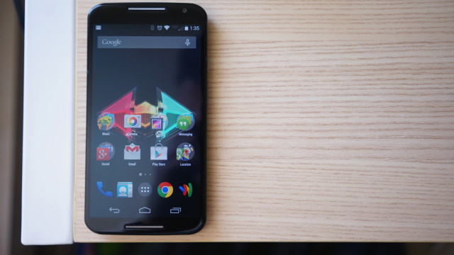
Moto X 2014 at its lowest brightness setting
As we mentioned previously, the new Moto X is once again using an AMOLED display and because of that, the usual pros and cons apply. Blacks are much darker than you’d find on traditional LCD displays (this has power consumption benefits as well) and colors are over saturated (but we kinda dig that).
We will say, it seems Motorola has turned down the saturation just a tad for the new Moto X, but we’re sure it has more to do with the newer Samsung panels they’re using. On last year’s model, viewing photos in Instagram or in the Gallery app showed noticeably orange skin tones. For the new Moto X, everyone still looks very much like a normal human being and not so much like an Oompa Loompa.

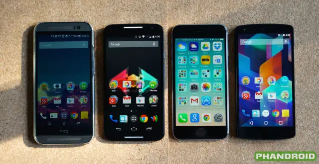
HTC One M8, Moto X 2014, iPhone 6, Nexus 5
The display does have the typical AMOLED yellow tinge to it, something you’ll notice when viewing whites but can affect other colors like blues. This is actually what bothered us most about the display and when compared against other devices, the difference is even more obvious.
Also, it’s almost if there’s a strange film on the AMOLED, just under the glass, making for a glittery look (like those matte screen protectors). Although 1080p, the display isn’t nearly as sharp as say, the Nexus 5 or other LCD devices.
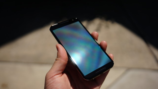
Daylight visibility is always a challenge and when viewing in direct sunlight and AMOLED’s funny way of creating a nearly blinding rainbow effect was apparent. We suppose if worst comes to worse, you can always find some shade or make your own.
There’s a good chance many of you wont notice any of the above issues with the new Moto X’s display, but there was enough that, overall, we were left with a bad impression.
Performance
Running a nearly stock Android experience has its benefits. With an OS unencumbered by the usual OEM skins, it wouldn’t take much horsepower to provide an adequate Android experience (just take a look at the Moto G (2nd Gen). Thankfully, Motorola didn’t skimp in this regard, equipping the new Moto X with an uber fast 2.5GHz Qualcomm Snapdragon 801 processor worthy of a flagship Android device. They could have used something a lot older and got nearly the same results in terms of real-world speed, but we’re glad they chose one of the quickest mobile processors currently available. The result? An unhindered OS that can spread its wings and fly.
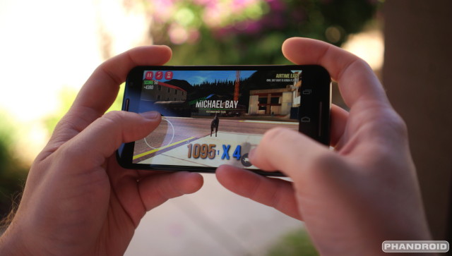
Everything feels like it’s been put into overdrive. Apps open quicker than you can blink, the UI is always silky smooth, and games run at high frame rates. If you’re coming from the previous Moto X, you’ll notice how much quicker the camera quick shake gesture now opens the app, with little down time from shake, to vibrate, to the app launching. Honestly, it’s a c0mplete joy to use. I really can’t say enough about how kicky fast and buttery this phone is. It’s like a Nexus 5 on steroids.
Storage
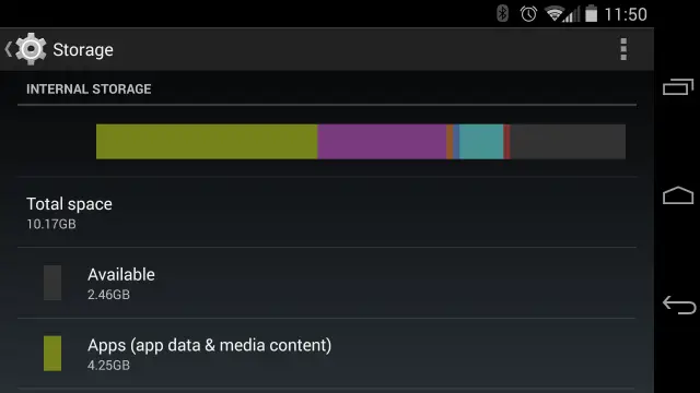
Limited storage is just one of those things that’s either gonna bug the sh*t out of you, or wont be any skin off your nose. For us, having only 16GB and 32GB options for the new Moto X sounds like a major oversight on Motorola’s part. Aside from last year’s model having access to a larger 64GB config, no such option is available (yet) for the new Moto X. Looking at how much storage space is even usable on the new Moto X, we dove into our settings and sure enough, our 16GB model had only about 10.2GB of that was even usable. Even for a base model, that’s borderline unacceptable.
This is further compounded by the fact that the new Moto X doesn’t offer a micro SD card slot, leaving the phone stuck with whatever amount of storage you choose before hand. Ultimately, the choice is yours, but we’d recommend opting for the 32GB model lest you kick yourself a few months down the road when you have no more room for apps, games, or media. 16GB model shouldn’t even be an option.
Battery life
Battery life is one of those areas that’s always the hardest test. Because no 2 people have the same smartphone usage habits, there’s no telling how someone’s 20+ hours of battery life will translate to you specifically. Even still, we’ll go ahead and give you our accounting of what battery life was like on the new Moto X.
Using the device as our primary daily driver for the past few weeks, we found battery life more than acceptable (but it wont blow you away). Typical life for us was about 16 or so hours with normal to light usage, 2+ hours of screen on time, WiFi and Bluetooth always on. Despite the absence of last year’s X8 low-power core, standby time on the new Moto X is where the phone truly shines. If you find yourself at work or spending a long day at a theme park, rest assured that if you don’t fiddle around with the Moto X very much, you can get upwards of 24 hours+ with little to no usage (but still allow notifications and phone calls to come through).
That’s not to say it wasn’t improved, but at 2,300mAh, it’s a feeble attempt at increasing last year’s 2,200mAh battery. We would have been more than happy to take a slightly thicker or filled out Moto X with a larger battery, something closer to the 2,800mAh offered by competing devices like the Samsung Galaxy S5.
So, while the phone doesn’t deliver in spades when discussing battery life, it’s not necessarily lacking. Still, when a smartphone scores such high marks in just about every other category, it’s almost painful to see something so fundamentally important such as battery life take somewhat of a back seat. The fact that it’s 2014 and 2-day battery life on our smartphones sounds like a fantasy is depressing. We can’t even tell you how much extra money we’d pay for a 3,100mAh Moto X option in Motomaker, but we’re sure Motorola already has bigger batteried Moto Maxx variant planned for Verizon later this year (pure speculation).
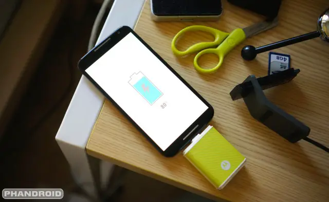
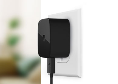
Another thing worth mentioning is thanks to that speedy Snapdragon 801 processor we told you about earlier, the new Moto X is now Quick Charge 2.0 ready. That means when paired with Motorola’s Turbo Charger (sold separately), you can get an extra 8 hours of battery life with only 15 minutes of charge time. I don’t know about you guys, but I’ve taken bathroom breaks longer than that. If you can’t (or wont) extend battery life, why not have the dang thing charge faster? Pretty sweet.
Notably absent was any kind of “extreme power saving mode” like we’ve seen on many competing devices which can extend battery life substantially by scaling down CPU cores, disabling background apps, or disabling data after a specific amount of sleep time. With Motorola’s suite of apps, you would have thought they’d had include something like this, but we suppose there’s always next year.
Camera
In an age of sharing every meal, traffic jam, or plane ride on social media, we get it — if you’re shopping around for a new smartphone, you’re probably going to want make sure it’s capable of taking a nice photo. Just about every year, smartphone OEMs tout some new camera technology or new way of focusing and capturing light. Not matter what, they almost always fall short of expectations because, well, they’re just smartphones — not DSLRs. Take last year’s Moto X and it’s 10MP “Clear Pixel” camera that was quite literally the worst shooter we’d ever seen from an Android device (well, mid to high-end devices anyway).
With the bar set so low, the new Moto X didn’t have to improve much to beat out the last year’s model. Thankfully, Motorola went with a much better 13MP Sony Sony Exmor RS IMX135 sensor coupled with a slightly faster f.2.2 lens in the new Moto X. This is actually the same sensor as found on devices like the LG G3 or Samsung Galaxy Note 4 — all top camera performers. This pretty much leaves Motorola’s software to do all the fine tuning.
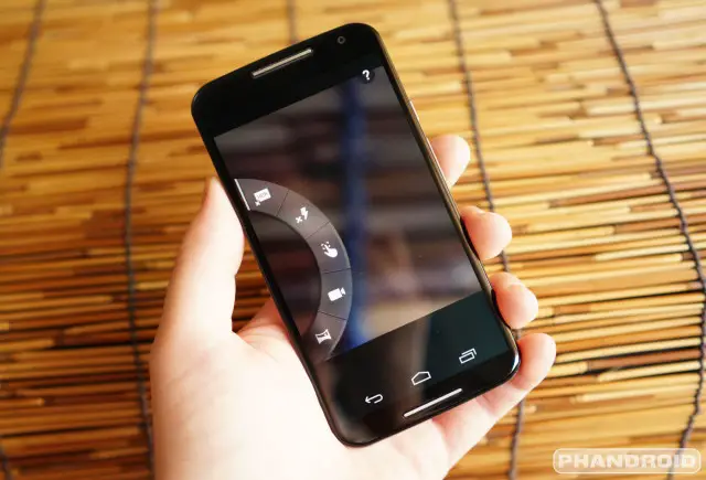
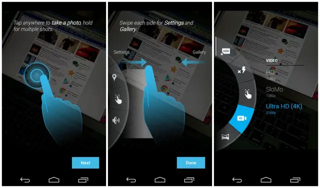
The Motorola’s custom camera app is where all the magic takes place and is pretty much the same one we saw on the original Moto X. Motorola’s Camera app doesn’t go overboard with features like Samsung, or offer a complete set of manual controls like HTC, but — like the rest of Motorola’s apps — does provide a few additional features not normally found in “stock” Android.
Taking a shot is as easy as pressing anywhere on the screen (or long press for burst shots). Aside from now being able to shoot 4K video, it’s pretty much the same tap-to-shoot app we saw last year and therein lies the problem. Because the camera app automatically handles all the focusing, more than often we’d tap the screen to take a shot that wasn’t properly focused. It’s annoying and could have been easily fixed by adding a tap-to-focus-then-shoot option in the app’s settings.
Another extremely nifty feature is the fact that the camera actually starts firing snapshots in the background before your finger ever reaches the display. This works in tandem with Motorola’s new Gallery app, which can tell when you’ve taken what it feels is a “bad shot,” providing you with a suggestion of a better one it captured on its own. Believe it or not, this actually came in handy in real life while attempting to snap a photo of someone walking down the street. By the time I pressed the shutter button, they had already walked by but luckily, Motorola’s Gallery app showed me a better shot with the man completely in the frame. It’s easy to see how this could help when trying to capture your kids doing something silly.
We should also note that we completely fell in love with the Camera app’s quick launch gesture, executed by twisting the entire phone twice to quickly open the app. It can even be done while the phone is sleeping and sadly, is probably the only time we’d use Motorola’s camera app (or when shooting 4K video) over something like say, the Google Camera. In any case, here’s a few sample shots (along with video) as taken with our new Moto X (2nd Gen) so you can see the camera’s actual output and judge for yourself.
2 minutes of 4K video was roughly 800MB in size
Overall, we found the camera quality more than adequate for some quick off the hip shooting, although occasionally inconsistent. In some cases shots showed a lot of noise (in a way, we kinda like that) and although we’ve yet to see a truly wonderful low light shooter from a smartphone, the new Moto X was certainly one of the worst offenders. Chances are, you’ll be using the new Moto X to shoot a close up of the kids, or that fancy meal the wife cooked up. If that’s the case, you’ll find the Moto X capable of producing a perfectly decent photo as evidenced above.
Software
There’s absolutely no question the new Moto X’s greatest strength lies in its software. What is probably a lingering philosophy of their short time with Google, Motorola does very little to alter the Android experience in the Moto X (or the rest of their devices), keeping the same “stock” UI as found on Nexus devices.
The only difference is that Motorola throws in a few of their own apps, bringing some additional functionality to what would have otherwise been bare bones Android. Everything from automating certain tasks, or adding a more convenient lockscreen, but the most notable improvement is the way Motorola has extended Android’s standard voice commands by providing “always listening” functionality. This means that, even with the screen off, you can still perform quick Google searches, set a timer, or just ask the Moto X what time it is — all without ever having to physically touch the phone.
Moto
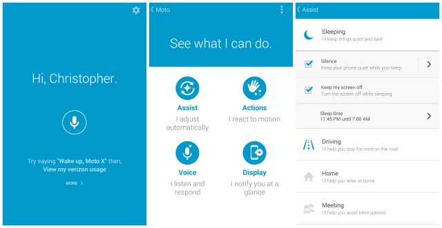
While posted individually in the Google Play Store, Motorola new suite of apps are actually located inside another app simply called “Moto.” Opening Moto will initially pull up the Moto Voice function right off the bat (like S Voice or Siri), but the app also acts as a hub for Motorola’s other contextual services (found after clicking the small gear icon). There are four main apps: Assist, Moto Actions (motion), Moto Voice, Moto Display (Active Display). Details on which features can be found in each are provided below.
- Moto Actions: Utilizing the IR sensors located on the front of the device, Actions allows users to interact with the new Moto X using simple gestures (I guess this is why they ditched the name of the Touchless Control app). Wave a hand above the new Moto X to silence calls and/or alarms. You can even launch the camera when the phone is sleeping by flicking your wrist twice.
- Moto Voice (formerly Touchless Control): Essentially audio monitoring for your smartphone, Moto Voice gives users the ability to wake their devices using a simple voice command — totally hands free. New for the Moto X (2nd Gen), you can now create your own custom voice prompt. Anything from “Hi-Yo, Silver. Away!” to “OK, Jarvis.” There’s new actions too, with the ability to post a status updates to Facebook, messages in Whatsapp, or even check your <insert carrier here> usage. It’s limited, but we expect more apps will be supported in the future.
- Moto Assist: It’s one of those handy features that sounds like it would have found itself already baked into Android by now. Whether you’re driving, in a meeting or back home, Moto Assist can change your phone’s behavior to do your bidding automagically. Driving? Assist will read your text messages aloud. In a meeting? Assist will mute the ringer so you’re not interrupted. Set up your own quiet hours and you can even whitelist certain callers (or anyone calling in rapid succession) for emergency situations.
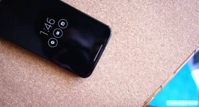
- Moto Display (formerly Active Display): For the all new Moto X, Motorola has rebranded their Active Display app as Moto Display. Like a smart lockscreen on top of the normal Android lockscreen, Display will “breathe” notifications as they arrive, allowing you to peek at them using only a finger. An improved version of last year’s Active Display, Moto Display can even detect when your hand is near (IR sensors), activating before you even touch it.
Probably the best part about all of these applications is that they’re found and updatable in the regular ‘ol Google Play Store. This means you won’t have to wait around for a full system update to get your hands on a few new software features or bug fixes (this has long been Android’s Achilles heel). What can be seen as the fingerprint of their former parent company, this mimics the move we saw Google take recently with many of their apps, albeit those are available to everyone while Motorola’s apps remain exclusive to their line of devices.
Motorola Gallery
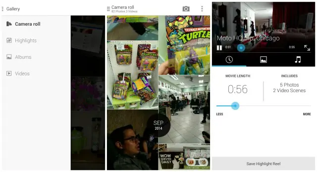
While we don’t see too much wrong with stock Android’s Gallery app, Motorola saw fit to replace it with their own in the new Moto X. Design-wise, the app reminds us a lot of Google’s Photos app from Google+ — white background, vertical scrolling, side menu, etc. — only Motorola’s sticks to covering local storage. Perhaps further fingerprints of Google’s influence, the Gallery app even takes Google+’s popular Highlights feature and makes it available in the app.
Highlights groups together photos and videos by dates, and allows users to combine them into their own home video reel, complete with background music and everything. Because it’s all local storage, you wont have to bother backing up your photos and videos to the cloud — everything can be done directly on your phone.
Other apps and features:
Although Motorola’s “big 4” contextually aware applications take most of the limelight, there’s a handful of other apps and features Motorola has packed inside the new Moto X that still deserve some attention.
Other apps that can be found on the new Moto X include Motorola Migrate, an application that helps you import contacts, photos, and videos from an old phone to your new Moto X. Should you find yourself in need of technical support, the Motorola Help app is only a click away and a great place to find quick support for your Moto X. Spotlight also makes a return, a sort of interactive story book that takes advantage of all the hardware sensors available on the Moto X.
The all new Motorola Connect is alive and well in the new Moto X, although it’s gotten a bit of a face life. A one stop shop for Motorola’s connected accessories (Power Pack Micro, Moto 360, etc.), we don’t think the Chrome extension — which allows you to send/receive text and picture messages from your phone — is up and running on the new Moto X quite yet.
Again, all these apps are also found on the Google Play Store where they can easily be updated without the need for a full system update.
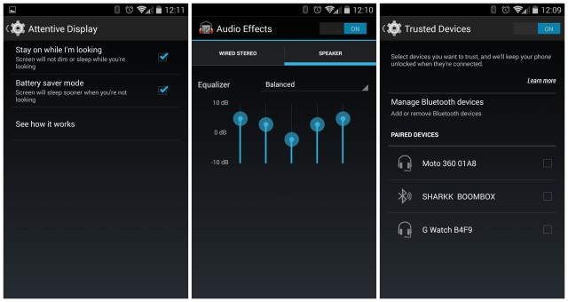
While the Moto X features a mostly stock Android experience, they did bake in a few new must-have features we don’t know how we’d live without. Attentive Display is an option in the Settings app that keeps your phone awake while you’re facing the device, and sleeps it quicker when you’re not.
Motorola has also added their own customizable equalizer app called Audio EQ to tweak your phone’s audio to your heart’s content. Our favorite feature? Trusted devices. This allows a password protected Moto X to stay unlocked only while connected to specified (i.e., trusted) Bluetooth devices. Move out of range? Your device goes back being locked down with a password.
What’s Missing?
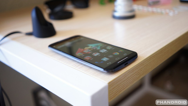
If you made it this far in the review, you’d know that the new Moto X (2nd Gen) does a lot of things right. Still, no matter the smartphone/tablet/piece of technology, there’s always going to be a few things that were simply left on the cutting room floor. Gotta leave something for next year, right? Going by current smartphone trends, things we would have love to have seen in the new Moto X are as follows:
- Water resistance (IP67 rating) – While it’s not true every device has this, we have to admit being able to take our phone in the shower for some Netflix viewing will change your life.
- Wireless charging – It’s was a damn shame to see this left out of current flagship devices this year and the Moto X (2nd Gen) is no different. As one of the more convenient features in recent times, we’re really hoping this isn’t the start of some new trend.
- 64GB model – It took awhile, but after almost a year since it was release, Motorola began offering a 64GB model of the original Moto X. How or why this isn’t an option for the new Moto X is beyond us.
- Micro SD card slot – Although we’re not quite sold on the idea of micro SD cards in our Android devices, we know many of you are. With HTC and LG recently offering memory expandability on their devices, we were taken aback by Motorola’s move.
- IR blaster – At one point, it seemed every new flagship was carrying around an IR blaster. A feature that gives users universal remote functionality out of the box, the best remote is the one you always have on you.
- Extreme battery saving software – Just about every OEM offers some kind of “extreme power saving mode” on their flagships. With Motorola’s strange move to keep the battery so small in the new Moto X, the least they could have done was included something similar (and they still could in the form of an app somewhere down the road).
- Motorola Alert: One of our favorite Motorola applications, Motorola Alert is only available to the Moto E, Moto G, and original Moto X. The app allows you to send a distress beacon in the event of an emergency, and while not currently compatible with the new Moto X, could become compatible in the future.
Bottom Line
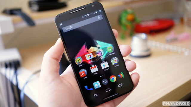
When all is said and done, the all new Motorola Moto X (2nd Gen) is not only a worthy upgrade from last year’s model, but easily one of the best Android handsets to date. It’s not perfect by any means, but Motorola did manage to do a great job at improving just about every aspect of the original, from design and build quality, to internal hardware specs, and even software.
Factor in a nearly stock Android experience, unparalleled software support with system apps that update independently of firmware updates, and the fact that this new Moto X will be one of the first Android devices to receive new Android updates (Android L, anyone?) — it’s easy to see how the new Moto X is an a class all of its own.
At $500 for the base model and $575 for a Moto X with all the trimmings, you’re probably going to want (or have to) to get one on contract. Keep in mind Motorola also offers 2 years of coverage for accidental damage for an additional $80.
With Google Play edition devices hanging in the balance, the new Moto X is probably the closest thing we’ll get to a premium Nexus device and the living embodiment of Android’s core principals. Having said all that, the new Moto X (2nd Gen) has just elbowed its way to the top of our ever growing Android family and demands your consideration should you be in the market for a new Android smartphone. Seriously, it’s hard to top this right now.
Pros:
- Premium build quality
- Near stock Android
- Front facing speaker
- Minimal overall size
- Camera performance
Cons:
- Display
- No micro SD
- 32GB model (highest config) is still limited
- No wireless charging
- Battery life isn’t great
Rating: 4.6 / 5






Grainy display & so-so battery life?
Nice attributes for a flagship.
If it were me lookin’ at a MOTO,I’d spend a lot less & get a better phone w/the MOTO G.
That’s just me being nitpicky. Most people wouldn’t even notice that stuff with the exception of battery life, which is good, just not great.
I thought about it long n’ hard and ultimately made the Moto X my daily driver. Just can’t beat Motorola’s software support. Can’t wait until Android L is available for the new X.
I hear ya on the nit-picking.Whether it bothers you or not,you’re just reporting what you see & we all appreciate that.
I’m not too picky on displays myself.
Only one that bothered me was the G3’s,everything else I’ve owned (at the time) has been acceptable,going all the way back to the HUAWEI ASCEND.
Battery life might get a bump w/an update,whether it needs it or not.
The 32GB w/o expandable memory is definitely what should be the basement,I can live w/32GB.
I think I’d still have opted for the MOTOG,w/the expandable memory being the deciding factor & the extra speaker being the icing on the cake.
Why MOTO thought it’d be wise to omit these on the X ’14 & put ’em on the 2nd string team is beyond me……..
I’m thinking it was to keep the size down, but really who knows. Like you said, it’s downright baffling. :/
Moto G is pretty slick though. I’m telling everyone in my family (who doesn’t want to spend more than $200 on a smartphone) to get one.
The X ’14 definitely looks to be a capable phone & scores lots of points on looks/styling.
Some might not agree w/this,but,most who post here probably have their phone in their hand more often than not,so,looks & ergonomics does indeed play a factor when I look at a new phone.
From what I’ve seen in pix/vids,the X ’14 is near the top of the list in that department.
Hey Chris, how is the battery compared against the Nexus 5? My N5 gets me through the day most of the time but if it’s a little better that would be awesome.
I’d say it’s comparable to / a little better than my Nexus 5. Haven’t used it as a daily driver in so long though I don’t want to steer you wrong.
2 hours screen-on time with normal to light use is pretty terrible.
It’s about the same as my HTC One M8, Nexus 5, iPhone 6. Keep in mind I never turn off WiFi, Bluetooth is always one, screen brightness is near max’d.
Chris idk if you will see or reply to this, but are you guys going to review the Xperia Z3 if it comes to the US? I am really interested in the phone, hearing how great the battery life and camera are.
No Micro SD and only 32GB
2,300mAh battery
2014 and no Wireless charging
801 not 805
no h20 proofing
Nothing about this phone is exciting or flagship worthy.
Other than the design/build quality and front end user experience of course. But who cares about that stuff?
Or you can look at the bright side:
Premium build quality
Near stock Android
Quick firmware updates
Front facing speaker
Small overall size
Nice camera performance
Not everything in life is about hardware. Would you buy a smartphone if it had all the above but ran Windows Phone?
-Premium build quality – Samsung has it, so does Sony. And that is partially over rated IMHO. It is not jewelry to me.
-Near stock Android – of no value to me as I root and ROM all phones
-Quick firmware updates – see above
-Front facing speaker – of no value to me, I don’t use my phone like that
-Small overall size – ok, I like that. But the Z3 compact offers that and more
-Nice camera performance – nice yes I agree, BUT that is not only subjective you can often get improvements with hacked APK’s and/or ROMs
A 32gb phone in 2014 as flagship with “Nice camera performance” and all that we can do – media downloads and such – and yet no SD card support.. that alone is a joke.
And I live an active lifestyle near the beach, so water proofing is pretty key.
And they had 2300 mah batteries last year.. nice no progress on that front. The Z3 is looking at near and at 3000 depending on model.
So you see, I did list some things important to….. ME. I can look at the bright side, but there is not much of it in the X. Maybe the “quarK’ will offer more, but not so sure. And BTW, I am a MOTO fan, I have had 2 and we have 1 in the family now still.
Have to disagree with the premium build quality of the Samsung. That fake leather back with the dots and the 3 ridged chrome painted plastic rim kills it for me every time. And while its not the most important thing in a phone, it is distracting to say the least (I don’t use cases on any phone ive ever had). Plus that UI… but I guess you address that since you ROM.
Camera quality looked pretty rough from the samples…
Great review! Very tempting phone! does the motorola skip work with this phone? i think i will just have to wait to see if there is another nexus around the corner…if not, maybe this phone will drop in price a little.
chris – just a suggestion, would it be possible to incorporate snapshots of actual battery use for future reviews? so far, the battery life section for all of the phandroid phone reviews have been pretty lacking with subjective commentary. it would the readers a much better idea of what to expect if you can post screenshots of commonly used apps like GSAM. it doesn’t have to be too thorough, just use it like how you would during a normal day until the battery is close to dying and take a snapshot of the main screen to showing screen on time, talk time, system up time, etc.
nice idea, or some sort of standardized battery test at least. Stream video for 2 hours, music for 2 hours, games for an hour and standby for 5 hours or something.
I’ve never understood the “16 GB models shouldn’t exist” argument. I’ve been using my 16 GB Nexus 4 for over a year now and have yet to come close to macing it out. And I’m on a 2 GB share plan on AT&T so it’s not like I’m keeping everything in the cloud. I guess I’m the exception, not the rule.
Had the 16gb N4 since it came out, I constantly have to remove music to add new stuff, or if I go on a flight remove a few gb worth of music to add a movie. Or if I want to add new games I have to delete a few. It gets pretty annoying, and would be nice to not have to be concerned with storage anymore. 16gb models really should disappear. It costs all of $5 – $10 extra (Probably less when a manufacturer makes a bulk deal) to put a 64gb card in one of these things, and there’s not really any size difference in the chip. I can’t figure out why they keep skimping on this other than to push cloud storage, and cloud storage still isn’t the answer since data isn’t always available.
Great review, you’ve only made me want it even more now.
No two day battery you say? OPO, been up since 6:30 this morning.
What’s your screen on time?
I was running on almost 2 hours. I get over 4 hours of screen on time regularly.
seems pretty standard. I get 4-4.5 on the g3.
Yeah it’s great with these bigger devices. Bigger phone=bigger battery.
What’s your brightness? I get about 4 hours and 20 ish minutes with my OPO at full brightness, big improvement over my nexus. 5’s 2 hours.
I use auto-brightness.
I get up to 6-8 with my droid maxx 1080m… I’m wondering how the moto x 2014 will hold up with my sometimes heavy usage if I get one
“while laying down with the phone in our bed.” – makes it sound like the Phandroid team have one large bed that they all retire to every night. I picture you guys in pjs with little old man sleeping hats on, holding your phones.
We all have matching Android onesies.
You should probably be selling those over at androidarea. You could probably make a few bucks.
About the lack of extreme battery saving mode – is this not supposed to be in android L? Moto probably thought there was little point developing their own when the standard version would be along soon?
I haven’t seen the new X, but the current X, the phone in my pocket right now, has a battery saving mode. I find it odd that they would take it out with the new X. Unless like you said, that it’s coming in L, which is only a few weeks away. I’m not sure if Chris missed this. I sent him a message to confirm.
I read so many things about how bad the camera is….yet its a “pro” on this article. Who should I believe?? I am going to upgrade today and am torn between sticking with an LG and going from the G2 to G3 or picking up the new Moto X. I dunno what to do =
I read that the camera on Moto X isn’t very good either.
yeah but this review…..its saying its good?? I’m guessing that Motorola will update the software since its producing bad images with the same lens that the G3 is using. I think its down to the camera and battery for me. Might as well seal the deal and get the G3.
Curious to see what people who have used both think of buying this phone vs a nexus 5?
Thorough review. Device is definitely my favorite non-Nexus, but somewhat big though. One question remains – does it bend?
Love this phone. Thinking of getting one with a leather back. I’m just afraid what’s gonna happen with the leather in a few month. Can I change the back cover if I want to? Does Motorola sell only the cover?
Great review.
If worst comes to worse, it’s actually getting a little better.
I hate to say this, but as good as the new Moto X is, I’m seriously considering jumping ship after 4 years with Android to iOS. I’m stuck with Verizon but I just refuse to deal with their crap bloatware and delayed updates. Up until now, I’ve always had an unlocked/rooted phones which allowed me to bypass all their nonsense, but it looks like that well has finally dried up. A developer edition of the Moto X was my last hope, but that seems to be off the table. The rest of my family uses iOS and I’ve been the lone hold out, but it looks like I may have to succumb to the dark side. With both the G3, S5, and the Moto X pretty much locked down, there seems to no options on the Verizon Android front for me.
So iOS 8.0.1 didn’t convince you that carriers need to test the software that goes out to their devices? I mean – it only kept people from dialing 911. No biggie right? :P
Meh, I consider it a fluke. Sucks for Apple but I wouldn’t hold their feet over the fire for it because it was contained and resolved fairly quickly. If this was Verizon with an Android update, you can guarantee that it would take days before they slowly moved toward a fix.
That said, my original post is now mute. I’m going to give the Moto X a chance. The whole iOS issue of not being able to put my shortcuts and icons where I want them really bugged me. Forgot how anal retentive Apple is about having arranged rows. Ordered myself a 32gb black front/bamboo back cover and it should be here this Tuesday. First thing I’m going to do is disable and hide all the Verizon crapware.
Ah Motorola, what have you done?! You went off and married the HTC One M8, and your offspring produced the Moto X 2014. By no means is this an ugly phone to look at! Alas, though, the HTC One, with it’s supermodel attributes (tall, lean, sexy) ALL appear in the Moto X 2014. On a web browser, she looks GREAT! In person, she looks even better! But… can I live with her? Let’s face it: men choose wives like they do cars. We pick one hot enough to get noticed but not so hot that we get car-jacked. The Moto X 2014 is car-jack-worthy, although I suspect thieves are too busy trying to get their hands on the iPhone 6 to notice… for the moment.
Where the Moto X 2014 fails me is in it’s height. Like a supermodel, she’s tall! My Verizon store had the demos out today, so I HAD to give her a try. The thing is, I could never purchase or lease this “car”. She didn’t test-drive well in my hands, and here’s why:
1. As stated above, she’s tall. The phone is too tall for one-handed use. My 5’7″ frame with matching sized hands simply couldn’t accommodate use without straining my thumb during one-handed use. Google: are you listening? iPhone offers a 1-button push approach to scaling down the screen for one-handed use. I hope this feature is in Android L, too!
2. She’s sexy! The thing is, most of our friends will buy the iPhone 6 or the S5, and this phones manages to step above the crowd in looks, which makes her noticeably different. I’m only guessing that this will make the Moto X 2014 a target among thieves akin to driving a red car.
3. You don’t offer a “Pure Edition” for Verizon, and who am I kidding when I secretly hope that someone (Chinese middle man?) can crack or unlock the bootloader?
Verizon, you’re leaving me with limited options. My hand(s) can’t hang onto your phones anymore!
I got my Moto X2 today and it is just fabulous, It blows out the iphone 6 in every way. I mean it. The HD display is one of the best available. Dont think to wait for Nexus 6, Moto x2 is a unique user experience and it is not about just having gr8 hardware.
The design is the best available out there today. It’s so sleek & stylish. iphone 6 black looks great for me but this is a rich and stylish with a metallic finish.
The voice recognition is so great and the touch less function is just blowing away.
I wonder how this will all pan out with Android L and Project Volta…
Someone needs to address the fact that ATT and Moto aren’t on the same page with this device. There are several reports, from me included, about the Pure Edition not activating properly on ATT. ATT doesn’t recognize the IMEI in this phone as an LTE capable device. You have to add a custom APN in settings just to get data, but only HSPA+. Then you have to call ATT, argue and convince them to add a different IMEI on your account, give them one from an old phone that you hopefully have laying around, and only then will you get LTE. While I now have it working, it’s really an issue that needs to be fixed for real, and not with a hack.