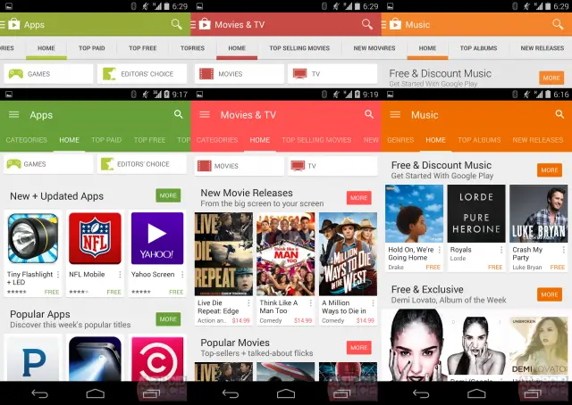
 (top: old, bottom: new)
Android’s new Material Design language has been slowly rolling out to Google services and 3rd-party apps. We’re still waiting on the release of Android L to see Material Design in all its glory. One app that has changed a lot over the years is the Play Store, and you can bet it will be changed once again for #Materiyolo. The good folks over at Android Police got their hands on some leaked screenshots of the update.
First and foremost you can notice some slight changes to the section colors and top bar. The gray has been replaces with a dark grayish teal. The colors for apps, games, and music have been adjusted slightly darker. Movies & TV, books, and newsstand are a bit brighter. You can see the color comparisons below (top is the current Play Store).

These new colors are even more present in the new UI. The section colors have migrated down to the navigation tabs. This creates a really nice clean and unified look. And yes, the Material Design animations are present as well, as seen below. All in all it’s a very nice update. Not a huge difference from the current version, but just enough refinement to look fresh. How do you like this new look? Are you ready for Material Design yet?


I hope Google also plans to update the Gmail, Google Music, and Hangouts icons to flatness too. The consistency has to adhere to all platforms and services to be considred a unified design language,
All the services you mentioned are slated to have their apps updated with the new material design language. I’d be very surprised if they didn’t update the icons as well.
Some of those colors are too bright, imo. Specifically Movies & Music.
I was a little hesitant when they announced material design but every time an app gets updated with it I love it. I am definitely looking forward to these new roll outs.
The new green is horrible, just like the one in Hangouts and Hangouts dialer.
Yes, Hangouts just look like a huge top portion is wasted. I don’t recall if it’s just an eye trick and it’s the same amount, but I’m not really liking it. It could also have something to do with me running an Xposed Mod to change my status bar color to mimic the app. =.3
I like the new green.
Agree! The Hangouts new UI is bleh,but what gets me is them taking away the swipe to delete function!! SMH
Woah!! What a huge difference!!!*
This looks terrible… why the MASSIVE colored bar at the top? It just makes it look crappy
The bar is the same size, just more of it is colored.
I understand that… but the color makes it look much bigger than the current format… It just looks a lot worse to me
Agreed if they are doing it this way why not shrink the space instead of having all that wasted empty space?
Lazy design.
If they reduced the size of the header, then they could show more of the apps that get cut-off at the bottom.
Honestly, the boners that people get over such mundane changes. It blows my mind.
I’d never have noticed the difference if it wasn’t pointed out.
I’ve had it for a while now on my oneplus one with an xposed mod to change the status bar to look like the app. I must say that I enjoy the design.
I like it.
However, as much as I appreciate the changes Google is doing with all of it’s Play-related apps (and stuff like Drive)… I really, really wish they’d do a total overhaul of the web-based Play Store, even on Chrome on a decent computer, it can be laggy and could look infinitely better, particularly any tabs that show your purchases like My Apps, My Books, My Movies & TV… I wonder if they will give it this “material design” look for web after they’ve rolled it out to devices.
Sure freakin’ hope so.
Look forward to this and the rest of the design changes. My N5 will have never looked better once they get here.
#PraiseGrouchnikov #Materiyolo
Awaiting Android L on my Nexus 5. This will do for now
I HATE it, specifically on update details for apps because it cuts off and makes me scroll to the bottom.
One thing is certain. Now “design language” is the new term that has been somehow just known and used, like, forever.
Meme of the year.
Can’t wait for its fifteen minutes of fame to expire.