After a year of silence while all of their competitors have gotten moving on the smart watch arms race, Apple has finally decided to reveal their plans to launch a smart watch. Dubbed the Apple Watch, the device struts its stuff in typical Apple fashion: it aims to be beautiful, and Apple — as usual — feels like they’re the only ones who have done the smart watch “right.” Whether that’s accurate is a different story altogether and certainly remains to be seen. Let’s take a look at its design and some of its early features up against some of the latest Android Wear smart watches ahead of its early 2015 launch.
Apple Watch Design vs Moto 360 Design
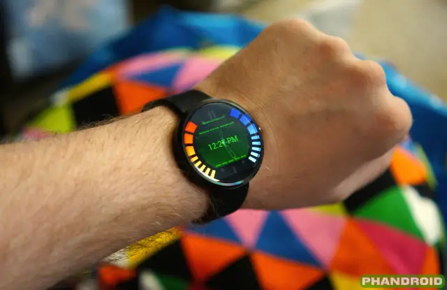
When Motorola set out to make their smart watch they weren’t satisfied with something that just worked. They wanted something beautiful, yet still every bit as functional as anything else. The use of metal outer bands for the watch body and genuine Horween leather for the wrist straps certainly do drive that vision home.
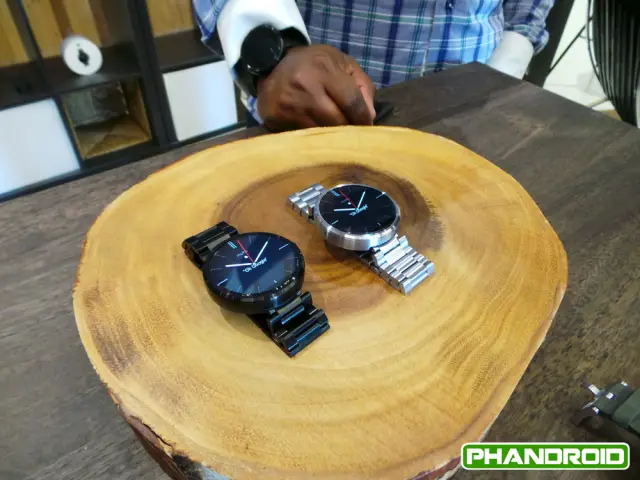
Even better are the steel band editions that will be made available in a couple of months’ time. The device looks like a fashionable accessory more than a child’s toy sitting on your wrist, and that’s probably what caused it to sell out so fast compared to the competition — turns out people care just as much about looks as they do its performance and features. It impressed the pants off us when we first unboxed it and got our first deep look at the thing, and that seems to be a consistent feeling throughout the tech world for anyone else lucky enough to have used one.

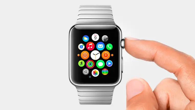
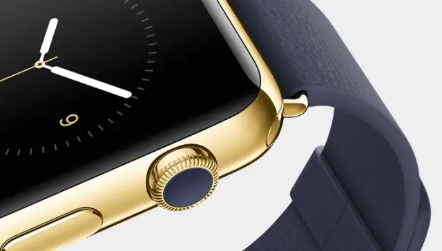
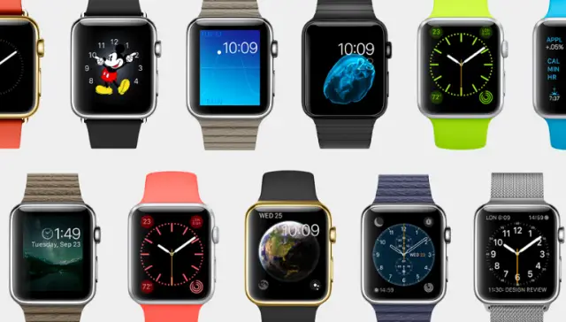
For Apple’s bit, they naturally wanted to make sure the design for the Apple Watch was stunning. While they didn’t opt to go with a circular watch face, they did manage to create a squared form factor that looked about as nice and neat as anyone can ask for. It’s made from stainless steel that’s been polished quite well, and features a physical dial — something Apple refers to as the “Digital Crown” — that will be used to help you move through user interfaces without having to touch the display.
Apple’s planning to offer many different wrist straps for the Apple Watch. So far they’ve announced leather, polymer, metal mesh and stainless steel options, though we’re not sure if you can select which one you prefer at checkout (nor are we certain any of these cost more than the others). All of this will come from three distinctive collections consisting of the base collection, the Watch collection and the Sport collection. It all looks pretty nice and it certainly contends for the “best looking smart watch” crown with the same tenacity that the Moto 360 does.
Apple Watch Display vs Moto 360 Display
Motorola made a pretty bold design statement with their Moto 360. While everyone was naturally inclined to use rectangular and squared displays for their smart watches, Motorola was the first to consider a circular form factor. It made it look and feel more like a smart watch, and it was the driving force behind everyone’s excitement for its arrival. LG has since matched Motorola’s form factor with their circular LG G Watch R, though everything else is still largely square.
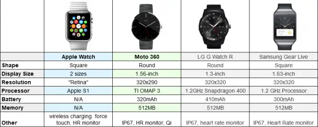
Motorola’s Moto 360 officially clocks in at 1.56 inches and has a resolution of 320 x 290. It’s a bit odd on paper, but it all comes together nicely on a display that looks crisp and leaves plenty of room for displaying whatever it is you need it to display. Motorola caught a lot of flack for it not being fully circular — there’s an unseemly black strip on the bottom to hide ambient light sensors — but the end result is a lack of an ugly bezel and a form factor that puts the focus squarely on the display.
Apple didn’t go into too much detail about the size and resolution of the display for the Apple Watch, though they did drop the Retina name to speak about its clarity. It’s pretty much a given that Apple will use a display that’s just as sharp as any on the market. Apple also shares one key distinction with the Samsung Gear S — the display is flexible. Not sure that much means from a user-facing perspective, but I’m sure it had to be flexible in order for Apple to create the design they wanted.
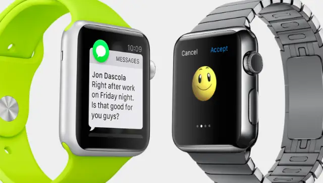
Interestingly enough, Apple also has a smaller model alongside it for those who want something a bit more petite. It looks the same and should have all the same features, but the smaller form factor is there for those who are turned off by the physical bulk of most smart watches.
The Apple Watch display is covered by sapphire to provide crystal clarity and durability. Apple’s display can also apparently tell the difference between a tap and a hard push as it’s pressure sensitive. Again, not sure what that would be useful for in the context of a smart watch but it’s neat anyway. We’ll be looking into the nitty gritty hard specs of the display as more details spill out, but it’s one area we’re sure Apple certainly won’t be losing in.
iOS on Apple Watch vs Android Wear
Android Wear, as you know, is the driving platform behind many of the most popular smart watches today. Like the phone and tablet counterpart, Android Wear is open and available for use by any manufacturer able and willing to make a smart watch.
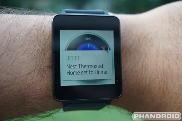
At its core, the operating system is powered by Google Now, the search platform that delivers the information you need whenever It works best when paired with an Android smartphone loaded up with apps that have Android Wear functionality built-in.
For instance, you could control music playback of Google Play Music using small controls on the smart watch. Navigating to Starbucks will bring the directions up on your wrist so you only need to glance at your watch instead of looking down at your phone (this is an area where Google Now would come in handy — searching for local Starbucks locations on your phone would likely automatically prompt you to navigate to the nearest one on your smart watch). Use voice to respond to messages or search for pertinent information.
On watches like the Moto 360, heart rate monitor apps (loaded up at the OEMs’ discretion) and other health-related solutions will help you track workout information without much work on your part. It’s a pretty good mix of value-packed features added by OEMs and integration by the collection of apps already available in the vast Android ecosystem. Google set out to make a platform that wasn’t simply “Android Mini,” and it’s worked out quite well for them in the early going.
Thankfully Apple has decided to do the same with the Apple Watch. Instead of shrinking the iPhone user interface down to bite-sized goodness, they crafted a new take on it that puts emphasis on telling you the time, helping you track your fitness, helping you find your way around your city and more. At the center of it all will always be your favorite watch face telling you the time, and getting to apps and notifications are only a quick swipe away from that initial “home screen,” of sorts.
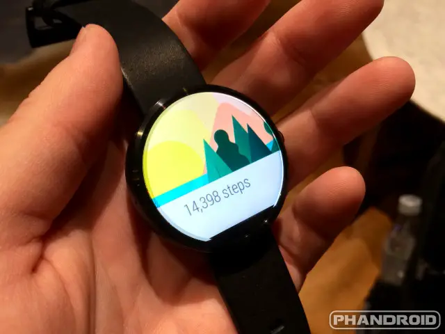
Siri is loaded up to help you search for information and reply to messages in a non-cumbersome way. The health apps will use the watch’s four LED sensors, accelerometer and gyroscope to give you updates on your heart rate, the amount of steps you’ve taken and other information relevant to a good workout. Incoming notifications display the latest information about everything going on in your digital life, and some of them are actionable in case they require some sort of response.
Apple took things a step further by introducing the ability to use Apple Pay (their new NFC-based payments option) with the Apple Watch. Instead of having to tap your phone against a PoS terminal, you can tap the smart watch that’s already on your wrist.
One annoyance with the Apple Watch is that it requires an iPhone to use. That prerequisite unfortunately ties you to one ecosystem. That’s not to say Android Wear is different — it does require you to pair it to an Android 4.3 or higher smartphone — but at least you have a wide variety of choice in manufacturers. It’s up to the OEMs to sway you to go all in with their products by adding features no other OEM can offer, but if you want to pair your Motorola smart watch with a Samsung, LG or HTC smartphone there’s nothing stopping you from going that route. With Apple, it’s all Apple or nothing.
Both platforms have taken a similar approach to the smart watch — they don’t want to be bigger than they need to be. The phone is where you should do most of your heavy lifting, and the smart watch simply acts as a convenient bridge for quick information and the quick actions you need to act on said information. It shouldn’t be any more inconvenient to use than a traditional timepiece, and we feel both platforms tackle that problem quite effectively. Anything more they feel need to be added will certainly come in the way of software upgrades down the line, and it’ll be interesting to see how these two platforms evolve side-by-side.
Apple Watch vs Moto 360: Battery
Well, this one’s a bit hard to talk about — we have no idea what to expect from the Apple Watch in terms of battery. Apple didn’t touch on many of the specifics, though that information should makes it way to the forefront ahead of launch.
Early reports suggest it shouldn’t be hard for Apple to best Motorola, though: seems a great deal of people are rather unhappy with the Moto 360’s juice. Motorola generously rates the battery life for a full day, though most people claim to only be able to get 12 to 16 hours out of it. That’s likely to be quite unacceptable for many folks’ needs as many people spend at LEAST 16 hours of the day away from home.
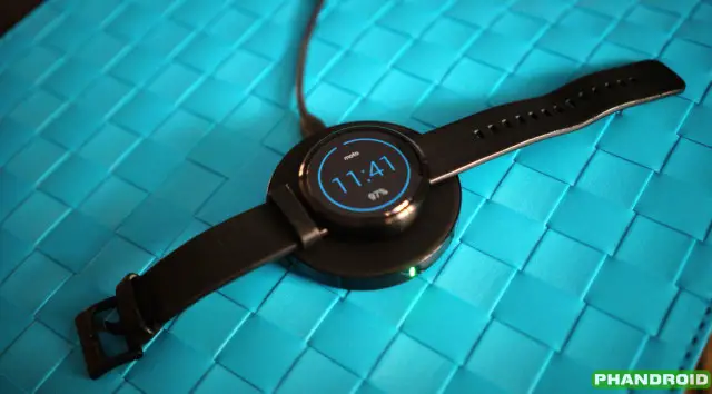
At least charging on both of these options are cool, though. The Moto 360 features Qi wireless charging and can simply be docked into a convenient desktop charging cradle or used with a number of existing Qi-based charging mats. The Apple Watch uses a magnetic MagSafe charger for its wireless charging needs. Needless to say we’re very happy about these qualities over the pin-based charging solutions of other smart watches.
Apple Watch Price vs Moto 360 Price
And now we come down to one of the most important factors of them all — price. The Moto 360 comes in at a base price of $250, and the premium steel band option will run you $50 more. Apple, on the other hand, ain’t cheap — a base price of $350 is what they’re asking, and we’re not yet sure if that includes any of the premium wrist band options that showed off at the event.
Apple’s always been known to be a bit on the pricey side when it comes to their wares, but recent pricing trends on the phone side of things led us to believe they’d look to keep it under control for the Apple Watch. Whether a $350 purchase atop the cost of one of the latest iPhone handsets is worth the cost of admission is up to you to decode. Thankfully you have a bit of time to decide as Apple doesn’t expect the watch to go on sale until some point early next year.
Which one gets your money?
Even with all that Apple showed today we don’t know much about the Apple Watch. Questions about water resistance and battery life still obviously hang in the balance, and those are major factors in the worth of a smart watch (just ask all the folks disappointed with the poor battery performance of the Moto 360).
For now, let us know which of these smart watches will have your attention, and since we know many of you won’t be looking to grab an iPhone just for the sake of using the Apple Watch, let us know what you think about its design up against all the rest!
[polldaddy poll=8296697]
[polldaddy poll=8296699]






This one looks like a flippin Galaxy Gear. Like, identical.
I’m leaning more towards the ZenWatch for a look alike. Way to funky of a design for me. I have a Galaxy Gear 2 and love it BUT really like the LG G Watch R.
Dear moto, please call me about a commercial idea. It goes something like this. You are anxiously waiting to go on a blind date. Finally, your date shows up. You open the door. Cue wa wa waaaaa music as the most hideous and annoying person (Justin beiber) is standing there. iwatch.
My goodness that is one ugly watch.
awesome. The funny thing is Bieber would probably be too dumb to realize he’s being made fun of in the commercial.
i like them all except for the the gear s. I don’t know why people think it has to be round because it doesnt
This one looks exactly like a flippin’ Galaxy Gear. Like, Identical.
True but you know what they gonna say; Apple reinvented smart watch.
Apple reinvented reinvention.
I’d get my eyes checked if I were you…
http://www.engadget.com/2013/09/04/galaxy-gear-hands-on/
Honestly, I prefer the Moto, but I’m inclined to wait until the next generation. If they could trim it down a bit in both depth and diameter, it would be perfect.
Nice kiddie watch apple.
Eh, now that I see the iWatch on wrists, I’m much less impressed: http://appleinsider.com/articles/14/09/09/first-look-hands-on-with-the-all-new-apple-watch
Meh.
looks like there was a mandatory minimum number of icon rows to be displayed.
350 dollar Apple Watch that can’t stand alone. Dead on arrival. Should’ve been phoneless.
There are people out there that will buy anything apple made and at any cost.
How about an option for “none of the above”? Android wear definitely isn’t ready for prime time, yet. I suspect the same is true of the iWatch, but don’t have enough info yet. They all appear to be too limited in real functionality, and too expensive for the functionality they offer.
I’m not an Apple fan by any means, but there is clearly one area where the iWatch trounces Android Wear, and that’s 3rd party support. Apple’s market clout in the U.S. enables them to strike deals that Google can only dream about and wish for.
Indeed. They’re helping with #FirstWorldProblems. They’re able to quickly view messages and notifications and see things at a quick glance.
That’s all they’ll be able to do. Until we get one of those watches like in Spy Kids where it’s a holograph coming out the watch. And phones will be able to teleport us, but it’ll drain the battery and people will be complaining that their phone dies fast and Android can teleport 5 miles farther and stuff like that.
I may have been day dreaming a bit too much today.
Just wait for the people walking around with their phones going off, their watches beeping, Google Glassing you, with a tablet in their shoulder slung hipster bag. Ugh!
That’s a lot of gadgets to turn off in a plane before takeoff.
so when one puts a phone into airplane mode why wouldn’t the wear and tablet devices automatically follow? hmmm.
Hahaha, that perfectly describes me except none of my devices make any sound.
Is that a v-tech toy or a smartwatch from Apple…. I can’t really tell the differences.
Then buy a v-tech toy, it will save you a lot of money and be better suited to your needs, for sure.
OK, all of the rectangular Android watches are butt ugly. The Moto 360 and the round LG watch are an improvement. I’m not an apple hater, but that apple watch looks a little too femininine in most of the renderings. Oh well, such an unecessary product to most people anyway, so no loss.
I really like the look of the Pebble steel, except they put their logo on the front.
Why is the Sony Smartwatch 3 not in this comparo?
Came here to say this. Only one with GPS/NFC/Transflective screen technology. Not the prettiest of the bunch but seems to have more in terms of hardware/future proofing
Now that the Apple Watch has been released, I still say the Moto 360 looks the best out of all the smartwatches.
This thing looks like a kid’s toy…
Hey look, Fisherprice made a copy of Android wear!
You mean Android vendors rushed to market first? How ignorant are you to not realize Apple has been talking about a watch far longer than Google or Samsung were even interested.
I’ve been talking about time travel. I guarantee I won’t invent it. Does that mean I can claim it’s mine because I was talking about it before it was invented (if it ever will be)? No way.
Apple never talked about it, it was only rumor. Learn the difference.
Yet Android Wear looks better thought out than the confusing interface of Watch OS.
And Michael Knight was talking to a smartwatch decades before any of them. How ignorant are you to nor realize talk don’t mean S**t
Anyone remember Microsoft’s SPOT (Smart Personal Object Technology) watches some years ago? In a way, they started the smartwatch revolution.
Since I’ve had it, the Moto 360 has gotten consistent 5% battery per hour. Thats 20 hours of use or more since my notifications and such die way down after peak hours.
I got in a battle once recently with a guy elsewhere on the internets about the value of round smart watch designs today, I say they have serious limitations… and in the end, what format did one of the biggest players in the industry choose for their watch – well, it is not round mofos. Just saying.
And the sheep will follow the biggest player, you’re absolutely right, that doesn’t make them right though, it just makes them lazy – round is more difficult and why make it difficult if you can maximize your profit on a square one.
Personally I still prefer my Tissot to any of those pseudo-watches and I may be a lazy procrastinator but I can still pull out my phone out of my damn pocket.
Round is more difficult, which is why Moto 360 doesn’t even have a perfectly round screen, it’s more like a flat tire. More difficult doesn’t mean it makes more sense, or any sense at all. Have you seen many round computer screens or TVs lately? ;)
They also said 3.5 inch screen was perfect, said NFC was dumb and they wouldn’t use it and even put out a phone that messed up wireless signals when you were holding it without a case. Yeah. But because they’re one of the biggest its right. Ha
But look at what’s selling.
Well product design is to each his own. You can’t argue to a person that round is better then square or vice versa. Some people like circles, some like squares, and some like triangles. Same goes for screen size, its all subjective
I am disappointed in Apple for coming out with an ugly smart watch as this. Apple has been usually the ones big on design, but this is just plain ugly with its big bezels and thick-chrome bulge.
I guess Motorola just out-designed Apple.
To each their own.
Introducing the MOTO 360:
Where a lag-laden experience has never looked better…………………………….
The thing is, next year’s Moto 360 will have gradually evolved the OS; the “new” Apple Watch will be stuck with basically what it has now; they’re not going to admit they fundamentally screwed up the interface.
The challenge Motorola will face will be all about the battery. They need to use a lower-power processor, and will, and they need to figure out where to put more battery (I think the band is the obvious choice; you can even change it out and have a fresh charge.)
Apple seems to have screwed up on the one thing they’re supposed to be the best at: the interface.
There is nothing stopping Apple from evolving their design, making the next iterations of their watch thinner, using a slightly bigger screen, and improving the software. This is what they have always done with their products, and it’s in their DNA.
I’d wait until the Apple Watch is finished and ready for launch before drawing too many conclusions. There are going to be a few tweaks and some tuning of the OS and apps.
Yeah, but the UI is pretty much broken from the start. The Apple Watch UI compared to Android Wear is almost a reversal of historical patterns. It is Apple’s UI that is cluttered, full of unnecessary details, and needs an extra button to control it all. It looks like control panels for Windows or Linux . . . very un-Apple like. Android Wear is by no means perfect, but it is elegant and simple.
https://phandroid.com/2014/09/11/apple-watch-ui-vs-android-wear-ui/
That is not going to change without a huge climbdown with Apple admitting, “We got the UI all wrong.”
Thing is you can’t really judge how the UI works and the flow in it from looking at 6 random and unrelated screenshots from a work in progress.
ABout your link: You don’t know the options available, and you dont know which level in the UI some of the Apple Watch screenshots are from. The detailed weather forecast is clearly not at the top level when you go to the weather app. The detaiils are there when you want them, under a simpler glanceable information view. Also, some of the things shown on the Apple Watch are simply not available on Android Wear, so it’s compared to something completely unrelated in the screenshots. Comparing the App Launcher homescreen against a simple watchface is simply very misleading.
The article is obviously biased and contains a lot of errors and omissions, like the mention of a “1-inch display” which is in fact 1.32 or 1.53 inches, and failing to mention that the Stopwatch on Apple Watch has other, simpler view modes. The article is amateurish and shallow, and is very far from giving a relevant answer to the question it poses.
Interesting points. Thanks for the follow-up. I look forward to seeing better articles on the Apple Watch.
Where can I find details about LG G watch R?
It has a pretty big battery. If that thing is waterproof to at least 50 meters, it’s done deal for me. If it comes in titanium band, it would be a bonus.
moto360, unfortunately isn’t really waterproof.
50m is asking a lot from a smartwatch!
Poll results are identical for both questions… lol
it means no one is choosing function completely over style. or everyone thinks that their watch has all the goods for both function and style–and i’d definitely disagree on that part!
Love the Moto 360 but if the LG r came in silver I would go for that one. Looks watch like.
But for me android wear is much lore user friendly than the apple watch.
Does anyone care about the horrible lag on the 360?
I was actually going to buy one, but the lag made it look disgusting.
I do but it looks so good just laying on your wrist.
Is the lag really that bad? i was going to buy a 360 but they just sold out to fast when i gets back in stock i really want to buy one, i was deadset on buying ome but i’m just hearing so many negative things as of late, i think it’s still the best looking watch out here. What do you think Chris is the 360 still worth buying or should i wait the g watch r?
I am hearing from several people that if there is, you aren’t noticing it. Most of it is happening when it wakes from sleep, but it isn’t bad
Depends on what you care about really. I like the looks of the 360 so I’m not TOO concerned with it’s laggy performance.
The LG G Watch gets significantly better battery life and performs silky smooth. Tough choice.
thats a 1st gen product for you. we’ll just have to wait until next year when the refresh the product and learn from all the mistakes that they made. similar to the moto x.
same applies with apple ;-) ? Remember iPhone Original and then 4’s insane design .. :P.. Though the root of lag is in android :-x google needs to make android better
They have. Every version improves on project butter. I think you will see massive improvements when android wear is based on Android L. Project Volta will also improve battery life
Plus we will see the new Health related functionality and more. Android L will definitely take advantage of the features in the watches.
haha of course! it applies to all tech products regardless of the company. i was just mentioning my reason for not giving into the temptation of such a hyped and beautiful smartwatch. ive learned that the hard way with the gnex. i was very tempted in purchasing the moto x 2013 esp when my gnex was and still is on its last legs. when it comes to new products, wanting the something that is designed so nicely, it’s hard to resist not making a purchase. people will probably ignore the faults of the new product and just wait for the eventual upgraded model. that’s what i know im going to do with the new moto x when i purchase it (hoping that theres a way to get root). i already know that the camera isn’t going to compare to the iphone and the battery life is going to be average. for me personally, that’s the cons that i will have to take with a new phone when ive been personally spoiled with stock android (og droid and gnex).
and YES the issues with lag lays in android. android needs to be more optimized. project butter was a start, but there’s more work to be done. hopefully we’ll see some more improvements in the L release.
Waiting for these prices to get real.
Kind of doubt I’ll even consider a smart watch for the next couple of years, but of all the watches pictured in this article, that 360 is by far and large the prettiest, and if and when I do ever get one hopefully that design or a variant of it will be available.
Man that iWatch looks fugly. All hyped up and it looks like that. All of the new Android/Samsung Tizen watches look much better.
except the samsung ones look too much like they shrank a phone and wrapped it around a wrist. uhhgh.
Hey, it rocks the star trek communicator style man. Don’t diss that.
If I buy a smartwatch it will be the Sony SW3 for real fitness tracking credentials. Might want to add it to your poll options!
Haven’t we seen enough of devices that tried to “improve” navigation by doubling the touchscreen with a physical controller. And how such things are redundant and silly? Apple Watch = HTC G1/My Touch.
The trackball/touchpad on the G1 and G2 were quite functional and complimented the touchscreen well. But YES in 2014 its quite redundant.
So, a mouse with a physical scrollwheel is redundant and silly in your eyes, now that computers with touchscreens or touchpads are quite common?
why are they showing the gear live at the top and not the gears s?
Which one gets my money?
Pebble.
With the TI-OMAP 3630 SoC in the Moto 360 the thing is a no go for me. Even though it is the prettiest Smartwatch by far.
LG G Watch R or the next version of the Moto 360 for me.
I am watching, listening and getting a great picture of the 360, and I am now ready to make the purchase. People are saying that they aren’t having any issues, the battery is really good, and there is no stutter. On another site someone gave some insight on the Omap3 compared to the SD400. I would have loved to have seen the SD400 in the watch, but from everything I am seeing (real world customers), I think it is a win-win
I’m fine with my pebble looking at these prices…holy crap!
I prefer the Moto 360 but I don’t see why the ZenWatch ranks so low. It looks very similar to the Apple Watch but with a better looking band… I think the ZenWatch is the second best looking smartwatch.
I think it is definitely 360, Zen and then Apple. Asus has really done an awesome job with the Zenwatch, but the 360 is just pure class.
You can choose from a whole range of different bands for the Apple Watch, even brown leather simllar to LG’s band, if that’s what you prefer. The Zen watch looks a bit thinner than Apple Watch, and that’s an advantage, but Gorilla Glass compared against Apples sapphire crystal isn’t.
That Apple A (for a**holes) Watch’s sapphire is a bad design. Made for looks only. It’ll be great for scratch resistance, but I’m thinking other real watch makers are laughing out loud about it’s bulbous face. People will be Whacking and iCracking it’s for more Genius Expensive repairs. Zen is a beauty, but this writer is obviously a closet Apple fan!
Holy cow! The iWatch has N/A for battery? Sign me up for preorder! I want a smart watch that doesn’t require a battery!
That’s because they too embarrassed to put their numbers up. Rumors are they’re not happy with what some claim is less than 18hours on such a small battery. They un-officially claim it’s a day of normal use. The charger technology isn’t any different than Moto360 in reality and you could say they copied Moto! ;-P
The chart up above says the Apple watch has wireless charging. I’m pretty sure that’s false as they made a point to show the “mag-safe” like charging cable and no standards (or proprietary wireless charging tech) were mentioned.
They just mean that it is inductive. It isn’t Qi or the competition. It is proprietary like everything else Apple does
Not necessarily they said it was a combination of magsafe and wireless charging there was no mention of what technology they were using it’s possible they are using Qi but we probably won’t find out until people get their hands on it.
I am willing to bet that, even if it is Qi, Apple will find a way to make it proprietary like everything else they do.
Still waiting for the HTC version… anyone hear anything when thats going to be announced ?
I heard they scrapped plans for their watch
Just saw an announcement that theyre having an event in October. Probably will announce it then. No way they make the next Nexus and then miss out on the smartwatch fad craze.
http://www.androidauthority.com/htc-android-wear-watch-2015-524338/
Really wish moto had gone with snapdragon 400. That OMAP 3 is an ancient processor
No Sony SmartWatch?
The LG G Watch R looks like a plastic child’s toy next to the Motorola 360.
They’re not showing any Android Wear or Tizen powered smartwatch in it’s true best light!
Moto360 finally got the battery issue straightened out from the tear down:
http://pocketnow.com/2014/09/09/moto-360-battery-size
Google too has clarified (unlike Apple hiding behind the truth) that OEM battery makers (like both Samsung and LG) are working on or now have denser batteries coming, along with Wear code Optimizations in an Update coming along with Android Lollipop Reveal on Nexus 8 tablet and Nexus X smartphone.
Check out LG Round smartwatch: http://www.theinquirer.net/inquirer/news/2362309/lg-reveals-a-circular-smartwatch-the-g-watch-r
Yeah, where is the Sony Watch?
These watches can lead to sexual immorality, with indecent messages being sent wantonly to people. Technology is a gift from God but we must have limits.
I’m buying a Moto360 because that Horween Leather is made in Chicago, Illinois.
Ron Amadeo said the leather looks and feels cheap.
Ron Amadeo is a silent secret cell Applewellian Agent. Bent on hating SAMSUNG and GOOGLE TO DEATH!!! lol….. he’s clearly as much on CrApple’s iPayola Dole as this writer. Look at the cheap FAKE leather PLASTIC (they call it Polymer.. lol) and Pleatherette on A for A**holes Watch? It’s the same vinyl Pleatherette as their $80 phone covers)? ;-P …..apparently this writer and the iDiot Ron “The HATEROID” Amadeo suck donkeys. When it comes to evaluating smartwatches that are out and the one that’s still Vaporware until NEXT FREAKING YEAR!!! http://horween.com/
Battery Life? Come on how in the World is A Watch…. that size going to have a battery any more efficient than what LG and SAMSUNG will sell Apple? Get real…. we all know Samsung just announced new flexible mold-able or thin (like in straps) highly dense batteries. The Galaxy Gear S is a 3G Stand Alone Smartphone Watch and on a 300mAh flexible compact battery lasts 2 days (like deep cycle in RVs’). It’s solid instead of dangerous liquid and punctures cuts won’t have you blowing yourself up or catching fire. Here’s what Apple says about their obviously smaller battery in A Watch: http://9to5mac.com/2014/09/10/apple-reportedly-not-happy-with-one-day-watch-battery-life-expects-improvements-by-2015-launch/
Rumor mill is saying they’re not even getting 24 hours right now and it’s obviously tiny (most likely 100-200mAh) flexible one from Samsung or some other OEM supplier, who has the technology ready for mass production. Samsung is the leading OEM battery supplier in the World. They’re buying that company shown on that link too! …..they’re also working on Ultra High Density batteries using graphene and nanotube technology!
LOL no. Ron Amadeo is not a Google hater.
I’m looking for Function over form! …….so I’m thinking on my manly wrist, the GEAR S 3G smartwatch is going to look great. Apparently Sports Celebs are now thinking the same thing. They don’t want to be tied to or have to carry their phone around with them all the time. Jogging? Come on….. what a joke! lol…. Even for music, jogging or golfing or rock climbing I want to be free of my Big Phablet Phone and possibly damaging/dropping it! :D
I’ve had the Pebble metal and it really doesn’t really do much. It’s basically way over rated. The battery life with every update seems to be getting worse… not better. If you’re a girl with dainty little girl Lisa Frank Designer wrists, then go for Apple’s iT Watch. Then you can time the charging at least once a day with putting on more makeup! lol…..
But…. hey, I guess a lot of iGuy flamers and tranny’s can do that too! ;-P …..but hey 2 days on Tizen wearing Gear S 3G is twice as good as Moto360 and A (for A**holes) Watch and stand alone calling is a major plus, on top of it’s great curved looks and features! …..and no thanks, I can do without the gimmicky Taptic Morris Code and sharing Pink Hearts of iWatch!