
Refreshed nav buttons spotted on Google Design page and we’re not talking about the weird shapes from the Android L Preview

After seeing the newly redesigned triangle/circle/square navigation buttons in the Android L Developer Preview, let’s just say we were excited at this latest discovery that suggesting they may not be Google’s final design.
We dug through Google’s Design page last week to show you guys a few of the redesigned Google apps arriving later this year. Because it is a design page, we weren’t entirely sure which screenshots were legit, and which were nothing more than a quick mockup.
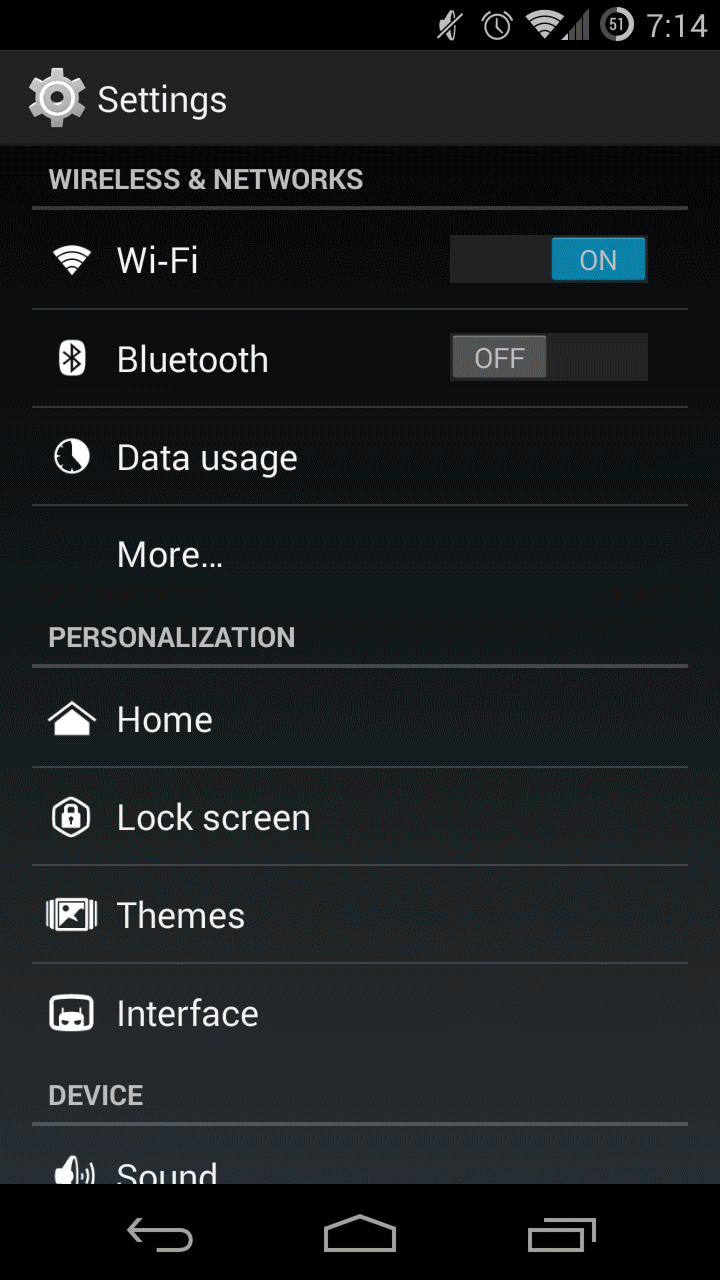
KitKat navigation buttons vs Google Design page (click to play GIF)
After digging through that same design page, one eagle-eyed Reddit member found refreshed navigation buttons in one of the screenshots and wouldn’t you know it — they’re not the PlayStation style shapes found in the Android L Developer Preview.
While this could mean any number of things — at worst, this is nothing more than a quick mockup — it appears these more traditional-style nav buttons were, in fact, designed with Android L in mind. Taking a look at the back and home buttons, you’ll notice they have been slightly slimmed down. Nothing too major, but it’s the multitasking button that caught our eye, mirroring closely the new 3D recents found in Android L.
It’s clear not everyone is a fan of Android L’s new nav buttons and it’s entirely possible these are nothing more than placeholders for what’s to come in the final release. We’ll just keep crossing our fingers that these more traditionally styled nav buttons show up in Android Silver, rumored to debut later this year/early next.
[Google Design | via Reddit]