
I think it’s safe to say we’re all pretty hyped about the upcoming Android L release, the next version of Android that looks to pretty things up with Google’s new Material redesign. As part of Google’s new found focus on design, the search giant is already providing developers with a handy resource page.
The page discusses all the dos and don’ts in regard to the new Material design and in the process, it appears Google may have let slip some of their Google apps getting the fresh new facelift. While in many cases, these were simply mockups to provide developers with examples of how to use Material, sifting through the guidelines were able to find a few that we believe can be called legit “leaks.” Let’s take a look.
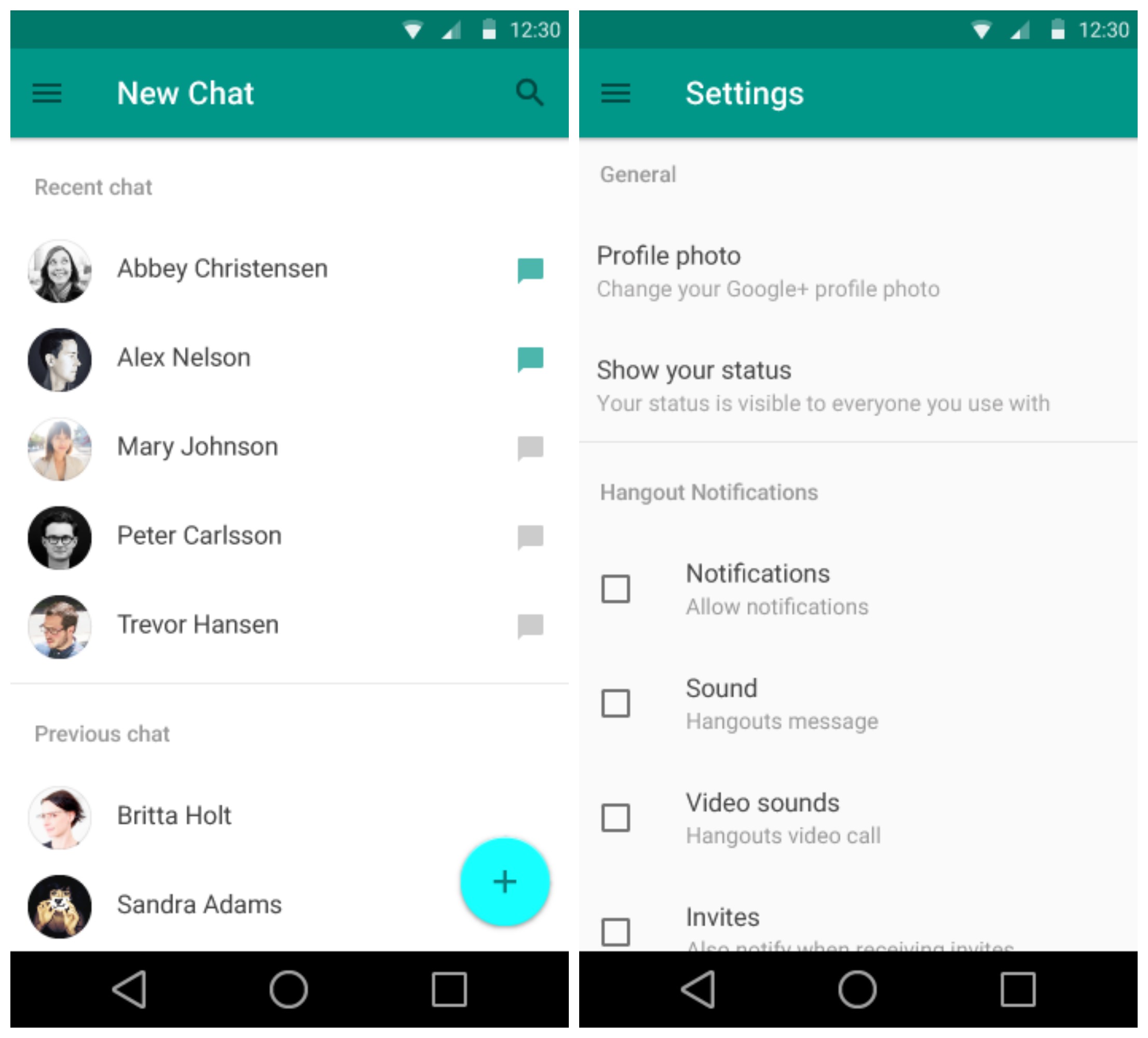
Settings
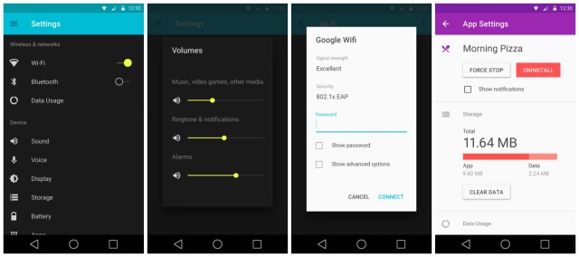
New for Android L is a redesigned Settings app and although it may appear to be rocking a dark theme in these images, we’ve seen some hands-on with L showing an all new light theme. So what gives? Well, we don’t think Google will allow users to choose between a dark and light theme with Android L, this is probably just an example of Settings using Material’s dark theme. Oh, and check out that redesigned Apps Settings, it looks absolutely gorge.
Contacts
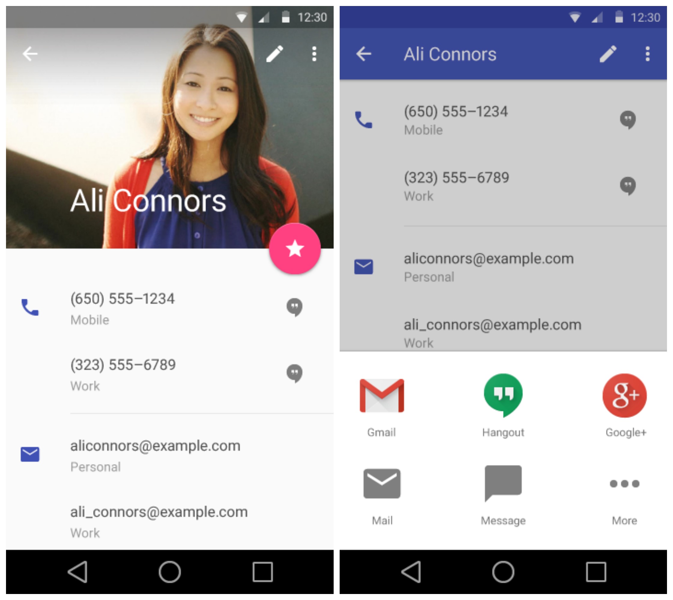
Contacts is also getting some Material love. We found Android L’s new “complete action” popup that vaguely reminds us of the one found on iOS. We’re sure it’s just a coincidence.
Gallery/Photos
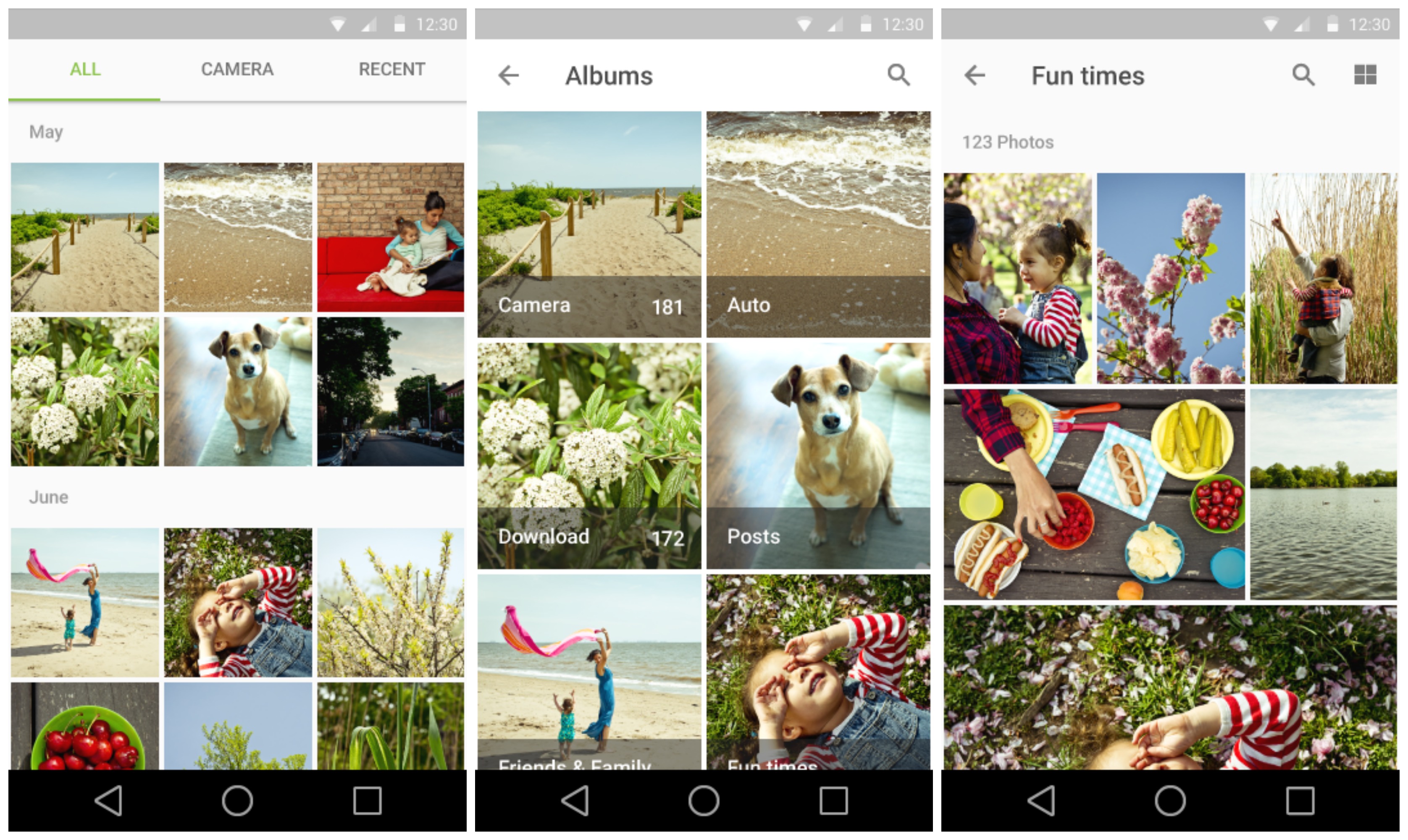
Now, we’re not entirely sure if this is the Photos or the stock Gallery app (maybe neither), but it looks all refreshed for the upcoming Android L release.
Google Keep
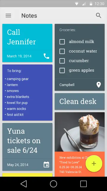
Google Keep also found its way in the style guidelines, and were not much has changed, you’ll notice Material’s new floating “compose” button.
Gmail
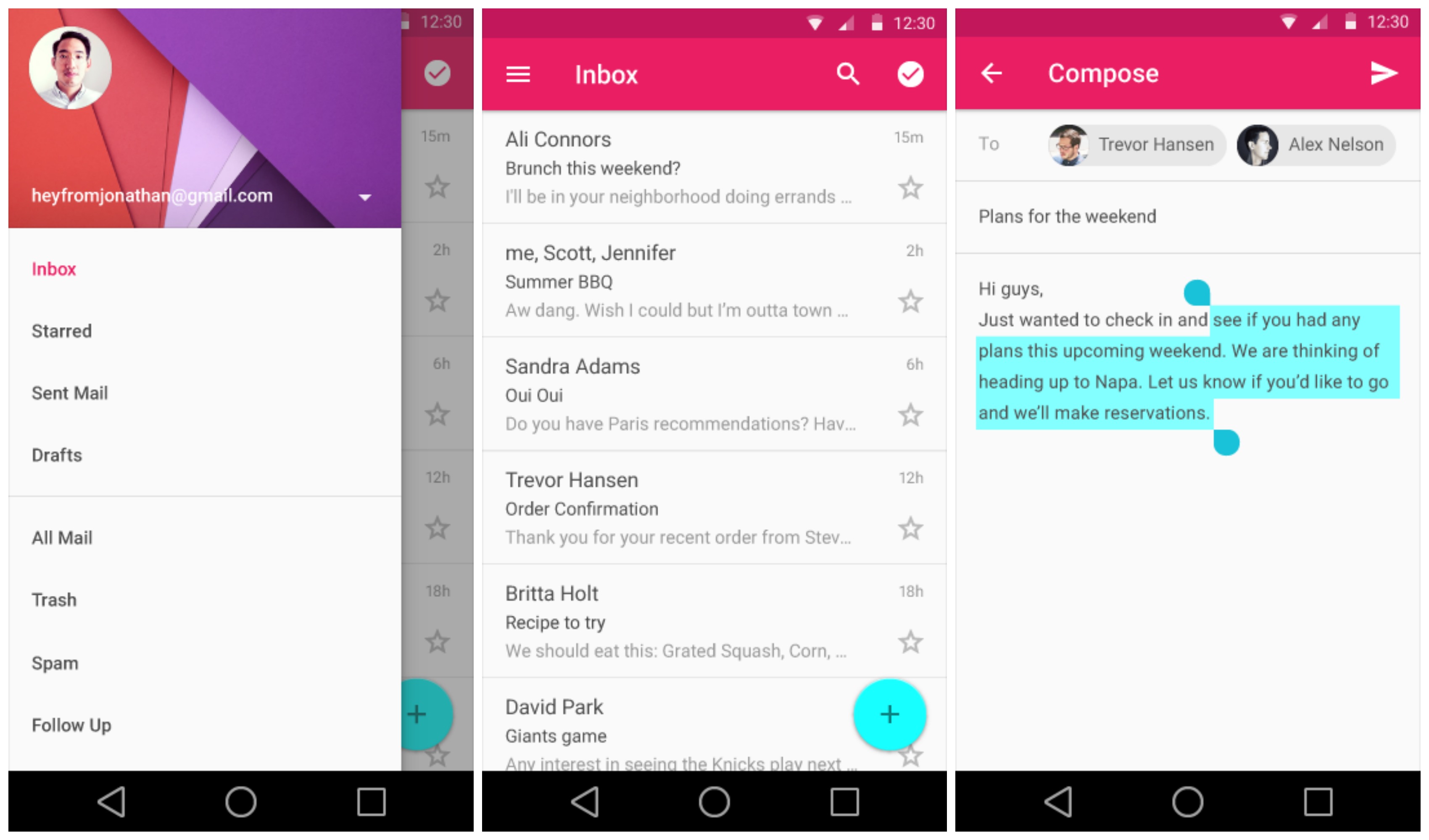
We got a glimpse of Gmail during the Google I/O keynote, and here we get a glimpse of the new text selection handles coming to Android L. Small, but simple.
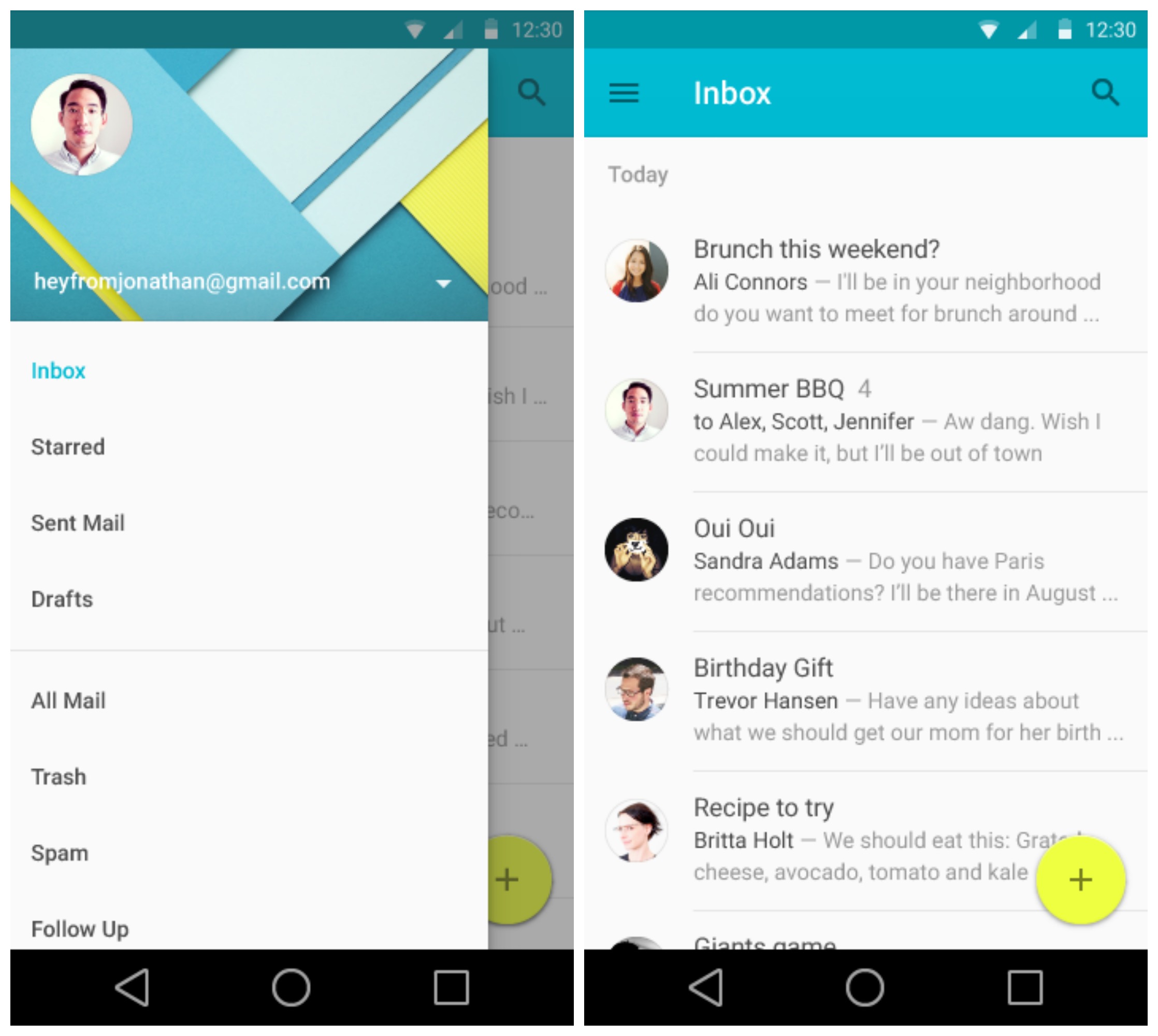
We found screenshots of what appears to be Google’s stock Email app, the one that recently became available on Google Play. It mirrors closely the Gmail application, only featuring an aqua blue/yellow color scheme.
Hangouts
Now Hangouts looks so drastically different from our current version, we’re not entirely sure how accurate this new look is. Whether a generic mockup or a sneak peek, it’s clear Google is focusing on a much more minimal, simple user experience.
Google Keyboard
You’ll notice the Google Keyboard popping up in both a dark and light theme — but not so fast. It’s possible the keyboard simply changes its color based on whatever is “underneath,” similar to the keyboard found on iOS. While options are always good, it’s also possible Google will have a system wide dark and light theme for Android L, but don’t hold your breath.
YouTube

Digging through the Material files, we found a short video for a new YouTube app. The video was mainly to show off the new buffering animations coming in Android L. We like ’em.
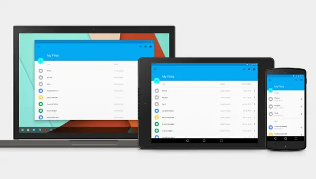
Google Drive
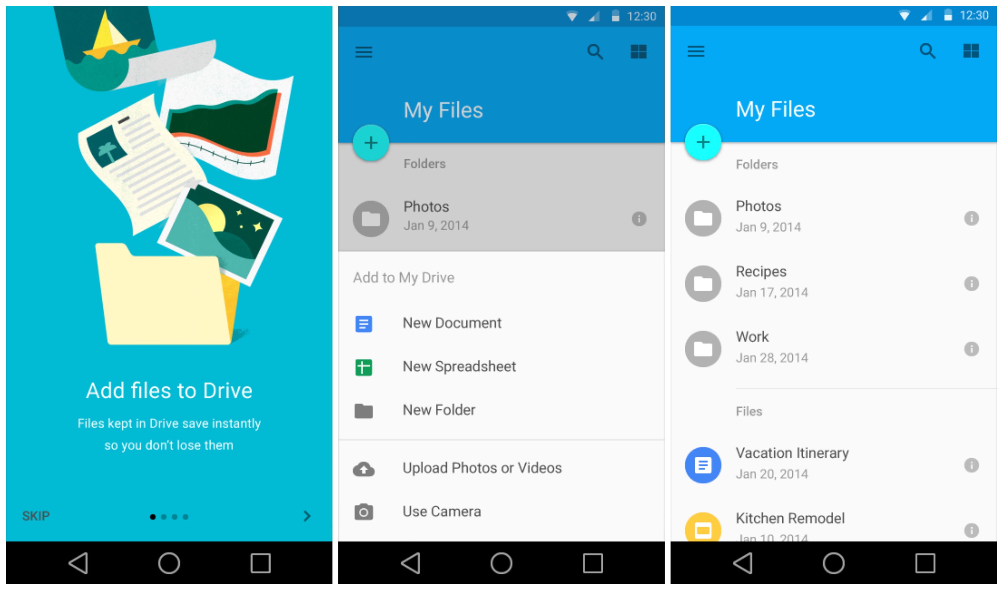
Google Drive was made many an appearance during the I/O keynote, but here we get a look at the introduction page and a few screenshots of the file system. Pretty standard affair and cleaner than the current version.
Google Play Store, Books
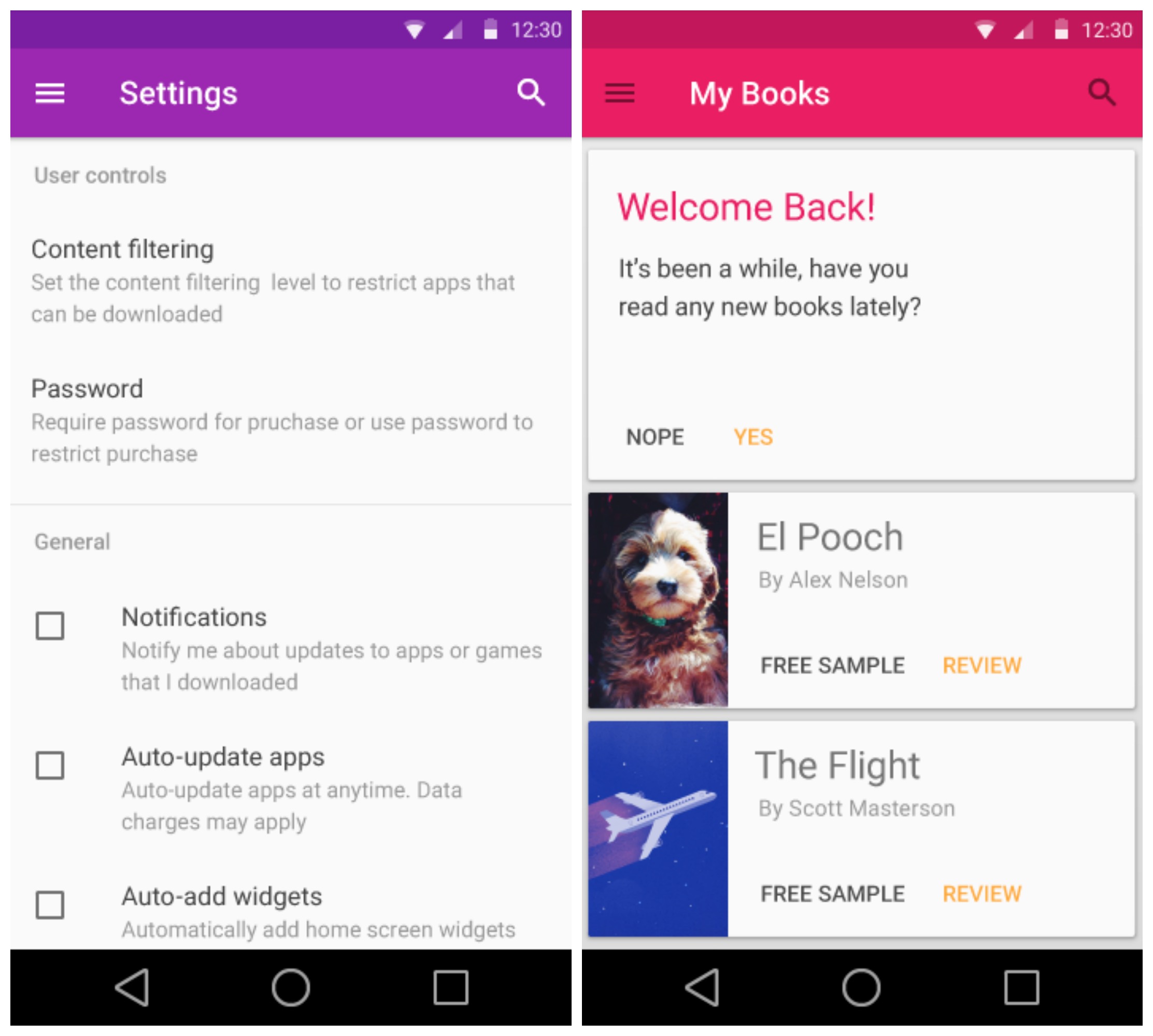
Screenshots of the Google Play Store and Play Books was buried deep within the style guidelines page. While they don’t reveal much, they do show us the overall color scheme Google could use for the Material version of these apps.
Chrome
To show off one of the new ways of loading images in Android L, a new version of Chrome was shown off in video form. While the static image doesn’t show much, the video has this awesome new loading animation that fades an image into view, instead of abruptly loading it.
Maps
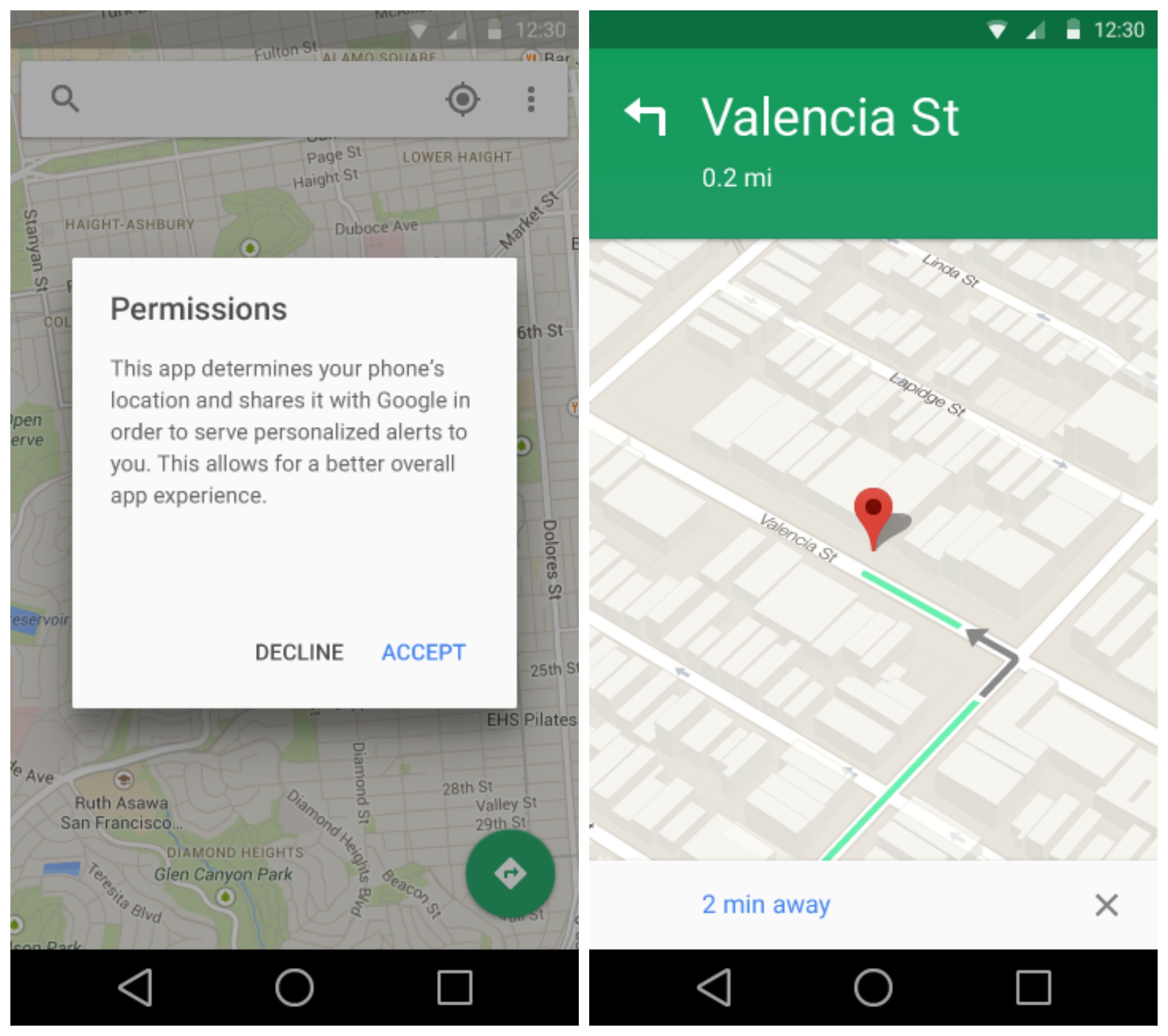
Google Maps is also getting the Material treatment and doesn’t look too different from the current version found on KitKat. You will note a new permissions popup asking for general location data from the app.
Google Play Music
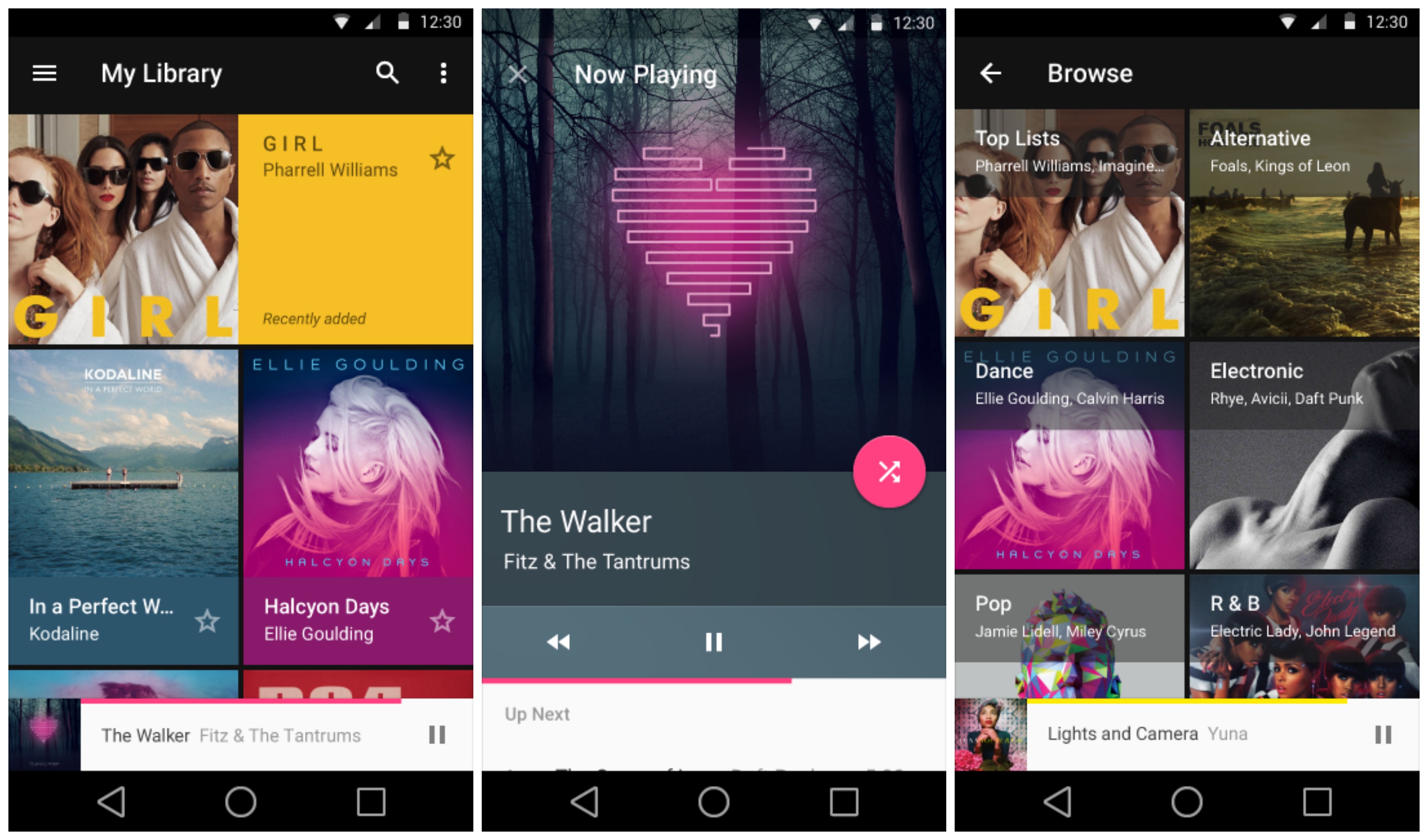
For Google Play Music, we’re seeing a much more simple interface from our current version. We don’t hate it, but we just started getting used to the redesign that feels like was barely introduced not too long ago.
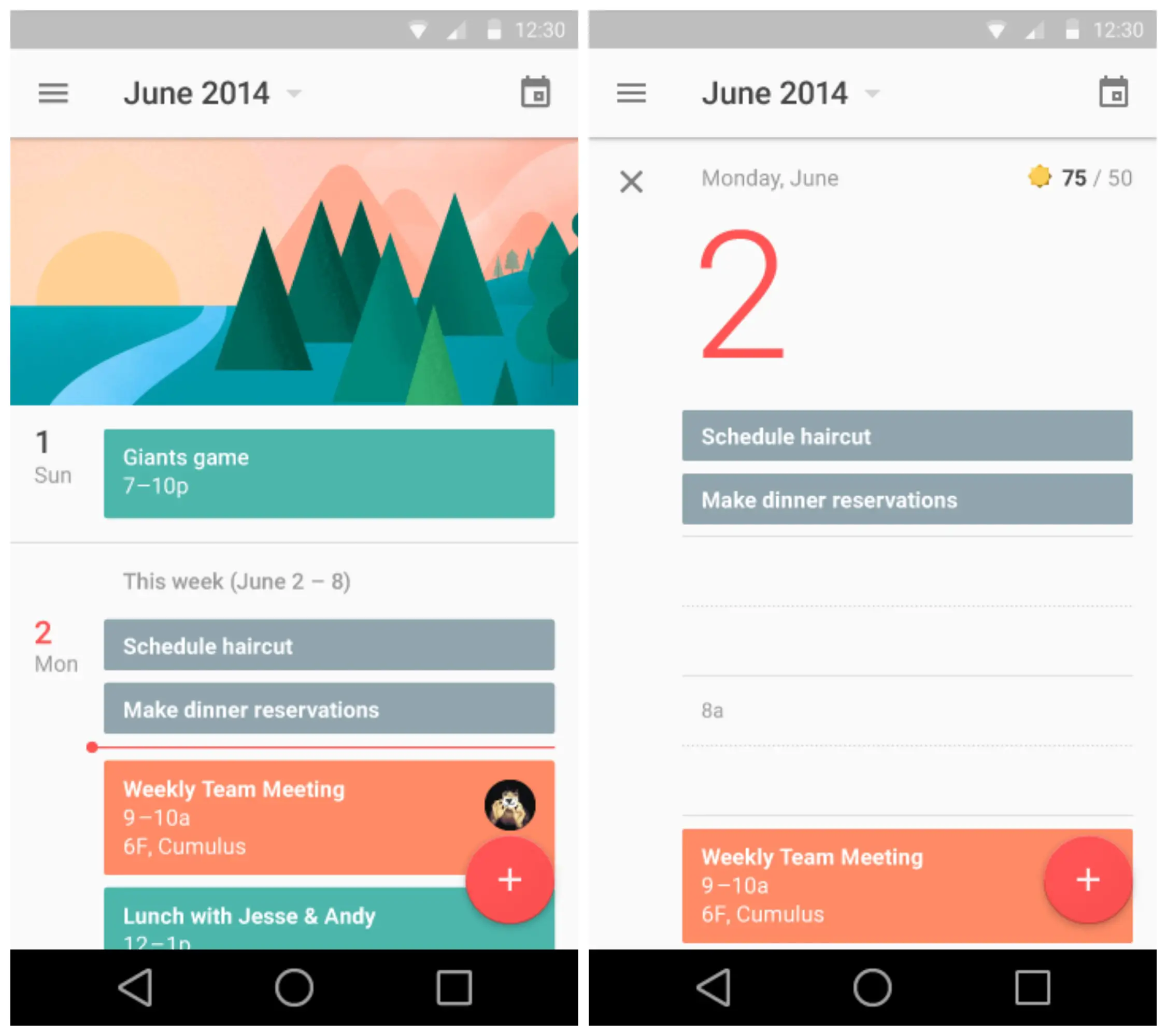
Google Calendar

Lastly, Google Calendar was shown off in all its Material glory. The app is clean and really, the screenshots don’t do it justice. There are loads of animations for expanding calendar entries, scheduling events, and everything else the app offers. It’s a thing of beauty.


MMM….. ANDROID
Android Lima Beans :d
I think you might be on to something!
Or on something.
My favorite dessert.
Am I the only one that thinks this all looks absolutely GORGEOUS?? I love the Google now style of things… I’m soooo glad I have a Nexus 5 right now because damn that’s just beautiful. And whether they release one more nexus phone, or just go with Android silver devices, I’m definitely going stock android after my Nexus 5.
The design looks nice and clean — I like that. More than the design, I’m absolutely in love with animations. I’m going to be playing with my phone so much, I might go blind.
I love everything about it besides like @scoter boy 1said, the onscreen buttons kinda suck but everything else tho… I’m so excited right now
Then you guys must love the new Touchwiz/LG/Sense UI’s, ’cause they look pretty much exactly like this.
I actually like Sense, some elements of TouchWiz are great and some are terrible looking, and I’ve never actually seen the LG UX in depth, but for the most part yea.
I like Touchwiz, havent used LGs but abhor Sense
I agree about the buttons!
Yea I agree on the look of hangouts. I like it how it is right now.. But I’m assuming that nobody will like it 100% completely and me personally, from what I’ve seen today I like it probably about 90% – 95%. So thats a acceptable ratio for me, imo.
Besides, they could update Android after the “L” release and maybe even the color scheme out?? I guess the main thing I like is the overall consistently and the lighter more colorful theme.
You know, part of it is that I LOVE Holo Dark. This is just way too bright and cheerful for me.
And yes, I do enjoy that it’s consistent, but I wish it was different than it is.
Also: http://coub.com/view/jp2g
I love holo dark too but Google never seemed to really get it completely right if you know what I mean. It always seemed kinda disjointed. I love the card style, and the flatter edges, too bad they didn’t stick with holo dark but just with those touches.
Yeah, likewise. I just enjoyed the flawed Holo Dark more than the more thought out Holo Light. If anything, I would worship the Google Overlords forever if they would just have the option to turn all the bright colors dark!
Agreed.
I’m not a fan of the new designs for the onscreen buttons. Maybe it’s just because they’ve never changed before.
That’s the only design element I don’t like…
I’m sure the amoled fanboys are crying about all the light designs battery consumption wise, but I’m not one of them so bring it on!
It looks cool, but I’m still waiting for some CONSISTENCY in the design. Look at “App Settings” vs “Settings” in the first series of pictures — they look like two different operating systems entirely.
I would tend to agree, but, with KK there is the option for light or dark. I think that is what you might be seeing in the images posted. There are other examples as well. The Keyboard is shown in light and dark, side by side. I do however like the minimalistic design approach. Back to basics.
Seriously, this looks way more awesome than anything on iOS ever.
I am really digging the new UI. Be interesting to see how much of it filters through on skinned devices like M8 and particularly the S5 since Google has been working close with them in terms of a less intrusive TW, which i’m liking.
And not to start a war, but i’ve spent the morning reading everything Google I/O here and other sites, and the amount of references by a certain fruity demographic saying this is a copy of ios lol – no idea – took a lot of strength to just leave it alone……….
I doubt you could tell the difference between this and the TouchWiz on the S5 at a glance.
When can I get his one my Nexus 7 (2013)? I MUST KNOW!
Tomorrow
It would be awesome wouldn’t it?
Hopefully you can change the color scheme. Really don’t care for the bright colors.
Crossing my fingers for a dark or light theme option, but I think the colors are here to stay.
I’m afraid you are probably right. Would love a dark theme option!
The nav buttons on the chrome image are awesome looking. I’d be just fine if those were the ones that come with Android L. Much better than the circle/triangle/square we’ve been seeing today.
reminiscent of playstation….
Look at the chrome leak specifically. That image has different buttons than the rest.
I saw them, I dont really like those. I like the playstation looking ones more
Anyone else find it weird that the on-screen buttons in the Chrome screenshot reflect the old style instead of the new?
Maybe you get a choice.
Please hangouts have pop up notifications.
I do NOT like this! The design and colour scheme looks like something from a child’s toy. Here’s hoping some awesome developer has a way to theme everything immediately upon release because between the app aesthetics and those hideous nav buttons I would hate looking at my device.
Don’t accept the OTA then. Or flash a KK rom.
Nova launcher.
But that won’t fix the hideous white notifications, horrible blue notification buttons, ugly giant white bars on the lock screen and terrible bottom buttons. This is the worst Android has looked since 2.x.
Someone call the whaaambulance!!
looks like the lg g3 lol and i don’t like the keyboard at all
That’s the beauty of Android….. Change it.
Save a APK of the Google Keyboard now, incase you have trouble finding one when this rolls out.
im not much of a fan of the navigation buttons
I definitely agree, I loved the ones we have now from the start! But these… These don’t even indicate what they do! They’re just symbols!
It looks quite nice. More importantly, it’s showing an abundance of consistency.
Why is keep so dull? Everything is extremely colorful except for keep, which is actually colorful right now with it’s yellow action bar.. That seems weird.
I HATE all the ugly Google colors. I just want a simple consistent color scheme with an option to choose the base color to theme it. That’s all! Oh…and let me decouple the Google apps if I don’t want them. I like integration but I also like my privacy and want to be able to turn off what I don’t want.
Blackberry 10 is waiting for you…
…and Fisher Price is waiting for you.
Sorry, I don’t understand you. I can’t speak troll.
Troll calls someone who has a different opinion of a product he drools over a troll. Irony at its finest.
Two cans, some string and a tin foil hat for you then.
You do realize that you can disable many of the Google apps post ICS? I don’t use Calender, Movies & TV, Books, Newsstand and several others and I have them all disabled, so you can turn off what you don’t want to use.
You can do all of that. Well, I should say Android allows you to do all of that. It just might be hard for you specifically.
I like it , but can anyone get the SDK ?
It’s out soon. 9am US time probably (around 5pm BST)
I’m kind of new to “SDK” how do I get that on my nexus 5 ? Like what apps what I need and what should I do when I download it
The SDK is not for your phone.
It’s probably best that you do not install the preview if you are not sure how it works. You will need to download the development kit and flash the image onto your phone using command line tools.
There will be tutorials when the images are released i imagine.
Oh , thank you lol I’ve never been good with command line tools
Googles doing too much.. Touching my music app.
I just got my OnePlus One invite. Now I’m conflicted. I only have 72 hours to decide if I’m going to buy the phone, but Android L is making me want to stick it out with my Nexus 5.
What would YOU do?
One plus one. It’ll get l pretty soon after it’s released.
Keep that Nexus 5…just my opinion.
Nexus 5. Not a big enough jump to switch in my opinion.
Definitely the Nexus 5. The OPO is imho way too large.
Stick with the Nexus 5 and send that invite my way ;)
I don’t care one bit about the new designs. What I wish Google would do is FIX it’s services so they actually work! Let me know when Google music will work without having errors streaming all the time. Let me know when I can do something as simple as seek on my car stereo through Bluetooth.
Let me know when the play store stops having errors downloading apps. Let me know when YouTube will play a video without having to refresh the page 5 times. Let me know when chrome loads webpages with some semblance of speed. Better yet, let me know when Google hires developers that have half a brain. All the new features and designs to me scream “new bugs”! I’ve lived through a ton of supposed “bug fix” updates from Google but I’m being 100% honest when I say they introduce more bugs each year than they fix. About ready to switch.
My Nexus 5 has no clue about anything you’re talking about. What did you do? Pee on your Samsung Galaxy Ace or something?
No I peed on your mothers face.
My two year old SGS3 has no problems either. Sounds like a bad install, mate.
A bad install of what? The issue is with Google servers on multiple devices. The music streaming problem may have been specific to the G2 as many G2 owners were complaining about it on G+ but everything else I described was present on at least 5 devices that I either owned or personally saw with my own eyes. Then theres play store reviews. Look at YouTubes for example.
Do you use custom ROM’s? ‘Cuz I repeat, I have ZERO problems on a two year old stock phone on 4.3. I streamed music for 8 hours on Saturday on a long car trip. I use Drive, YouTube, Play Movies, Maps, Now, Hangouts, Voice, and G+ multiple times every week. Not much of a Books/Magazines/Keep guy, but otherwise, I use Google services to the hilt. And if they didn’t work consistently, I wouldn’t use them.
I’voe got no problem with SGS2, it’s still runs good till now, try changing your custom rom
No custom rom and if people had reading comprehension skills you’d remember that the issues were on multiple devices.
I have three Androids, one is a 3.5 year old tablet. Now, it has problems, but NONE of them are related to Google services. Ditto my other, newer devices, which are both butter smooth in every aspect.
Maybe u need to stop splooging on ur devices, u can only make so many insurance claims before they catch up to u bro…plus if u had many devices, its a data issue, not software, genius!
Don’t et the door hit you on the way out. On second thought, maybe it might knock some sense into you.
If your version of sense is to keep using something that doesn’t work you can keep it.
Most of them issues sound like your internet is the cause. I have none of them issues.
Well I guess if its not happening to you it mist not be happening huh?
I am just pointing out that i am not having these issues. Therefor you may consider that it may be something specific to you. Internet is the first thing i could think of.
i do all necessary troubleshooting before I blame a company for a problem. And almost every issue I described here happens on multiple devices on any network. Google servers get a little wonk every year it seems when they’re working on updates. This year is just particularly bad.
I stream all of the time, I kill that radio feature. Chrome is quick for me. Only time I have had an issue downloading an app is when there is some known issue with the play store (maybe once in the past two years)
Maybe you shouldnt have cheaped out on the plan (Sprint?).
As for seeking, I can FFW/RW but not seek, but that is on my bluetooth interface as it didnt work with an iphone either. Maybe your car is as terrible as your internet.
Must be my equipment or internet Because your precious Google can do no wrong. Look at the reviews on the play store before being a moron.
I’ve been using Android for years and occasionally I’ll have a Google Play Store error message but that’s it.
This looks too much like iOS 7.
No.
WE are you talking about drinking koolaid I see
Yep, I already greatly miss the dark/glowing blue interface from Android 4.x. This is like a hideous iOS clone.
I really like the new Gmail/email and the new keyboard looks super slick
The Pink theme is horrible and better be configurable.
It’s not pink it’s bright red
Difference
I’m not sure these pictures are the final design. I doubt Google would release a pink theme for Gmail and Play Books for example. Just look at the picture below they unveiled during the keynote, this is the real deal. I think Google altered their apps design to show devs how they’ll be able to customize the theme’s base color to fit their brand.
@phinn:disqus
@Gamercore:disqus
am I the only one who finds the redesigned back, home and app switch buttons ugly and unintuitive? playstation?!
No your not sir.
Placeholders… hopefully.
That and that new yellow color for the notifications/settings.
I get the style, but I don’t see why Home can’t stay as a house icon. Someone must have though a 5-sided shape was too much.
Yea they’re terrible, way too abstract. The only ones are perfect. Additionally the new color scheme is horrible.
Love Android 4.x’s Holo theme :(
If you want android to have a dark design where nothing fits together, then don’t update anything. If you want some design standards which most people do, then update.
I like this. It’s different and I like Android how it is now but it won’t take me long to get used to it. I think it looks pretty sleek. I’d change some things but whatever that’s what launchers are for.
love it , just have one request Google. Please put the comma back on the main keyboard in Google Keyboard in front, opposite side of the space bar from the period. We use the comma a lot, would be useful without having to hit another key.
You can have it, but at the expense of losing the voice input key. Dig into the keyboard settings.
Just remove the mic option in the settings and you’ll have your comma back.
Those back symbols sux
So I can’t edit comments from the Phandroid app?
iOS ripoff
I noticed on the grocery list; almond milk. I had no idea that almonds had nipples.
Ugh this is so damn ugly. I LOVE the dark with glowing blue accent look of Android 4.x so far that works so well with OLED, this hideous bright/pastel interface is no good. Everything looks so pastel and generic. And those bottom 3 buttons? They are too abstract, the other icons are far better. Every single thing about this design is a step back to generic for me.
I daresay iOS 8 looks far better than this.
“works with OLED?” In what way? The power saving was a myth.
Huh? LED pixels are off when black, so dark or black colored menus stand out and look incredible. Additionally, with the pixels off they’ll use less power, that’s not a myth at all go look at DisplayMate’s reviews of OLED screens with energy draw on bright vs. dark screens.
They are not off, they are just dimly lit. If you are in a dark environment you can see the screen lit even with the screen fully black. OLED still has the issue of color burn in, and bad saturation as well.
Just use a laucher
When do these apps get released or will they only show this in the 5.0 version?
5.0
When do these app modifications come out? or will it only be in version 5.0?
This is so generic and ugly. I want Holo back.
I do not like how spaced apart the data, signal and battery icons are from the clock. That just looks terrible.
Not bad looking, but more empty space, less lines per view, and way too much like iOS 7; I really like the Holo theme but most important is how much information per screen and how easy is it to tell different elements apart on screen, my biggest complaints with Android and iOS changes.
iSheep be like “iOS 8 is better.”
It’s gaddam raining skittles and Micky D’s happy meals over there in Mountain View. What the hell is going on with Google?
My personal opinion. 1. I don’t like how the things are spaced. Too much realestate wasted in space. 2. Too many flashy colors look childish.
So it’s Windows Mobile Metro by way of Playstation.
Looks a lot less boring than the current Kit Kat looking going on. I like it. I might consider going back to stock
This looks really, really great. Except one thing: the colour palette. There’s far too much grey and dull colours a lot like LG’s G3 skin. Especially on Keep and Play Music. Brighten it up a bit and it’ll be amazing.
Still no dark theme option? Then all this is erroneous…
If Google really wanted to implement something, then two versions should have been ‘leaked’. Light and dark.
I honestly really like the design and the color schemes (almost would make me go back to stock). But i really hope the colors are customizable; that’s the only thing i wish my M8 had. Other than that cant wait for HTC to send out this update to my phone :)
The picture shown there is not Play Music. If you watch their other videos about redesigning the Play Suite of apps, you’ll see that Play Music is very much different from the music player that’s always shown during the keynote. Play Music still has that orange color. I dont know what that other Music Player is. (Attached is a screenshot of the presentation about play apps)
I have to get used to a damn box for settings and recent apps.
Makes it look like an unloaded character.