
After seeing the newly redesigned triangle/circle/square navigation buttons in the Android L Developer Preview, let’s just say we were excited at this latest discovery that suggesting they may not be Google’s final design.
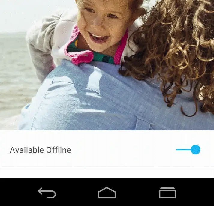
We dug through Google’s Design page last week to show you guys a few of the redesigned Google apps arriving later this year. Because it is a design page, we weren’t entirely sure which screenshots were legit, and which were nothing more than a quick mockup.
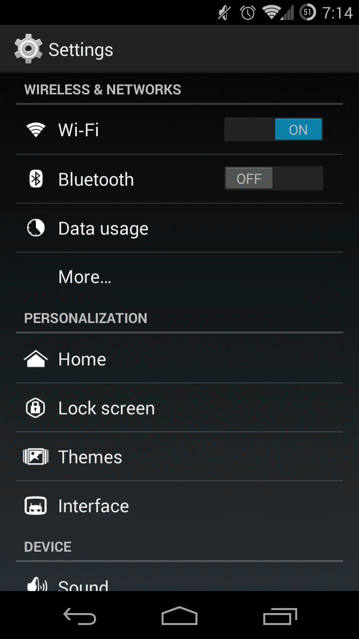
KitKat navigation buttons vs Google Design page (click to play GIF)
After digging through that same design page, one eagle-eyed Reddit member found refreshed navigation buttons in one of the screenshots and wouldn’t you know it — they’re not the PlayStation style shapes found in the Android L Developer Preview.
While this could mean any number of things — at worst, this is nothing more than a quick mockup — it appears these more traditional-style nav buttons were, in fact, designed with Android L in mind. Taking a look at the back and home buttons, you’ll notice they have been slightly slimmed down. Nothing too major, but it’s the multitasking button that caught our eye, mirroring closely the new 3D recents found in Android L.
It’s clear not everyone is a fan of Android L’s new nav buttons and it’s entirely possible these are nothing more than placeholders for what’s to come in the final release. We’ll just keep crossing our fingers that these more traditionally styled nav buttons show up in Android Silver, rumored to debut later this year/early next.
[Google Design | via Reddit]


Good to know that those shapes might only be placeholders. It was the only thing in L that I didn’t welcome.
I was hoping those nav buttons in the L preview were just place holders.
…
*PRAISE DUARTE!
LMAO I was totally thinking that when I posted it..
Maybe you’ll get to choose.
I feel like every Android release we hope Google will let us choose themes, etc. but it never happens. Like everyone said below, I’m guessing the weird shapes are just place holders making it easy to spot the Android L Developer Preview.
Or those ones from the Design page were old re-designs and the ones from the L preview are the newest.
Yup.
I actually prefer the ones in the L preview over these.
Don’t hurt me please….
GET. OUT.
Chris… I thought we were friends…
I’m mentioned as your friend right here, was this a lie?!??! http://phandroid.com/2013/05/09/google-glass-calls-and-messaging/
It’s okay we are all open to everyone’s opinions in these chat’s (Crossing finger’s behind back while grabbing bat)
That sounds difficult to do. Are you grabbing the bat with the same hand that has the crossed fingers?
Pshh to easy
I like em too.
me too
LEAVE.
Blame Bush
Blame Obama. Bush was an idiot but Obama is set on destroy.
Yeah! He is killing Murica! He hates our freedom and was sent here by the Muslim agenda to destroy capitalism! Also, I heard he eats puppies.
I didn’t know about the eating puppies part what a monster.
Obama admitted he ate dog meat when he was in Indonesia.
puppies are delicious!!
…
/s
You wouldn’t be one of those people who wants “their” country back, would you?
That would be Putin
The L Preview buttons looked like Playstation Buttons. That aside, they also are not intuitive. To the average user, they look like Play or rewind, stop or record, and pause.
I like the new icons the triangle is still pointing left for “back” the task button is the same concept as it is now but without a second square behind it. The home button is the biggest change but, I can’t see too many people scratching their heads over it. The shapes are still functional but are now more aesthetically pleasing.
I like them too, but I think Google would get sued by Sony for the back button, and by Apple for the multitask button.
Agreed. I don’t see what the big deal is. Spend literally 2 minutes with the phone, even if you’ve never used Android before, and you’ll figure out that the O brings you back to the home screen. It’s not going to be the end of the world. I think people just like to complain about new things.
I wonder what people were thinking when they first saw those shapes used for record stop and pause?
They didn’t have to think, because they were told and shown, by the manufacturer what they meant, and that’s been ingrained in their heads ever since.
What if someone was buying their first Android phone? They’d be confused as heck. Some people just gotta fix things that aren’t broken.
They didn’t bother me either, it’s not like they moved them around and then changed the look. That would had messed me up.
You could change all the keys on my keyboard and that wouldn’t bother me at all either.
The shapes are nicer.
These are 100% better. The circle for the home button doesn’t even make sense. Please Google use these buttons.
Circle is for apps (like the all apps button in the Google Now launcher
Also found this one, it’s from the GIF Google used to show the new Chrome anination
Much better task switcher, what a difference a line makes. I actually like the triangle for Back though, I think they could use this with fatter versions of the home and task buttons and get a good compromise of both usability and a friendly look:
I’ll be keeping the L preview ones if they do change them in the final release build.
Someone pointed these out in the comments here last week.
I just don’t understand why they would use a placeholder that looks completely different to go back to something like it was before, why not just leave them? I’m real skeptical about this even though I think it would be a good idea to switch.
The KitKat screenshot looks great. Nice and clear contrasty text and buttons (except the time should be bold), battery percentage in the icon, text is not too large and there is not space everywhere. The PlayStation buttons on Android L… not unique, not very recognizable… there’s a point where things should just be kept recognizable. Also there is way too much empty space there… that is wasted space to me.
One idea as to why google wants to move to the new shapes is that these buttons could then become context based like on gaming stations. So the back button could be fire and the circle jump, etc. I hope not because most users will be confused by that.
Thank you Chris! I’m really surprised to see my first reddit post (I’m u/aliencorgi) get so far… I really didn’t expect that… Really humbled!
Those settings menu-the personalization part. Stock android isn’t as customizable…. Please respond, is that a custom rom or stock android?