Jonathan Martinez was on hand for Phandroid in San Francisco today for CyanogenMod’s shindig, where they gave us a closer look at the all new OnePlus One running CyanogenMod 11s. The device is everything we thought it’d be at first glance. Fast. Powerful. Beautiful. Sleek. Slick. Big. REAL big. That 5.5-inch 1080p HD display is the window to the custom version of CyanogenMod, which is currently based on Android 4.4 KitKat.
Here are the rest of the specs you care about:
- 5.5-inch JDI display with 1080p HD resolution
- Qualcomm Snapdragon 801 quad-core 2.5GHz chipset
- 3GB of LP-DDR3 RAM clocked at 1866MHz
- Between 16GB and 64GB of internal storage
- 13 megapixel Sony Exmor IMX 214 f/2.0 aperture sensor with 4K video recording and dual LED flash, 5 megapixel front sensor
- 3,100mAh lithium polymer battery
- dual-band WiFi AC, Bluetooth 4.1, GPS w/ GLONASS, NFC
- microUSB 2.0, multi-colored LED notification light and a 3.5mm headphone jack
- Android 4.4 KitKat with CyanogenMod 11S
- 152.9 x 75.9 x 8.9 mm, 162 g
Got that? The quick story is that this is one powerful device — perhaps the most powerful you’ll be able to find right now — and it costs as little as $300. Unreal we say, but reality says otherwise apparently.
There are some neat things going on here in the software. The most noteworthy is the ability to switch between capacitive navigation buttons and on-screen navigation buttons on the fly. Different strokes for different folks, we suppose.
Also featured in CyanogenMod 11s is a custom lock-screen option that gives you a look at the time, date, weather and possibly other bits of pertinent information before diving into everything else your phone has to offer. CyanogenMod tells us the lock-screen will have open APIs for apps to hook into, which makes it sound like it’ll be quite easy for developers to integrate music controls, enhanced notifications and more.
And aside from the special squared-off iconography featured, everything looks like AOSP-styled goodness (of course, it’s nowhere near AOSP once you get beneath the hood of it all). All the video and photos you need can be had above, so be sure to scarf it all down if you’re wondering how this thing looks in the flesh ahead of its eventual launch.

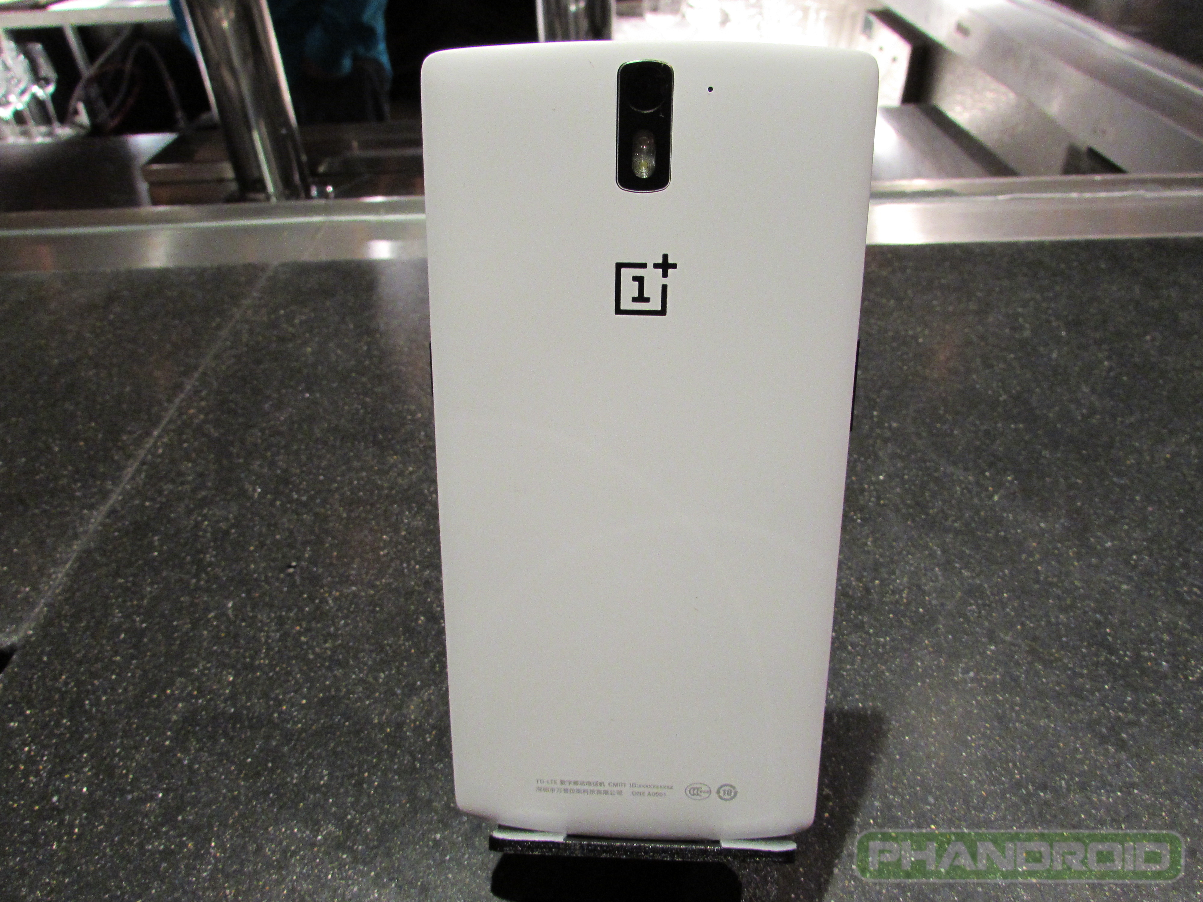








Typo in, ” and it custs as little as $300.”
:)
Thanks for the hands-on. Great device.
Also, do I see blue capacitive buttons? Because in all the pictures I’ve seen, they look white. Can the back light be changed?
Yeah, blue capacitive buttons on these preproduction models.
How does it feeeeel?
It felt silky smooth and even though it is a large phone, it feels better in the hand than any Note I’ve held.
Thanks. What about “build quality”?
Does the chrome looking band around the screen get in the way or does it look bad in person?
Build quality was stellar and that is a big plus considering that these were all preproduction models. Super sturdy in the hand and it certainly passed the bend test. No creaking at all.
The chrome band is a nice touch but I can see why some may not like it. I think it is a fresh take on smartphone design.
Just how I like ’em… all big and big-like.
Thumb wars?
Thumbtanic :)
Also featured in CyanogenMod 11s is a custom lock-screen option that gives you a look at the time, date, weather and possibly other bits of pertinent information before diving into everything else your phone has to offer. http://sn.im/28v1ckw
errr…… what??? that’s all????
Yeah, sorry I didn’t dive more into the UI stuff. See my comments above for more info.
Easy to hold in the hand? It’s barely in your hand because of that huge size. I’m not digging those square icons and the plain look.
I do like the option of capacitive buttons as that surely made me miss screen real estate, but I don’t know if it’s good enough to lose those moving buttons depending on orientation.
Capacitive buttons are an option and are so because the Chinese market still really dig those buttons over on-screen nav buttons; this according to the One+ team.
It was fine in the hand for what it is. It is a big phone, but a nice phone to hold and isn’t slippery at all.
weird… arstechnica says chinese wanted on-screen and its the americans (i think) that wanted capacitive.
The market research on this suggests otherwise.
Looks nice to me… I’d like to get a hold of one.
Thanks for the hands-on jmar, your first one on Phandroid – congrats, good job!
Nice job jmar! Phone looks nice too. :)
There was a lot going on at the event so I didn’t get to all that I wanted to get to.
The Cyanogen team told me that the idea behind the UI was to create something elegant and functional. They have done just that here with the ‘One.’
As far as the UI goes, they are taking a modular approach to things like the Launcher and Iconography. There will be a big update to Trebuchet coming soon and the team is looking to plug into the various icon packs available in other custom launchers. The idea is that instead of relying upon on custom launcher the user rather picks what they like from various sources and makes it their own.
Furthermore,
They have flattened the KitKat UI in a way that is fresh and beautiful; but, if you don’t like it, then you can change it.
Two other quick points:
1. The bootloader will not be encrypted, so your standard android oem unlock command in terminal will be available so that you may install a custom recovery and mods, etc…
2. The CM team is building a beautiful gallery app that is in the Alpha stages of production.
Good to see jmar back in the game! Thanks for the review man.
Thank you!!!!!
Wait, are you the one who made this review? If so then just pointing out that you made a small mistake, the two grills on the bottom are both speakers, it’s a bottom stereo speaker setup, and that additional hole is probably not for noise cancelling, that is likely the main mic for calls.
you know nothing
I actually do, these details have already been explained and shown…it’s a bottom stereo speaker setup, they’re both speakers not just one.
When does it go on sale for non phone smashers?
Review units are going out late May and the phone is set to launch in Q2 so I would say expect June.
16gb versions are in early-mid may, and 64gb version are in mid-late june
Not soon enough.
not even on sale in China
I can’t wait to get this phone, seem’s perfect to me! Also, why wouldn’t you want to use the capacitive buttons? Unless your a HTC fan and like having some wasted space under the screen I mean.
Why does it only apply to hTC fans… lots phones have on-screen buttons.
Would you buy this phone?
ur an idiot
Why is this phone so large? Looks obese…way to much bezel.
Also, the square icons in that video look horrid.
哦,这个300美元和中国的售价差不多,中国是2000元人民币,只是没有见到真机,不知道具体怎么样,但感觉比较完美。
what a stupid overly big “phone”…this is a phablet stop calling it a phone