As part of a quick behind the scenes tour of Motorola’s new HQ in Chicago, the folks at The Verge conducted a quick interview sesh with Jim Wicks, Motorola’s senior vice president of design and the man behind products like the Motorola Moto X and the upcoming Motorola Moto 360.
During the interview, we get a brief glimpse at the Moto 360 as it appears on Wicks’ wrist in its sleeping state. The Verge notes that Wicks was “dogfooding” the smartwatch, a prototype highlighted by the Motorola “M” on the watch’s bezel (don’t expect the logo to appear in the retail version). It’s entirely possible he was keeping the display off to keep the press from seeing early Android Wear software builds, but there was a few times during the interview where Wicks manually turns on the display to fiddle around in its UI. 2 things:
- Will users have to manually touch the physical button to wake the smartwatch
- Will there be an “always-on” option that perhaps Wicks wasn’t using on this prototype?
Really, it’s tough to say by the few seconds the 360 appears on camera and we’ll have to wait until Motorola reveals more details about their smartwatch in the coming weeks before drawing conclusions. But I think it’s safe to say a smart watch you have to physically interact with in order to show the time could be a tough sell for some. You may remember last week when LG took the wraps off the white/gold version of the LG G Watch last week, the Korean manufacturer was touting an “always-on” display.
The Motorola Moto 360 is set to go on sale this summer, right around the time we’re expecting to see a followup to the Motorola Moto X, currently rumored as the Motorola Moto X+1. Video tour of Motorola’s new digs — as well as a quick look at the Moto 360 — can be found below.


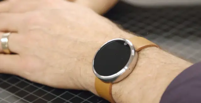




Maybe I just saw it differently, but it looked as though throughout the video he was trying to turn it OFF, not on. It seemed as though he would only hit the button after it woke up to get the display to go back to sleep. This could have just been to keep from revealing too much. If you watched the recent video with Matias Duarte and Joshua Topolsky, Duarte wouldn’t even take the watch out let alone play with it. And if you read The Verge article that accompanies this video, it seems that Wicks is similarly hesitant to show off any functionality, just the exterior design that we’re already familiar with.
Looks like he had to press and hold the button for a few seconds to get it to turn off the display. If that’s the case, I would say the display is designed to be on more than it is to be off.
If it is “always on” it would be nice if they figured out a way to make the screen automatically turn off when you take the band off. I don’t want to have to manually “shut off” my watch just to keep it from illuminating my bedroom at night.
A pre-requisite of a smartwatch is that it’s always on, just like a dumb watch. Pebble have already set the bar, they have to at least aim that high.
Motorola already said, weeks ago, that the time would be displayed when you look for it, without having to fiddle around with the watch.
Yeah, but that could mean a lot of things. Would it just have the LCD display without being backlit requiring a shake or movement to light up (like the Pebble)? Or will it be completely black (like in The Verges pictures)? Maybe the time would only show like a screen saver. Questions, questions…
It’ll probably be just like the Moto X’s Active Display, except with a clock face and longer awake duration. Though, the problem with AMOLED screens is burn-in, so if it’s on, it likely won’t display something until needed.
Nokia Lumias with AMOLED screens have information including color images, the time, and notifications displayed continuously while in sleep mode. I notice no discernible hit on overall battery life. They prevent burn-in by shifting the position of the time and notifications every minute. Displayed images are switched every 5 minutes.
For this to work for an analog clock face with hands the hour hand would need to be bumped a few pixels every minute to prevent burn-in.
Moto 360 is better looking than Samsung’s wearables in my opinion. So far it doesn’t make you look like a tech geek or something. Though the official functions are still unknown, the guy from the video is having a hard time just to turn off the display.
The size is what’s throwing me off. I’d have to see it in person, of course, but the pics from here and the verge peg it as quite a big smartwatch. So while it doesn’t look like geek tech, it does still stand out (which may be good or bad, depending on your preferences.
Meanwhile I’m enjoying my Gear Neo…. =P
Can it, if I am running short on time give me some to spare? If not, worthless.
Let me check my watch and see if I am still obese, yep!
Devices like this will spur growth in glasses and contact lens.
could be bigger like the big watches
seems smaller than the pictures…im still think I prefer a square design better, mostly because reading and responding to text messages will be key
My Uncle Isaac just got a nice 12 month old
Jeep from only workin on a pc at home… Read Full Article
CashDuties.ℂom