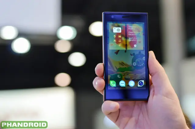
Hands-on with the Jolla Phone and SailFish OS [VIDEO]
The Jolla smartphone has long been announced, but the project was revealed so early that the team didn’t even have any prototypes ready to show the world. All these months later, though, we’ve finally gotten a chance to see the thing in person. We caught up with Jolla at Mobile World Congress to take a look at what they hope will shake the smartphone world up a bit and attract people to try something new.
What is Jolla?
It’s a smartphone. That’s the easy answer. But Jolla’s team created the device with a set of values and ideals that they feel are important to the overall package. Jolla was built as a community “movement,” of sorts.
They contend that the phone wouldn’t exist without real demand from the people who want to buy it. The developers who create apps for it are a major component. Designers who want to create unique Jolla cases will help the phone fit any user’s personality. Basically, Jolla is for you and by you.
But what makes this phone special? Well, it isn’t quite the specs, as they read out like your average smartphone in this day and age:
- 1.4GHz dual-core Qualcomm Snapdragon processor
- 1GB of RAM
- 16GB of internal storage
- 4.5-inch 960 x 540 display
- 8MP rear camera; 2MP front camera
- 2,100 mAh battery
The design and build quality are great, but even that doesn’t quite set it apart. It’s the sum of all of Jolla’s other unique parts. SailFish UI, a gesture-based system that does away with the need for navigation buttons. The “other half,” which can change your wallpaper, color scheme and other parts of your appearance depending on what back cover is attached. And did we mention it runs Android apps?
SailFish UI and Android Apps
SailFish UI is a Meego-based operating system that emphasizes beauty and gestures above all else. In fact, some might say that the beauty is in the gestures themselves. One of the first things you’ll notice about the phone is that there is no back button. There is no home button. There is no menu button. None of that is even on-screen, because you don’t perform these actions in typical fashion.
Flipping between applications is as simple as swiping from the left or right edge of your display. Going between settings, recent apps and your home-screen is all done by scrolling vertically. You can even access quick functions for each application in the switcher. For instance, swiping right on the switcher icon for Messaging might open up a new message box.
Accessing menu items within applications is done by holding down on the item and pulling down on it. For instance, to edit a contact you’d just place your finger on their name and start pulling down. A set of options will appear at the top highlighting each of the actions you can perform — simply let go to select it.
Having trouble visualizing all that? You can see it being demoed in the video above. It’s smooth, it works well, and it looks like a fresh take on the smartphone experience (because, quite frankly, the lines are beginning to blur).
Meego encourages developers to build native SailFish apps, but they know it’ll be tough to attract a sizable crowd. That’s why they’re making it easy for developers to port their Android applications over using an Android runtime. It’s the same sort of setup you’ll find in Blackberry 10, and we certainly don’t mind it here. We’re not yet sure how the process for porting apps will be, but if it’s anything like other runtimes out there we imagine Jolla will take the time to make sure it’s pain-free, quick and easy.
The Other Half
And then there’s this. What’s “the other half,” you ask? Well, it could mean a couple of different things here. One side of it is metaphorical — for most people, a smartphone is their other half. As sad as that may sound, it really is one of the most important devices in your life, as it keeps you connected to your world and the people you love. There’s another half to the other half, though, and that’s the unique ability for your backplate to change your device’s look and feel.
So what is it, and how does it work? It’s a back plate — not unlike the ones you see on most smartphones — that serves as a cover to protect your battery, microSD card slots and SIM card ports. These doors have two sets of pins on them, though, that allow them to transmit data from tiny pieces of flash memory embedded inside the backplates.
One set of pins is for data transfer, which could facilitate things like changing your wallpaper or possibly installing apps. Install an Angry Birds case, for instance, and you’ll get a nice Angry Birds wallpaper to match. Installing a Phandroid case could have our winking mascot show up on your desktop. The phone’s user interface colors can also dynamically change based on the wallpaper, so your phone truly becomes yours and “your other half.” The other set of pins can facilitate cases for wireless charging.
Jolla even gave us an example of a case that could come with a camera lens attachment and enhance your photos, though we couldn’t tell if that was just ambitious dreaming or something that could become reality. Either way, Jolla’s unique extensibility features will give consumers something to think about when they’re deciding if they should ditch the likes of Android or iOS for a journey into the unknown. Check out the video and photos from our hands-on time with the device above.

