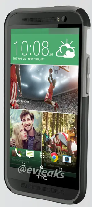
We already got a look at a few (bulky) HTC M8 cases that leaked a few weeks back. At the time, these cases only confirmed the HTC One followup would include an additional hole on the back, although it’s function remained a mystery. While those cases didn’t actually show the phone housed inside, a new leak from @evaleaks is giving us a good look at just that.
The promo images show the front of the device, as it appears inside a miscellaneous thick case. Really, it’s not much. But you can see how the placement of the ambient sensors differ from the current model, as well as the return of the “HTC bezel” along the bottom. Also worth noting is the date of the clock/weather widget, showing March 25th — they day HTC recently appointed as the HTC M8/One Plus/One 2 unveiling date.








I think they should have the dock and on screen buttons disappear when Blinkfeed is on the screen. It’d be cleaner and less cluttered
Its a render, im sure the onscreen buttons disappear when theyre not being used.
So that’s 3pm UK time then? Can’t wait to see how the cameras work.
..strange tweet from HTC 2 minutes ago – “84 years ago today, scientists discovered Pluto. You’ll always be a planet in our hearts, lil’ guy” maybe Pluto = m8 ??
If the bezel is really that size with a 5 inch screen this phone is going to be quite big, I was hoping they would go the S4 route and make it aprox the same size as the One with a bigger screen and decreased bezel.
Oh well will have to wait and see for the release, not as excited as I was before though.
It’s just a render, basically a One edited to show on screen buttons and slightly more rounded corners.
Oh yes I know it’s a render just like the others, I am still on the fence about that leak the other day but all signs are pointing to a larger phone. But I still do hold some hope, we’ll wait and see what happens. Either way 3/25 will be a day to watch.
Thanks HTC for hearing us power button back to right
But I will miss beats audio and capacitive button
6 UP please….
What was wrong with the power button on the left ?
The power button is on the top now, which I prefer. But apprently I am in the minority.
It was on the top on the original ONE as well.
That extra huge chin bezel makes no sense, especially with on-screen nav buttons. PASS.
For the life of me HTC..why would there be such a humongous bezel on this device…unless we are looking at the M8 mini OR HTC has something else as a surprise. I thought the goal was to get rid of that bottom part where the HTC logo and buttons were and replace it with all screen plus on-screen keys. So if u take the space from where the screen ends at the bottom past the speakers to the base of the device…u are looking at one HUGE BEZEL. I hope they are not shooting themselves on the foot again..pls HTC say it isn’t so. Well i am hoping they prove us concerned HTC fans wrong and deliver the appropriate minimal bezel M8 OR a 5”-5.2” screen device with looks akin to the Desire 8 with a compact form factor and a screen to face ratio of 80+%. HTC shouldn’t hand the top crown to Sammy so easily…cuz we know they want that top device crown in 2014.
the real estate u gain from taking away the logo bar isnt that great…. you probably couldnt even fit a row of icons down there
Please Mr chou, don’t be the reason yall have bad sales this year because you allowed that huge bezel, making the phone big for nothing, please utilize that space for screen estate or take it away to make the phone smaller
Somehow i think sales will be just fine. There arent THAT many whiny, anal, idiots on the planet that will be disappointed by that.
I think he’s right. In order to take on Samsung HTC needs a game changer. Sadly, that bezel will hurt them. They made the phone larger for no good reason.
Those humongous bezels are a minus and will cost them big time. The major OEMs are trying to keep the bezels on their flagship devices minimal…so i am perplexed to see this from HTC. I hope this is not the M8 cuz i really want a device from HTC. I also have the Sammy GS5 and the LG G3 as my target devices.
Just so I know, who exactly are you calling an idiot
HTC is NOT Apple and while the sales might be “Alright” people
looking for new Android phones won’t eat up whatever HTC throws at them.
Aside from HTC fans maybe. Mobile users are looking for game changing
devices in and out. So even though HTC hardware might be great a lot of
consumers will be looking at the physical attributes of the phone and
those bazels make the phone bigger than competition devices with same
size screen.
TL;DR
HTC need to try harder.
I don’t mind some bezel at the bottom if it means my clumsy hands don’t always accidentally press the bottom right draw icon like they do on my S4. All I am waiting to hear about is battery capacity…. please be 3k, please be 3k.
Looks to me they will be adding a front facing flash, HTC have a thing for people taking selfies, makes sense.