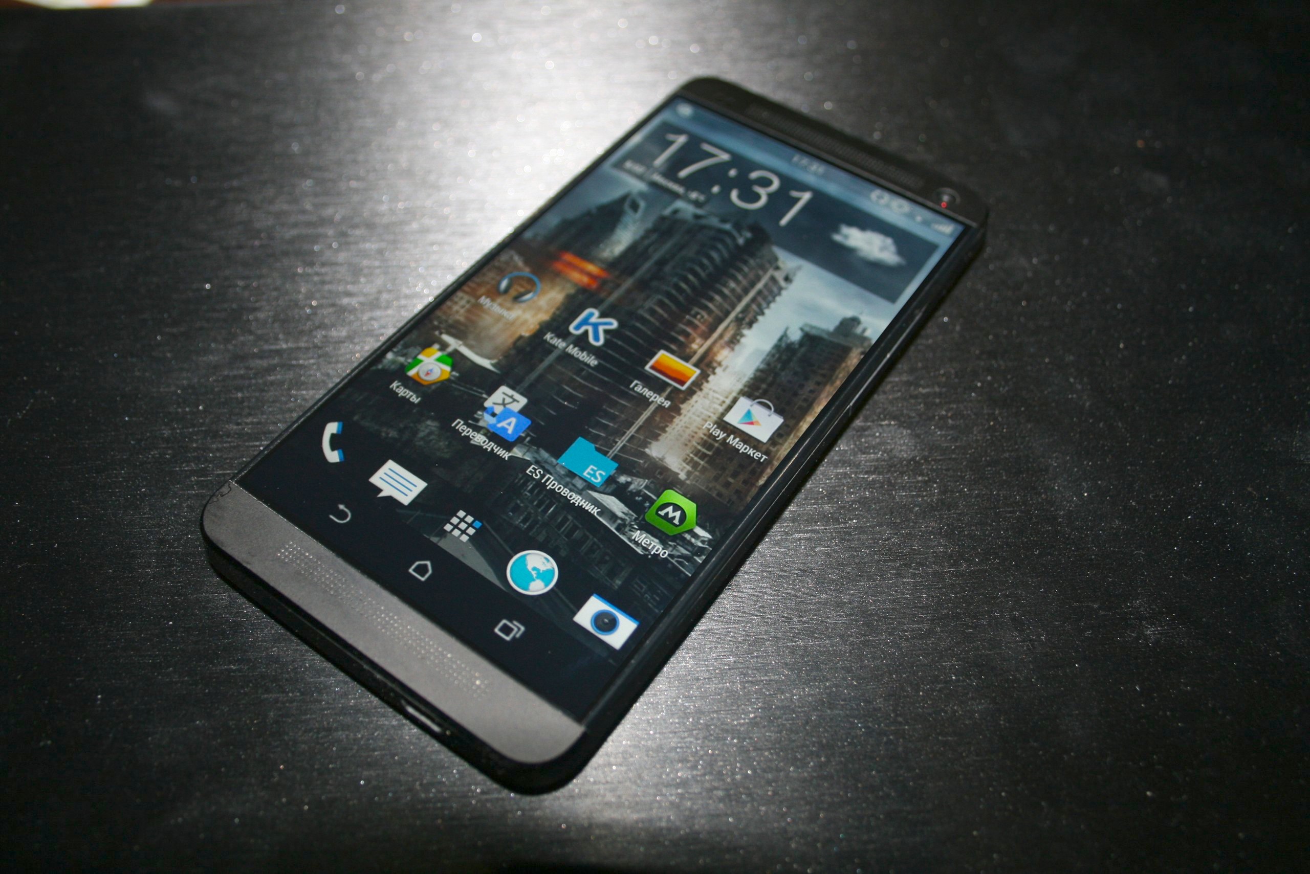
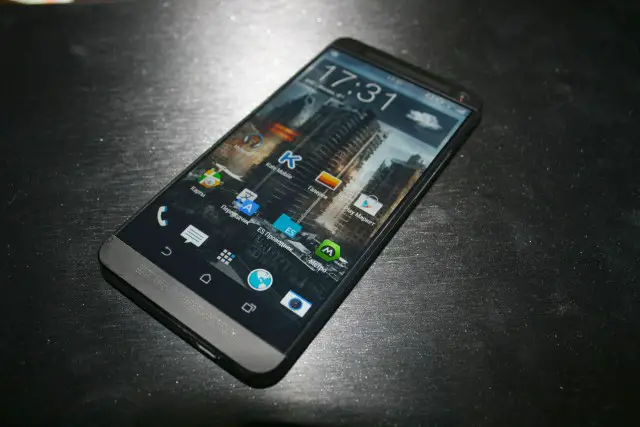
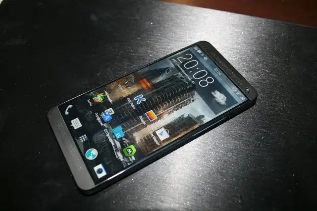
Earlier today, we got what appeared to be a fairly good look at the back of the HTC M8 (aka One 2, One Plus), dual cameras and all. While the jury is still out on that particular photo’s legitimacy, some new pics of the M8 were posted on a Russian site, this time giving us a clear look at what could be the front of the M8. And really, that’s all she wrote. All we can say is this is pretty much how the M8 — which is said to look strikingly similar to the original HTC One — appears in our dreams. But is it real?
We should point out the fact that in one image, the device shows the rumored display buttons. Checks out. But wait — in the other pic, from a slightly different angle, you’ll notice they aren’t present. So, how the heck does HTC think we’re going to quickly access back, home, and multitasking on the homescreen if they disappear? Makes us question if this “leak” is legit, or simply another elaborate hoax. What do y’all think?
[Mobiltelefon.ru | via Phone Arena]


As fake as my PhD
*cancels his appointment*
yes because Kit Kat doesn’t have something called Immersive Mode???
Immersive mode was never meant for EVERY app, and especially not the homescreen. If anything, I’m hoping it’s just an early build where — for some crazy reason — immersive mode is enabled on the homescreen, but will be removed by release.
There are custom roms that use immersive mode for everything. Maybe HTC is doing something similar? I sure hope so anyway.
Not sure if this is real or not… I don’t see what he Nav keys would have to dissapear on the home screen… They should blend into the background like the N5 and G2
THIS. Why are they not transparent?
Even phones that updated to KitKat now don’t have the transparent look on the status bar or nav keys for Moto phones. They could custom it however they want. We will just have to see.
“So, how the heck does HTC think we’re going to quickly access back, home, and multitasking on the M8 if they disappear?”
My money is on them taking the ‘immersive mode’ swipe gesture through to all apps/launchers etc
That would incredibly inconvenient when on the homescreen. Don’t need a gesture getting in the way of quickly pressing home/back/multitasking.
Multitasking could be a simple swipe-up like iOS’s bottom drawer.
And, why do you need a back button on the homescreen?
I thought the same thing. Two of those three buttons are basically irrelevant on the homescreen, and I suspect that the app switcher button gets used by normal people a lot less than we’d generally expect.
SMS popups, when inside a folder, etc.. The point is, there’s a reason Google didn’t create immersive mode for every app (and especially not the launcher). It’s simply not practical.
You don’t have to use the immersive mode, at least you don’t with AOKP/PA. Hide the buttons if you want, don’t if you don’t. A simple gesture can bring it back or away.
That makes sense but why add an extra step to do what you did before? I think that’s Chris’s point. It’s not improving anything to remove them. In PA you can bring the nav key’s from the side or bottom aka PIE and that’s more convenient then a gesture up to show them, then press one of the three vs just press it and done.
Functions right from the home screen are meant to be done in as little as one action which is to tap on it. Anything beyond the home screen can have or should have multiple functions.
I know Immersive mode auto-hides the navbar, but what if there was a way to where you *have* to manually swipe to hide and show the navbar?
HTC *could* be doing that, if this is real…
Maybe it has pie controls? I much prefer gester based controls on my note 3. But then it’s a gigantic phone sooo.
Maybe a swipe up from the bottom brings the nav bar up. Only problem is, no HTC logo in this picture. Every phone I can remember from them has the logo somewhere on the front.
That would actually be kinda neat..
Jester-based controls? You’ll need to get a guy with a funny hat with bells attached who speaks on rhymes to do that.
What if the second render is actually the real deal and the home and back buttons or place on both sides of the speakers like Samsung has there’s next to the center task button, I think that would be sick
The hardware is surely real and not a mock. You can see some kind of mark or stain on the bottom left front in both pictures. Seems weird that this person would take both of these pictures hours apart. Dunno
Yes, but this could just be a ONE with the display stretched.
If the bezel on the sides, top and bottom are as small as this “leak” and it has a minimum 5″ screen, I’d look at HTC again. I love the front facing speakers, but the ONE feels HUGE for a smaller screen.
Perhaps a toggle menu like Nova i love that feature’
Did anyone notice that the clock is in the middle of the notification bar too?
Anybody else notice that when the Nav buttons are gone, all the icons are still in the same location relative to the wallpaper?
You would think that when the nav buttons go away, the icons would shift downward relative to the wallpaper.
It just seems strange that HTC would shrink/stretch the wallpaper to account for this action.
Maybe swipe up from the bottom to make the navigation buttons appear and swipe down to minimize them. It would be one extra step but would allow you to use the whole screen when you see fit. Just a thought
I had my G2 doing that, you get used to it.
That’s just like how most roms implement the immersive mode all the time. That’s all that is really. (I love that by the way)
Maybe the second pic is not displaying functionality, just proof of on screen buttons.
I am almost certain that this is fake.
Its looks beautiful… and also fake, unfortunately.
I hope this is real, otherwise I just creamed myself for nothing…
Don’t over hype the phone. You WILL disappoint yourself. LoL!!
I’m calling fake on this one, look at the center clock on the notification bar. classic rooted phone function
I actually agree with that. And if HTC actually brings out a center clock…
Or even better, a clock that can be right aligned, centered, left aligned, or completely removed. Heck!! Give us everything we root for and we can only get to these “added features” by unlocking developer options.
Great. Now I’m over hyping the phone.
What if the second render is actually the real deal and the home and back buttons or place on both sides of the speakers like Samsung has there’s next to the center task button, I think that’s a hit
But doesn’t 4.4 have immersive mode? Being able to swipe away your navbar?
Don’t know, I haven’t been blessed with 4.4 yet , thanks to ATT, and I can’t remember all the abilities from watching the nexus videos running 4.4
I’m hoping it was the ROMs I was trying, but it’s not a “blessing”. Don’t feel like you’re missing anything with the update.
I actually went back to 4.3 because things weren’t working right. Like I said, I hope it was just the ROMs.
Wait, what’s going on? Kate Mobile is a Russian application, but I thought HTC was a Taiwanese company. So does this mean this is out in Russia?
Hmm…
And why did it take almost 3 hours to get another picture… on the same surface?
The clock in the middle of the status bar doesn’t seem right. I guess it could be part of Sense 6.0, but for now, it looks weird.
Not sure how I’d feel about minimized navigation buttons. That would be kind of annoying on the home-screen.
I’ve no idea if this is real but it would be awesome if it utilizes the immersive mode ALL the time like 4.4 custom ROMs allow you to do. A quick swipe up from the bottom and there are your buttons. There is a little black bar there at the bottom. I can’t tell if its screen or bezel. If this is real, this could be the device that brings me back to HTC…. If it releases on VZW like all the others. I was so excited for the ONE but by the time it was available to me, I’d moved on.
I call FAKE…..if the on-screen buttons do disappear, the icons would have to move relative to the wallpaper image, or the wallpaper would have to stretch and look weird. Well, pay attention to where the icons are in reference to the background on the first image, and they are exactly the same in the second image. The photoshopper simply cut the on-screen buttons out and moved the bottom speaker bezel up.
Wow stunning! Next phone for sure~
But it’s funny how the first photo has navigation buttons where the 2nd photo has none, LOL~!
Photoshop epic fail!
Another weird thing besides the missing nav buttons… There’s no battery icon in the notification bar. And the time is now centered when it was to the right in the original One.
Sometimes, I wonder what’s going on in a fake leaker’s mind. If they spend all this time photoshopping, how do they miss such basic details? Furthermore, what kind of psycho gets excited off of tricking a niche group of tech enthusiasts into thinking a certain phone is coming when in reality, it’ll be slightly different?… So many questions for this leaker…
Simple to access the back, home, and recent apps buttons simply swipe up from the bottom.