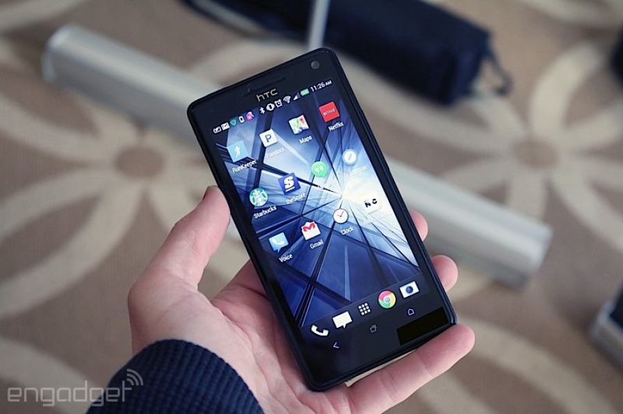
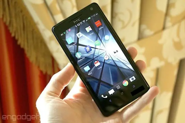
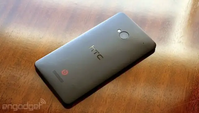
As we near the inevitable sequel of last year’s HTC One (who’s 1st birthday is only a few short months away) the boys at Engadget are giving us a rare look at a prototype version of the device, the HTC One that wasn’t. You might remember just before the HTC One was made official, a few versions — much like this one — were leaked out onto the net.
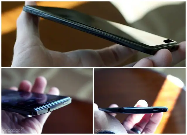
Featuring a soft touch finish and more edgy corners, the design was very reminiscent of the HTC 8X, HTC’s then Windows Phone. We have doubts that this was even a later prototype, having got our hands on an even later version during HTC’s One event in New York last year. The version we saw looked more like the HTC Droid DNA/Butterfly S, featuring dual-front facing speakers on an unmarked, glossy plastic shell.
While not mind blowing, it’s sometimes fun to take a look at the process that goes into designing our favorite devices. What do you guys think? Did HTC change the One for the better? Can’t wait to see what they have planned for the next version (HTC M8).





I actually like this more than the One that was released
Looks better than the one.
Isn’t that a HTC DNA?
Wow I’m so glad they went with the production design!
this one looks very generic. glad the ended up changing it!
It looks better than the release One, that’s for sure
It’s not horrible, just didn’t scream “flagship” device.
In the end, the aluminum build made for a more premium feeling handset, even if personally, I prefer soft touch (phone stays where you put it).
Again, super excited to see if they make any changes to the One design for the M8 (sequel), or if the One+ means mostly internal changes.
I think you added a useless “not”.
That would have killed HTC
Killed HTC? They would have been wiped from existence.
Note to HTC, go back to your old capacitive button arrangement or on screen buttons for the next phone. I loved my HTC one but the buttons and smallish screen made me give it to my sister in law.
Yeah, DNA was damn near perfect for me. 3-button arrangement. 5-inch 1080p display. All it needed was a better camera and front facing speakers.
butterfly s has almost everything, minus the camera (which is still good enough for facebook pics).
real shame they didn’t release it worldwide, didn’t regret importing mine love the screen, dual front speakers and amazing battery life.
I just hate the speakers on the Butterfly S. The speaker covers on the One bring it together rather than having two ominous holes in the glass.
IKR!? They need to do something similar to what LG has done. Use software buttons, but allow them to be changed without the need of root.
I still have my One, tucked away in a corner, replaced by the Nexus 5. It was almost perfect, but it irritated me on a daily basis.
Looks like crap compared to the original HTC One.
thank god they didnt release that lol i love my one its still the best looking phone out
мʏ ƈօ-աօʀĸɛʀ’ѕ ѕтɛք-αυɴт мαĸɛѕ $75/нօυʀ օɴ тнɛ ƈօмքυтɛʀ. ѕнɛ нαѕ вɛɛɴ ғιʀɛɖ ғʀօм աօʀĸ ғօʀ 9 мօɴтнѕ вυт ʟαѕт мօɴтн нɛʀ ιɴƈօмɛ աαѕ $16815 ʝυѕт աօʀĸιɴɢ օɴ тнɛ ƈօмքυтɛʀ ғօʀ α ғɛա нօυʀѕ. ɢɛт ʀɛɖιʀɛƈтɛɖ нɛʀɛ http://makesupto60dollarsperhour.qr.net/nHBl
Thank god they changed it. I’d still have an S4. lol
I worked at T-Mobile as tech support when this phone was new and my boss had this prototype as a beta tester.
I wished they changed the home button.